North star · Keep the page calm and spacious, using dark ink for structure and indigo only to direct attention.
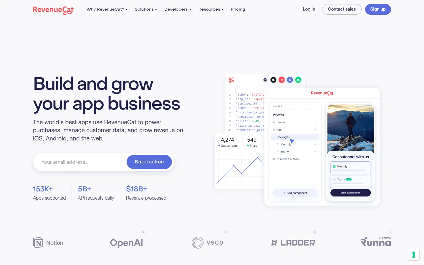
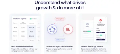
The page uses a cool, nearly white canvas as a quiet backdrop for dark indigo typography and selective blue calls to action. A pale-gray hero establishes the tone, then long white product sections alternate with a broad light-gray paywall and testimonial band. Object Sans gives headlines a distinctive, tightly tracked shape; Helvetica Neue keeps body copy and much of the navigation understated. The desktop layout favors a centered content frame, broad whitespace, and repeated two- or three-column feature arrangements rather than dense text. Product UI illustrations carry the visual detail: they sit in soft, lightly bordered cards and layered interface compositions, while customer logos and statistics act as compact proof points. Hairline borders define inputs and cards; restrained shadows separate floating interface previews without making the site feel heavy. Blue is reserved for primary actions, links, metrics, and small highlights, with occasional warm red confined to brand marks or illustrative details.
Body copy and much of the navigation, with lighter text setting a restrained reading tone.
Aa 设计
objectSans
网络字体 · 字重 400 / 500 / 700 / 300 · 占比 33%
免费替代:Space Grotesk
Display and heading hierarchy, buttons, captions, and prominent links.
角色
示例
字号
字重
行高
字距
特大标题
Large hero headline and other top-level campaign statements.
RevenueCat
60px
500
1.13
-0.04em
一级标题
Primary page heading, especially the homepage hero.
RevenueCat
56px
500
1.13
-0.04em
二级标题
Major section titles and centered feature-group introductions.
RevenueCat
48px
300
1
-0.04em
三级标题
Feature-card headings and secondary product-story titles.
RevenueCat
40px
500
1.13
-0.04em
四级标题
Smaller card and detail headings within product sections.
RevenueCat
30px
400
1.5
-0.04em
正文
Explanatory paragraphs, case-study copy, and feature descriptions.
The quick brown fox 敏捷的狐狸
16px
300
1.5
0
辅助文字
Compact labels, ratings, and supporting interface annotations.
The quick brown fox 敏捷的狐狸
14px
400
1.43
0
按钮
Primary and secondary action labels.
The quick brown fox 敏捷的狐狸
14px
400
1.43
0
导航
Top navigation and related menu labels.
The quick brown fox 敏捷的狐狸
14px
400
1.43
0
链接
Inline feature links and case-study calls to action.
The quick brown fox 敏捷的狐狸
16px
500
1.5
0
间距与布局
基准单位 4px · 密度:宽松
120px版块间距
4px元素间距
—卡片内边距
1216px内容最大宽度
1px
2px
4px
6px
8px
12px
14px
16px
20px
24px
28px
32px
40px
44px
48px
Use a centered desktop content frame capped at the measured 1216px maximum, with a spacious density and long pauses between major sections. The hero is a three-part composition: left-aligned copy and signup form, layered product UI on the right, and a customer-logo row below. Feature storytelling alternates centered introductions with two- or three-column cards and offset split layouts. Broad white stretches contrast with continuous pale-gray bands. Keep text blocks short, align cards consistently, and use generous whitespace rather than filling every column.
圆角与层次
按钮 · 4px
输入框 · 9999px
卡片 · 16px
图片 · 16px
导航 · 4px
链接 · 4px
xl · card
hairline · link
hairline · other
md · card
The page is mostly flat, with fine pale borders defining inputs and cards. Use soft, diffuse shadows selectively beneath floating product previews and prominent cards to create separation without heavy contrast. Rounded card corners soften the interface, while most section boundaries rely on changes in white and pale-gray surface rather than dividers.
组件
下面的预览按实测的按钮、输入框、徽标、卡片样式重建(字体用替代字体)。
Primary action
Use Signal Indigo #576ddb with white text for the free-start action; buttons are compact, rounded pills in the measured components.
Sales action
Pair the primary action with a restrained outlined or text-style sales option, using Slate Text #3d3d5c rather than competing blue fill.
Hero signup
Place a white, pill-shaped email input with a Mist Border #eaedf6 outline beside or directly joined to the blue primary action.
Feature card
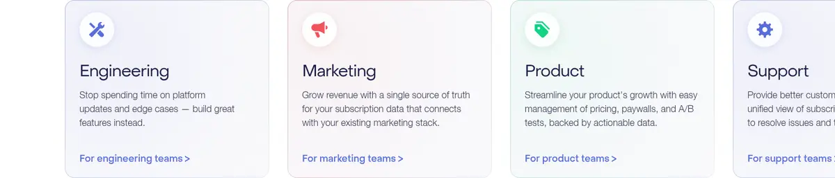
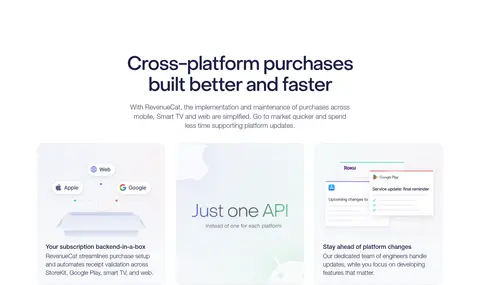
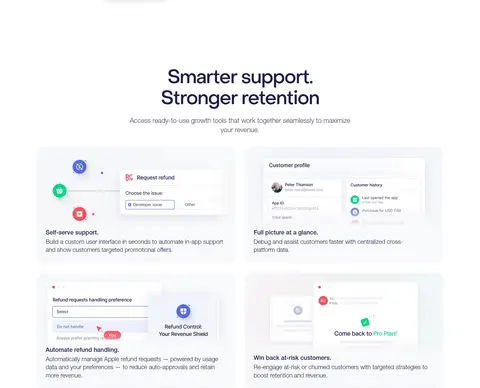
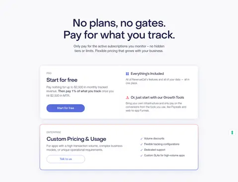
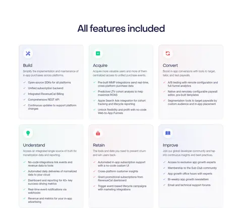
Use a white or very pale-gray card, subtle outline, and rounded corners; include a small illustration, clear title, short copy, and a blue text link.
Product preview
Layer bright dashboard or mobile UI mockups with restrained shadows and soft edges; keep dark text and color accents within the interface.
Case-study proof
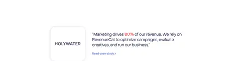
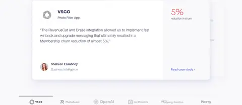
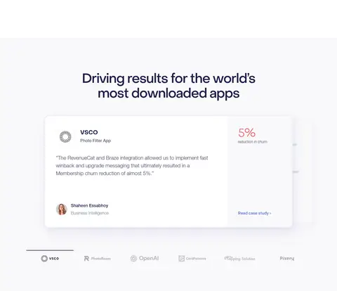
Combine a client mark with a compact outcome-led quote and a small blue case-study link, leaving ample breathing room.
Logo and trust row
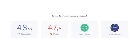
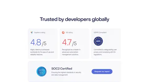
Show customer marks or ratings in a light, low-contrast horizontal group, keeping them subordinate to page headings.
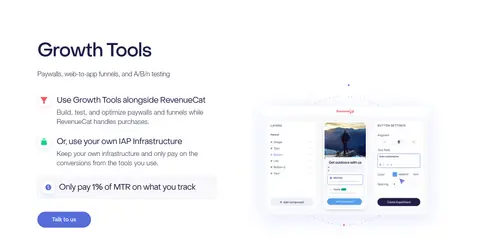
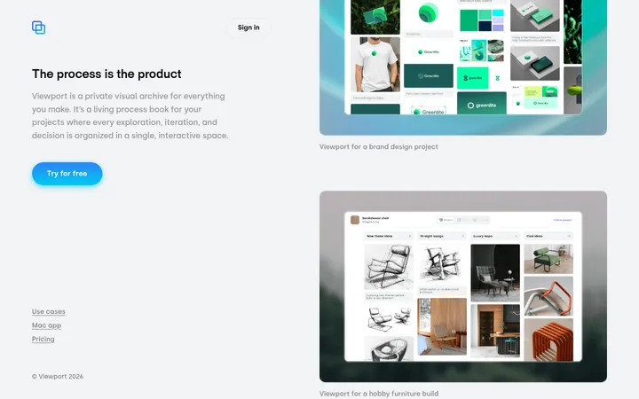
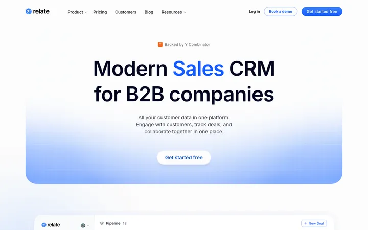
Imagery · Favor polished product-interface illustrations over editorial photography. Compose dashboards, paywall editors, charts, and mobile screens as layered mockups inside soft-edged cards, often with a small amount of overlap. Customer logos, ratings, and case-study marks provide quieter proof. Keep images bright and low-contrast against the pale canvas; colorful details belong inside the interface previews, not as broad decorative fields.
Use Cloud Gray #f9f9fb and Gallery White #ffffff as the main alternating surfaces.
Set prominent headings in Object Sans with tight tracking and Midnight Ink #1f1f47.
Reserve Signal Indigo #576ddb for primary actions, links, and concise data highlights.
Give feature explanations generous space and short, clearly grouped copy.
Use product-interface mockups to demonstrate functionality.
Separate cards with delicate Mist Border #eaedf6 hairlines and soft shadows.
✕ 不该做
Do not turn the page into a dense dashboard or packed text grid.
Do not use bright blue as a full-width background.
Do not add heavy, high-contrast shadows to every card.
Do not use warm illustration colors as the primary brand palette.
Do not make headings or navigation all caps.
Do not fill whitespace with unrelated decorative photography.
给 AI 的提示词
想快速出一个同风格的新页面,把这段话连同 DESIGN.md 一起发给 AI。
Build a new RevenueCat-style SaaS page with a calm, spacious rhythm and a clear product-story hierarchy. Use Cloud Gray #f9f9fb and Gallery White #ffffff for alternating surfaces, Midnight Ink #1f1f47 for headlines, and Slate Text #3d3d5c for supporting copy. Apply Signal Indigo #576ddb sparingly to primary actions, links, and key metrics. Use Object Sans or a close geometric substitute for headings and controls, and a neutral sans-serif for body copy. Arrange a centered desktop content frame with short copy blocks, generous whitespace, product UI previews, feature cards, customer proof, and a final conversion prompt. Keep edges lightly bordered with Mist Border #eaedf6 and use soft shadows only for floating previews. Avoid dense layouts, large saturated color fields, and unrelated photography.