Replicate 以明亮鲜明的渐变首屏,呈现面向 API 的 AI 平台。模型卡片、代码示例与深色企业服务区,让开发者能直观了解产品能力。
North star · Use bold gradient framing to attract attention, then make every section quickly legible through crisp white space, real model outputs, and practical code.
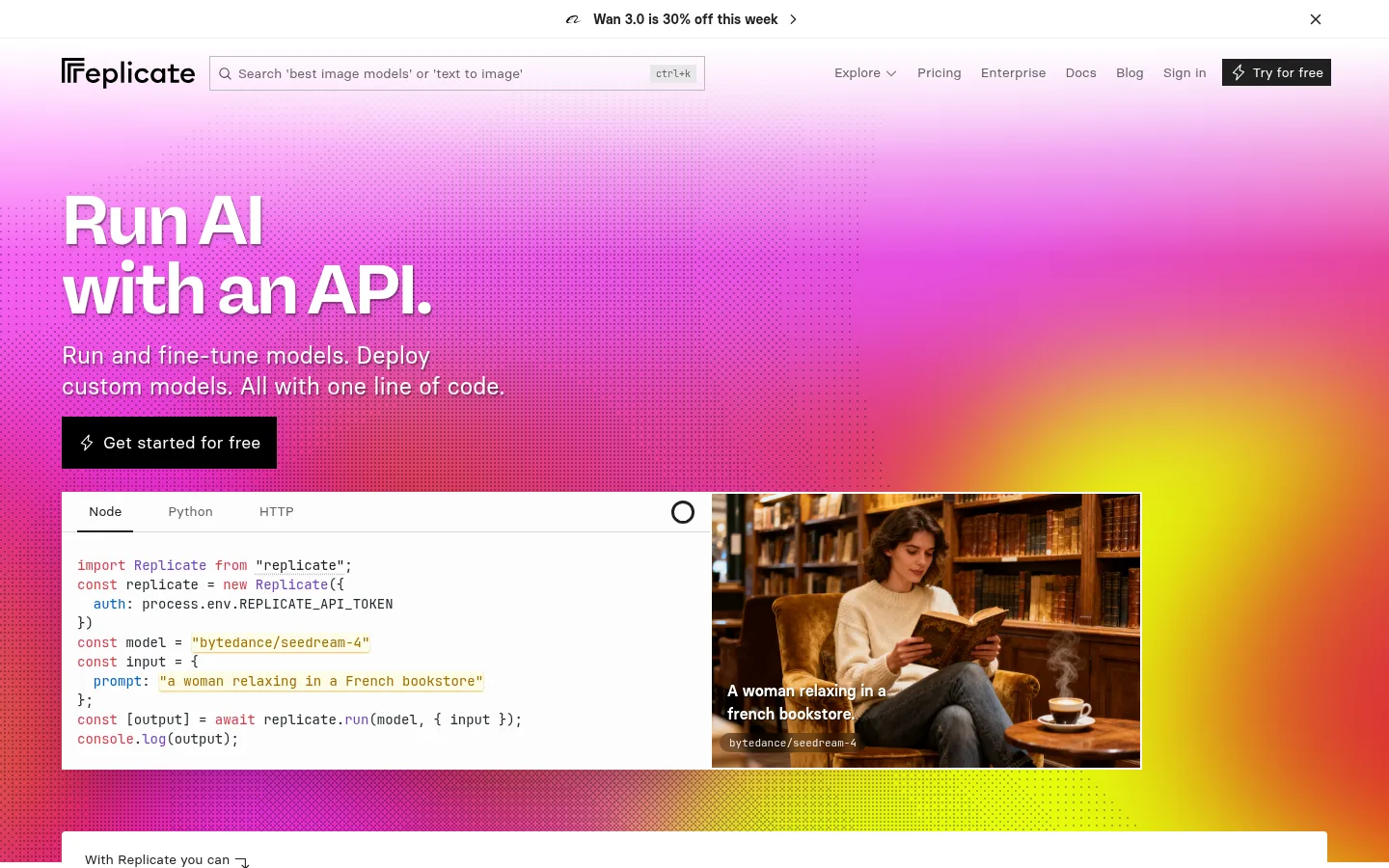
The page starts with a white navigation strip and an oversized, full-width hero washed in vivid pink, magenta, orange, and yellow gradient light. White display text and a black CTA sit over the color field, while a framed code-and-image demo grounds the spectacle in a usable developer workflow. Basier Square handles most interface text; the heavier Freigeist Neue display face gives headlines a compact, assertive character, and JetBrains Mono marks code and technical labels. The layout alternates between dense model-card grids and spacious white editorial sections, then switches to a nearly black enterprise band with restrained red-orange details. Hairline borders define cards and code panels instead of relying on rounded containers or pervasive shadows. Images and video show real model outputs, so the vivid gradient remains a brand-level frame rather than a substitute for product evidence.
配色
点色块复制色值。用途说明来自对页面的实测位置(背景、文字、描边、按钮)与截图判读。
品牌色
强调色
表层色
中性色
功能色
页面底色 · Gallery White表层 · Carbon Ink表层 2 · Soft Paper主文字 · Carbon Ink次要文字 · Quiet Graphite弱文字 · Gallery White描边 · Signal Vermilion强调 · Ember Button强调 2 · Signal Vermilion强调 3 · Deep Cobalt
Primary navigation, body copy, buttons, cards, and most interface text.
Aa 设计
jetbrains-mono
网络字体 · 字重 400 · 占比 16%
免费替代:JetBrains Mono
Code panels, technical labels, and compact model or link metadata.
Aa 设计
rb-freigeist-neue
网络字体 · 字重 600 / 400 / 700 · 占比 10%
免费替代:Space Grotesk
Large display hero and prominent section headings.
角色
示例
字号
字重
行高
字距
特大标题
Oversized, bold hero headline.
Replicate
128px
700
1
0
一级标题
Primary hero and major section titles.
Replicate
48px
400
1
0
二级标题
Strong subsection headings and feature titles.
Replicate
30px
600
1.2
0
三级标题
Model or content-card headings.
Replicate
29px
400
1.11
0
四级标题
Supporting feature and instructional headings.
The quick brown fox 敏捷的狐狸
24px
400
1.33
0
正文
Explanatory copy, descriptions, and card text.
The quick brown fox 敏捷的狐狸
14px
400
1.43
0
辅助文字
Small metadata and short lowercase labels.
The quick brown fox 敏捷的狐狸
12px
400
1.33
0
按钮
CTA and action labels.
The quick brown fox 敏捷的狐狸
14px
400
1.43
0
导航
Top-level navigation and category controls.
The quick brown fox 敏捷的狐狸
14px
400
1.43
0
链接
Compact technical and model links.
The quick brown fox 敏捷的狐狸
11px
400
1.5
0
代码
Code examples and developer snippets.
const style = 1;
14px
400
1.43
0
间距与布局
基准单位 8px · 密度:紧凑
32px版块间距
8px元素间距
—卡片内边距
1312px内容最大宽度
1px
2px
4px
6px
8px
10px
12px
16px
24px
32px
64px
Use a wide centered content frame, with measured page maximum width of 1312px, and let the opening gradient hero span the viewport. The hero pairs left-aligned copy and CTA with a broad code-and-output demo. White sections alternate between compact multi-column model grids and centered editorial content; the instructional section uses a bordered inset panel. The enterprise band is dark and four-column, followed by an open gallery-like feature section and a multi-column footer. Maintain compact component spacing with clear section breaks.
圆角与层次
按钮 · 9999px
图片 · 50%
徽标 · 2px
链接 · 50%
hairline · badge
xl · card
hairline · footer
Favor flat surfaces and crisp hairline borders over layered card shadows. Model and code cards use square corners and dark outlines; the dark enterprise area separates itself through a full-width inverse surface. Keep layering purposeful: the hero demo sits above the gradient, and the instructional content is framed within a colored band. Avoid adding depth effects not present in the measured style.
组件
下面的预览按实测的按钮、输入框、徽标、卡片样式重建(字体用替代字体)。
Gradient hero
Full-width multicolor backdrop with large white headline, concise support copy, black CTA, and a framed code-plus-output demo.
Model category row
Compact category links and search controls lead into dense, horizontally broad model-card collections.
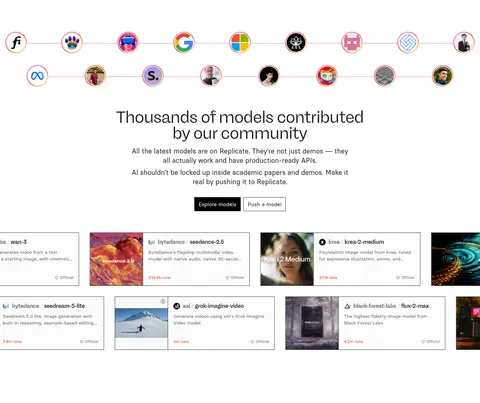
Model card
Square-corner card with thin dark outline, model thumbnail, name, short description, and compact metadata.
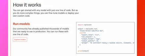
How-it-works panel
White instructional content framed by a vivid gradient band, with explanatory text alongside code examples.
Enterprise band
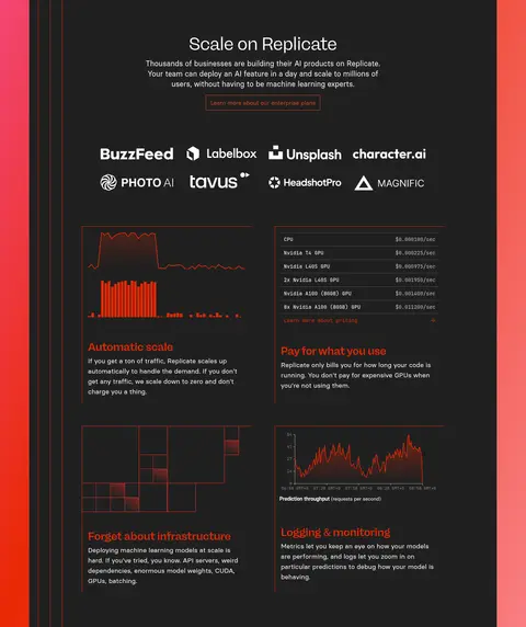
Carbon Ink (#202020) full-width section with centered introduction, customer logos, and a two-by-two feature arrangement.
Build showcase
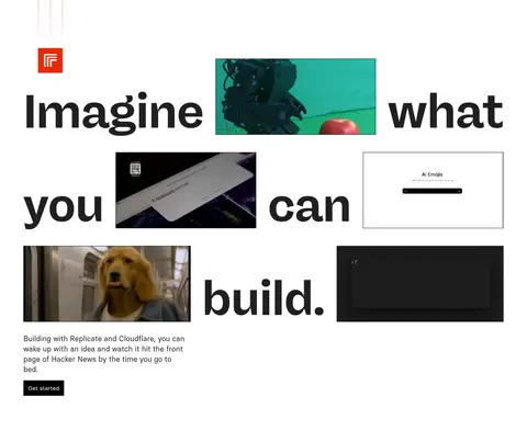
Open white gallery pairing oversized typography with cropped video and product examples.
Footer
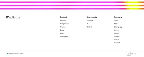
White multi-column link directory with a narrow multicolor gradient rule separating it from the content above.
Imagery · Show real generated images, video outputs, model previews, and customer marks rather than generic illustrations. The hero demo places readable code beside a large output image in one framed panel. Model cards crop media into thumbnails while retaining titles and brief metadata. The showcase section mixes video tiles with oversized words. The gradient is atmospheric framing; keep media itself legible and varied.
Use the gradient as a bold hero or section frame, not a page-wide wash.
Pair technical claims with legible code or genuine model output.
Use Carbon Ink (#202020) for core text and dark inverse sections.
Keep model cards crisp, square-cornered, and visibly outlined.
Reserve JetBrains Mono for code and technical metadata.
✕ 不该做
Do not replace the vivid hero gradient with a muted corporate palette.
Do not use rounded, floating cards as the default container.
Do not bury code examples under decorative effects.
Do not turn every section into a dense card grid.
Do not use gradient colors as ordinary body text.
Do not invent new palette hex values or heavy shadows.
给 AI 的提示词
想快速出一个同风格的新页面,把这段话连同 DESIGN.md 一起发给 AI。
Build a new developer-facing page in Replicate’s visual style. Start with a Gallery White (#ffffff) canvas and a wide, vivid hero gradient using Electric Orchid (#ff6bfc), Signal Vermilion (#ea2804), and Coral Haze (#f97e82). Set oversized headlines in a bold geometric display sans; use a clean sans for interface copy and JetBrains Mono for code. Pair each main claim with practical evidence: code snippets, model cards, generated media, or workflow examples. Use Carbon Ink (#202020) for strong text, black CTAs, and occasional inverse sections; use Quiet Graphite (#646464) for secondary navigation. Keep cards square and outlined, layouts broad and compact, and section rhythm varied between dense model grids and open editorial space. Use gradients as framing, not as a replacement for content.