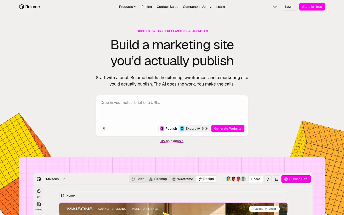
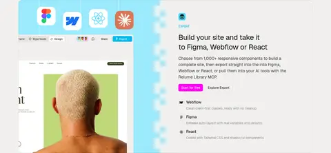
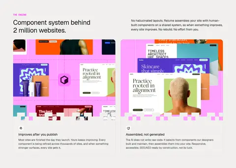
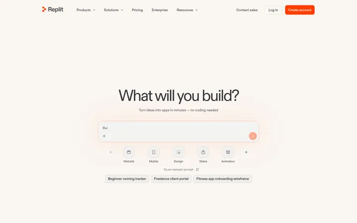
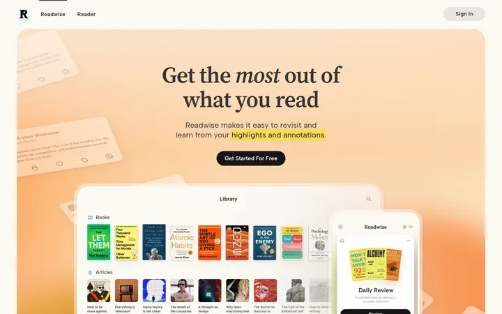
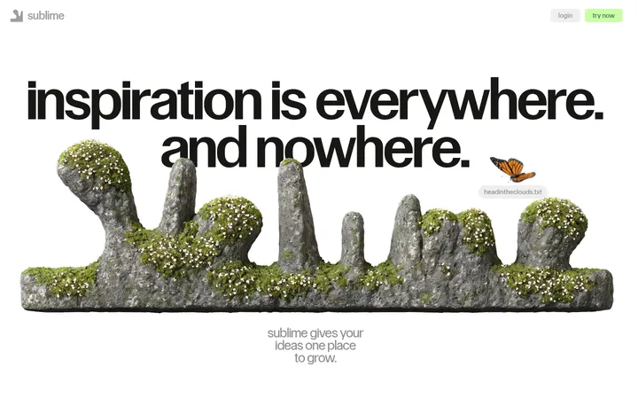
Relume以克制的暖中性色界面搭配醒目的洋红色行动按钮和鲜活的产品预览。宽松居中的主张逐步展开为产品能力、导出流程、客户故事与可交互示例。
North star · Keep the warm neutral canvas and clear editorial hierarchy dominant; use magenta sparingly to mark action and emphasis.
The page is built on a warm off-white canvas (#f1f0ee), not pure white, which keeps the long homepage calm while allowing saturated magenta (#ff00f4) to make the primary actions and small uppercase trust labels immediately visible. Near-black headings and body copy carry the message; fine gray borders quietly define controls and card edges. Typography is clean, mostly Geist Variable, with large, regular-weight centered hero text and compact monospaced uppercase eyebrows. The hero leaves generous breathing room around the brief-input panel, then introduces a framed product interface with vivid pink and yellow geometric illustration. Lower sections alternate between concise copy and screenshots, collage-like component previews, and customer examples. The layout remains modular and grid-led, while bright cyan, pink, peach, and yellow chiefly animate product imagery rather than replacing the neutral brand canvas.
配色 点色块复制色值。用途说明来自对页面的实测位置(背景、文字、描边、按钮)与截图判读。
品牌色
Warm Canvas
#f1f0ee
Dominant page background across the hero, section bands, and footer.
强调色
Electric Magenta
#ff00f4
Primary CTA fills, trust eyebrow text, and select product-interface highlights.
Blush Edge
#ffd9ff
Faint pink edge detail on button states; secondary to the main magenta.
Candy Pink
#ff9fff
Bright preview-card fills, interface framing, and soft radial decorative effects.
表层色
Clean White
#ffffff
Input panel, white controls, and selected product-preview surfaces.
Peach Sand
#f4c490
Warm product-preview or card accents, rather than a major page band.
Bright Cyan
#98eafd
Cyan cards and export-preview accents, mostly within showcased product imagery.
Pink Mist
#ffcfff
Pastel card or preview backgrounds; use as an illustration surface, not the page canvas.
中性色
Soft Ink
#101010
Headings, primary navigation, body text, and strong foreground details.
Quiet Border
#dbdad9
Hairline outlines around navigation controls, cards, and interface elements.
Deep Charcoal
#161616
Occasional strong copy and interface text, close to the primary ink.
Muted Ink
#343434
Secondary copy, supporting navigation links, and subdued text.
Quiet Gray
#8a8a8a
Low-emphasis helper text and muted details.
功能色
Grid Charcoal
#1b1919
Subtle inset rules and technical grid effects, not a broad page surface.
Butter Cream
#fff5cb
Pale text or decorative details inside product previews, not a core page surface.
Soft Butter
#fff2b0
Light yellow illustration or mockup detail; not a defining interface color.
Roasted Brown
#361d02
Dark lettering or imagery detail within embedded sample-site previews.
文字 背景 对比度 WCAG #101010 Soft Ink#f1f0ee Warm Canvas16.71:1 AAA #101010 Soft Ink#ffffff Clean White19.03:1 AAA #101010 Soft Ink#98eafd Bright Cyan14.07:1 AAA #101010 Soft Ink#ffcfff Pink Mist14.15:1 AAA #343434 Muted Ink#f1f0ee Warm Canvas10.93:1 AAA #343434 Muted Ink#ffffff Clean White12.45:1 AAA
字体 字号阶梯:Major Third(比例约 1.255,正文 18px)。示例用免费替代字体渲染,数值为实测。
Aa 设计
Geist Variable 网络字体 · 字重 400 / 500 / 440 · 占比 64%
免费替代:Inter
Primary display, headings, body, and much of the interface copy
Aa 设计
Helvetica Now Display 系统字体 · 字重 400 / 500 · 占比 25%
免费替代:Inter
Secondary headings, captions, and small display details
Aa 设计
PP Writer 系统字体 · 字重 400 · 占比 3%
免费替代:Instrument Serif
Occasional serif styling in embedded sample-site content
Aa 设计
Relume Icons 网络字体 · 字重 400 · 占比 3%
免费替代:Material Symbols
Small product and interface iconography
Aa 设计
Geist Mono Variable 网络字体 · 字重 500 / 400 · 占比 2%
免费替代:Geist Mono
Uppercase navigation-style eyebrows and technical labels
Aa 设计
ABC Diatype Semi-Mono 系统字体 · 字重 500 · 占比 1%
免费替代:IBM Plex Mono
Minor semi-monospace interface or mockup text
角色 示例 字号 字重 行高 字距 特大标题 Large promotional statements and prominent centered hero messaging.
Relume
56px 400 1.2 -0.03em 一级标题 Primary hero headline and major page-level statement.
Relume
40px 400 1.2 -0.02em 二级标题 Major feature-section headings and secondary promotional statements.
Relume
32px 400 1 -0.01em 三级标题 Feature titles and supporting section headings.
Relume
28px 440 1.4 -0.02em 四级标题 Card and subsection headings within product stories.
The quick brown fox 敏捷的狐狸
23.5px 500 1.4 0.01em 正文 Hero description and explanatory product or feature copy.
The quick brown fox 敏捷的狐狸
18px 400 1.5 0 辅助文字 Compact supporting descriptions and image or card details.
The quick brown fox 敏捷的狐狸
16px 400 1.4 0.01em 导航 Small uppercase monospaced navigation-style labels and eyebrows.
The quick brown fox 敏捷的狐狸
14px 500 1.43 -0.02em 链接 Short links, attribution, and compact supporting actions.
The quick brown fox 敏捷的狐狸
12px 500 1.5 0 眉题 Small uppercase section identifiers above headings.
The quick brown fox 敏捷的狐狸
5.5px 400 1.5 0.03em 代码 Compact uppercase technical or product-interface labels.
const style = 1;
14px 500 1.43 -0.02em
间距与布局 基准单位 4px · 密度:适中
80px 版块间距
8px 元素间距
— 卡片内边距
1280px 内容最大宽度
2px
3px
4px
6px
8px
9px
12px
16px
24px
32px
The measured page max width is 1280px, with comfortable density and a recurring 80px section rhythm. The hero is centered and narrow in composition, while product and proof sections shift into two- and three-column arrangements. Keep copy aligned to the start in feature sections, but center the primary hero and closing CTA. Use generous gaps between major blocks and tighter groupings within cards and controls. The opening navigation is a slim horizontal bar; long sections remain visually light despite dense screenshots.
圆角与层次 inset · other, button, card
inset · button, card, other
inset · other
inset · other, button
The interface is mostly flat, with thin gray hairlines separating controls and outlining subtle surfaces. Buttons and cards use restrained inset edge effects rather than prominent drop shadows. Product screenshots gain depth through overlapping panels, colorful frames, and layered mockup content; preserve those overlaps while keeping surrounding page sections quiet.
组件 下面的预览按实测的按钮、输入框、徽标、卡片样式重建(字体用替代字体)。
Top navigation A horizontal header with the Relume mark, compact product links, a bordered Log in control, and a magenta Start for free button.
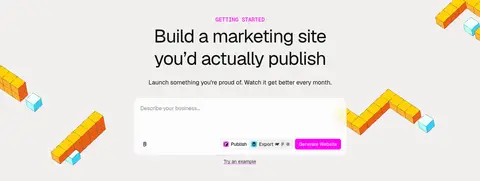
Brief input A broad white, lightly rounded text-entry surface with muted placeholder text and compact action controls aligned along its bottom edge.
Primary CTA Bright #ff00f4 fill, white text, compact Geist label, and measured 6px corner radius.
Product preview Large browser-like interface imagery with layered application chrome, sample-site content, and vivid illustrated framing.
Feature panels Editorial split sections pairing a concise heading and copy with product screenshots or preview cards.
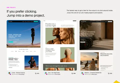
Demo project cards Three side-by-side site previews with image-led layouts and compact labels beneath the screenshots.
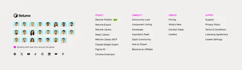
Footer A light multi-column link area with brand mark, community imagery, and grouped product and support navigation.
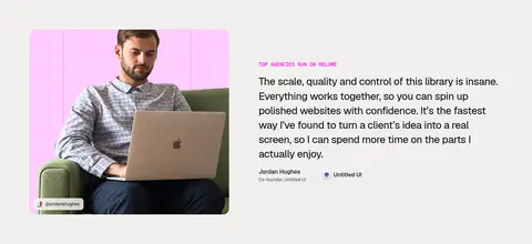
Imagery · Product imagery is central: large browser-like interface previews, component collages, and polished sample-site screenshots demonstrate the workflow. Bright pink, cyan, peach, and yellow mostly live inside those previews. Geometric, gridded 3D-like forms flank the hero and CTA, while the testimonial section uses a rounded portrait crop. Keep imagery crisp and framed by the warm canvas rather than applying a heavy global tint.
页面版块 共 11 个版块,按页面从上到下排列,每个都标了类型、布局和交互套路。
该做与不该做 ✓ 该做 Use #f1f0ee as the dominant page canvas. Reserve #ff00f4 for primary actions and small high-attention accents. Keep hero messaging centered and concise. Use crisp sans-serif typography with compact uppercase eyebrows. Show real-looking product screens as evidence, not generic decoration. Separate major blocks with generous whitespace and subtle hairlines. ✕ 不该做 Do not turn the whole page into a bright pink or white surface. Do not use heavy shadows to lift ordinary cards. Do not crowd the hero with extra navigation or copy. Do not treat mockup colors as the main brand palette. Do not make every section a centered text block. Do not use oversized decorative type in interface controls. 给 AI 的提示词 想快速出一个同风格的新页面,把这段话连同 DESIGN.md 一起发给 AI。
复制 Build a new Relume-style page on a warm #f1f0ee canvas, using #101010 for confident, readable headings and #343434 for secondary copy. Use #ff00f4 selectively for primary actions and compact uppercase trust or section labels; keep #ffffff for input and control surfaces, with #dbdad9 hairlines instead of heavy shadows. Set headlines in a clean Geist-like sans, with a centered, generous hero and narrower supporting copy. Organize lower content into modular split sections and image-led grids. Feature crisp browser-style product previews; allow #ff9fff, #98eafd, #ffcfff, and #f4c490 to appear mainly inside those previews. Maintain comfortable whitespace, align feature copy deliberately, and build depth through layered screenshots rather than decorative card elevation.
DESIGN.md Tailwind v4 CSS 变量 Design Tokens
---
title: "Relume design system"
variant: extended
source: https://www.relume.ai/
captured_at: 2026-10-12
theme: light
industry: ai
generator: Design DNA (https://four.wiralomi.com/style/relume-io)
ai_generated: true
ai_label: "本文件由 AI 辅助生成:数值取自公开网页的实测样式,命名、用途说明与建议为模型解读。商标归原所有者。 / AI-assisted content"
---
# Relume · Design System
> Warm editorial canvas, electric magenta, tangible product craft
**Theme:** light · **Industry:** ai · **Source:** https://www.relume.ai/ · **Captured:** 2026-10-12 (1440×900 desktop)
_AI-assisted content: values are measured from the public page at capture time; names, roles and guidance are model-written interpretations. Trademarks belong to their owners._
Relume pairs a restrained warm-neutral interface with sharp magenta calls to action and vivid product previews. Spacious, centered messaging gives way to modular proof, export workflows, customer stories, and demo projects.
## North star
Keep the warm neutral canvas and clear editorial hierarchy dominant; use magenta sparingly to mark action and emphasis.
## Overview
The page is built on a warm off-white canvas (## Colors
| Name | Hex | Token | Group | Role |
|---|---|---|---|---|
| Warm Canvas | ` | `--color-warm-canvas` | brand | Dominant page background across the hero, section bands, and footer. |
| Electric Magenta | ` | `--color-electric-magenta` | accent | Primary CTA fills, trust eyebrow text, and select product-interface highlights. |
| Soft Ink | ` | `--color-soft-ink` | neutral | Headings, primary navigation, body text, and strong foreground details. |
| Grid Charcoal | ` | `--color-grid-charcoal` | semantic | Subtle inset rules and technical grid effects, not a broad page surface. |
| Quiet Border | ` | `--color-quiet-border` | neutral | Hairline outlines around navigation controls, cards, and interface elements. |
| Blush Edge | ` | `--color-blush-edge` | accent | Faint pink edge detail on button states; secondary to the main magenta. |
| Deep Charcoal | ` | `--color-deep-charcoal` | neutral | Occasional strong copy and interface text, close to the primary ink. |
| Candy Pink | ` | `--color-candy-pink` | accent | Bright preview-card fills, interface framing, and soft radial decorative effects. |
| Muted Ink | ` | `--color-muted-ink` | neutral | Secondary copy, supporting navigation links, and subdued text. |
| Butter Cream | ` | `--color-butter-cream` | semantic | Pale text or decorative details inside product previews, not a core page surface. |
| Soft Butter | ` | `--color-soft-butter` | semantic | Light yellow illustration or mockup detail; not a defining interface color. |
| Clean White | ` | `--color-clean-white` | surface | Input panel, white controls, and selected product-preview surfaces. |
| Peach Sand | ` | `--color-peach-sand` | surface | Warm product-preview or card accents, rather than a major page band. |
| Quiet Gray | ` | `--color-quiet-gray` | neutral | Low-emphasis helper text and muted details. |
| Roasted Brown | ` | `--color-roasted-brown` | semantic | Dark lettering or imagery detail within embedded sample-site previews. |
| Bright Cyan | ` | `--color-bright-cyan` | surface | Cyan cards and export-preview accents, mostly within showcased product imagery. |
| Pink Mist | ` | `--color-pink-mist` | surface | Pastel card or preview backgrounds; use as an illustration surface, not the page canvas. |
### Semantic aliases
`--color-canvas` → ` (Warm Canvas) · `--color-surface` → ` (Clean White) · `--color-surface-2` → ` (Bright Cyan) · `--color-surface-3` → ` (Pink Mist) · `--color-surface-4` → ` (Peach Sand) · `--color-text` → ` (Soft Ink) · `--color-text-muted` → ` (Muted Ink) · `--color-text-subtle` → ` (Butter Cream) · `--color-border` → ` (Quiet Border) · `--color-accent` → ` (Electric Magenta) · `--color-accent-2` → ` (Candy Pink) · `--color-accent-3` → ` (Peach Sand) · `--color-on-accent` → ` (Clean White)
### Contrast (WCAG 2.x)
| Text | Background | Ratio | Level |
|---|---|---|---|
| ` | ` | 16.71:1 | AAA |
| ` | ` | 19.03:1 | AAA |
| ` | ` | 14.07:1 | AAA |
| ` | ` | 14.15:1 | AAA |
| ` | ` | 10.93:1 | AAA |
| ` | ` | 12.45:1 | AAA |
| ` | ` | 9.2:1 | AAA |
| ` | ` | 9.26:1 | AAA |
| ` | ` | 1.04:1 | fail |
| ` | ` | 1.1:1 | fail |
### Gradients
- `linear-gradient(90deg, rgb(27, 25, 25) 1.25px, rgba(0, 0, 0, 0) 0px), linear-gradient(rgb(27, 25, 25) 1.25px, rgba(0, 0, 0, 0) 0px)`
- `radial-gradient(circle, rgb(255, 159, 255) 0%, rgba(0, 0, 0, 0) 70%)`
- `linear-gradient(90deg, rgb(241, 240, 238), rgba(241, 240, 238, 0))`
- `linear-gradient(90deg, rgba(241, 240, 238, 0) 22%, rgb(241, 240, 238))`
## Typography
| Family | Token | Source | Weights | Role | Free substitute |
|---|---|---|---|---|---|
| Geist Variable | `--font-body` | webfont | 400, 500, 440 | Primary display, headings, body, and much of the interface copy | Inter |
| Helvetica Now Display | `--font-display` | system | 400, 500 | Secondary headings, captions, and small display details | Inter |
| PP Writer | `--font-pp-writer` | system | 400 | Occasional serif styling in embedded sample-site content | Instrument Serif |
| Relume Icons | `--font-relume-icons` | webfont | 400 | Small product and interface iconography | Material Symbols |
| Geist Mono Variable | `--font-mono` | webfont | 500, 400 | Uppercase navigation-style eyebrows and technical labels | Geist Mono |
| ABC Diatype Semi-Mono | `--font-abc-diatype-semi-mono` | system | 500 | Minor semi-monospace interface or mockup text | IBM Plex Mono |
- **Geist Variable:** Regular, open sans-serif; large headlines use tight negative tracking, with restrained weights.
- **Helvetica Now Display:** Clean display sans; medium weights and slightly positive tracking for compact labels.
- **PP Writer:** Use sparingly for sample-site editorial content, not the main Relume interface.
- **Relume Icons:** Keep icons compact and functional; do not substitute decorative illustration for interface symbols.
- **Geist Mono Variable:** Compact uppercase labels; medium weight and slightly tight tracking.
- **ABC Diatype Semi-Mono:** Use only for occasional compact interface details; it is not a dominant text face.
### Type scale — Major Third (ratio ≈ 1.255, base 18px)
| Role | Size | Weight | Line height | Letter spacing | Case | Family | Used for |
|---|---|---|---|---|---|---|---|
| display | 56px | 400 | 1.2 | -0.03em | — | Geist Variable | Large promotional statements and prominent centered hero messaging. |
| h1 | 40px | 400 | 1.2 | -0.02em | — | Geist Variable | Primary hero headline and major page-level statement. |
| h2 | 32px | 400 | 1 | -0.01em | — | Helvetica Now Display | Major feature-section headings and secondary promotional statements. |
| h3 | 28px | 440 | 1.4 | -0.02em | — | Geist Variable | Feature titles and supporting section headings. |
| h4 | 23.5px | 500 | 1.4 | 0.01em | — | Helvetica Now Display | Card and subsection headings within product stories. |
| body | 18px | 400 | 1.5 | 0 | — | Geist Variable | Hero description and explanatory product or feature copy. |
| caption | 16px | 400 | 1.4 | 0.01em | — | Helvetica Now Display | Compact supporting descriptions and image or card details. |
| nav | 14px | 500 | 1.43 | -0.02em | uppercase | Geist Mono Variable | Small uppercase monospaced navigation-style labels and eyebrows. |
| link | 12px | 500 | 1.5 | 0 | — | Geist Variable | Short links, attribution, and compact supporting actions. |
| eyebrow | 5.5px | 400 | 1.5 | 0.03em | uppercase | Helvetica Now Display | Small uppercase section identifiers above headings. |
| code | 14px | 500 | 1.43 | -0.02em | uppercase | Geist Mono Variable | Compact uppercase technical or product-interface labels. |
OpenType features in use: `"liga"` .
## Spacing & layout
- Base unit **4px**, density **comfortable**.
- Scale (most used values): 2, 3, 4, 6, 8, 9, 12, 16, 24, 32 px.
- Section rhythm 80px · element gap 8px · card padding — · max content width 1280px.
The measured page max width is 1280px, with comfortable density and a recurring 80px section rhythm. The hero is centered and narrow in composition, while product and proof sections shift into two- and three-column arrangements. Keep copy aligned to the start in feature sections, but center the primary hero and closing CTA. Use generous gaps between major blocks and tighter groupings within cards and controls. The opening navigation is a slim horizontal bar; long sections remain visually light despite dense screenshots.
## Shape & elevation
- Radius: button `6px` · card `16px` · media `5px` · badge `9999px` · nav `6px` · xs `4px` · sm `5px` · md `6px` · lg `8px` · xl `12px` · 2xl `16px` · pill `9999px`
- Shadow `inset` (other, button, card): `rgba(27, 25, 25, 0.1) 0px 0px 0px 1px inset`
- Shadow `inset-2` (button, card, other): `rgba(27, 25, 25, 0.1) 0px -1px 0px 0px inset`
- Shadow `inset-3` (other): `rgb(27, 25, 25) 0px 0px 0px 1.25px inset`
- Shadow `inset-4` (other, button): `rgb(255, 159, 255) 0px 0px 0px 1px inset`
- Shadow `hairline` (card, other): `rgba(27, 25, 25, 0.1) 1px 0px 0px 0px`
- Shadow `hairline-2` (other): `rgba(27, 25, 25, 0.1) 0px 1px 0px 0px`
- Motion: standard transition `0.2s ease` on interactive elements.
The interface is mostly flat, with thin gray hairlines separating controls and outlining subtle surfaces. Buttons and cards use restrained inset edge effects rather than prominent drop shadows. Product screenshots gain depth through overlapping panels, colorful frames, and layered mockup content; preserve those overlaps while keeping surrounding page sections quiet.
## Imagery
Product imagery is central: large browser-like interface previews, component collages, and polished sample-site screenshots demonstrate the workflow. Bright pink, cyan, peach, and yellow mostly live inside those previews. Geometric, gridded 3D-like forms flank the hero and CTA, while the testimonial section uses a rounded portrait crop. Keep imagery crisp and framed by the warm canvas rather than applying a heavy global tint.
## Components
### Top navigation
A horizontal header with the Relume mark, compact product links, a bordered Log in control, and a magenta Start for free button.
### Brief input
A broad white, lightly rounded text-entry surface with muted placeholder text and compact action controls aligned along its bottom edge.
### Primary CTA
Bright ### Product preview
Large browser-like interface imagery with layered application chrome, sample-site content, and vivid illustrated framing.
### Feature panels
Editorial split sections pairing a concise heading and copy with product screenshots or preview cards.
### Demo project cards
Three side-by-side site previews with image-led layouts and compact labels beneath the screenshots.
### Footer
A light multi-column link area with brand mark, community imagery, and grouped product and support navigation.
### Measured component styles
- **Primary button** (“Start for free”): background ## Do
- Use ## Don't
- Do not turn the whole page into a bright pink or white surface.
- Do not use heavy shadows to lift ordinary cards.
- Do not crowd the hero with extra navigation or copy.
- Do not treat mockup colors as the main brand palette.
- Do not make every section a centered text block.
- Do not use oversized decorative type in interface controls.
## Agent prompt
Build a new Relume-style page on a warm ## Page sections (top to bottom)
| # | Type | Layout | UX patterns | UI patterns |
|---|---|---|---|---|
| 1 | hero | Centered hero copy above a wide brief-entry panel, with product preview emerging below. | brief input, generate action, example link | magenta trust label, white input panel, paired CTAs |
| 2 | video | Full-width, single-column application preview beneath the hero. | product walkthrough | browser-style frame, pink framing, layered screenshot |
| 3 | logo-cloud | One horizontal band of compact customer logos. | social proof | small logo row, neutral canvas |
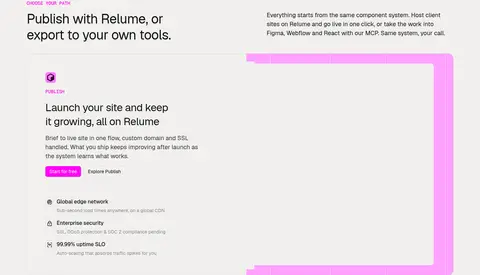
| 4 | feature-grid | Introductory heading and copy followed by alternating product-focused feature panels. | choose publishing path, feature exploration | split panels, pink and cyan imagery, compact feature lists |
| 5 | product-showcase | Two-column showcase with a website mockup and supporting export copy. | export workflow, tool comparison | sample site preview, tool icons, split layout |
| 6 | feature-grid | Section introduction above two large preview cards and supporting copy. | system explanation, component evidence | collage previews, layered cards, short feature captions |
| 7 | video | Full-bleed centered statement with oversized illustrated wordmark and small follow-up link. | agency story link | oversized yellow lettering, neutral open space |
| 8 | testimonials | Portrait image beside a left-aligned testimonial and attribution. | customer proof, attribution | rounded portrait crop, small magenta eyebrow, editorial split |
| 9 | gallery | Section title and brief introduction above a row of three site-preview cards. | browse demos, open project | three-column gallery, website screenshots, compact metadata |
| 10 | cta | Centered closing headline and brief form with scattered geometric illustrations. | enter a brief, generate website | magenta CTA, white input panel, floating illustrations |
| 11 | footer | Brand and community area beside multiple grouped link columns. | browse resources, follow social links | multi-column footer, small community portraits, grouped navigation |
## Source CSS custom properties (selected)
```css
--_publish-colors---foreground--primary: