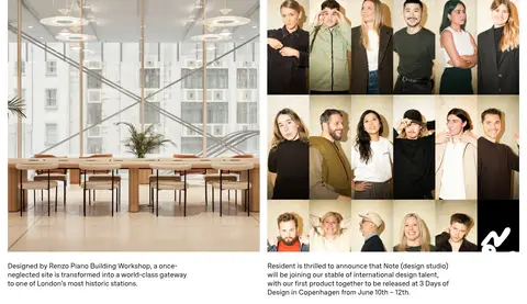
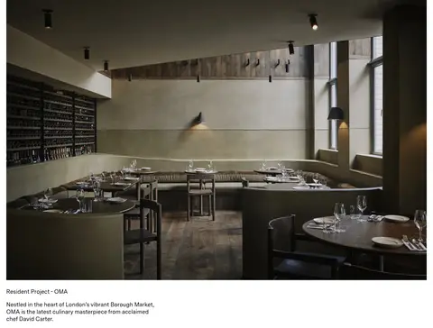
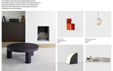
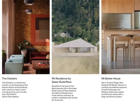
North star · Let a white, spacious editorial canvas frame the furniture and architecture; keep interface styling quieter than the imagery.
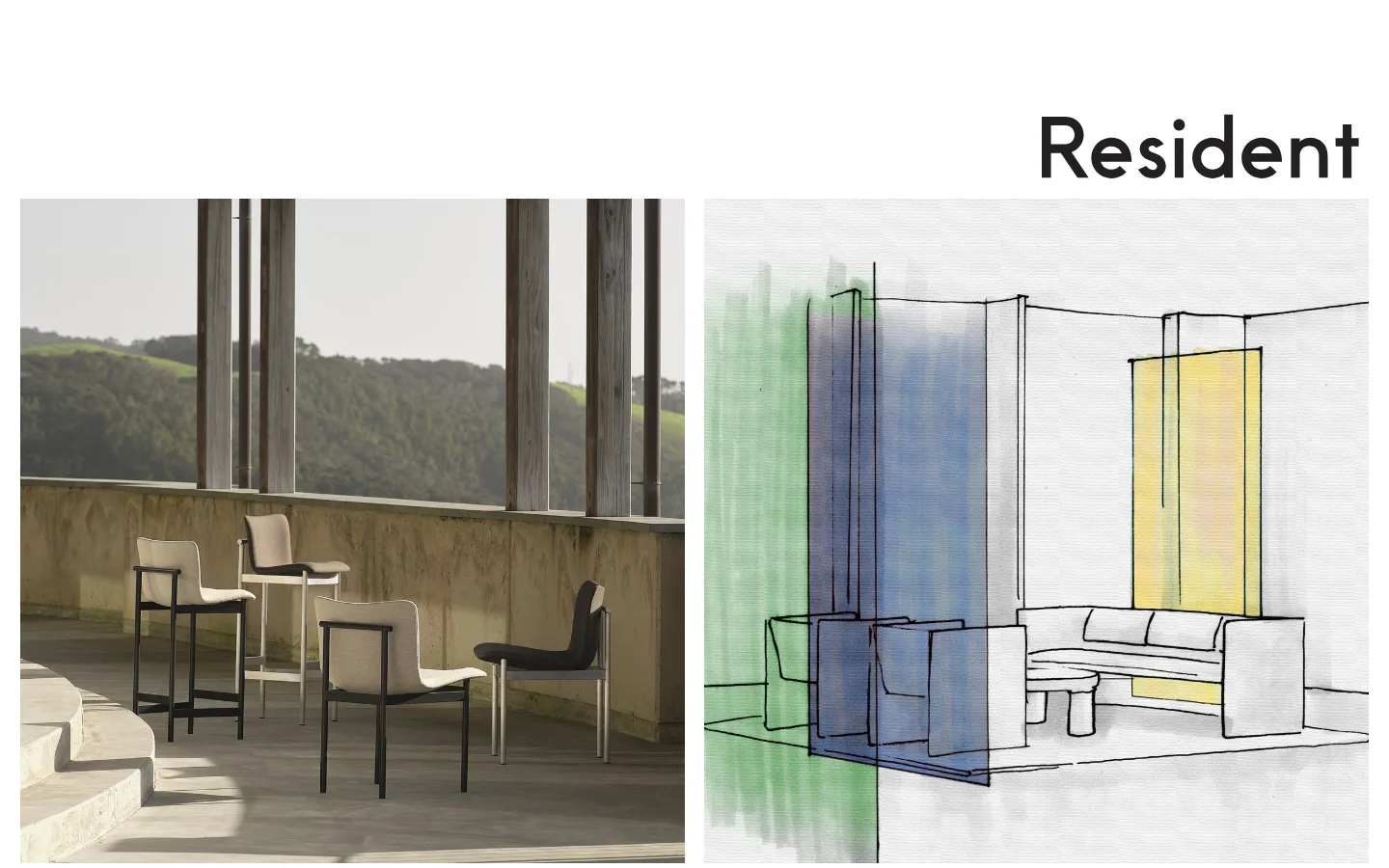
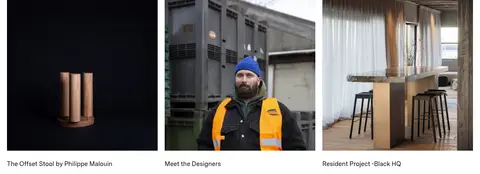
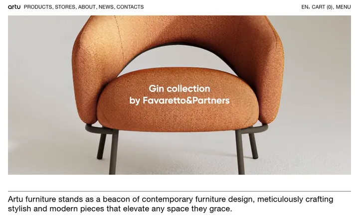
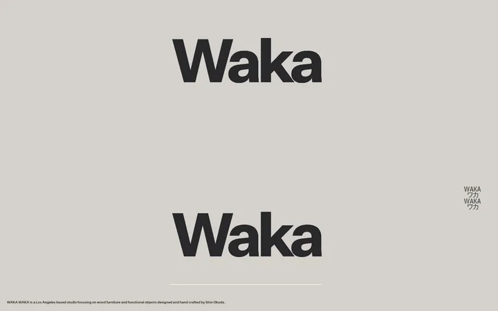
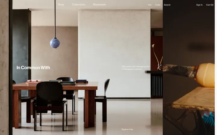
The visual system is defined by a clean white canvas (#ffffff) and near-absolute black typography (#000000), with no measured accent or surface colours. Subtle olive, stone, and warm grey tones appear in photography and product imagery rather than as interface colours; keep them image-bound. MessinaSansWeb is used throughout, giving the small editorial captions and larger headings a consistent, contemporary voice. The opening places a large wordmark above a paired, image-led feature; below, images and short text blocks alternate with expansive blank intervals. Product releases use neat, evenly aligned image tiles with compact names, designer credits, and prices. Project stories range from paired images to a single full-width photograph, maintaining a gallery-like cadence. Keep edges and backgrounds flat: the evidence shows no shadows, decorative borders, or coloured section bands. The overall effect is quiet and architectural, with generous spacing doing the work that ornament would otherwise do.
Site-wide headings, editorial copy, product captions, links, and footer details.
角色
示例
字号
字重
行高
字距
一级标题
Prominent page heading and major editorial titles.
The quick brown fox 敏捷的狐狸
27px
500
1.29
-0.037em
正文
Project descriptions, editorial paragraphs, and primary copy.
The quick brown fox 敏捷的狐狸
18.5px
500
1.29
0
辅助文字
Product names, designer credits, prices, and compact labels.
The quick brown fox 敏捷的狐狸
14px
400
1.4
0
间距与布局
基准单位 1px · 密度:宽松
334px版块间距
—元素间距
—卡片内边距
1398px内容最大宽度
1px
5px
6px
14px
19px
21px
27px
The measured page max width is 1398px, with content laid out as a spacious editorial grid. The first view pairs two large images beneath the right-aligned wordmark; further down, image-and-copy groups shift between paired features, product tiles, and project stories. A two-column section and a five-column footer appear in the measured structure. The 334px section gap creates a pronounced, gallery-like rhythm. Keep elements aligned to broad content edges and leave ample blank space between unrelated blocks.
圆角与层次
按钮 · 50%
没有测到阴影:页面是扁平的,层次靠底色和描边区分。
The page is flat and gallery-like: measured data contains no shadows, gradients, or surface colours, and the sections share the same white background. Avoid cards that appear lifted or boxed in. Use image boundaries and whitespace to define groups; reserve the rounded treatment only for the measured pill-shaped button where relevant.
组件
下面的预览按实测的按钮、输入框、徽标、卡片样式重建(字体用替代字体)。
Wordmark
Large black Resident wordmark positioned above the hero imagery, aligned toward the right in the opening view; a prominent repeat anchors the footer.
Editorial image-and-copy feature
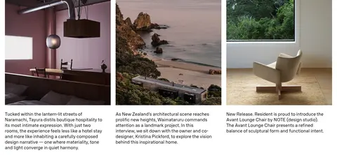
Large project or news image paired with concise black copy, with generous blank space separating it from neighboring content.
Product tile
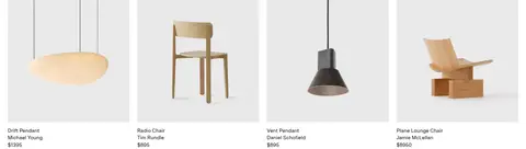
Rectangular product image followed by compact product name, designer credit, and price; the measured page includes four-item product groups.
Project story
Large interior or architecture image with a short project title and descriptive copy beneath or alongside it.
Footer directory
White footer with the wordmark, company contact details, and small link groups arranged across five columns.
Pill button
A measured button has a 50% radius and dark #333333 text; keep it visually understated and do not infer an unmeasured fill.
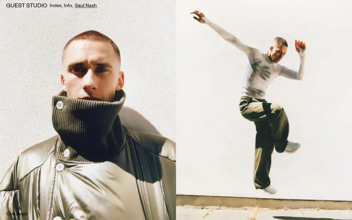
Imagery · Photography leads: architectural interiors, residences, landscapes, people, and styled product shots are presented in large, clean rectangular frames. Product tiles use pale, uncluttered backdrops; project imagery can be atmospheric and darker. The hero pairs a real space photograph with a loose coloured architectural drawing. A video appears in the lower editorial feed. Keep image colours inside the media rather than translating them into UI accents.
Let large, carefully framed images lead each story.
Preserve generous blank intervals between content groups.
Keep product captions compact and information-rich.
Use MessinaSansWeb or a close sans-serif substitute.
✕ 不该做
Do not introduce unmeasured accent colours into interface elements.
Do not add coloured section bands or gradients.
Do not add shadows or decorative card borders.
Do not crowd the page with dense controls or copy.
Do not treat colours inside photographs as brand UI colours.
Do not add unsupported spacing, sizes, or corner radii.
给 AI 的提示词
想快速出一个同风格的新页面,把这段话连同 DESIGN.md 一起发给 AI。
Build a new Resident-style page as a quiet editorial gallery, not a conventional boxed ecommerce template. Use Gallery White (#ffffff) as the full-page canvas and Ink (#000000) for the wordmark, headings, copy, and captions. Use MessinaSansWeb where available, with DM Sans as a close free substitute. Follow the measured spacious rhythm and broad content width, letting large architectural and product images define each block. Alternate paired image-and-copy stories, product tiles, and project features; keep text concise, with names, designer credits, and prices easy to scan. Maintain generous empty intervals between sections and simple alignment across image edges. Keep surfaces flat, without shadows, gradients, coloured bands, or invented interface accents. Let any warm, olive, or stone colours remain within photography.