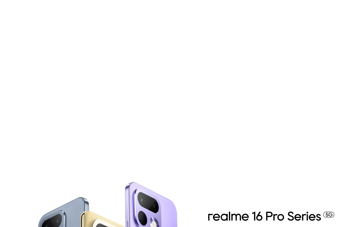
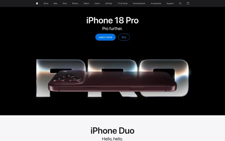
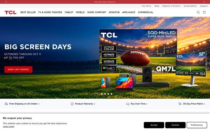
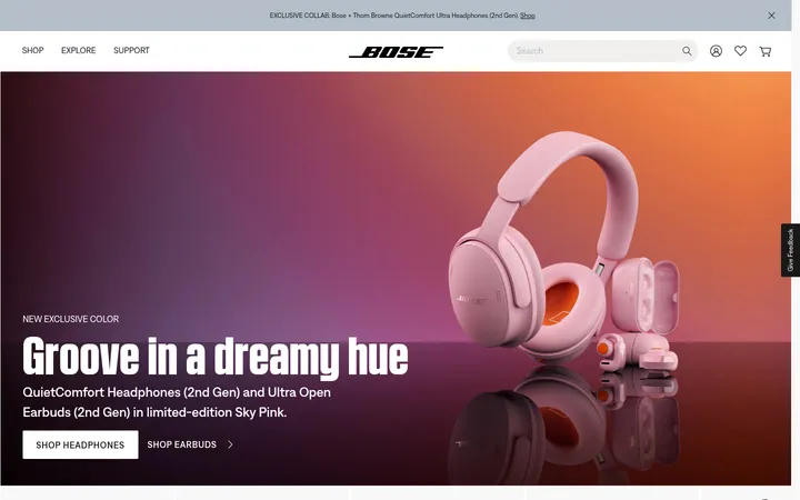
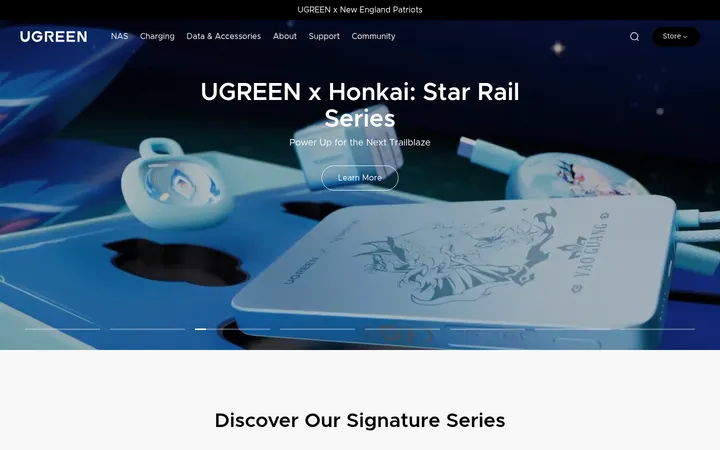
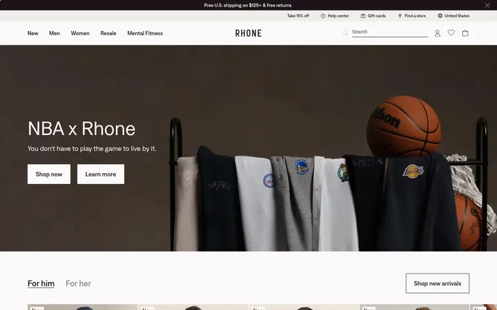
North star · Keep interface chrome quiet and let large, carefully framed product imagery carry the page’s visual impact.
The page is defined by a white-first palette: Gallery White (#ffffff) fills the canvas and keeps attention on campaign media, while True Black (#000000) carries the primary product naming and navigation. Most visual colour comes from phones, campaign photography, and other image assets rather than a persistent interface accent; treat those colours as content, not brand UI tokens. System sans-serif typography gives the navigation and product labels a clean, contemporary feel, with heavier display roles for headings and bold links. The opening is a spacious, full-bleed product hero, followed by similarly wide launches and a compact two-part audio feature. Lower sections shift to multi-column discovery and collaboration content, then community imagery and dense recommendation/support links. Keep section boundaries quiet, rely on whitespace and media for hierarchy, and reserve dark surfaces and fine borders for footer treatment.
System sans-serif used across navigation, headings, body copy, captions, and links.
角色
示例
字号
字重
行高
字距
一级标题
Primary campaign headline and highest-level page title.
realme
32px
700
1.38
0
二级标题
Major section headings such as discovery and collaboration.
realme
28px
600
1.3
0
三级标题
Product or feature subheadings within campaign content.
The quick brown fox 敏捷的狐狸
20px
500
1.4
0
四级标题
Compact secondary headings and supporting feature labels.
The quick brown fox 敏捷的狐狸
18px
600
1.33
0
正文
General descriptions and supporting copy.
The quick brown fox 敏捷的狐狸
14px
400
1.43
0
辅助文字
Small labels and secondary image or content details.
The quick brown fox 敏捷的狐狸
12px
400
2.33
0
按钮
Compact interface and locale control text.
The quick brown fox 敏捷的狐狸
12px
400
2
0
导航
Main product and category navigation.
The quick brown fox 敏捷的狐狸
14px
600
1.14
0
链接
Prominent calls to action such as Learn More.
The quick brown fox 敏捷的狐狸
16px
700
1.19
0
间距与布局
基准单位 8px · 密度:紧凑
36px版块间距
12px元素间距
—卡片内边距
1312px内容最大宽度
8px
10px
12px
16px
20px
40px
Use wide, centered content within the measured 1312px maximum width, while campaign media can run full bleed. The first three product sections are tall single-column stages; the audio feature divides into two columns. Later sections become compact discovery and collaboration grids, followed by a single-column community feed and a four-column recommendation/support area. Keep alignment clean and spacing compact between elements, with clear breathing room between major blocks.
圆角与层次
图片 · 8px
链接 · 9999px
md · link
The overall interface is flat, with few persistent card treatments. Keep section hierarchy in the media and whitespace rather than shadows. Use subtle separation where needed; the measured footer uses a dark surface with a fine border tone. A modest shadow is present on a link element, not as a page-wide card style.
组件
下面的预览按实测的按钮、输入框、徽标、卡片样式重建(字体用替代字体)。
Global navigation
Compact system-sans category links in black on white; measured nav text is 14px and weight 600.
Campaign hero
Full-bleed product image or video with minimal overlay copy; maintain strong product focus and spacious composition.
Learn More link
Prominent black text on a light grey pill, measured as bold 16px with a 23px radius and 20px horizontal padding.
Discovery grid
Five-column brand exploration area using image-led destinations rather than heavy boxed cards.
Collaboration gallery
Multi-item media gallery with numbered items and a featured collaboration link.
Recommendations and support
Dense four-column lower-page link area for recommended devices, support, software, and documentation.
Imagery · Prioritize large product campaign images and video, with devices framed as the focal point against bright or campaign-specific backgrounds. The first viewport shows a mostly white hero with product renders entering from below and product naming placed beside them. Later sections mix promotional media, collaboration imagery, and community photography. Preserve image colour and composition as content; avoid adding decorative illustration that competes with it.
Use Gallery White (#ffffff) as the primary canvas.
Set primary product names and headings in True Black (#000000).
Let campaign imagery occupy generous full-width areas.
Use measured system-sans typography with clear weight contrast.
Keep section transitions quiet and whitespace-led.
Reserve Graphite Footer (#222222) and Footer Hairline (#393939) for the lower-page inverse treatment.
✕ 不该做
Do not turn campaign image colours into persistent interface accents.
Do not add decorative gradients unsupported by the page’s visual hierarchy.
Do not place every section inside a bordered card.
Do not crowd the product hero with extra copy or controls.
Do not use heavy shadows as a general elevation system.
Do not replace the bright canvas with a dark global theme.
给 AI 的提示词
想快速出一个同风格的新页面,把这段话连同 DESIGN.md 一起发给 AI。
Build a new realme-style consumer electronics page with a bright Gallery White (#ffffff) canvas and True Black (#000000) typography. Keep the interface chrome minimal so large, carefully framed product photography or video leads each major section. Use the measured system sans-serif character: compact, semibold navigation, strong campaign headings, and restrained supporting copy. Organize the page as broad campaign stages followed by image-led discovery, collaboration or community content, then a denser recommendation and support area. Use whitespace and section scale instead of card borders to create hierarchy. Treat image colours as campaign content, not global UI accents. If an inverse footer is needed, use Graphite Footer (#222222), Footer Ash (#a7a7a7), and subtle Footer Hairline (#393939).