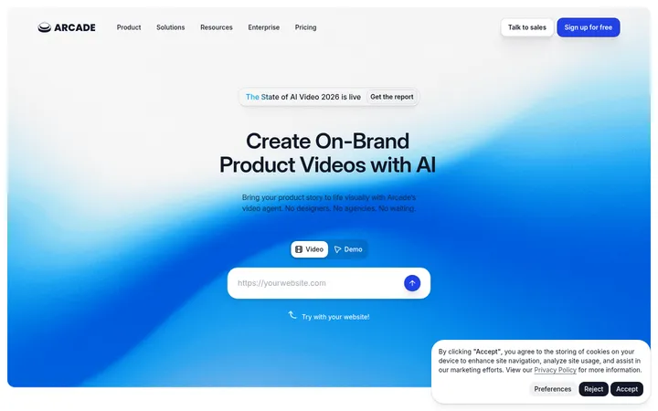
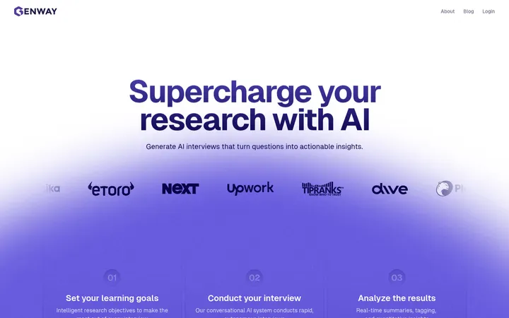
North star · Let spacious product-led storytelling carry the page, using electric blue as a precise accent and charcoal as the single major contrast break.
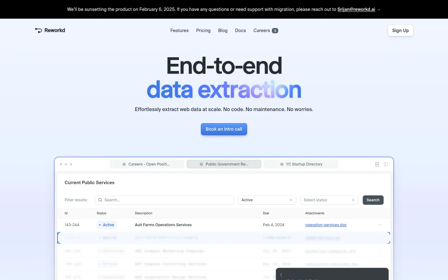
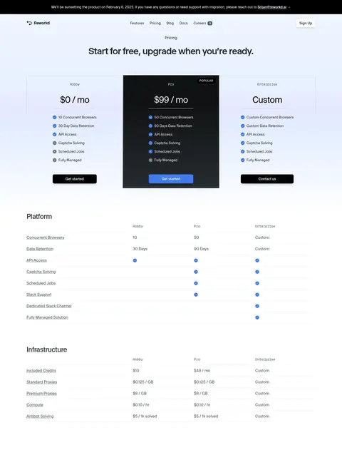
The page relies on a white foundation, with a very pale blue wash behind the opening hero and product preview. Ink-dark headings and muted gray copy keep the message crisp; saturated blue appears selectively in the hero headline, primary CTA, interface details, and luminous gradient panels. The typography pairs a distinctive display face for large centered claims with a clean sans for navigation and explanatory copy, while monospaced text is reserved for compact technical labels. Layout moves from a centered hero into a broad browser-like product mockup, then alternates explanatory text, interface imagery, and feature cards. Most sections remain airy and bright, while a full-width charcoal proof section creates a deliberate tonal break. Fine borders and soft shadows frame UI previews; imagery is primarily product interface rather than lifestyle photography. The result feels technical and polished, with color and contrast guiding attention instead of decorative clutter.
Primary interface and reading sans: navigation, body copy, links, and UI labels.
Aa 设计
__GeistMono_c1e5c9
网络字体 · 字重 400 / 450 / 500 / 600 · 占比 21%
免费替代:Geist Mono
Compact code-like labels and technical captions.
Aa 设计
__selecta_a4b3da
网络字体 · 字重 500 / 400 · 占比 8%
免费替代:Manrope
Display headlines, including the centered hero statement and section titles.
Aa 设计
__GeistSans_3a0388
网络字体 · 字重 500 / 600 / 700 · 占比 3%
免费替代:Inter
Minor supporting UI typography where a slightly more technical sans is needed.
角色
示例
字号
字重
行高
字距
特大标题
Oversized centered hero headline and major campaign statements.
Reworkd
80px
500
0.95
-0.025em
一级标题
Primary page or section headings, set in the display face.
Reworkd
40px
400
1.1
-0.02em
二级标题
Compact feature titles and secondary section headings.
The quick brown fox 敏捷的狐狸
18px
500
1.33
-0.01em
正文
Explanatory paragraphs, product descriptions, and general copy.
The quick brown fox 敏捷的狐狸
14px
400
1.57
0.01em
辅助文字
Small technical captions and secondary product labels.
The quick brown fox 敏捷的狐狸
12px
400
1.67
0
导航
Header and footer navigation links.
The quick brown fox 敏捷的狐狸
14px
400
1.43
0.02em
链接
Inline links and emphasized navigational actions.
The quick brown fox 敏捷的狐狸
14px
500
1.43
0.02em
代码
Monospaced snippets and data-oriented UI text.
const style = 1;
12px
400
1.67
0
间距与布局
基准单位 4px · 密度:适中
80px版块间距
8px元素间距
—卡片内边距
1216px内容最大宽度
2px
3px
4px
5px
6px
7px
8px
10px
12px
16px
24px
32px
48px
64px
A centered desktop composition uses a measured maximum content width of 1216px, with the hero aligned centrally and later explanatory sections shifting to left-aligned content or three-column arrangements. The page alternates generous full-width section bands with constrained product previews and card groups. Measured spacing uses a 4px base and an 80px section gap; keep the density comfortable rather than filling every region. The long page is paced by a pale hero, bright feature content, a deep charcoal proof section, and a simple footer.
圆角与层次
按钮 · 4px
卡片 · 8px
图片 · 50%
导航 · 8px
链接 · 6px
hairline · other
sm · button, other
xl · other, card
hairline · media
Most surfaces remain flat, with pale hairlines separating controls and cards. Product previews receive soft, diffuse shadows and a fine outline to lift them from the white or pale-blue canvas. Use stronger depth sparingly on the hero mockup, floating code panel, and gradient CTA; the charcoal proof band itself stays visually broad and uncluttered.
组件
下面的预览按实测的按钮、输入框、徽标、卡片样式重建(字体用替代字体)。
Announcement strip
A narrow black banner sits above the header, with centered white migration notice copy and an inline email link.
Header navigation
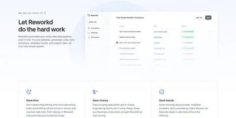
Brand mark at left, compact centered navigation, and a small raised sign-up control at right over the pale hero wash.
Centered hero
Large two-line display headline, blue emphasis on the second line, short supporting sentence, and a blue call-booking CTA.
Browser preview
Wide browser-like product window with a fine border, rounded frame, table controls, and a dark floating code/data panel.
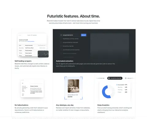
Feature cards
Light cards combine small interface illustrations, concise titles, and supporting text; use subtle borders rather than heavy fills.
Proof and CTA band
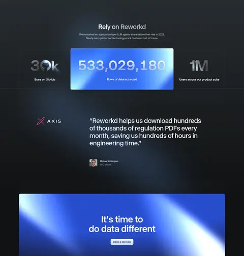
Charcoal full-width section pairs metrics and a testimonial with a bright blue gradient call-to-action panel.
Footer columns
A white footer groups the brand/address, navigation, other links, and social destinations into aligned columns.
Imagery · Imagery is led by detailed browser and dashboard mockups, code panels, data tables, and analytical interface cards rather than photography. Frame previews as large, crisp product windows with subtle outlines and soft lift; keep content readable but treat tiny interface copy as texture. Blue luminous gradients appear in select proof metrics and the closing CTA, while most feature cards stay light and restrained.
Keep the opening hero centered on a pale, nearly white canvas.
Use Graphite Ink (#272c30) for primary copy and dark proof surfaces.
Reserve Bright Azure (#3e79ea) and Signal Blue (#3161df) for purposeful emphasis.
Make product screenshots and interface previews the primary visual evidence.
Use generous measured section spacing and clear shifts in alignment.
Frame important UI previews with fine borders and restrained shadows.
✕ 不该做
Do not make every section dark or saturated.
Do not use gradients as a default card background.
Do not replace product-interface imagery with lifestyle photography.
Do not crowd the hero with secondary links or extra content.
Do not let decorative accents compete with the headline or CTA.
Do not add heavy shadows to ordinary text sections or footer content.
给 AI 的提示词
想快速出一个同风格的新页面,把这段话连同 DESIGN.md 一起发给 AI。
Build a new Reworkd-style SaaS page with a calm, product-led hierarchy. Use Gallery White (#ffffff) as the main canvas, Graphite Ink (#272c30) for headlines and copy, and Mist Gray (#f3f4f5) or Cloud Border (#e3e8ea) for quiet dividers. Apply Signal Blue (#3161df) and Bright Azure (#3e79ea) selectively to headline emphasis, primary actions, and interface details; keep Ice Blue (#e8f1ff) as a soft wash rather than a saturated block. Use a distinctive tight-tracked display face for large claims, a clean sans for navigation and body, and monospaced text only for technical snippets. Center the hero, then show a large believable dashboard preview. Alternate bright explanatory sections with one charcoal proof band and a luminous CTA. Keep spacing generous, borders fine, shadows restrained, and content readable.