Reclaim 以明亮留白、清晰黑色文字和蓝紫色点缀,呈现轻松易懂的 AI 日程管理体验。日历界面、数据卡片与穿插的深色区块共同展示产品能力,也让长页面更易浏览。
North star · Keep a generous white canvas and use periwinkle, product UI, and dark bands as deliberate, limited signals of action and structure.
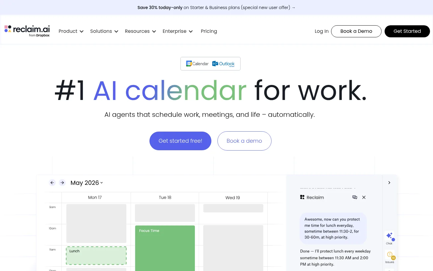
The page is built on a white canvas, with pale periwinkle bands grouping the three core feature areas and black full-width sections creating deliberate contrast later in the story. Black carries headings and primary text; muted gray supports supporting copy, while vivid blue-purple buttons and links guide attention. Poppins is the defining typeface: rounded, geometric letterforms keep large centered headings friendly rather than corporate, with lighter weights in secondary headings and body copy. The hero uses a large calendar-and-assistant interface mockup instead of lifestyle photography. Across the page, repeated calendar screenshots, metric tiles, small logos, and evidence cards make the software the main visual subject. Wide section spacing and a centered content frame give the long homepage a measured rhythm; cards stay mostly flat, relying on fine borders and restrained shadows rather than heavy elevation.
配色 点色块复制色值。用途说明来自对页面的实测位置(背景、文字、描边、按钮)与截图判读。
品牌色
Periwinkle Mist
#c2caf9
Pale feature-card fill and fine borders, also used for initiative tiles and soft link surfaces.
Signal Indigo
#5562eb
Primary filled CTA buttons and select accent details; the main action color.
强调色
Link Cobalt
#3451e8
Occasional inline link accent; subordinate to the main button blue.
Lavender Haze
#96a0f3
Minor button-related accent; use sparingly rather than as a page-wide surface.
表层色
Gallery White
#ffffff
Main page canvas, white cards, and reverse text on saturated buttons and dark panels.
Cloud Periwinkle
#ebefff
Background band behind the stacked focus, meeting, and interruption feature panels.
中性色
True Ink
#000000
Headings, body text, links, and full-width dark sections.
Soft Charcoal
#474747
Muted supporting text on the light canvas.
Quiet Divider
#dbdbdb
Subtle card and interface hairlines, especially around FAQ and UI mockups.
Blue Black
#181d25
Dark section and card text color, distinct from pure black in some product-focused areas.
Graphite Text
#2b2b2b
Occasional deeper supporting heading or text tone.
功能色
Neutral Fade
#b2b2b2
Gradient-related measured color; not a defining interface color in the screenshots.
Interface Gray
#808080
Minor neutral interface details and subdued controls.
Calendar Green
#7ac17b
Metric tiles and calendar event blocks; also appears in product mockups and gradients.
Midnight Blue
#151f8b
Gradient stop in decorative treatments, not a dominant flat page color.
Deep Calendar Green
#14532d
Dark green gradient stop and occasional illustration or metric-card content.
文字 背景 对比度 WCAG #000000 True Ink#ffffff Gallery White21:1 AAA #000000 True Ink#ebefff Cloud Periwinkle18.32:1 AAA #000000 True Ink#c2caf9 Periwinkle Mist13.11:1 AAA #474747 Soft Charcoal#ffffff Gallery White9.29:1 AAA #474747 Soft Charcoal#ebefff Cloud Periwinkle8.11:1 AAA #474747 Soft Charcoal#000000 True Ink2.26:1 不达标
字体 字号阶梯:Perfect Fourth(比例约 1.316,正文 16px)。示例用免费替代字体渲染,数值为实测。
Aa 设计
Poppins 网络字体 · 字重 400 / 300 / 500 / 600 / 700 · 占比 99%
免费替代:Nunito Sans
Primary font for headings, body, buttons, and links.
Aa 设计
Inter 网络字体 · 字重 400 · 占比 2%
免费替代:Inter
Minor supporting interface text.
角色 示例 字号 字重 行高 字距 一级标题 Centered hero headline and primary page statement.
Reclaim
48px 400 1.2 0 二级标题 Major section headings, usually centered or left aligned.
Reclaim
40px 400 1.25 0 三级标题 Light-weight feature and subsection headings.
The quick brown fox 敏捷的狐狸
22px 300 1.36 0 四级标题 Card titles and smaller section labels.
The quick brown fox 敏捷的狐狸
20px 400 1.4 0 正文 Product explanations, feature descriptions, and general copy.
The quick brown fox 敏捷的狐狸
16px 400 1.5 0 辅助文字 Compact notes, helper labels, and small supporting text.
The quick brown fox 敏捷的狐狸
14px 300 1.43 0 按钮 CTA labels, rendered in a light-weight rounded pill style.
The quick brown fox 敏捷的狐狸
18px 300 1.78 0 链接 Inline actions, initiative links, and navigation links.
The quick brown fox 敏捷的狐狸
16px 400 1.5 0
间距与布局 基准单位 2px · 密度:宽松
100px 版块间距
5px 元素间距
— 卡片内边距
1218px 内容最大宽度
5px
7px
8px
10px
12px
15px
16px
20px
26px
30px
40px
60px
100px
A spacious, long-form homepage organized around a measured 1218px maximum content width. The hero centers its headline and actions above a large product mockup; lower sections alternate centered metric displays, two-column feature splits, and multi-column card groups. White sections dominate, with pale blue feature bands and full-width black panels establishing chapter breaks. Headings may be centered for broad statements or left-aligned beside supporting content. Preserve generous separation between sections and keep dense interface details inside contained mockups.
圆角与层次 inset · other
md · card
lg · media
The overall treatment is mostly flat, with color bands and fine outlines providing separation. Cards use subtle borders, and selected product media may carry a restrained soft shadow. The hero dashboard creates depth through overlapping interface panels rather than conspicuous card elevation. Keep rounded treatment concentrated on pill CTAs and small interface elements.
组件 下面的预览按实测的按钮、输入框、徽标、卡片样式重建(字体用替代字体)。
Primary CTA Pill-shaped #5562eb button with white Poppins text; a smaller outlined secondary action sits beside it in the hero.
Announcement strip Slim pale periwinkle banner above the navigation, with centered promotional copy and an arrow link.
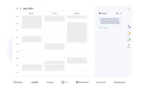
Hero product display Centered headline and actions above a wide calendar-and-assistant mockup, with customer logos below.
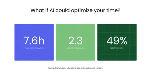
Metric tiles Three large rectangular cards use blue, green, and deep green fills to foreground time-saving statistics.
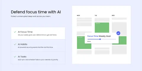
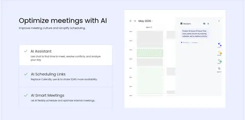
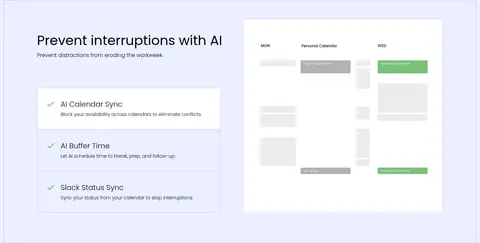
Feature split panels Stacked pale #ebefff bands pair feature copy and compact checklist cards with calendar UI imagery.
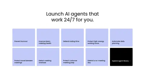
Initiative cards Compact #c2caf9 tiles form a multi-column grid, with one black tile reserved for the exploration link.
FAQ rows Single-column questions separated by thin neutral rules, each with a small disclosure control.
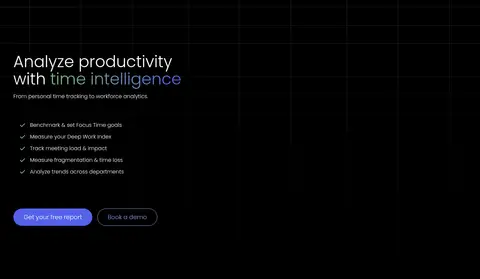
Dark content band Full-width black section with white copy, small checklist items, and subdued outlined actions or UI.
Imagery · Software UI is the main imagery: calendar grids, assistant panels, analytics charts, and product screenshots appear in broad, clean frames. The hero mockup is large and layered, with a calendar beside an assistant interface; feature sections use smaller interface examples aligned opposite copy. Metric cards use saturated blue and greens, while customer logos and small icons provide supporting proof. Avoid lifestyle photography or decorative imagery that competes with the product.
页面版块 共 17 个版块,按页面从上到下排列,每个都标了类型、布局和交互套路。
该做与不该做 ✓ 该做 Use white as the dominant page canvas. Reserve #5562eb for primary actions. Use #ebefff to group related feature content. Let product UI screenshots carry the visual storytelling. Alternate dark bands with generous white sections. Use Poppins with rounded, sentence-case typography. ✕ 不该做 Do not make the whole page dark. Do not use saturated gradients as the default background. Do not add decorative photography that competes with the UI. Do not replace spacious section breaks with dense content blocks. Do not give every card a heavy shadow. Do not use multiple competing CTA colors. 给 AI 的提示词 想快速出一个同风格的新页面,把这段话连同 DESIGN.md 一起发给 AI。
复制 Build a new Reclaim-style productivity SaaS page with a spacious white canvas (#ffffff), Poppins typography, and a centered content frame no wider than the measured 1218px maximum. Use #000000 for strong headings, #474747 for supporting copy, and #5562eb for primary pill CTAs. Group related feature content in pale #ebefff bands, using #c2caf9 for cards and fine borders. Show the product through calendar and assistant interface mockups, not lifestyle photography. Alternate centered statements and metrics with two-column feature splits and occasional full-width black sections. Keep cards restrained, hierarchy clear, and section spacing generous. Treat green metric and calendar colors as product data accents rather than broad brand surfaces.
DESIGN.md Tailwind v4 CSS 变量 Design Tokens
---
title: "Reclaim — Homepage design system"
variant: extended
source: https://reclaim.ai/
captured_at: 2026-10-12
theme: light
industry: productivity
generator: Design DNA (https://four.wiralomi.com/style/reclaim-ai)
ai_generated: true
ai_label: "本文件由 AI 辅助生成:数值取自公开网页的实测样式,命名、用途说明与建议为模型解读。商标归原所有者。 / AI-assisted content"
---
# Reclaim — Homepage · Design System
> Calm calendar clarity, energized by vivid AI accents.
**Theme:** light · **Industry:** productivity · **Source:** https://reclaim.ai/ · **Captured:** 2026-10-12 (1440×900 desktop)
_AI-assisted content: values are measured from the public page at capture time; names, roles and guidance are model-written interpretations. Trademarks belong to their owners._
Reclaim pairs a bright, spacious canvas with crisp black typography and periwinkle accents to present AI scheduling as calm and approachable. Calendar interface mockups, metric tiles, and alternating dark bands make the product tangible while keeping the long page easy to scan.
## North star
Keep a generous white canvas and use periwinkle, product UI, and dark bands as deliberate, limited signals of action and structure.
## Overview
The page is built on a white canvas, with pale periwinkle bands grouping the three core feature areas and black full-width sections creating deliberate contrast later in the story. Black carries headings and primary text; muted gray supports supporting copy, while vivid blue-purple buttons and links guide attention. Poppins is the defining typeface: rounded, geometric letterforms keep large centered headings friendly rather than corporate, with lighter weights in secondary headings and body copy. The hero uses a large calendar-and-assistant interface mockup instead of lifestyle photography. Across the page, repeated calendar screenshots, metric tiles, small logos, and evidence cards make the software the main visual subject. Wide section spacing and a centered content frame give the long homepage a measured rhythm; cards stay mostly flat, relying on fine borders and restrained shadows rather than heavy elevation.
## Colors
| Name | Hex | Token | Group | Role |
|---|---|---|---|---|
| Periwinkle Mist | ` | `--color-periwinkle-mist` | brand | Pale feature-card fill and fine borders, also used for initiative tiles and soft link surfaces. |
| Gallery White | ` | `--color-gallery-white` | surface | Main page canvas, white cards, and reverse text on saturated buttons and dark panels. |
| Signal Indigo | ` | `--color-signal-indigo` | brand | Primary filled CTA buttons and select accent details; the main action color. |
| True Ink | ` | `--color-true-ink` | neutral | Headings, body text, links, and full-width dark sections. |
| Soft Charcoal | ` | `--color-soft-charcoal` | neutral | Muted supporting text on the light canvas. |
| Link Cobalt | ` | `--color-link-cobalt` | accent | Occasional inline link accent; subordinate to the main button blue. |
| Lavender Haze | ` | `--color-lavender-haze` | accent | Minor button-related accent; use sparingly rather than as a page-wide surface. |
| Cloud Periwinkle | ` | `--color-cloud-periwinkle` | surface | Background band behind the stacked focus, meeting, and interruption feature panels. |
| Neutral Fade | ` | `--color-neutral-fade` | semantic | Gradient-related measured color; not a defining interface color in the screenshots. |
| Quiet Divider | ` | `--color-quiet-divider` | neutral | Subtle card and interface hairlines, especially around FAQ and UI mockups. |
| Blue Black | ` | `--color-blue-black` | neutral | Dark section and card text color, distinct from pure black in some product-focused areas. |
| Graphite Text | ` | `--color-graphite-text` | neutral | Occasional deeper supporting heading or text tone. |
| Interface Gray | ` | `--color-interface-gray` | semantic | Minor neutral interface details and subdued controls. |
| Calendar Green | ` | `--color-calendar-green` | semantic | Metric tiles and calendar event blocks; also appears in product mockups and gradients. |
| Midnight Blue | ` | `--color-midnight-blue` | semantic | Gradient stop in decorative treatments, not a dominant flat page color. |
| Deep Calendar Green | ` | `--color-deep-calendar-green` | semantic | Dark green gradient stop and occasional illustration or metric-card content. |
### Semantic aliases
`--color-canvas` → ` (Gallery White) · `--color-surface` → ` (Cloud Periwinkle) · `--color-surface-2` → ` (True Ink) · `--color-surface-3` → ` (Periwinkle Mist) · `--color-surface-4` → ` (Blue Black) · `--color-text` → ` (True Ink) · `--color-text-muted` → ` (Soft Charcoal) · `--color-text-subtle` → ` (Gallery White) · `--color-border` → ` (Periwinkle Mist) · `--color-accent` → ` (Link Cobalt) · `--color-accent-2` → ` (Signal Indigo) · `--color-accent-3` → ` (Periwinkle Mist) · `--color-on-accent` → ` (Gallery White)
### Contrast (WCAG 2.x)
| Text | Background | Ratio | Level |
|---|---|---|---|
| ` | ` | 21:1 | AAA |
| ` | ` | 18.32:1 | AAA |
| ` | ` | 13.11:1 | AAA |
| ` | ` | 9.29:1 | AAA |
| ` | ` | 8.11:1 | AAA |
| ` | ` | 2.26:1 | fail |
| ` | ` | 5.8:1 | AA |
| ` | ` | 1.15:1 | fail |
| ` | ` | 21:1 | AAA |
| ` | ` | 1.6:1 | fail |
### Gradients
- `radial-gradient(circle at 75% 35%, rgba(122, 193, 123, 0.5), rgba(255, 255, 255, 0) 17%), radial-gradient(circle at 22% 57%, rgba(85, 98, 235, 0.5), rgba(255, 255, 255, 0) 21%), radial-gradient(circle, rgba(255, 255, 255`
- `linear-gradient(rgba(0, 0, 0, 0.3), rgb(0, 0, 0)), url("https://cdn.prod.website-files.com/67859049c02d67b2cfcceebf/6a17713b696aedabb1566744_grid_bck.svg")`
- `linear-gradient(140deg, rgb(21, 31, 139), rgb(112, 123, 246) 80%), linear-gradient(140deg, rgb(21, 31, 139), rgb(20, 83, 45) 65%)`
- `linear-gradient(120deg, rgb(85, 98, 235) 40%, rgb(122, 193, 123) 61%)`
## Typography
| Family | Token | Source | Weights | Role | Free substitute |
|---|---|---|---|---|---|
| Poppins | `--font-body` | webfont | 400, 300, 500, 600, 700 | Primary font for headings, body, buttons, and links. | Nunito Sans |
| Inter | `--font-inter` | webfont | 400 | Minor supporting interface text. | Inter |
- **Poppins:** Rounded geometric sans; measured weights span light through bold. Use sentence case, neutral tracking, and lighter secondary headings.
- **Inter:** Measured at low share and regular weight; keep it limited to small utility details.
### Type scale — Perfect Fourth (ratio ≈ 1.316, base 16px)
| Role | Size | Weight | Line height | Letter spacing | Case | Family | Used for |
|---|---|---|---|---|---|---|---|
| h1 | 48px | 400 | 1.2 | 0 | — | Poppins | Centered hero headline and primary page statement. |
| h2 | 40px | 400 | 1.25 | 0 | — | Poppins | Major section headings, usually centered or left aligned. |
| h3 | 22px | 300 | 1.36 | 0 | — | Poppins | Light-weight feature and subsection headings. |
| h4 | 20px | 400 | 1.4 | 0 | — | Poppins | Card titles and smaller section labels. |
| body | 16px | 400 | 1.5 | 0 | — | Poppins | Product explanations, feature descriptions, and general copy. |
| caption | 14px | 300 | 1.43 | 0 | — | Poppins | Compact notes, helper labels, and small supporting text. |
| button | 18px | 300 | 1.78 | 0 | — | Poppins | CTA labels, rendered in a light-weight rounded pill style. |
| link | 16px | 400 | 1.5 | 0 | — | Poppins | Inline actions, initiative links, and navigation links. |
## Spacing & layout
- Base unit **2px**, density **spacious**.
- Scale (most used values): 5, 7, 8, 10, 12, 15, 16, 20, 26, 30, 40, 60, 100 px.
- Section rhythm 100px · element gap 5px · card padding — · max content width 1218px.
A spacious, long-form homepage organized around a measured 1218px maximum content width. The hero centers its headline and actions above a large product mockup; lower sections alternate centered metric displays, two-column feature splits, and multi-column card groups. White sections dominate, with pale blue feature bands and full-width black panels establishing chapter breaks. Headings may be centered for broad statements or left-aligned beside supporting content. Preserve generous separation between sections and keep dense interface details inside contained mockups.
## Shape & elevation
- Radius: button `9999px` · card `5px` · link `5px` · xs `3px` · sm `5px` · md `10px` · pill `9999px`
- Shadow `inset` (other): `rgb(243, 246, 255) 0px -1px 5px 2px inset`
- Shadow `md` (card): `rgba(0, 0, 0, 0.05) 5px 5px 10px 0px`
- Shadow `lg` (media): `rgba(9, 20, 66, 0.25) 0px 20px 32px -8px`
- Motion: standard transition `0.15s ease` on interactive elements.
The overall treatment is mostly flat, with color bands and fine outlines providing separation. Cards use subtle borders, and selected product media may carry a restrained soft shadow. The hero dashboard creates depth through overlapping interface panels rather than conspicuous card elevation. Keep rounded treatment concentrated on pill CTAs and small interface elements.
## Imagery
Software UI is the main imagery: calendar grids, assistant panels, analytics charts, and product screenshots appear in broad, clean frames. The hero mockup is large and layered, with a calendar beside an assistant interface; feature sections use smaller interface examples aligned opposite copy. Metric cards use saturated blue and greens, while customer logos and small icons provide supporting proof. Avoid lifestyle photography or decorative imagery that competes with the product.
## Components
### Primary CTA
Pill-shaped ### Announcement strip
Slim pale periwinkle banner above the navigation, with centered promotional copy and an arrow link.
### Hero product display
Centered headline and actions above a wide calendar-and-assistant mockup, with customer logos below.
### Metric tiles
Three large rectangular cards use blue, green, and deep green fills to foreground time-saving statistics.
### Feature split panels
Stacked pale ### Initiative cards
Compact ### FAQ rows
Single-column questions separated by thin neutral rules, each with a small disclosure control.
### Dark content band
Full-width black section with white copy, small checklist items, and subdued outlined actions or UI.
### Measured component styles
- **Primary button** (“Get started free!”): background ## Do
- Use white as the dominant page canvas.
- Reserve ## Don't
- Do not make the whole page dark.
- Do not use saturated gradients as the default background.
- Do not add decorative photography that competes with the UI.
- Do not replace spacious section breaks with dense content blocks.
- Do not give every card a heavy shadow.
- Do not use multiple competing CTA colors.
## Agent prompt
Build a new Reclaim-style productivity SaaS page with a spacious white canvas (## Page sections (top to bottom)
| # | Type | Layout | UX patterns | UI patterns |
|---|---|---|---|---|
| 1 | hero | Centered hero copy and CTAs above a wide calendar-and-assistant product mockup. | Primary and secondary CTA, Calendar compatibility cue | Large Poppins headline, Layered calendar dashboard |
| 2 | logo-cloud | A horizontal trust strip beneath the hero product display. | Social proof, Customer count note | Small monochrome logos, Centered caption |
| 3 | stats | Centered heading above three evenly arranged metric cards. | Scannable proof points | Blue and green solid tiles, Large numerical values |
| 4 | feature-split | Pale blue band with feature copy and checklist on one side, product UI on the other. | Feature checklist, Product demonstration | ## Source CSS custom properties (selected)
```css
--osano-clear-dialog-background: rgba(255,255,255,0);
--osano-button-border-color: #fff;
--osano-button-background-color: