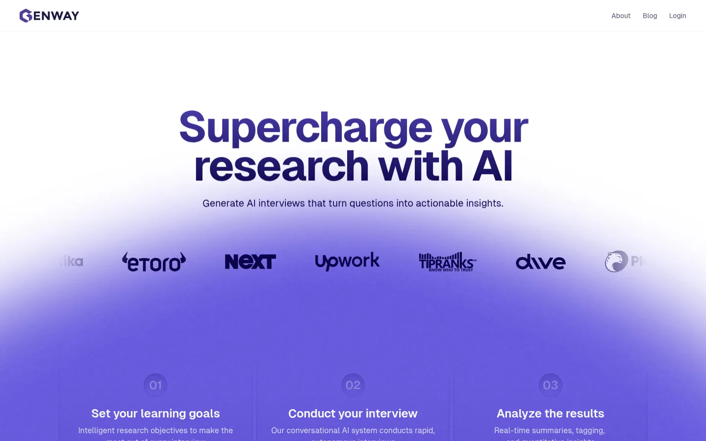
Genway 首页以干净的白色画布、深靛色文字和柔和紫色渐变,呈现 AI 用户研究平台。产品界面、客户背书与精炼的功能模块层层展开,引导访客从品牌主张走向行动按钮。
North star · Use generous white space and deep-indigo type to let violet product storytelling carry the page.
The page builds its identity around a white canvas (#ffffff), deep indigo text (#0a0449), and expansive violet glow that gives the hero a distinctive sense of energy without making the interface feel dark. Pale lavender surfaces (#f7f6fd and #edebfb) separate long-form content sections gently, while #6b5ee0 provides a focused accent in headings and interface details. Geist is used throughout: bold, tightly tracked display headlines establish hierarchy, and regular-weight body copy remains compact and readable. The layout alternates centered, full-width moments with constrained product cards and split feature narratives. Large product demonstrations and interface illustrations make the platform tangible; customer logos and testimonials add credibility. Rounded cards and subtle shadows lift product imagery from the background without relying on heavy borders. Generous vertical breathing room keeps the many homepage sections legible and makes the darker final CTA feel like a deliberate visual anchor.
General fallback and mixed-weight text where the family is declared without a named cut.
角色
示例
字号
字重
行高
字距
特大标题
Oversized hero or campaign statements, set in bold with tightly packed lines.
Genway
88px
400
0.9
-0.04em
一级标题
Primary hero headline and other top-level page statements.
Genway
68px
400
0.9
-0.04em
二级标题
Major section titles such as platform and customer-proof headings.
Genway
56px
400
1
-0.04em
三级标题
Feature-block headings and secondary promotional titles.
Genway
36px
400
1.2
-0.02em
四级标题
Smaller card titles and supporting subheads.
The quick brown fox 敏捷的狐狸
24px
400
1.3
0
正文
Descriptive copy for features, testimonials, and product explanations.
The quick brown fox 敏捷的狐狸
16px
400
1.5
0
辅助文字
Small labels and concise supporting metadata.
The quick brown fox 敏捷的狐狸
12px
400
1.2
0
链接
Navigation and compact calls to action.
The quick brown fox 敏捷的狐狸
14px
400
1.2
-0.01em
间距与布局
基准单位 4px · 密度:适中
80px版块间距
8px元素间距
—卡片内边距
1200px内容最大宽度
1px
4px
5px
8px
10px
12px
16px
20px
24px
28px
32px
36px
64px
80px
The measured page content is organized around a 1200px maximum width, with a comfortable density and a clear centered alignment for the hero and major section introductions. The homepage alternates broad gradient or tinted bands with constrained cards, product demonstrations, and split feature stories. Vertical section spacing is generous, with a measured 80px section gap; smaller elements use a measured 8px gap. The hero begins with ample white space, then transitions into violet. Cards and proof modules create a steady rhythm without making the page feel crowded.
圆角与层次
卡片 · 12px
图片 · 9999px
链接 · 32px
md · other
hairline · link, card
xl · card
xl · other
The page favors clean surfaces and restrained separation over strong outlines. Product cards use subtle layered shadows and rounded corners; measured card radius is 12px. Some small interface elements carry a faint violet focus-like ring. Avoid heavy borders or dramatic elevation, reserving the strongest contrast for the dark CTA band.
组件
下面的预览按实测的按钮、输入框、徽标、卡片样式重建(字体用替代字体)。
Hero
Centered, oversized indigo headline and short supporting line on white, transitioning into a broad violet glow.
Customer logo row
A horizontal line of customer marks sits within the hero-to-product transition, tinted to harmonize with the indigo palette.
Process cards
Three sequential steps pair concise labels and copy with product interface previews over the violet field.
Product demo panel
A wide, softly elevated interface mockup anchors the AI-led product story beneath a centered section title.
Feature cards
Rounded white cards group interview, usability, and survey offerings, with brief descriptions and compact links.
Feature narratives
Alternating split layouts pair indigo headlines and testimonial copy with short feature lists and small interface visuals.
Closing CTA
A dark indigo rounded panel with centered white headline and supporting line closes the content before the footer.
Imagery · Imagery is primarily product UI: interview, survey, dashboard, and analytics mockups presented as clean floating panels. Customer logos and testimonial portraits provide small moments of human proof. A large, soft violet gradient acts as atmosphere rather than literal illustration. Keep mockup detail legible but subordinate to the headline, and avoid adding unrelated decorative photography.
Alternate broad section bands with compact product cards.
Use Geist-like sans-serif typography with tight display headlines.
Make product mockups feel like lifted, rounded panels.
Reserve the darkest surface for a focused closing CTA.
✕ 不该做
Do not turn the page into a dark-mode interface.
Do not use bright unrelated accent colors.
Do not crowd the hero with extra copy or controls.
Do not apply strong borders to every card.
Do not let decorative gradients reduce text contrast.
Do not make product mockups visually louder than the message.
给 AI 的提示词
想快速出一个同风格的新页面,把这段话连同 DESIGN.md 一起发给 AI。
Build a new Genway-style AI SaaS page with an airy white canvas and a crisp, product-led rhythm. Use Gallery White (#ffffff) as the primary background, Midnight Indigo (#0a0449) for headlines and core text, and Signal Violet (#6b5ee0) as a controlled accent. Introduce Lavender Mist (#f7f6fd), Lilac Haze (#edebfb), and Pale Iris (#e1def8) in soft section washes, not hard color blocks. Use a Geist-like sans serif, with large tightly tracked bold headings and calm regular body copy. Center the hero, then alternate broad atmospheric sections, rounded product cards, and split feature narratives. Show realistic interface mockups, customer marks, and concise proof points. Keep shadows subtle, spacing generous, and the final CTA dark and focused.