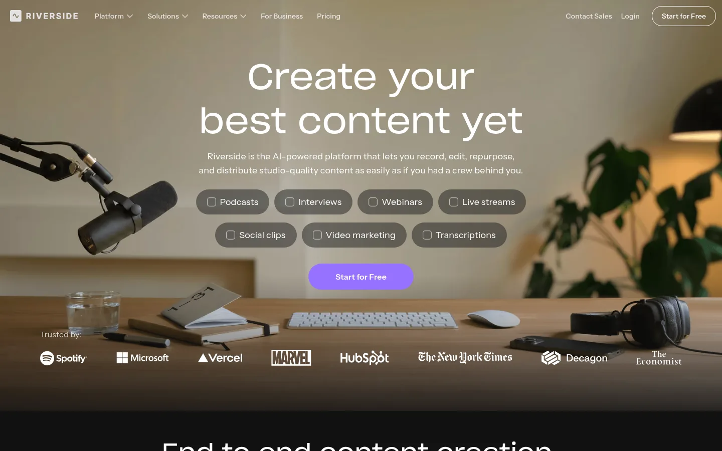
Riverside 以克制的深色界面搭配温暖、电影感的录音场景影像。明亮的紫色行动按钮与醒目的大字标题,引导访客了解录制、AI 剪辑、发布和直播功能。
North star · Keep the interface quiet and dark so real recording imagery leads, while purple marks the next action.
The page alternates between a near-black product canvas and pale studio-quality feature bands, using white and muted gray typography to keep dense feature explanations legible. Purple is reserved for the primary conversion button, so it stands out without competing with the content. The hero breaks from the otherwise dark system: a full-bleed, warmly toned studio photograph carries the navigation, oversized centered headline, supporting copy, selectable use-case chips, CTA, and customer logos. Sharp Grotesk gives display and H1 text a spacious, human feel; Instrument Sans handles navigation, body copy, and feature labels with practical clarity. Large media panels show real people, the recording interface, and editing software rather than abstract decoration. Sections shift between centered statements, split layouts, and full-width demonstrations, with comfortable separation and rounded cards. The overall strategy is cinematic but product-specific: let evidence of recording quality and workflow capability do the visual selling.
配色 点色块复制色值。用途说明来自对页面的实测位置(背景、文字、描边、按钮)与截图判读。
强调色
Signal Violet
#9671ff
Primary filled Start for Free buttons; use sparingly against the dark interface.
表层色
Deep Canvas
#111111
Main dark canvas beneath product demonstrations and most feature sections.
Graphite Panel
#1d1d1d
Cards, dark panels, and some interface surfaces, subtly distinct from the canvas.
Cloud Paper
#f6f6f6
Light feature bands for recording-quality demonstrations and their accompanying copy.
中性色
Studio White
#ffffff
Headlines, navigation, button labels, selected borders, and text on dark sections.
Soft Silver
#d2d2d2
Secondary explanatory copy and supporting text on dark backgrounds.
功能色
Slate Text
#383838
Low-emphasis text and heading details; not a defining brand surface.
Dim Charcoal
#555555
Occasional subdued text; secondary measured color, not a primary interface color.
文字 背景 对比度 WCAG #ffffff Studio White#111111 Deep Canvas18.88:1 AAA #ffffff Studio White#f6f6f6 Cloud Paper1.08:1 不达标 #ffffff Studio White#1d1d1d Graphite Panel16.86:1 AAA #d2d2d2 Soft Silver#111111 Deep Canvas12.49:1 AAA #d2d2d2 Soft Silver#ffffff Studio White1.51:1 不达标 #d2d2d2 Soft Silver#f6f6f6 Cloud Paper1.4:1 不达标
字体 字号阶梯:Augmented Fourth(比例约 1.446,正文 16px)。示例用免费替代字体渲染,数值为实测。
Aa 设计
Instrument Sans 网络字体 · 字重 400 / 500 / 600 / 700 · 占比 93%
免费替代:Inter
Navigation, body copy, captions, cards, and most interface labels.
Aa 设计
Sharp Grotesk 网络字体 · 字重 400 · 占比 7%
免费替代:Space Grotesk
Display headlines and primary hero heading.
角色 示例 字号 字重 行高 字距 特大标题 Largest campaign-style statements and prominent feature headlines.
Riverside
70px 400 1.25 0 一级标题 Main hero headline and major page-level heading.
Riverside
50px 400 1.25 0 二级标题 Section headings introducing feature groups and demonstrations.
Riverside
30px 500 1.35 0 三级标题 Feature titles and smaller product-story headings.
The quick brown fox 敏捷的狐狸
24px 500 1.25 0 正文 Explanatory copy, feature descriptions, and card content.
The quick brown fox 敏捷的狐狸
16px 400 1.55 0.01em 辅助文字 Supporting labels, metadata, and small explanatory text.
The quick brown fox 敏捷的狐狸
14px 400 1.55 0.011em 导航 Header navigation and compact menu labels.
The quick brown fox 敏捷的狐狸
14px 400 1.55 0.011em
间距与布局 基准单位 2px · 密度:适中
80px 版块间距
10px 元素间距
33px 卡片内边距
1280px 内容最大宽度
4px
5px
6px
7px
8px
10px
12px
14px
16px
20px
23px
24px
26px
30px
31px
32px
The page uses a measured maximum content width of 1280px, with sections that move between centered headline compositions, two-column feature splits, and broad media demonstrations. The first viewport is an immersive full-bleed photographic hero; below it, dark and pale bands establish clear changes in content context. Measured section spacing is generous, while card groups and inline controls remain compact. Align feature copy to the start of its column, reserve centered alignment for campaign statements, and keep the overall density comfortable.
圆角与层次 The interface is mostly flat, relying on dark-versus-light section changes and media placement for hierarchy. Cards use a subtly distinct graphite surface with rounded corners; measured cards have an 8px radius. A moderate shadow appears on a product-style card, while borders are limited and light. Use layering mainly for controls and interface mockups over video or photography.
组件 下面的预览按实测的按钮、输入框、徽标、卡片样式重建(字体用替代字体)。
Primary CTA Filled Signal Violet (#9671ff) pill button with white Instrument Sans text; the repeated Start for Free action.
Outlined CTA Compact dark-background option with white text and a thin white outline, using a pill silhouette.
Header navigation A restrained horizontal row of small Instrument Sans links over the hero image, ending with a pill-shaped action.
Use-case chips Translucent, rounded selectors grouped beneath the hero copy, with a small outlined square icon and white label.
Feature card Graphite (#1d1d1d) card with white text, rounded corners, and measured padding around 33px.
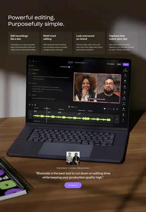
Product demonstration Large video or interface image framed as evidence of recording quality, editing capability, or live production.
Customer logo strip White customer marks placed over the darker lower edge of the hero photograph as compact trust signals.
Imagery · Use documentary-style video and photography of people recording, editing, and presenting. The opening studio image is warm, full-bleed, and atmospheric; later sections show faces, recording setups, and recognizable product UI in framed demonstrations. Maintain natural skin tones and realistic environments. Product imagery should explain workflow or quality, not become abstract decoration; the customer logo row is a supporting proof point.
页面版块 共 13 个版块,按页面从上到下排列,每个都标了类型、布局和交互套路。
首页
首屏 沉浸式首页主视觉
Full-bleed studio photograph with overlaid navigation, centered hero copy, chips, CTA, and logo row.
使用步骤 端到端创作流程
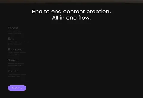
Dark two-column feature section with centered heading, workflow content, and product media.
图集 Riverside作品展示
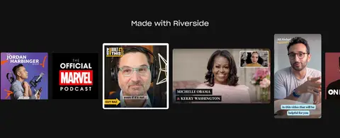
Centered title above a wide, multi-column strip of creator content.
图文交替 录音画质优势
Pale band with a large left-aligned heading and supporting copy in a second column.
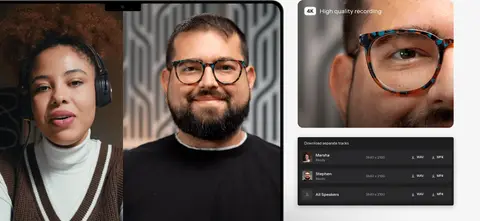
产品展示 录制效果演示
Pale two-column media composition with a large participant view and smaller recording details.
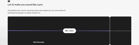
图文交替 AI音质优化
Light full-bleed feature block with copy above a wide audio comparison demonstration.
行动号召 AI加速提示
Short dark transition band with a single statement.
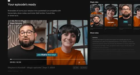
产品展示 AI成片与节目素材
Dark feature section with introductory headline, copy, and a wide product media composition.
视频 视频内容演示
Full-width video-led interstitial on the dark canvas.
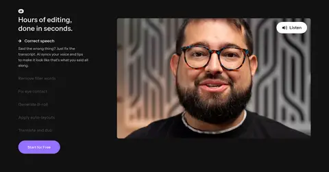
图文交替 AI视频剪辑功能
Dark two-column section with feature list on one side and a large participant video on the other.
产品展示 专业剪辑工作台
Tall photographic product showcase centered on an editing laptop and workflow details.
图文交替 播客托管发布
Dark section with a media illustration alongside stacked explanatory feature copy.
功能网格 直播与网络研讨会
Dark full-width section with a large heading, feature cards, live interface image, and testimonial.
该做与不该做 ✓ 该做 Use #111111 as the main interface canvas. Reserve #9671ff for high-priority actions. Set display headlines in Sharp Grotesk or a close substitute. Use real people and product UI as feature evidence. Alternate dark sections with clearly bounded pale bands. Keep cards rounded and visually quieter than media. ✕ 不该做 Do not add unmeasured brand colors to the core interface. Do not make every section a card grid. Do not compete with the hero photograph using extra decoration. Do not use purple for large background areas. Do not flatten the page into one continuous dark block. Do not replace product demonstrations with generic abstract graphics. 给 AI 的提示词 想快速出一个同风格的新页面,把这段话连同 DESIGN.md 一起发给 AI。
复制 Build a new Riverside-style SaaS page with a restrained, cinematic product aesthetic. Use Deep Canvas (#111111) for the main dark sections, Graphite Panel (#1d1d1d) for cards, Cloud Paper (#f6f6f6) for occasional light feature bands, and Studio White (#ffffff) for high-contrast headings and controls. Keep Signal Violet (#9671ff) for the primary CTA only. Use a Sharp Grotesk-like display face for large headlines and an Instrument Sans-like sans serif for navigation, body, and UI. Favor wide media demonstrations, real people, recording environments, and believable product screens. Vary centered statements with split feature layouts and full-width imagery; keep content within a measured 1280px maximum width and section rhythm comfortable. Use rounded pills for actions, subtle card corners, minimal borders, and little shadow. Make each section explain a distinct product capability.
DESIGN.md Tailwind v4 CSS 变量 Design Tokens
---
title: "Riverside design system"
variant: extended
source: https://riverside.com/
captured_at: 2026-10-12
theme: dark
industry: saas
generator: Design DNA (https://four.wiralomi.com/style/riverside-fm)
ai_generated: true
ai_label: "本文件由 AI 辅助生成:数值取自公开网页的实测样式,命名、用途说明与建议为模型解读。商标归原所有者。 / AI-assisted content"
---
# Riverside · Design System
> A dark studio for human conversations
**Theme:** dark · **Industry:** saas · **Source:** https://riverside.com/ · **Captured:** 2026-10-12 (1440×900 desktop)
_AI-assisted content: values are measured from the public page at capture time; names, roles and guidance are model-written interpretations. Trademarks belong to their owners._
Riverside pairs a dark, restrained SaaS interface with warm, cinematic recording-studio imagery. A vivid purple CTA and generous typography lead visitors through recording, AI editing, publishing, and live-streaming features.
## North star
Keep the interface quiet and dark so real recording imagery leads, while purple marks the next action.
## Overview
The page alternates between a near-black product canvas and pale studio-quality feature bands, using white and muted gray typography to keep dense feature explanations legible. Purple is reserved for the primary conversion button, so it stands out without competing with the content. The hero breaks from the otherwise dark system: a full-bleed, warmly toned studio photograph carries the navigation, oversized centered headline, supporting copy, selectable use-case chips, CTA, and customer logos. Sharp Grotesk gives display and H1 text a spacious, human feel; Instrument Sans handles navigation, body copy, and feature labels with practical clarity. Large media panels show real people, the recording interface, and editing software rather than abstract decoration. Sections shift between centered statements, split layouts, and full-width demonstrations, with comfortable separation and rounded cards. The overall strategy is cinematic but product-specific: let evidence of recording quality and workflow capability do the visual selling.
## Colors
| Name | Hex | Token | Group | Role |
|---|---|---|---|---|
| Studio White | ` | `--color-studio-white` | neutral | Headlines, navigation, button labels, selected borders, and text on dark sections. |
| Deep Canvas | ` | `--color-deep-canvas` | surface | Main dark canvas beneath product demonstrations and most feature sections. |
| Signal Violet | ` | `--color-signal-violet` | accent | Primary filled Start for Free buttons; use sparingly against the dark interface. |
| Soft Silver | ` | `--color-soft-silver` | neutral | Secondary explanatory copy and supporting text on dark backgrounds. |
| Graphite Panel | ` | `--color-graphite-panel` | surface | Cards, dark panels, and some interface surfaces, subtly distinct from the canvas. |
| Cloud Paper | ` | `--color-cloud-paper` | surface | Light feature bands for recording-quality demonstrations and their accompanying copy. |
| Slate Text | ` | `--color-slate-text` | semantic | Low-emphasis text and heading details; not a defining brand surface. |
| Dim Charcoal | ` | `--color-dim-charcoal` | semantic | Occasional subdued text; secondary measured color, not a primary interface color. |
### Semantic aliases
`--color-canvas` → ` (Deep Canvas) · `--color-surface` → ` (Studio White) · `--color-surface-2` → ` (Cloud Paper) · `--color-surface-3` → ` (Graphite Panel) · `--color-text` → ` (Studio White) · `--color-text-muted` → ` (Soft Silver) · `--color-text-subtle` → ` (Graphite Panel) · `--color-border` → ` (Studio White) · `--color-accent` → ` (Signal Violet) · `--color-on-accent` → ` (Studio White)
### Contrast (WCAG 2.x)
| Text | Background | Ratio | Level |
|---|---|---|---|
| ` | ` | 18.88:1 | AAA |
| ` | ` | 1.08:1 | fail |
| ` | ` | 16.86:1 | AAA |
| ` | ` | 12.49:1 | AAA |
| ` | ` | 1.51:1 | fail |
| ` | ` | 1.4:1 | fail |
| ` | ` | 11.15:1 | AAA |
| ` | ` | 1.12:1 | fail |
| ` | ` | 16.86:1 | AAA |
| ` | ` | 15.6:1 | AAA |
### Gradients
- `linear-gradient(rgba(0, 0, 0, 0), rgb(17, 17, 17))`
## Typography
| Family | Token | Source | Weights | Role | Free substitute |
|---|---|---|---|---|---|
| Instrument Sans | `--font-body` | webfont | 400, 500, 600, 700 | Navigation, body copy, captions, cards, and most interface labels. | Inter |
| Sharp Grotesk | `--font-display` | webfont | 400 | Display headlines and primary hero heading. | Space Grotesk |
- **Instrument Sans:** Use regular to bold weights; compact navigation and body copy stay sentence case, with subtly open tracking.
- **Sharp Grotesk:** Use regular weight for large display text; keep tracking neutral and line breaks deliberate.
### Type scale — Augmented Fourth (ratio ≈ 1.446, base 16px)
| Role | Size | Weight | Line height | Letter spacing | Case | Family | Used for |
|---|---|---|---|---|---|---|---|
| display | 70px | 400 | 1.25 | 0 | — | Sharp Grotesk | Largest campaign-style statements and prominent feature headlines. |
| h1 | 50px | 400 | 1.25 | 0 | — | Sharp Grotesk | Main hero headline and major page-level heading. |
| h2 | 30px | 500 | 1.35 | 0 | — | Instrument Sans | Section headings introducing feature groups and demonstrations. |
| h3 | 24px | 500 | 1.25 | 0 | — | Instrument Sans | Feature titles and smaller product-story headings. |
| body | 16px | 400 | 1.55 | 0.01em | — | Instrument Sans | Explanatory copy, feature descriptions, and card content. |
| caption | 14px | 400 | 1.55 | 0.011em | — | Instrument Sans | Supporting labels, metadata, and small explanatory text. |
| nav | 14px | 400 | 1.55 | 0.011em | — | Instrument Sans | Header navigation and compact menu labels. |
## Spacing & layout
- Base unit **2px**, density **comfortable**.
- Scale (most used values): 4, 5, 6, 7, 8, 10, 12, 14, 16, 20, 23, 24, 26, 30, 31, 32 px.
- Section rhythm 80px · element gap 10px · card padding 33px · max content width 1280px.
The page uses a measured maximum content width of 1280px, with sections that move between centered headline compositions, two-column feature splits, and broad media demonstrations. The first viewport is an immersive full-bleed photographic hero; below it, dark and pale bands establish clear changes in content context. Measured section spacing is generous, while card groups and inline controls remain compact. Align feature copy to the start of its column, reserve centered alignment for campaign statements, and keep the overall density comfortable.
## Shape & elevation
- Radius: button `9999px` · card `8px` · media `4px` · link `9999px` · xs `4px` · sm `8px` · pill `9999px`
- Shadow `md` (card): `rgba(0, 0, 0, 0.25) 0px 4px 15px 0px`
- Motion: standard transition `0.2s ease` on interactive elements.
The interface is mostly flat, relying on dark-versus-light section changes and media placement for hierarchy. Cards use a subtly distinct graphite surface with rounded corners; measured cards have an 8px radius. A moderate shadow appears on a product-style card, while borders are limited and light. Use layering mainly for controls and interface mockups over video or photography.
## Imagery
Use documentary-style video and photography of people recording, editing, and presenting. The opening studio image is warm, full-bleed, and atmospheric; later sections show faces, recording setups, and recognizable product UI in framed demonstrations. Maintain natural skin tones and realistic environments. Product imagery should explain workflow or quality, not become abstract decoration; the customer logo row is a supporting proof point.
## Components
### Primary CTA
Filled Signal Violet (### Outlined CTA
Compact dark-background option with white text and a thin white outline, using a pill silhouette.
### Header navigation
A restrained horizontal row of small Instrument Sans links over the hero image, ending with a pill-shaped action.
### Use-case chips
Translucent, rounded selectors grouped beneath the hero copy, with a small outlined square icon and white label.
### Feature card
Graphite (### Product demonstration
Large video or interface image framed as evidence of recording quality, editing capability, or live production.
### Customer logo strip
White customer marks placed over the darker lower edge of the hero photograph as compact trust signals.
### Measured component styles
- **Primary button** (“Start for Free”): background ## Do
- Use ## Don't
- Do not add unmeasured brand colors to the core interface.
- Do not make every section a card grid.
- Do not compete with the hero photograph using extra decoration.
- Do not use purple for large background areas.
- Do not flatten the page into one continuous dark block.
- Do not replace product demonstrations with generic abstract graphics.
## Agent prompt
Build a new Riverside-style SaaS page with a restrained, cinematic product aesthetic. Use Deep Canvas (## Page sections (top to bottom)
| # | Type | Layout | UX patterns | UI patterns |
|---|---|---|---|---|
| 1 | hero | Full-bleed studio photograph with overlaid navigation, centered hero copy, chips, CTA, and logo row. | Use-case selection chips, Primary free-start CTA, Customer trust marks | Warm photographic backdrop, Centered white headline, Purple pill button, Overlay navigation |
| 2 | how-it-works | Dark two-column feature section with centered heading, workflow content, and product media. | Sequential workflow overview, Free-start CTA | Dark canvas, Centered section title, Feature steps, Embedded media |
| 3 | gallery | Centered title above a wide, multi-column strip of creator content. | Browse customer examples | Dark background, Horizontal media gallery, Varied content thumbnails |
| 4 | feature-split | Pale band with a large left-aligned heading and supporting copy in a second column. | Explain local recording quality | Light surface, Two-column text, High-contrast dark copy |
| 5 | product-showcase | Pale two-column media composition with a large participant view and smaller recording details. | Inspect separate tracks, View recording quality | Large video frame, Stacked interface previews, Light band |
| 6 | feature-split | Light full-bleed feature block with copy above a wide audio comparison demonstration. | Listen to audio sample | Pale background, Audio comparison panel, Small listening control |
| 7 | cta | Short dark transition band with a single statement. | Build anticipation for AI tools | Dark canvas, Standalone headline |
| 8 | product-showcase | Dark feature section with introductory headline, copy, and a wide product media composition. | Preview finished episode, Review generated materials | Dark canvas, Video preview, Clips and show-notes panels |
| 9 | video | Full-width video-led interstitial on the dark canvas. | Watch product demonstration | Full-bleed video, Dark surroundings |
| 10 | feature-split | Dark two-column section with feature list on one side and a large participant video on the other. | Choose editing capability, Listen to sample, Free-start CTA | Feature navigation list, Large video frame, Dark interface |
| 11 | product-showcase | Tall photographic product showcase centered on an editing laptop and workflow details. | Explore editing interface, Read customer endorsement | Warm desk photography, Laptop product image, Overlaid testimonial |
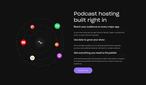
| 12 | feature-split | Dark section with a media illustration alongside stacked explanatory feature copy. | Understand distribution, Review audience analytics, Free-start CTA | Dark canvas, Platform-icon illustration, Stacked feature headings |
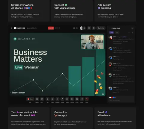
| 13 | feature-grid | Dark full-width section with a large heading, feature cards, live interface image, and testimonial. | Stream to multiple platforms, Manage audience interaction, Review testimonial | Feature card rows, Live-stream interface, Dark background, Purple CTA |
## Source CSS custom properties (selected)
```css
--brand-black: