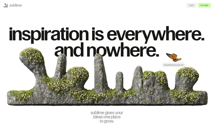
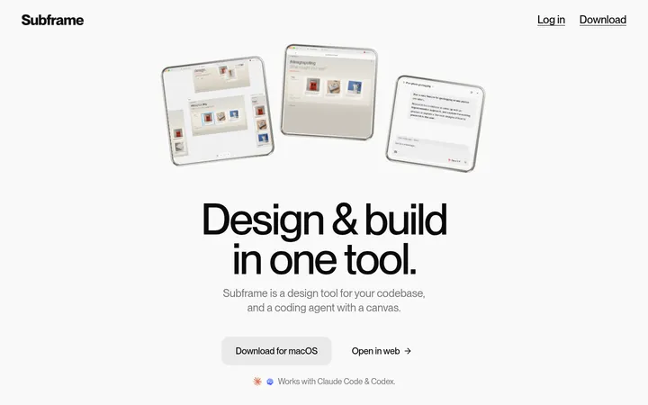
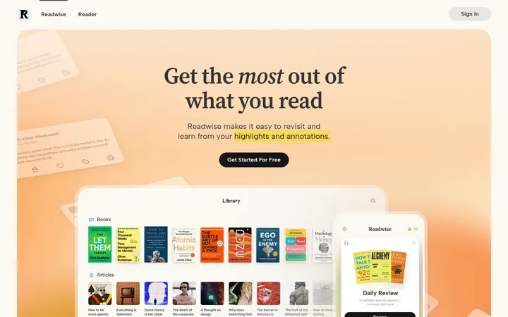
North star · Let oversized, playful typography and warm negative space lead, using bright accents sparingly to mark action and personality.
The page alternates crisp white and warm parchment sections with deep charcoal bands, giving each long-form block a distinct pause without relying on decorative borders. Black is the dominant text colour; lime and yellow punctuate calls to action, while pink creates a deliberately loud full-width signup moment. Ease Display supplies rounded, characterful headings, including a huge hand-cut-looking Streamtime wordmark, while Ease Standard keeps paragraphs and links compact and readable. The layout moves between centered introductory copy, broad product-screen imagery, a narrow text column on charcoal, and spacious feature and testimonial areas. Product UI is presented as evidence rather than ornamental device mockups; candid workplace photography adds context. Accent colours also appear in illustrations and testimonial cards, so keep their strongest usage tied to specific blocks rather than spreading them across every surface. Shadows are restrained to controls and selected cards.
Display headlines, section headings, navigation labels and large CTA text.
Aa 设计
Ease Standard
网络字体 · 字重 400 · 占比 49%
免费替代:Inter
Paragraphs, body copy, captions, links and supporting interface text.
角色
示例
字号
字重
行高
字距
特大标题
Oversized brand-wordmark and hero display moments.
Streamtime
100px
400
1
-0.06em
一级标题
Primary page headline and major introductory statement.
Streamtime
68px
400
1
-0.014em
二级标题
Section headings and prominent editorial subheads.
Streamtime
30px
400
1.2
-0.06em
三级标题
Feature headings and large navigation-style labels.
Streamtime
28px
400
1.1
-0.034em
正文
Explanatory paragraphs and feature descriptions.
The quick brown fox 敏捷的狐狸
18px
400
1.2
-0.053em
辅助文字
Small labels, attribution details and metadata.
The quick brown fox 敏捷的狐狸
12px
400
1.2
-0.08em
导航
Large menu labels and expressive navigation links.
Streamtime
28px
400
1.1
-0.034em
链接
Inline links and compact calls to action.
The quick brown fox 敏捷的狐狸
18px
400
1.1
-0.06em
间距与布局
基准单位 4px · 密度:适中
32px版块间距
30px元素间距
30px卡片内边距
1392px内容最大宽度
4px
7px
8px
9px
12px
16px
20px
24px
30px
32px
40px
48px
80px
120px
128px
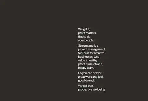
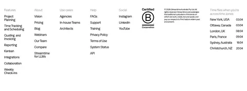
A long, scroll-led page uses broad, full-width colour bands and a measured content width capped at 1392px. The opening is centered, then the page alternates a narrow text column, wide product imagery, multi-column feature content, and offset testimonial cards. Section transitions are clear and spacious; some areas intentionally leave substantial empty canvas around content. The footer compresses into a dense multi-column directory. Keep alignment varied but deliberate: centered for the hero and editorial feed, left-aligned for product explanations and audience categories.
圆角与层次
按钮 · 4px
卡片 · 10px
图片 · 5px
导航 · 5px
链接 · 5px
md · button, nav
md · card
md · nav
Most section surfaces are flat, with separation created by colour bands and generous space rather than borders. Buttons have a restrained soft shadow and compact corners; selected cards use a subtle shadow or simple filled surface. Keep product media largely flush and avoid heavy outlines, stacked panels or deep floating effects.
组件
下面的预览按实测的按钮、输入框、徽标、卡片样式重建(字体用替代字体)。
Top navigation
Compact logo and dark Menu control at left; account actions sit at right, including a yellow demo pill and a light signup control.
Hero wordmark
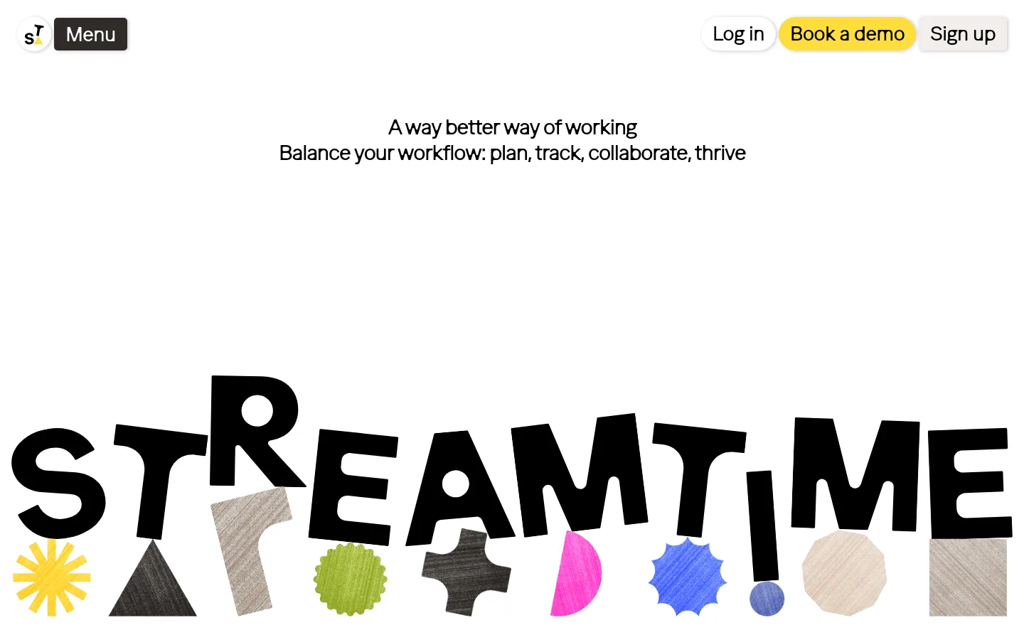
Centered introductory copy above an oversized black Streamtime wordmark with colourful cutout-like geometric artwork.
Product showcase
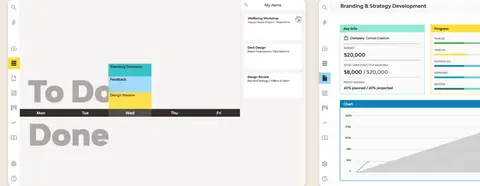
Wide software screenshots placed across a parchment section, followed by a concise feature heading and compact supporting statements.
Signup band
Full-width electric fuchsia CTA strip with large black prompt and a contrasting charcoal signup pill.
Audience cards
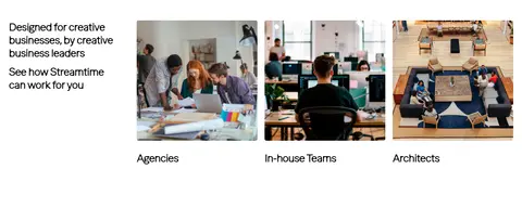
White section with a short introductory text column and three workplace-photo categories with captions.
Testimonial cards
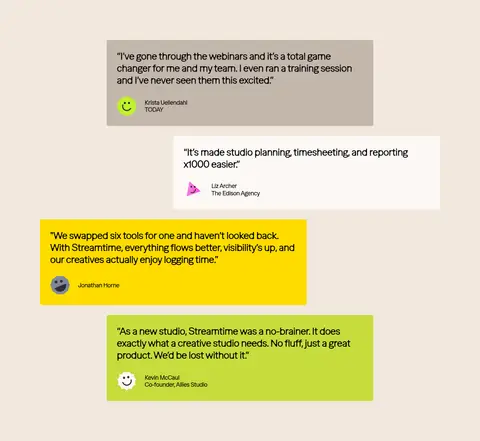
Loose staggered arrangement on warm parchment; cards use taupe, porcelain, yellow and lime fills with readable quotes.
Client logo band
Charcoal full-width strip with centered prompt and a horizontally arranged row of white client marks.
Editorial feed and footer
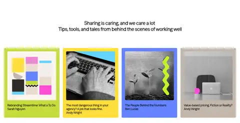
Centered editorial heading over colourful article cards, then a compact white multi-column link directory.
Imagery · Use product interface screenshots as broad, flat showcases, with their software details readable and minimally framed. Pair them with candid creative-team and workplace photographs in tidy rectangular crops. The opening wordmark illustration is oversized and collage-like, with paper-textured shapes and bright colour; treat those colours as artwork rather than expanding them into the UI palette. Testimonial cards can use small profile illustrations or marks.
Use warm parchment and white as the main alternating canvases.
Keep black text crisp and prominent on light sections.
Reserve charcoal bands for deliberate contrast and white content.
Use lime, yellow and pink as distinct, localized accents.
Set headings in expressive display type with tight tracking.
Mix centered introductions with asymmetrical, offset content.
Show product screens and real workplace imagery as evidence.
✕ 不该做
Do not turn every section into a bordered card.
Do not use bright accents as continuous page backgrounds.
Do not flatten the page into a uniform centered template.
Do not add gradients or glossy 3D effects.
Do not make headings uppercase or overly formal.
Do not mistake illustration colours for core UI surfaces.
给 AI 的提示词
想快速出一个同风格的新页面,把这段话连同 DESIGN.md 一起发给 AI。
Build a new page in Streamtime’s playful, studio-led visual language. Use Gallery White (#ffffff) and Warm Parchment (#f1e8de) as spacious alternating canvases, with Charcoal Studio (#2f2c29) for occasional inverse bands. Set expressive headings in Ease Display or a close Outfit substitute; use Ease Standard or Inter for readable supporting copy. Keep primary text Studio Ink (#000000). Introduce Fresh Lime (#c6dc3c), Sunshine Yellow (#ffde3b), and Playful Orchid (#ee84d5) as localized accents, not a general rainbow palette. Give content room to breathe, vary centered and left-aligned blocks, and use asymmetric feature layouts. Include clean product screenshots or candid creative-team photography. Favor flat surfaces, restrained control shadows, and simple compact corners over heavy borders or layered cards.