North star · Let restrained white-on-black typography frame rich, full-bleed website imagery, using bright sections only as purposeful product-focused contrast.
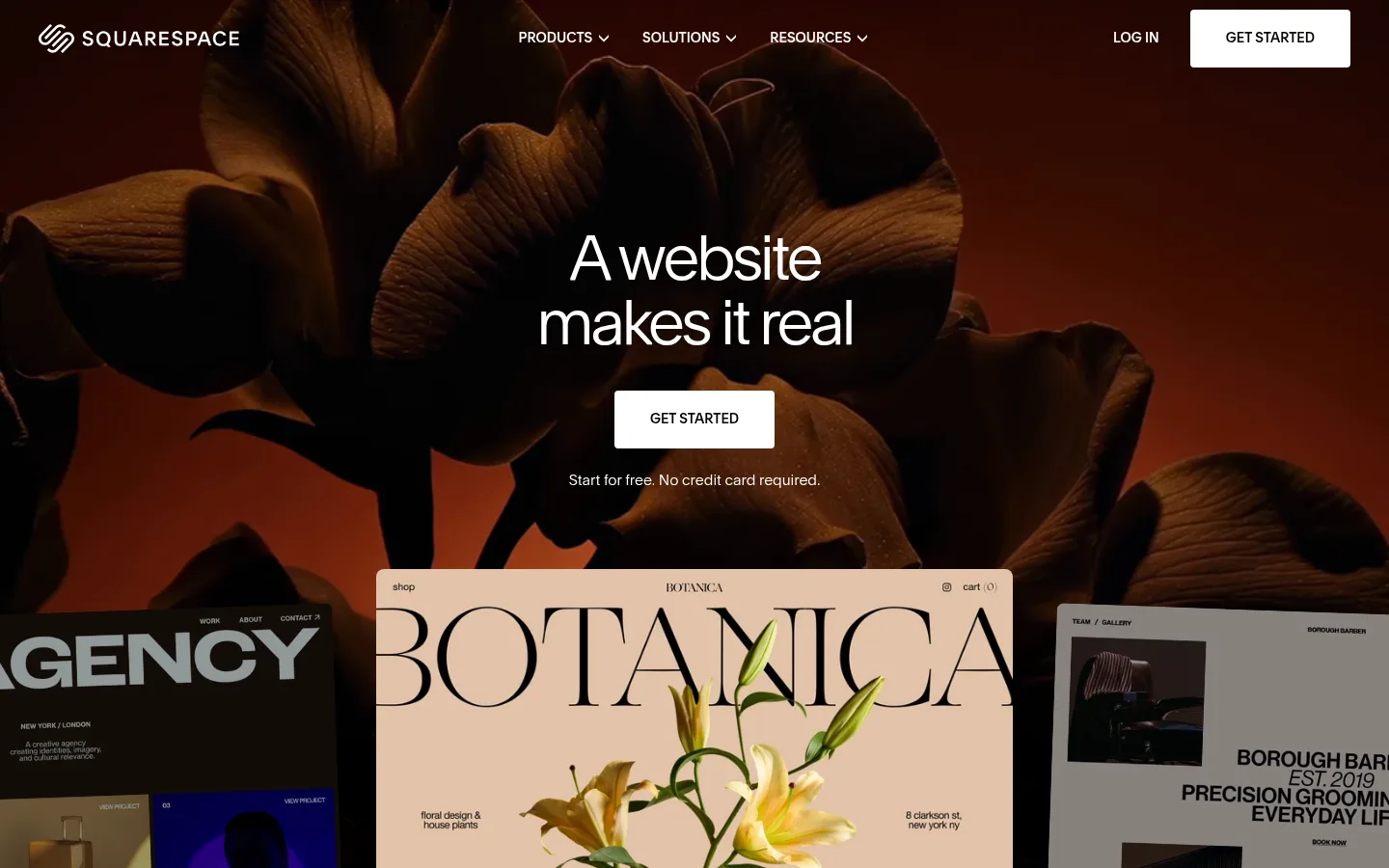
The visual identity is built around a black canvas (#000000), with white (#ffffff) carrying headings, navigation, links, and primary calls to action. A broad white band introduces business features and product cards, creating a deliberate tonal reset rather than a uniformly dark page. The opening viewport layers a centered, lightweight headline and compact CTA over dramatic floral photography and overlapping website previews; imagery supplies the page’s warm color, not a separate brand accent. Clarkson sans-serif handles nearly all text, using light display weights and tight tracking for large headings, while uppercase navigation and button labels are firmer. Clarkson Serif appears sparingly in a small heading role. Content shifts between centered hero and domain-search sections, wide carousels, multi-column feature layouts, and left-aligned FAQ rows. Generous blank intervals around product showcases balance the compact body copy and dense footer. Hairline dividers and flat surfaces keep the interface crisp; layered media and dark gradients create depth without relying on shadows.
Primary family for display, headings, body copy, navigation, links, and buttons.
Aa 设计
Clarkson Serif
网络字体 · 字重 400 / 300 · 占比 2%
免费替代:Lora
Sparse serif heading accent, measured for the h4 role.
角色
示例
字号
字重
行高
字距
特大标题
Oversized, lightweight campaign statement in the hero.
Squarespace
72px
300
1.04
-0.05em
一级标题
Primary page or section headline where prominent.
Squarespace
64px
300
1.04
-0.06em
二级标题
Major centered section headings and conversion messages.
Squarespace
56px
300
1.08
-0.04em
三级标题
Feature and product-card titles.
Squarespace
40px
400
1.08
-0.04em
四级标题
Occasional serif subheading for editorial contrast.
The quick brown fox 敏捷的狐狸
26px
400
1.08
-0.02em
正文
Supporting descriptions, explanatory copy, and footer content.
The quick brown fox 敏捷的狐狸
15px
400
1.4
-0.001em
辅助文字
Small helper notes, labels, and image-related details.
The quick brown fox 敏捷的狐狸
12px
400
1.4
0
导航
Uppercase site navigation labels.
The quick brown fox 敏捷的狐狸
14px
500
1
0
链接
Text links within feature areas and content.
The quick brown fox 敏捷的狐狸
15px
400
1.4
-0.001em
间距与布局
基准单位 8px · 密度:紧凑
40px版块间距
12px元素间距
—卡片内边距
660px内容最大宽度
4px
8px
12px
16px
24px
32px
40px
77px
120px
Use a broad, full-bleed page canvas, with measured text content reaching a 660px maximum width where appropriate. Center the hero and domain-search content; align feature-card copy and FAQ content to the left. Product areas use wide carousels and measured 12- or 9-column arrangements, while the footer divides into four columns. Alternate dark and white section bands for rhythm, leaving generous breathing room around showcases. The measured density is compact within navigation and footer, but open around major media and section introductions.
圆角与层次
按钮 · 9999px
输入框 · 8px
图片 · 8px
链接 · 8px
没有测到阴影:页面是扁平的,层次靠底色和描边区分。
The interface is largely flat, with no measured shadows. Use crisp section color changes, restrained #404040 hairlines, and image overlap to establish hierarchy. Dark gradients soften the edges of media and help it recede into the black canvas; card surfaces offer subtle contrast rather than strong elevation.
组件
下面的预览按实测的按钮、输入框、徽标、卡片样式重建(字体用替代字体)。
Primary CTA
White surface with black uppercase Clarkson medium label; measured button corner radius is 4px. Use the arrow treatment where the label includes GET STARTED.
Top navigation
Compact uppercase navigation with product, solutions, and resources links; position login and a white primary CTA alongside the brand mark.
Hero showcase
Centered lightweight headline and CTA over immersive photography, with layered website previews entering from the lower edge.
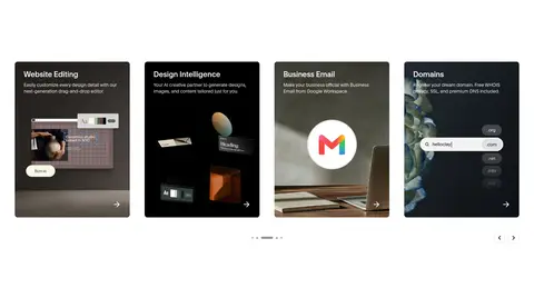
Feature carousel
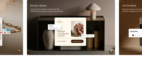
Wide image-led business feature panels with left-aligned title and copy; navigation controls signal horizontally browsable content.
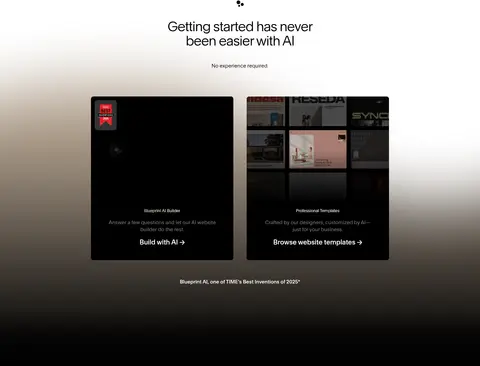
Product cards
Dark or image-backed cards combine a concise tool title, brief explanatory copy, product imagery, and a directional link.
Domain search
Centered heading, dark search input, and compact transfer-domain link on the black canvas.
FAQ rows
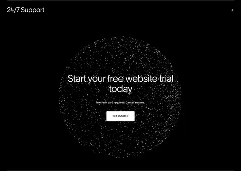
Left-aligned accordion-style questions separated by thin dark-grey rules, with a plus control at the far edge.
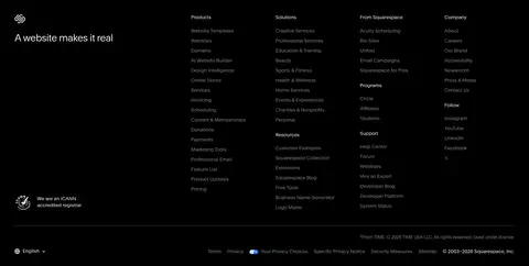
Footer directory
Four-column link directory on black, separated from the page by a hairline and finished with muted legal and utility details.
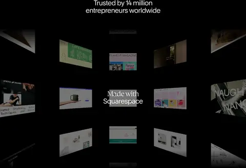
Imagery · Photography and website mockups dominate the first impression: cinematic floral imagery sits behind the hero, while overlapping portfolio previews demonstrate real site designs. Later carousels and cards use product screenshots, artwork, and business scenes. A dark gallery and subtle gradients fade media into black sections. Treat image colors as content-specific, not as a recurring brand palette; preserve strong, immersive framing.
Use #000000 as the default canvas and #ffffff for primary contrast.
Set large headlines in lightweight Clarkson-style sans-serif with tight tracking.
Keep the hero centered and let photography carry its dramatic color.
Use the white section band as a deliberate product-story contrast.
Build product showcases from real-looking website previews and image-led cards.
Separate dense content with whitespace and restrained #404040 rules.
✕ 不该做
Do not introduce bright accent colors into the interface palette.
Do not treat warm photography colors as brand UI colors.
Do not add heavy shadows or decorative gradients to ordinary controls.
Do not make every section a card or box.
Do not use heavy, tightly packed typography for large headlines.
Do not crowd the hero message with secondary copy or controls.
给 AI 的提示词
想快速出一个同风格的新页面,把这段话连同 DESIGN.md 一起发给 AI。
Build a new Squarespace-style page with a predominantly #000000 Canvas Black background and #ffffff Gallery White typography and primary CTA surfaces. Use #898989 Muted Grey only for supporting details, #404040 Divider Charcoal for restrained hairlines, and #2f2f2f Slate Surface for subtle card contrast; keep #dddddd Soft Silver minor. Set headings in a light, tightly tracked Clarkson-like sans-serif, with an occasional restrained serif accent. Lead with a centered, cinematic image-led hero and overlapping website previews. Alternate dark sections with a purposeful white product-feature band, using wide carousels, image-backed cards, and clear content breathing room. Keep navigation compact and uppercase, CTAs crisp, and FAQ rows left-aligned with fine dividers. Avoid heavy shadows, invented accent colors, or generic dashboard styling.