Rive 首页以克制的深色界面、醒目的展示字体和产品动效,呈现其交互设计与动画平台。黑色与炭灰色区块交替推进,精简的控件和用户评价卡片则强化了技术工具属性。
North star · Keep the interface nearly monochrome and let bold technical typography, product motion, and clear section rhythm provide the visual emphasis.
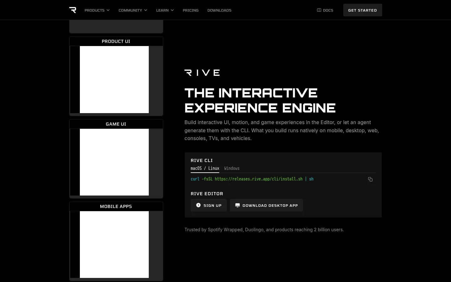
Rive’s visual strategy is monochrome and product-led: black anchors the hero, footer, and runtime section, while a charcoal band distinguishes the editor feature and the social-proof area. White display text delivers the strongest contrast; muted grays handle supporting copy and keep long descriptions secondary. The headings use uppercase, geometric Orbitron, while Inter Display supplies readable body copy and Tomorrow gives navigation and labels a compact technical cadence. Layout favors a centered, constrained content area with two-column feature sections, generous dark negative space, and denser card-based proof lower down. The hero pairs a column of labeled interactive previews with a strong text-and-CLI panel, making the product itself the primary visual. Motion and interface captures carry the personality; logos and testimonials provide evidence without introducing a colorful marketing palette. Buttons and cards remain subdued, using near-black fills and restrained separation rather than bright accent colors or heavy shadows.
配色
点色块复制色值。用途说明来自对页面的实测位置(背景、文字、描边、按钮)与截图判读。
品牌色
表层色
中性色
页面底色 · Graphite Canvas表层 · Absolute Black表层 2 · Dark Slate主文字 · Studio White次要文字 · Soft Ash弱文字 · Cool Gray
Feature-section headlines and major social-proof statement.
The quick brown fox 敏捷的狐狸
24px
700
1.3
0.008em
三级标题
Smaller product or subsection headings.
The quick brown fox 敏捷的狐狸
20px
700
1.2
0.01em
正文
Explanatory paragraphs, product descriptions, and testimonial copy.
The quick brown fox 敏捷的狐狸
14px
400
1.5
0
辅助文字
Compact uppercase labels and small metadata.
The quick brown fox 敏捷的狐狸
11px
400
1.6
0.01em
导航
Uppercase primary navigation and compact menu labels.
The quick brown fox 敏捷的狐狸
12px
500
1.2
0
眉题
Small uppercase section identifiers above feature headings.
The quick brown fox 敏捷的狐狸
14px
500
1.4
0.05em
间距与布局
基准单位 2px · 密度:适中
60px版块间距
10px元素间距
10px卡片内边距
1000px内容最大宽度
1px
2px
5px
8px
10px
12px
15px
16px
20px
30px
60px
Use a centered content frame capped at the measured 1000px maximum, with wide margins at desktop widths. The hero and major features use two-column compositions; the hero balances a vertical preview rail against copy and a CLI panel. Alternate black and charcoal section bands to separate stories without decorative dividers. Keep the runtime integrations in a multi-column logo field, then increase density for the testimonial cards and footer link columns. Preserve generous section gaps and tighter spacing inside controls.
圆角与层次
按钮 · 4px
输入框 · 8px
卡片 · 4px
图片 · 4px
链接 · 8px
inset · input
The page is predominantly flat, with black and charcoal bands doing most of the separation. Cards and controls use subdued dark fills and occasional fine edges rather than visible drop shadows. Preserve clear content layers through spacing and contrast; avoid glossy effects, gradients, or pronounced elevation.
组件
下面的预览按实测的按钮、输入框、徽标、卡片样式重建(字体用替代字体)。
Top navigation
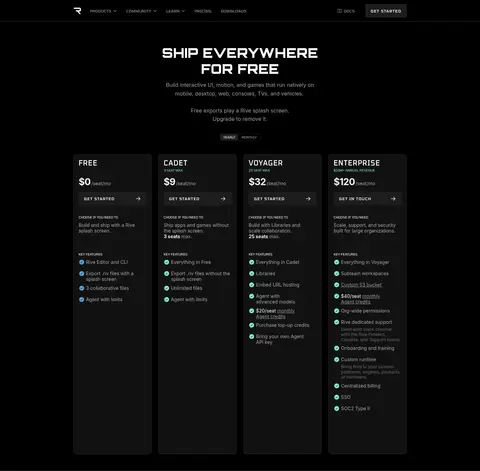
Compact uppercase Tomorrow labels on black, with the Rive mark, navigation links, docs access, and a subdued GET STARTED control.
Hero preview rail
A vertical stack of labeled product and use-case media previews, paired with the hero copy in a two-column layout.
CLI and editor panel
A dark #111111 product panel grouping a CLI label, platform choices, terminal command, editor label, and compact action buttons.
Feature split
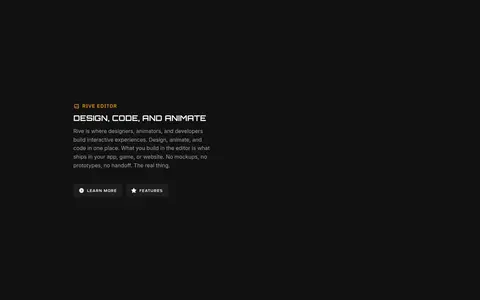
Two-column product section with a compact uppercase eyebrow and headline, supporting paragraph, and restrained dark action buttons.
Integration grid
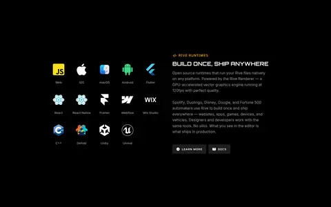
A multi-column field of platform and tool marks next to runtime copy; logos may retain their product colors.
Testimonial cards
Dense, dark review cards with small avatars, author details, and muted supporting text grouped beneath customer proof.
Newsletter and footer
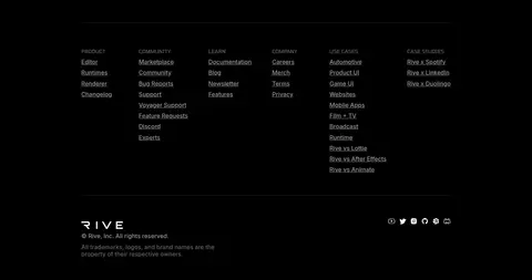
Simple email signup above multi-column link groups, separated by fine horizontal rules on the black background.
Imagery · Treat product interfaces and motion previews as the primary imagery, not decorative photography. The hero uses stacked, labeled preview panels alongside the product pitch; later sections show editor or runtime material and integration logos. Keep media framed simply against the dark canvas, with restrained edges and no invented color overlays. Individual logos or artwork may introduce color, but the overall page identity remains grayscale.
Use black and charcoal as the page’s structural colors.
Reserve strong white contrast for headings and key navigation.
Set major headings in uppercase Orbitron.
Use Tomorrow for compact uppercase labels and navigation.
Let product previews and real interface details carry the visual story.
Alternate section bands to clarify long-page progression.
✕ 不该做
Do not introduce a bright branded accent color absent from the measured palette.
Do not use gradients or colorful backgrounds to separate sections.
Do not make every paragraph or caption white.
Do not replace the product-led imagery with generic stock photography.
Do not add large shadows or glossy card effects.
Do not turn the compact technical labels into oversized navigation.
给 AI 的提示词
想快速出一个同风格的新页面,把这段话连同 DESIGN.md 一起发给 AI。
Build a new page in Rive’s restrained, technical visual style. Use Absolute Black (#000000) as the main canvas and Graphite Canvas (#111111) for selected feature bands and panels; reserve Studio White (#ffffff) for strong headings and key labels, with Soft Ash (#999999) and Cool Gray (#a0a0a0) for supporting copy. Set display headings in bold uppercase Orbitron, body text in Inter Display, and compact navigation or eyebrows in Tomorrow. Use a centered constrained content frame, two-column feature layouts, generous dark negative space, and tighter spacing within controls. Make product UI, motion previews, and integrations the core imagery. Keep buttons and cards subdued, favoring simple dark fills and fine separation over shadows, gradients, or decorative color.