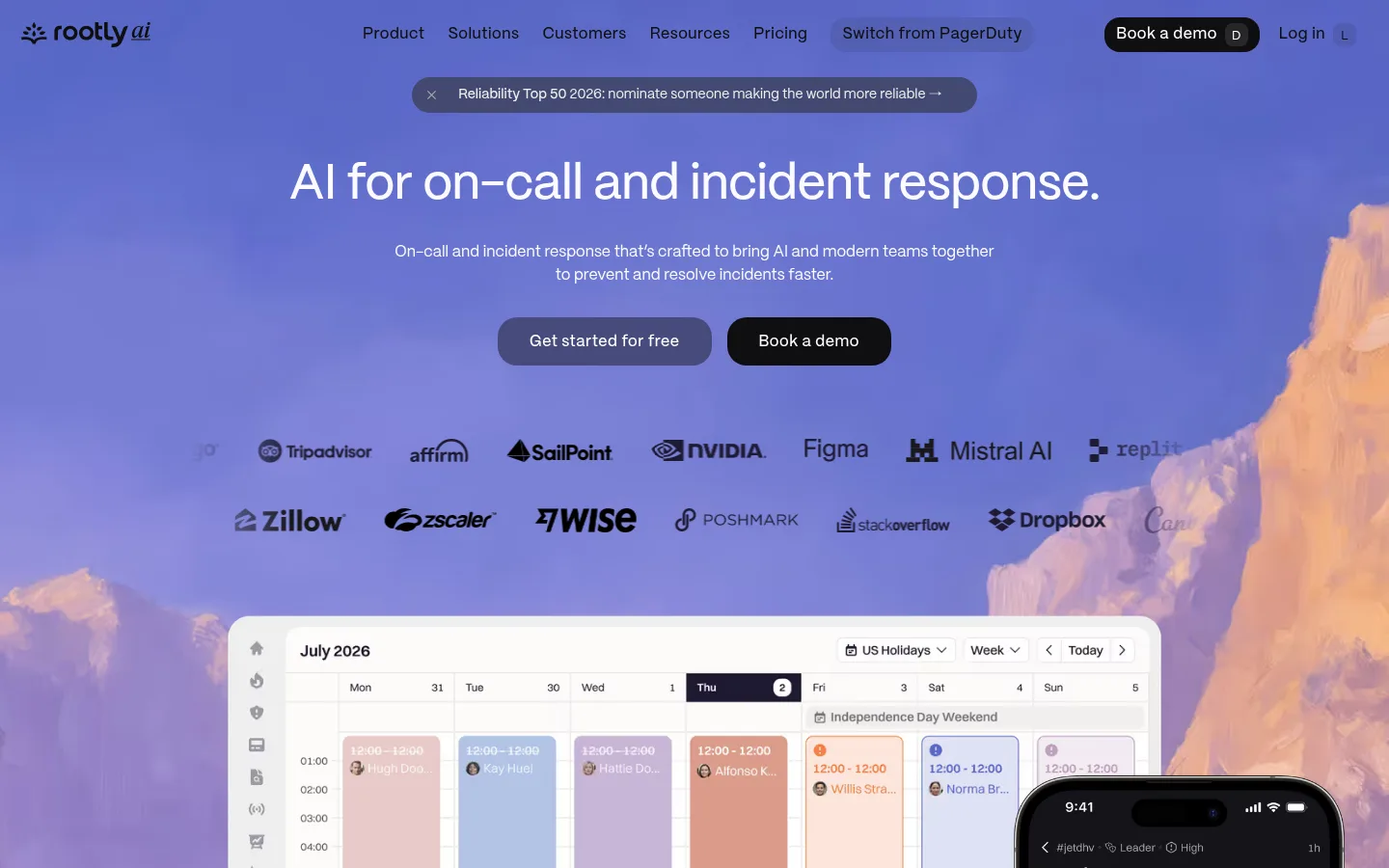
Rootly以清爽宽松的SaaS页面搭配紫色与桃色天空画面,让事件管理产品显得亲切易懂。克制的字体和充足留白让产品界面与转化入口一目了然。
North star · Keep the page calm and product-led, using expressive violet-and-peach imagery as a frame rather than a substitute for clear UI.
The homepage balances a white editorial canvas with a highly distinctive violet-and-peach visual world. The opening viewport places white hero copy and dark navigation over a full-bleed sky image; the imagery then reappears as a frame behind product UI, giving otherwise restrained feature sections a consistent brand signature. PP Mori supplies rounded, human sans-serif forms: medium-weight headlines are compact and confident, while regular body copy stays readable and understated. Content alternates between concise feature introductions and broad product demonstrations, with generous vertical pauses between sections. Soft lavender surfaces distinguish selected cards and the customer-proof band without fragmenting the mostly white page. Pill-shaped CTAs and rounded media containers soften the interface; the black footer provides a clear visual stop. Keep product screenshots legible and let imagery support, rather than compete with, the interface.
配色 点色块复制色值。用途说明来自对页面的实测位置(背景、文字、描边、按钮)与截图判读。
品牌色
Deep Iris
#4a3e8a
Strong violet end of the nav gradient; reinforce brand identity sparingly.
强调色
Root Violet
#6d55bd
Accent text and buttons; also the vivid violet stop in brand gradients.
表层色
Gallery White
#ffffff
Main page canvas, navigation and light media/card areas; preserves the airy section rhythm.
Slate Panel
#3e4361
Dark blue-gray panel color, most notably in navigation-related surfaces and UI imagery.
Lavender Mist
#f7f5ff
Pale lavender section and button surface that gently distinguishes selected content.
Lilac Card
#ebe5ff
Lavender card and link background, visible in comparison and customer-story treatments.
中性色
Root Ink
#100f12
Primary headings and body text, navigation labels, dark primary buttons, and the footer surface.
Quiet Graphite
#65646e
Muted supporting copy and secondary text on light backgrounds.
Soft Divider
#eaeaea
Quiet separator or secondary text detail, especially against dark UI surfaces.
功能色
Sky Hairline
#91cdfb
Measured border hue; use only for subtle outlines or focus-like details, not large surfaces.
Peach Cloud
#f8bfa9
Border color captured in navigation-area details; peach is more prominent in the decorative sky artwork.
Mint Signal
#8ce5d0
Measured border detail and occasional status-like interface accent, not a dominant brand surface.
文字 背景 对比度 WCAG #100f12 Root Ink#ffffff Gallery White19.11:1 AAA #100f12 Root Ink#3e4361 Slate Panel1.98:1 不达标 #100f12 Root Ink#f7f5ff Lavender Mist17.71:1 AAA #65646e Quiet Graphite#ffffff Gallery White5.83:1 AA #65646e Quiet Graphite#100f12 Root Ink3.28:1 AA-large #65646e Quiet Graphite#3e4361 Slate Panel1.65:1 不达标
字体 字号阶梯:Perfect Fifth(比例约 1.472,正文 16px)。示例用免费替代字体渲染,数值为实测。
Aa 设计
PP Mori 网络字体 · 字重 400 / 500 / 200 / 600 · 占比 100%
免费替代:Inter
Site-wide typography for hero and section headings, body copy, navigation, captions, and buttons.
角色 示例 字号 字重 行高 字距 一级标题 Centered hero headline; large, medium-weight, tightly tracked.
Rootly
51px 500 1.03 -0.01em 二级标题 Feature and CTA headlines; medium weight with compact line height.
Rootly
32px 500 1.1 -0.01em 三级标题 Card and sub-feature headings; concise, medium-weight labels.
The quick brown fox 敏捷的狐狸
20px 500 1.2 0 正文 Product descriptions, testimonials, and explanatory copy.
The quick brown fox 敏捷的狐狸
16px 400 1.47 0 辅助文字 Small feature labels, customer attribution, and UI supporting text.
The quick brown fox 敏捷的狐狸
13px 400 1.47 0 按钮 CTA labels in medium weight, with slight positive tracking.
The quick brown fox 敏捷的狐狸
16px 500 1 0.03em 导航 Light-weight primary navigation labels.
The quick brown fox 敏捷的狐狸
16px 200 1 0
间距与布局 基准单位 4px · 密度:宽松
115px 版块间距
8px 元素间距
41px 卡片内边距
1171px 内容最大宽度
4px
8px
12px
16px
20px
22px
24px
32px
48px
64px
115px
Use a spacious, centered content system capped at the measured 1171px page width. The hero is centered over full-bleed artwork; most feature sections use two-column text-and-product layouts, while selected showcases span broadly. Leave substantial vertical breathing room between sections and keep card groupings tidy. Align feature introductions to the left and reserve centered alignment for the hero, customer-switch band, and closing CTA. The overall density is low, with the footer as a compact multi-column directory.
圆角与层次 没有测到阴影:页面是扁平的,层次靠底色和描边区分。
The page is largely flat: white canvas, pale lavender card surfaces, and subtle separation through spacing rather than heavy shadows. Use rounded cards and media frames for soft layering. Product imagery can overlap sky backgrounds, and the dark footer supplies the strongest contrast; avoid adding conspicuous shadow systems or dense borders.
组件 下面的预览按实测的按钮、输入框、徽标、卡片样式重建(字体用替代字体)。
Hero and announcement Centered hero content and slim announcement pill over a full-bleed violet-and-peach sky; place primary actions below the supporting copy.
Pill CTA Rounded action buttons with medium PP Mori labels; pair dark ink buttons with lavender or muted secondary treatments.
Feature split Left-aligned feature heading and description paired with a large product demonstration; use two-column composition and generous whitespace.
Sky-framed product media Present crisp product UI over or within the recurring painterly sky artwork, using rounded media framing.
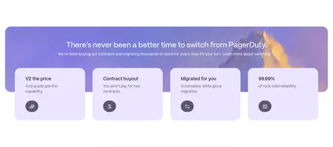
Switching cards Lavender promotional band with a centered switching message and four light cards summarizing price, contract buyout, migration, and reliability.
Customer proof Pale lavender section combining review or recognition marks with customer-story cards and restrained attribution.
Footer directory Near-black footer with grouped link columns, small utility text, and a prominent Rootly wordmark.
Imagery · Use painterly, soft-focus violet skies with peach cloud forms as the recurring visual signature, especially in the hero and behind product demonstrations. Frame crisp screenshots of calendars, incident threads, analysis, retrospectives, and status pages in rounded media containers. Customer logos and portraits provide proof and scale. Keep screenshot content readable; decorative art should sit behind or around the interface rather than obscure it.
页面版块 共 11 个版块,按页面从上到下排列,每个都标了类型、布局和交互套路。
该做与不该做 ✓ 该做 Use white as the default content canvas. Keep headings concise, medium-weight, and easy to scan. Reserve violet-and-peach sky art for hero and media framing. Give product screenshots visual priority over decoration. Use lavender surfaces to mark selected cards and proof sections. Keep CTAs rounded and clearly separated from body copy. Preserve generous vertical space between feature blocks. ✕ 不该做 Do not spread saturated violet across every section. Do not place decorative artwork over important product details. Do not crowd feature copy and screenshots into dense layouts. Do not introduce heavy shadows or a thick border system. Do not make headings all-caps or overly bold. Do not turn every card into a colored panel. Do not let the footer's dark palette leak into the main canvas. 给 AI 的提示词 想快速出一个同风格的新页面,把这段话连同 DESIGN.md 一起发给 AI。
复制 Build a new Rootly-style SaaS page with a bright, spacious canvas and a clear product-first hierarchy. Use Gallery White (#ffffff) as the main surface, Root Ink (#100f12) for primary text and dark actions, Quiet Graphite (#65646e) for supporting copy, and Root Violet (#6d55bd) with Deep Iris (#4a3e8a) as restrained accents. Use Lavender Mist (#f7f5ff) and Lilac Card (#ebe5ff) for selective cards or proof bands. Set typography in PP Mori or a close sans-serif substitute, using medium, compact headlines and regular body text. Favor a centered hero, two-column feature sections, broad rounded product demonstrations, and generous whitespace. Use painterly violet-and-peach skies as occasional framing behind crisp UI. Keep elevation subtle; finish with a distinct ink-dark footer.
DESIGN.md Tailwind v4 CSS 变量 Design Tokens
---
title: "Rootly design system"
variant: extended
source: https://rootly.com/
captured_at: 2026-10-12
theme: light
industry: saas
generator: Design DNA (https://four.wiralomi.com/style/rootly-com)
ai_generated: true
ai_label: "本文件由 AI 辅助生成:数值取自公开网页的实测样式,命名、用途说明与建议为模型解读。商标归原所有者。 / AI-assisted content"
---
# Rootly · Design System
> Calm product clarity against expressive skies
**Theme:** light · **Industry:** saas · **Source:** https://rootly.com/ · **Captured:** 2026-10-12 (1440×900 desktop)
_AI-assisted content: values are measured from the public page at capture time; names, roles and guidance are model-written interpretations. Trademarks belong to their owners._
Rootly pairs a clean, spacious SaaS layout with vivid violet-and-peach sky imagery to make incident management feel approachable. Quiet typography and generous white space keep product interfaces and conversion paths easy to scan.
## North star
Keep the page calm and product-led, using expressive violet-and-peach imagery as a frame rather than a substitute for clear UI.
## Overview
The homepage balances a white editorial canvas with a highly distinctive violet-and-peach visual world. The opening viewport places white hero copy and dark navigation over a full-bleed sky image; the imagery then reappears as a frame behind product UI, giving otherwise restrained feature sections a consistent brand signature. PP Mori supplies rounded, human sans-serif forms: medium-weight headlines are compact and confident, while regular body copy stays readable and understated. Content alternates between concise feature introductions and broad product demonstrations, with generous vertical pauses between sections. Soft lavender surfaces distinguish selected cards and the customer-proof band without fragmenting the mostly white page. Pill-shaped CTAs and rounded media containers soften the interface; the black footer provides a clear visual stop. Keep product screenshots legible and let imagery support, rather than compete with, the interface.
## Colors
| Name | Hex | Token | Group | Role |
|---|---|---|---|---|
| Gallery White | ` | `--color-gallery-white` | surface | Main page canvas, navigation and light media/card areas; preserves the airy section rhythm. |
| Root Ink | ` | `--color-root-ink` | neutral | Primary headings and body text, navigation labels, dark primary buttons, and the footer surface. |
| Deep Iris | ` | `--color-deep-iris` | brand | Strong violet end of the nav gradient; reinforce brand identity sparingly. |
| Quiet Graphite | ` | `--color-quiet-graphite` | neutral | Muted supporting copy and secondary text on light backgrounds. |
| Root Violet | ` | `--color-root-violet` | accent | Accent text and buttons; also the vivid violet stop in brand gradients. |
| Slate Panel | ` | `--color-slate-panel` | surface | Dark blue-gray panel color, most notably in navigation-related surfaces and UI imagery. |
| Sky Hairline | ` | `--color-sky-hairline` | semantic | Measured border hue; use only for subtle outlines or focus-like details, not large surfaces. |
| Peach Cloud | ` | `--color-peach-cloud` | semantic | Border color captured in navigation-area details; peach is more prominent in the decorative sky artwork. |
| Mint Signal | ` | `--color-mint-signal` | semantic | Measured border detail and occasional status-like interface accent, not a dominant brand surface. |
| Soft Divider | ` | `--color-soft-divider` | neutral | Quiet separator or secondary text detail, especially against dark UI surfaces. |
| Lavender Mist | ` | `--color-lavender-mist` | surface | Pale lavender section and button surface that gently distinguishes selected content. |
| Lilac Card | ` | `--color-lilac-card` | surface | Lavender card and link background, visible in comparison and customer-story treatments. |
### Semantic aliases
`--color-canvas` → ` (Gallery White) · `--color-surface` → ` (Root Ink) · `--color-surface-2` → ` (Slate Panel) · `--color-surface-3` → ` (Lavender Mist) · `--color-surface-4` → ` (Lilac Card) · `--color-text` → ` (Root Ink) · `--color-text-muted` → ` (Quiet Graphite) · `--color-text-subtle` → ` (Gallery White) · `--color-border` → ` (Sky Hairline) · `--color-accent` → ` (Deep Iris) · `--color-accent-2` → ` (Root Violet)
### Contrast (WCAG 2.x)
| Text | Background | Ratio | Level |
|---|---|---|---|
| ` | ` | 19.11:1 | AAA |
| ` | ` | 1.98:1 | fail |
| ` | ` | 17.71:1 | AAA |
| ` | ` | 5.83:1 | AA |
| ` | ` | 3.28:1 | AA-large |
| ` | ` | 1.65:1 | fail |
| ` | ` | 5.4:1 | AA |
| ` | ` | 19.11:1 | AAA |
| ` | ` | 9.63:1 | AAA |
| ` | ` | 1.08:1 | fail |
### Gradients
- `linear-gradient(45deg, rgb(74, 62, 138), rgba(0, 0, 0, 0))`
- `linear-gradient(112deg, rgb(109, 85, 189), rgb(173, 63, 104) 80%)`
## Typography
| Family | Token | Source | Weights | Role | Free substitute |
|---|---|---|---|---|---|
| PP Mori | `--font-body` | webfont | 400, 500, 200, 600 | Site-wide typography for hero and section headings, body copy, navigation, captions, and buttons. | Inter |
- **PP Mori:** Use clean sans-serif shapes; headings are medium weight with slightly tight tracking, body is regular, and buttons are medium without uppercase styling.
### Type scale — Perfect Fifth (ratio ≈ 1.472, base 16px)
| Role | Size | Weight | Line height | Letter spacing | Case | Family | Used for |
|---|---|---|---|---|---|---|---|
| h1 | 51px | 500 | 1.03 | -0.01em | — | PP Mori | Centered hero headline; large, medium-weight, tightly tracked. |
| h2 | 32px | 500 | 1.1 | -0.01em | — | PP Mori | Feature and CTA headlines; medium weight with compact line height. |
| h3 | 20px | 500 | 1.2 | 0 | — | PP Mori | Card and sub-feature headings; concise, medium-weight labels. |
| body | 16px | 400 | 1.47 | 0 | — | PP Mori | Product descriptions, testimonials, and explanatory copy. |
| caption | 13px | 400 | 1.47 | 0 | — | PP Mori | Small feature labels, customer attribution, and UI supporting text. |
| button | 16px | 500 | 1 | 0.03em | — | PP Mori | CTA labels in medium weight, with slight positive tracking. |
| nav | 16px | 200 | 1 | 0 | — | PP Mori | Light-weight primary navigation labels. |
## Spacing & layout
- Base unit **4px**, density **spacious**.
- Scale (most used values): 4, 8, 12, 16, 20, 22, 24, 32, 48, 64, 115 px.
- Section rhythm 115px · element gap 8px · card padding 41px · max content width 1171px.
Use a spacious, centered content system capped at the measured 1171px page width. The hero is centered over full-bleed artwork; most feature sections use two-column text-and-product layouts, while selected showcases span broadly. Leave substantial vertical breathing room between sections and keep card groupings tidy. Align feature introductions to the left and reserve centered alignment for the hero, customer-switch band, and closing CTA. The overall density is low, with the footer as a compact multi-column directory.
## Shape & elevation
- Radius: button `9999px` · card `20px` · media `16px` · nav `12px` · link `20px` · xs `8px` · sm `12px` · md `16px` · lg `20px` · xl `24px` · 2xl `32px` · pill `9999px`
- No box shadows measured: the page is flat.
- Motion: standard transition `0.3s cubic-bezier(0.33, 1, 0.68, 1)` on interactive elements.
The page is largely flat: white canvas, pale lavender card surfaces, and subtle separation through spacing rather than heavy shadows. Use rounded cards and media frames for soft layering. Product imagery can overlap sky backgrounds, and the dark footer supplies the strongest contrast; avoid adding conspicuous shadow systems or dense borders.
## Imagery
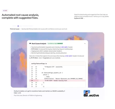
Use painterly, soft-focus violet skies with peach cloud forms as the recurring visual signature, especially in the hero and behind product demonstrations. Frame crisp screenshots of calendars, incident threads, analysis, retrospectives, and status pages in rounded media containers. Customer logos and portraits provide proof and scale. Keep screenshot content readable; decorative art should sit behind or around the interface rather than obscure it.
## Components
### Hero and announcement
Centered hero content and slim announcement pill over a full-bleed violet-and-peach sky; place primary actions below the supporting copy.
### Pill CTA
Rounded action buttons with medium PP Mori labels; pair dark ink buttons with lavender or muted secondary treatments.
### Feature split
Left-aligned feature heading and description paired with a large product demonstration; use two-column composition and generous whitespace.
### Sky-framed product media
Present crisp product UI over or within the recurring painterly sky artwork, using rounded media framing.
### Switching cards
Lavender promotional band with a centered switching message and four light cards summarizing price, contract buyout, migration, and reliability.
### Customer proof
Pale lavender section combining review or recognition marks with customer-story cards and restrained attribution.
### Footer directory
Near-black footer with grouped link columns, small utility text, and a prominent Rootly wordmark.
### Measured component styles
- **Primary button** (“Investigate”): background ## Do
- Use white as the default content canvas.
- Keep headings concise, medium-weight, and easy to scan.
- Reserve violet-and-peach sky art for hero and media framing.
- Give product screenshots visual priority over decoration.
- Use lavender surfaces to mark selected cards and proof sections.
- Keep CTAs rounded and clearly separated from body copy.
- Preserve generous vertical space between feature blocks.
## Don't
- Do not spread saturated violet across every section.
- Do not place decorative artwork over important product details.
- Do not crowd feature copy and screenshots into dense layouts.
- Do not introduce heavy shadows or a thick border system.
- Do not make headings all-caps or overly bold.
- Do not turn every card into a colored panel.
- Do not let the footer's dark palette leak into the main canvas.
## Agent prompt
Build a new Rootly-style SaaS page with a bright, spacious canvas and a clear product-first hierarchy. Use Gallery White (## Page sections (top to bottom)
| # | Type | Layout | UX patterns | UI patterns |
|---|---|---|---|---|
| 1 | hero | Full-bleed illustrated hero; centered headline, supporting copy, actions, logos, and layered product UI. | Announcement link, Primary and secondary CTA, Customer logo proof | Sky gradient artwork, Centered white headline, Rounded dark CTA |
| 2 | comparison | Wide centered promotional band above a row of four comparison cards. | Switching guidance link, Benefit scan | Lavender band, Four rounded cards, Compact feature icons |
| 3 | feature-split | Two-column feature introduction followed by a wide product demonstration. | Explore feature link, Product proof | Small category label, Rounded screenshot frame, Customer attribution |
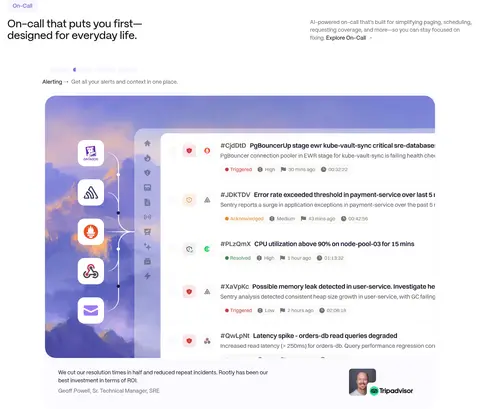
| 4 | feature-split | Two-column introduction with a broad on-call workflow demonstration below. | Feature exploration, Workflow preview | Category label, Large media frame, Testimonial attribution |
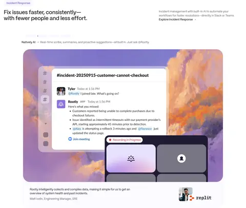
| 5 | feature-split | Two-column feature copy paired with a wide incident interface demonstration. | Explore incident response, In-context product proof | Rounded UI media, Sky artwork backdrop, Customer logo |
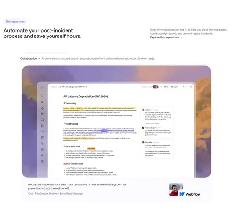
| 6 | feature-split | Two-column introduction above a broad retrospective product preview. | Feature exploration, Workflow explanation | Category label, Rounded screenshot, Customer quote attribution |
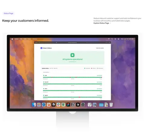
| 7 | product-showcase | Single-column introduction followed by a full-width desktop status-page mockup. | Explore status page, Product preview | Large device frame, Sky backdrop, Operational status panel |
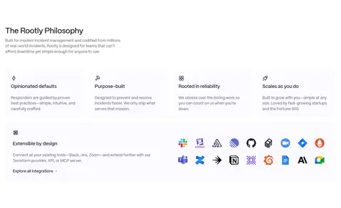
| 8 | feature-grid | Introductory content followed by four philosophy cards and a broad integrations row. | Explore integrations, Feature scan | Compact icon cards, Integration logo strip, Open white layout |
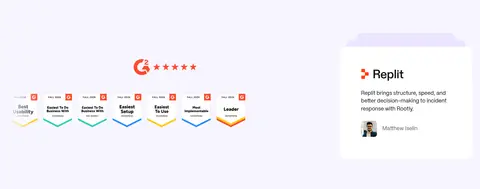
| 9 | testimonials | Pale lavender band with recognition marks and customer-story cards. | Customer proof, Case-study links | Lavender background, Review marks, Rounded quote card |
| 10 | cta | Centered closing headline with paired action buttons on a white canvas. | Free-start action, Demo action | Centered headline, Pill-shaped buttons, Minimal surroundings |
| 11 | footer | Dark footer with four link groups, a product-awareness prompt, and a large brand mark. | Grouped navigation, Newsletter or search inputs, Legal links | Ink-dark surface, Muted link columns, Large white wordmark |
## Source CSS custom properties (selected)
```css
--color-accent: