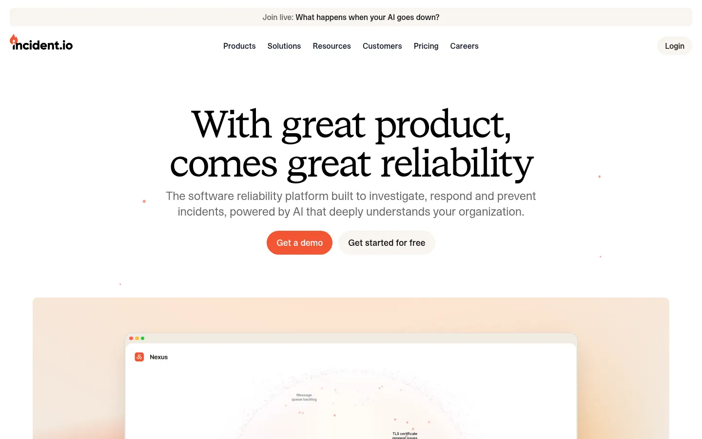
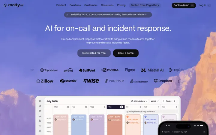
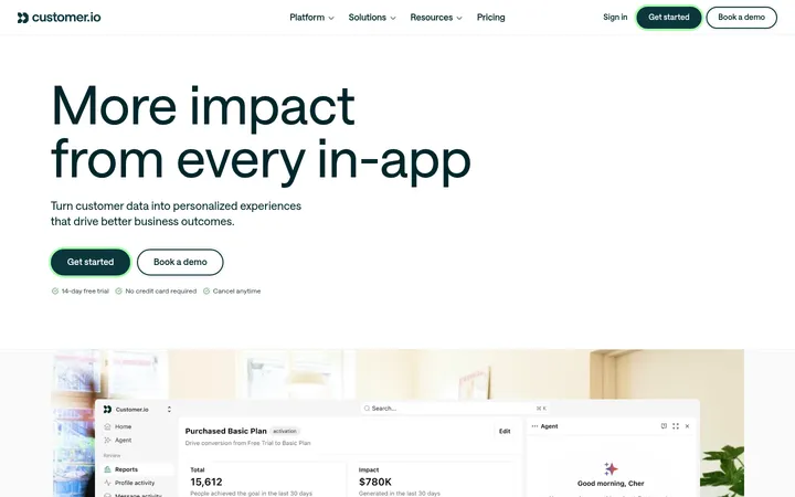
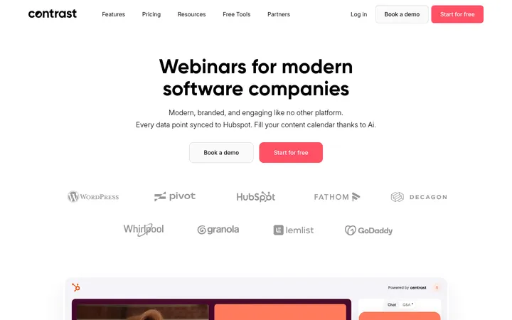
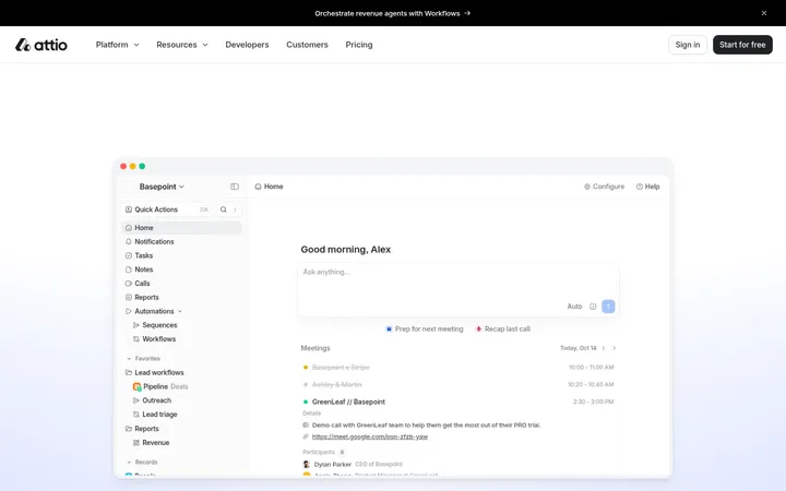
North star · Use generous white space and warm product panels to let editorial serif messaging lead, reserving coral for decisive actions and visual signals.
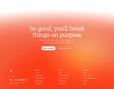
The visual system balances a predominantly white canvas with warm cream section bands and product panels, using coral as a concentrated signal for primary actions, inline emphasis and large atmospheric gradients. Headings use STKBureauSerif: large, regular-weight, tightly tracked, and centered in the hero; STKBureauSans keeps navigation, body copy and controls crisp and practical. Layout is spacious and editorial, with centered hero messaging, broad product visuals, logo and customer-proof interludes, then repeated feature split cards. Product screenshots sit inside pale, softly tinted frames rather than being isolated on stark white. Warm gradients range from pale apricot to saturated coral, especially around the hero product visualization and final CTA. Rounded pill buttons contrast with modestly rounded cards; thin warm borders and restrained shadows support layered UI without making the page feel heavy.
Navigation, body copy, buttons, cards and supporting interface text.
Aa 设计
STKBureauSerif
网络字体 · 字重 400 · 占比 10%
免费替代:DM Serif Display
Display headlines and major section headings.
Aa 设计
Geist Mono
网络字体 · 字重 400 · 占比 1%
免费替代:IBM Plex Mono
Small code or technical labels where a monospace treatment is needed.
角色
示例
字号
字重
行高
字距
特大标题
Oversized editorial statement headlines, led by the centered hero.
incident.io
80px
400
1
-0.04em
一级标题
Primary page headline or prominent campaign heading.
incident.io
60px
400
1.1
-0.03em
二级标题
Major feature and platform section headings.
incident.io
44px
400
1.1
-0.03em
三级标题
Feature-card and customer-story titles.
incident.io
36px
400
1.15
-0.025em
四级标题
Smaller card headings and strong subheads.
The quick brown fox 敏捷的狐狸
24px
500
1.3
-0.01em
正文
Explanatory paragraphs, product descriptions, and testimonials.
The quick brown fox 敏捷的狐狸
18px
400
1.4
-0.01em
辅助文字
Navigation details, metadata, labels, and small supporting copy.
The quick brown fox 敏捷的狐狸
13px
400
1.4
-0.01em
按钮
Primary and secondary CTA labels.
The quick brown fox 敏捷的狐狸
18px
500
1.4
-0.01em
导航
Top-level navigation and compact menu labels.
The quick brown fox 敏捷的狐狸
13px
400
1.4
-0.01em
链接
Inline calls to action and feature discovery links.
The quick brown fox 敏捷的狐狸
18px
500
1.4
-0.01em
代码
Technical snippets or compact monospace interface details.
const style = 1;
12px
400
1.33
0
间距与布局
基准单位 4px · 密度:宽松
112px版块间距
8px元素间距
48px卡片内边距
—内容最大宽度
4px
8px
10px
12px
16px
20px
24px
32px
40px
48px
A spacious, vertically flowing marketing page built from centered headline blocks and broad content areas. The hero centers copy and paired CTAs above a large framed product visual. Customer logos and proof sections create pauses between feature bands; later sections use repeated split layouts pairing concise copy and testimonial snippets with product UI. Preserve generous separation between sections and restrained content density. The measured data does not specify a page max width, so follow the screenshot's broad centered composition rather than imposing an invented dimension.
圆角与层次
按钮 · 9999px
卡片 · 8px
图片 · 50%
导航 · 4px
链接 · 8px
xl · card, button
sm · card
md · card
md · media
Most surfaces are flat, with warm hairline borders defining selected cards and panels. Product media and occasional cards use restrained, soft shadows to separate layers from pale backgrounds. Keep the visual hierarchy calm: rounded card edges and floating UI elements provide depth without heavy outlines or dark drop shadows.
组件
下面的预览按实测的按钮、输入框、徽标、卡片样式重建(字体用替代字体)。
Announcement strip
A narrow warm-neutral banner above the navigation, centered on a short event or product announcement.
Primary CTA
Coral pill button with light text; measured styling uses 18px medium STKBureauSans and 12px 20px padding.
Secondary CTA
Pale cream pill button with near-ink text, paired beside the coral primary action.
Product showcase frame
Large product UI visual in a softly tinted warm panel, with an ambient coral-to-apricot gradient.
Feature split card
Warm cream panel pairing a concise serif-led feature description and testimonial with a product screenshot.
Customer proof block
Logo row or customer story with concise result copy, attribution, and optional contained video preview.
Imagery · The page relies on product-interface screenshots and diagrams rather than decorative photography. Frame screenshots within warm cream panels, with soft ambient apricot and coral gradients behind hero visuals. Use customer logos, testimonial media and small interface details as proof; keep controls and product text legible. Video appears as a contained customer-story preview.
Keep the canvas predominantly white and introduce warm cream in defined content bands.
Use coral for primary actions and selective emphasis, not as a universal text color.
Set major messaging in a large, regular-weight editorial serif.
Pair product screenshots with pale warm frames and soft ambient gradients.
Alternate spacious centered moments with clear copy-and-product split layouts.
Use subtle borders and restrained shadows to distinguish layered surfaces.
✕ 不该做
Do not fill the whole page with saturated coral.
Do not replace the serif display voice with bold geometric headings.
Do not crowd feature cards or remove the generous section pauses.
Do not use heavy dark borders or pronounced shadows.
Do not let decorative gradients reduce product screenshot legibility.
Do not add unmeasured colors, dimensions, spacing values, or radii.
给 AI 的提示词
想快速出一个同风格的新页面,把这段话连同 DESIGN.md 一起发给 AI。
Build a new incident.io-style SaaS page with a predominantly Gallery White (#ffffff) canvas, warm Oat Milk (#f8f5f0) content panels, and Signal Coral (#f25533) reserved for primary actions and selective emphasis. Use an editorial serif such as DM Serif Display for large, regular-weight, tightly tracked headlines; use Inter-like sans-serif for navigation, body copy, and controls. Create a centered hero with concise messaging, paired pill CTAs, and a broad product-interface visual in a soft apricot-to-coral gradient. Follow with customer proof and spacious feature splits that pair short copy and testimonials with legible UI screenshots. Use Linen Edge (#f1ebe2) or Pebble Line (#e7e4df) for understated boundaries, and keep shadows soft. Match the page's calm density; avoid invented measurements and extra palette colors.