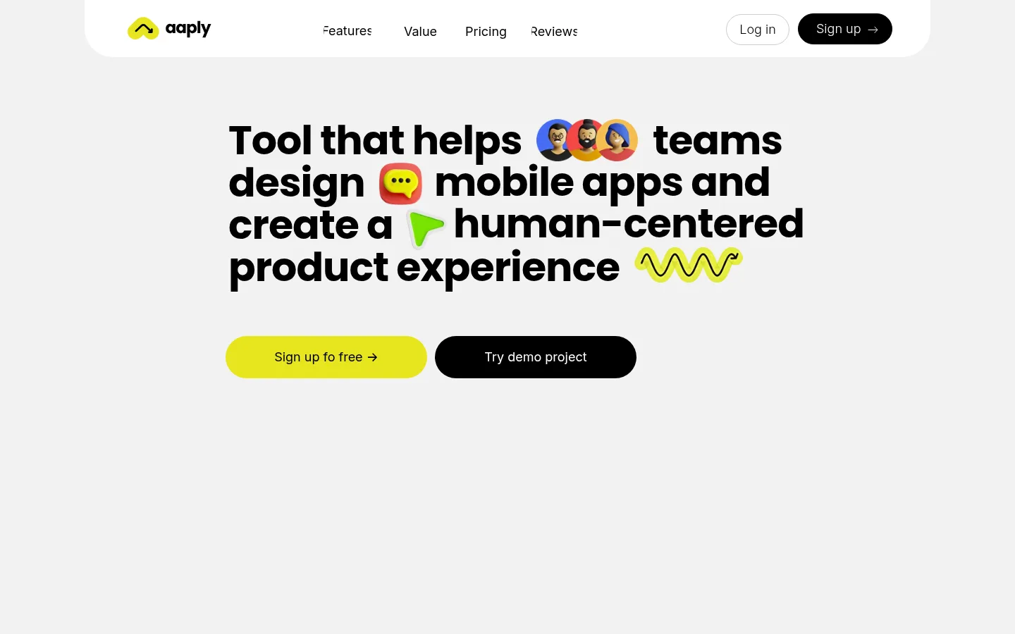
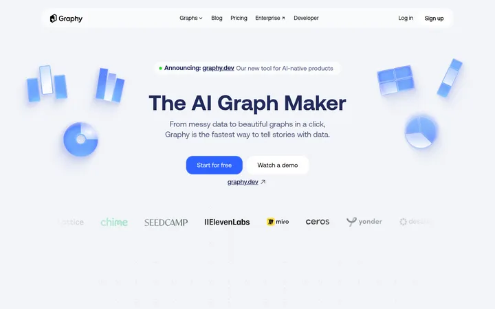
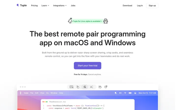
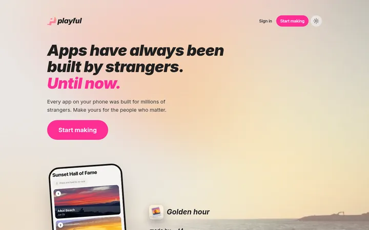
North star · Keep the page spacious and typographically bold, using lemon yellow for decisive actions and colorful visuals as contained accents.
The visual strategy centers on restraint interrupted by vivid, playful moments. A pale gray canvas (#f2f2f2) gives the opening hero a quiet field, while white content areas and black type keep the product story crisp and legible. The lemon-yellow accent (#e6e51e) anchors the primary sign-up action and returns as a strong feature band; red and blue appear as secondary accents, especially within colorful feature illustrations and demo cards. Poppins supplies the oversized, heavy headline character, while Inter handles navigation, body copy, and buttons with a more functional voice. The page uses a centered content composition and generous vertical breathing room, then shifts into compact, rounded feature cards that mix short copy with visual demonstrations. Images and playful graphic marks add warmth without displacing the clear black-and-white framework. Pills, soft corners, and thin pale dividers provide structure; elevation stays subtle, so color, typography, and spacing do most of the work.
Navigation, body copy, captions, buttons, and functional interface text.
Aa 设计
Poppins
网络字体 · 字重 500 / 700 / 400 · 占比 36%
免费替代:Outfit
Display headlines and prominent section headings.
角色
示例
字号
字重
行高
字距
特大标题
Oversized hero headline, bold and tightly tracked.
Aaply
57px
700
1.05
-0.018em
一级标题
Primary page heading and prominent feature titles.
Aaply
52px
700
1.56
-0.019em
二级标题
Major section headings and introductory feature copy.
Aaply
34px
500
1.35
0
三级标题
Supporting feature-card headings.
Aaply
31px
500
1.55
0
四级标题
Compact card and subsection headings.
The quick brown fox 敏捷的狐狸
27px
500
1.33
0
正文
Feature descriptions, explanatory copy, and supporting text.
The quick brown fox 敏捷的狐狸
18px
400
1.44
-0.028em
辅助文字
Small labels, notes, and card metadata.
The quick brown fox 敏捷的狐狸
15px
400
1.53
0
导航
Header navigation links and primary menu labels.
The quick brown fox 敏捷的狐狸
18px
400
1.55
0
间距与布局
基准单位 2px · 密度:适中
—版块间距
10px元素间距
—卡片内边距
1128px内容最大宽度
10px
20px
Use a centered content area capped at the measured 1128px maximum width. The hero is centered and isolated within a tall pale canvas, with a compact pill-shaped navigation shell above it and generous vertical space below. Follow with mostly white content sections and a card-based feature sequence; later cards form a two-column arrangement before a wide yellow feature band. The overall density is comfortable: keep copy concise and allow broad gaps between major blocks, while card interiors are more information-rich.
圆角与层次
按钮 · 9999px
导航 · 9999px
链接 · 9999px
md · other
sm · nav
The interface is predominantly flat, with clear section color changes and pale hairlines doing most of the separation. Use restrained shadows only where a floating interface element needs distinction. Rounded pills and cards create the primary sense of layering; avoid heavy shadows or dense borders.
组件
下面的预览按实测的按钮、输入框、徽标、卡片样式重建(字体用替代字体)。
Pill navigation
White rounded header shell with a compact logo, centered link group, outlined login control, and black sign-up pill.
Hero headline
Centered, heavy Poppins display copy on the pale canvas, punctuated by small colorful visual marks.
Primary CTA
Lemon-yellow pill with black Inter text and an arrow; pair with a black, white-text demo CTA.
Feature cards
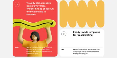
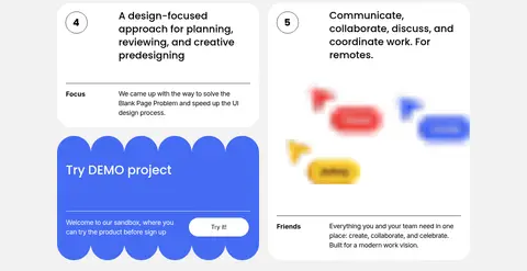
Rounded white or vivid-color panels combining numbered labels, concise copy, thin dividers, and product illustrations.
Demo panel
Bright blue rounded card with short welcome copy and a small white pill action.
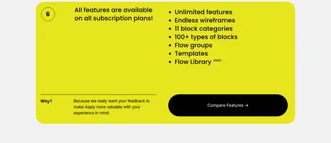
Feature summary band
Wide lemon-yellow rounded panel with a numbered heading, compact bulleted feature list, and dark comparison action.
Dark footer
High-contrast black closing area for final signup content, links, and brand details.
Imagery · Use colorful product demonstrations, playful graphic marks, and illustrated scenes rather than relying on conventional product photography. Keep visuals contained within feature cards and avoid letting their coral, blue, or other illustration colors redefine the brand palette. The hero uses small expressive visual inserts within its headline; below, larger card artwork and demo panels sit alongside explanatory text.
Use Poppins for large, confident display headlines.
Keep functional copy and controls in Inter.
Reserve Lemon Signal (#e6e51e) for key actions and standout bands.
Let the pale canvas and white sections carry generous negative space.
Use rounded pill controls and softly rounded feature cards.
Keep colorful artwork contained within feature demonstrations.
✕ 不该做
Do not crowd the hero with extra content.
Do not make red or blue compete with the primary yellow accent.
Do not use heavy shadows to define ordinary cards.
Do not turn feature sections into dense, text-heavy panels.
Do not replace the clear black text with low-contrast gray.
Do not use sharp, square-edged buttons where the pill treatment is established.
给 AI 的提示词
想快速出一个同风格的新页面,把这段话连同 DESIGN.md 一起发给 AI。
Build a new Aaply-style page with a calm Soft Canvas (#f2f2f2) foundation, Gallery White (#ffffff) content areas, and Studio Ink (#000000) typography. Use Lemon Signal (#e6e51e) for the main action and occasional full-width emphasis; treat Coral Pop (#f34646) and Cobalt Pop (#466cf3) as contained illustration colors. Set expressive display headings in bold Poppins and navigation, body copy, and controls in Inter. Center content within the measured 1128px maximum width. Give the hero ample vertical breathing room, then organize product explanations into rounded, illustration-led cards with concise copy and fine dividers. Use pill-shaped controls, restrained borders, and minimal shadow. Preserve a clean, high-contrast hierarchy and avoid visual clutter.