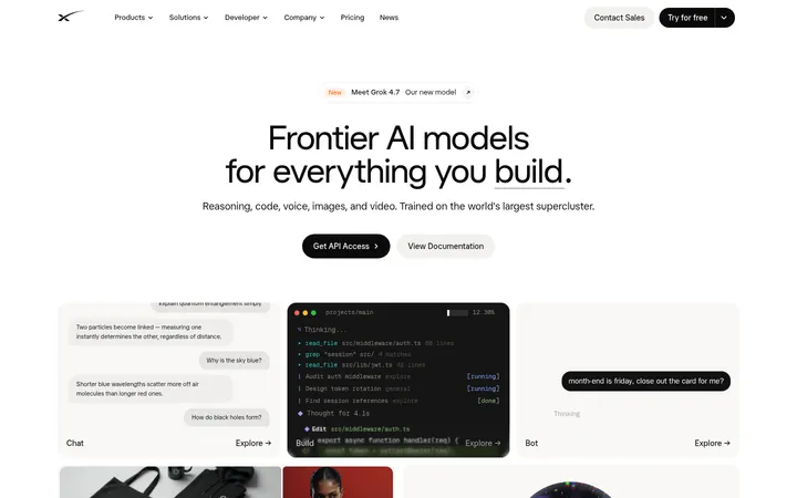
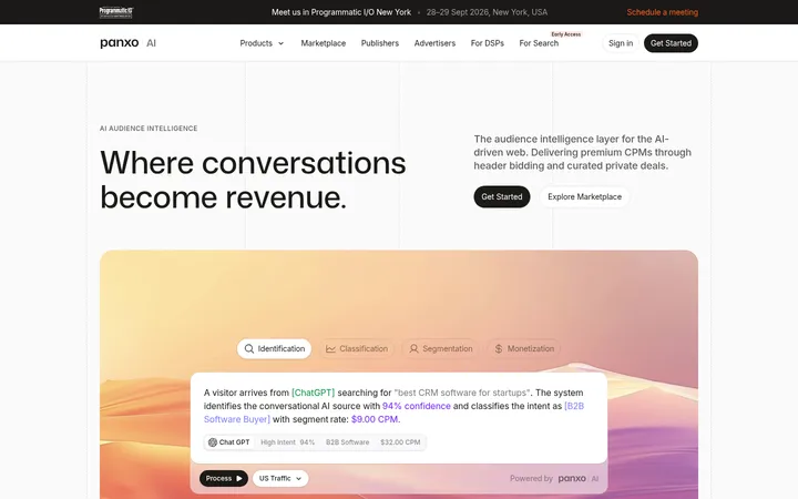
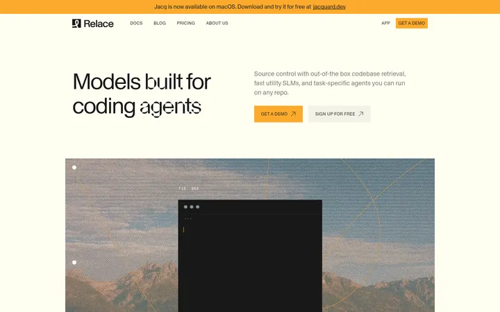
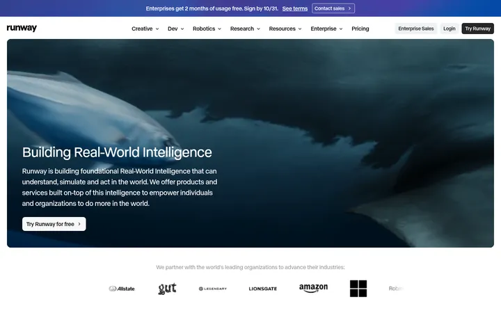
North star · Let restrained editorial typography and warm neutral space frame real customer proof, reserving deep black for the strongest contrast.
The page balances a warm off-white canvas with near-black surfaces, using contrast to distinguish the bright research and product narrative from the cinematic customer-proof band. The palette stays deliberately restrained: muted stone text and fine gray rules support the content, while the white CTA is a clear, high-contrast control. Display and heading copy uses the measured Season Mix-TRIAL Regular face with tight negative tracking, giving the large editorial statements a refined, slightly distinctive silhouette; compact system sans-serif carries navigation, labels, and supporting text. The top hero is full-bleed customer video under a dark overlay, with centered white type and paired actions. Below, a centered content frame organizes logos, research, product UI, and report cards with generous breathing room and thin dividers. The testimonial section reverses to black with image-led cards; the final CTA and footer return to light, ordered layouts.
Navigation, body copy, captions, and compact links.
Aa 设计
Season Mix-TRIAL Regular
网络字体 · 字重 420 · 占比 23%
免费替代:DM Serif Display
Display statements and page headings.
Aa 设计
Geist
网络字体 · 字重 400 / 500 · 占比 6%
免费替代:Geist
Smaller heading and interface emphasis.
角色
示例
字号
字重
行高
字距
特大标题
Large hero statement and prominent editorial headings.
Rox
56px
420
1.2
-0.02em
一级标题
Primary section heading, including major content and CTA blocks.
Rox
30px
420
1.2
-0.02em
二级标题
Secondary section headings and supporting editorial titles.
The quick brown fox 敏捷的狐狸
22px
420
1.2
-0.02em
三级标题
Card and subsection headings.
The quick brown fox 敏捷的狐狸
20px
420
1.2
-0.02em
四级标题
Compact interface or supporting headings.
The quick brown fox 敏捷的狐狸
18px
400
1.4
0
正文
Paragraphs, descriptions, and standard page copy.
The quick brown fox 敏捷的狐狸
14px
400
1.4
0
辅助文字
Small metadata, attribution, and supporting labels.
The quick brown fox 敏捷的狐狸
12px
400
1.4
0
链接
Compact navigation and inline actions.
The quick brown fox 敏捷的狐狸
12px
400
1.4
0
间距与布局
基准单位 2px · 密度:适中
80px版块间距
10px元素间距
—卡片内边距
1100px内容最大宽度
2px
4px
5px
6px
8px
10px
12px
13px
16px
20px
24px
30px
38px
40px
80px
Use a centered content frame with a measured maximum width of 1100px, while allowing the opening video and dark testimonial band to span the viewport. Content sections align mainly left; the closing CTA centers its heading and actions. The page rhythm is comfortable, with a measured section gap of 80px and clear pauses between logo proof, research, product, and news content. Light hairlines divide major regions. Keep the card and report areas orderly rather than dense, using small groups of aligned content and generous surrounding canvas.
圆角与层次
卡片 · 8px
图片 · 10px
链接 · 6px
lg · card
sm · card, other
hairline · link
inset · button
Most light content is flat, separated by fine gray rules rather than prominent containers. The customer-proof cards use measured rounded corners and deeper shadows to lift dark media from the black band. A subtle shadow supports small controls; avoid adding depth to every section or card.
组件
下面的预览按实测的按钮、输入框、徽标、卡片样式重建(字体用替代字体)。
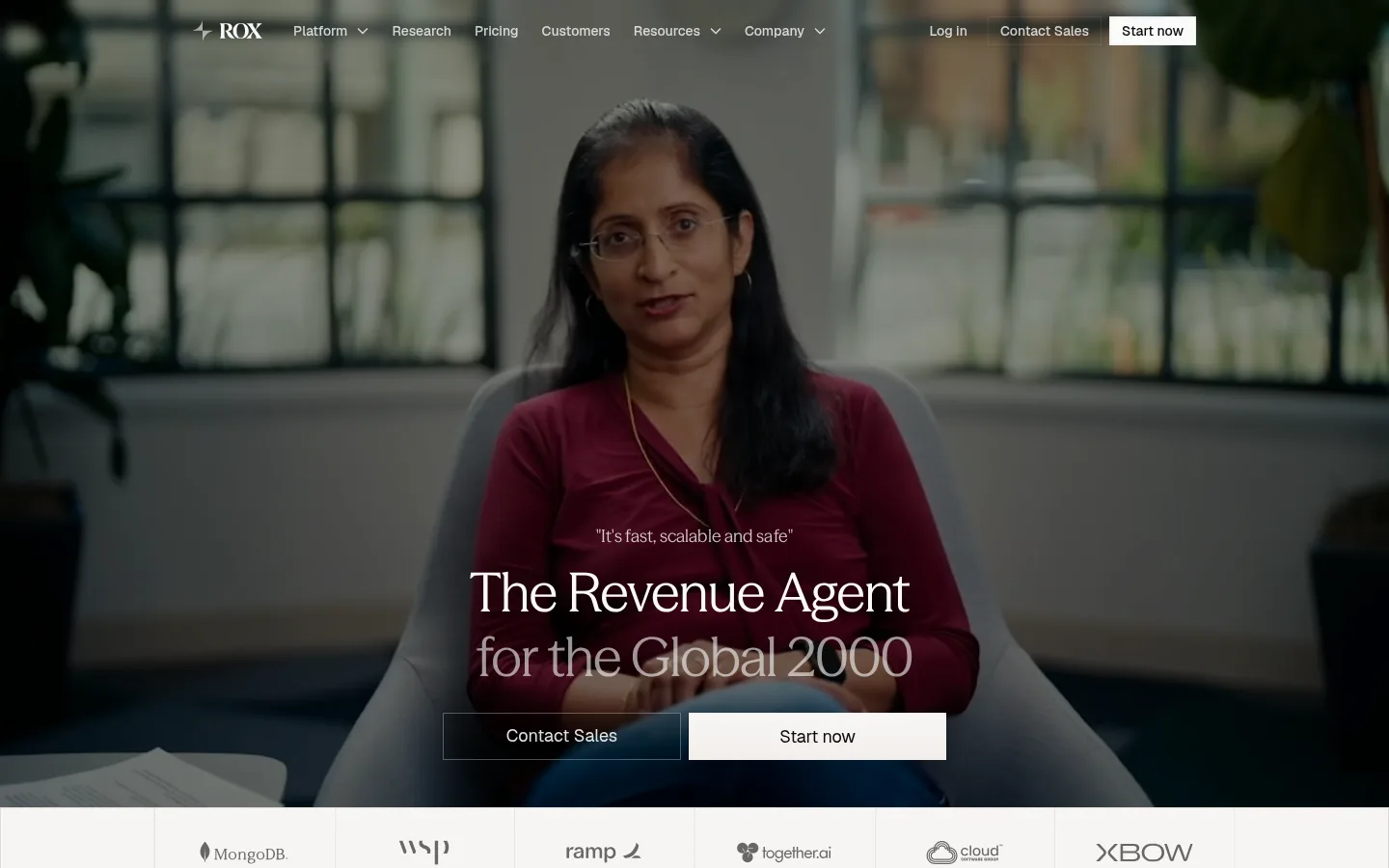
Full-bleed video hero
Customer footage fills the opening viewport beneath a darkened treatment; centered white display copy sits above paired Contact Sales and white Start now actions.
Customer logo strip
A horizontal sequence of monochrome customer marks rests on the light canvas, separated and framed by fine rules.
Research feature
Editorial heading and research links sit alongside a large product-interface image in an airy, aligned content area.
Product showcase
A product headline and compact platform link introduce a broad, light UI capture with supporting report cards below.
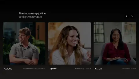
Testimonial cards
Dark story cards with customer video imagery, concise attribution, and strong contrast sit within the black testimonial band.
Closing CTA
Centered heading and concise supporting copy pair Contact Sales with a white Start now action on the light canvas.
Multi-column footer
A structured link directory, small brand/social details, and subdued legal copy close the page on a pale neutral surface.
Imagery · Customer interview video is the defining visual: full-bleed in the hero and reused as image-led testimonial cards, with dark overlays to maintain legible text. Product UI is shown as large, light interface captures, while report cards use restrained editorial thumbnails. Logos and product imagery sit within the page grid. The small amount of burgundy visible belongs to customer footage, not the brand palette.
Reserve #000000 and nearby dark tones for the customer-proof band and dark cards.
Use the display face for large, short editorial statements.
Keep navigation and supporting copy compact and sans-serif.
Use customer video as the main source of visual impact.
Separate major light sections with subtle gray rules.
Keep the closing CTA centered and visually quiet.
✕ 不该做
Do not introduce bright accent colors absent from the measured palette.
Do not turn the page into a dense dashboard layout.
Do not apply heavy shadows to every light card.
Do not treat colors in customer footage as brand colors.
Do not use oversized display typography for navigation or body copy.
Do not make every section dark; preserve the light editorial canvas.
Do not invent decorative gradients or elaborate illustration systems.
给 AI 的提示词
想快速出一个同风格的新页面,把这段话连同 DESIGN.md 一起发给 AI。
Build a new Rox page that follows the site’s calm editorial system. Use Gallery Linen (#f7f6f4) as the primary canvas, Paper White (#ffffff) for high-contrast controls and dark-surface copy, Warm Graphite (#57534d) for supporting text, and Fine Silver (#e5e5e5) for quiet dividers. Use near-black Stage Black (#000000) sparingly for a strong proof or media section. Set prominent headings in an elegant editorial display serif with tight tracking; keep navigation and body copy in a clean sans-serif. Structure content in a centered frame, with spacious section transitions, left-aligned editorial content, and a centered CTA where appropriate. Prefer authentic customer video, restrained product UI captures, and monochrome logos. Keep most sections flat; use selective depth on media cards only.