North star · Keep the interface predominantly white and ink-black, using spacious editorial sections and warm neutral cards to make product examples—not decoration—the focus.
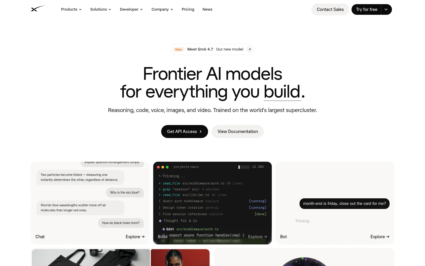
The page is built on a white canvas, with near-black text and warm off-white panels doing most of the visual work. Accent orange appears sparingly in small announcement details and vivid code-product artwork rather than as a broad interface color. Typography uses a clean, softly shaped sans-serif: large centered hero copy gives way to smaller, left-aligned section headings and restrained metadata. A three-column product preview makes chat, code, and bot experiences immediately legible, while later sections shift to a developer feature split, a horizontal metrics row, news cards, and a two-card onboarding choice. Generous vertical gaps keep these varied modules from feeling crowded. Rounded pill CTAs provide the strongest interaction cue; pale borders and subtle card edges separate content without heavy shadows. Product imagery is framed as interface examples and editorial thumbnails, adding color and texture while leaving the overall page calm and monochromatic.
配色
点色块复制色值。用途说明来自对页面的实测位置(背景、文字、描边、按钮)与截图判读。
品牌色
强调色
表层色
中性色
功能色
页面底色 · Gallery White表层 · Warm Porcelain表层 2 · Code Charcoal主文字 · Jet Ink次要文字 · Muted Taupe弱文字 · Pale Silver描边 · Soft Hairline强调 · Signal Ember强调 2 · Deep Signal Blue强调 3 · Apricot Glow
Primary display, headings, navigation, body copy, buttons, and links.
Aa 设计
GeistMono
网络字体 · 字重 400 / 700 · 占比 24%
免费替代:Geist Mono
Code previews and compact technical interface text.
Aa 设计
system-ui
系统字体 · 字重 400 · 占比 2%
免费替代:Inter
Minor system fallback text.
角色
示例
字号
字重
行高
字距
特大标题
Large centered hero statement introducing the AI platform.
SpaceXSI
60px
450
1
-0.01em
一级标题
Primary page or section heading, especially the hero headline.
SpaceXSI
48px
500
1
-0.01em
二级标题
Major section headings for developer, news, and onboarding content.
SpaceXSI
30px
500
1.2
-0.01em
三级标题
Card headings and subordinate feature titles.
The quick brown fox 敏捷的狐狸
24px
500
1.33
-0.01em
四级标题
Supporting subheads and short explanatory statements.
The quick brown fox 敏捷的狐狸
18px
400
1.63
0
正文
Descriptions, feature copy, and standard supporting text.
The quick brown fox 敏捷的狐狸
13px
400
1.63
0
辅助文字
Compact card metadata, labels, and footer details.
The quick brown fox 敏捷的狐狸
10.5px
400
1.63
0
按钮
Primary and secondary CTA labels.
The quick brown fox 敏捷的狐狸
14px
500
1.43
0
导航
Top-level navigation labels and dropdown items.
The quick brown fox 敏捷的狐狸
14px
500
1.43
0
链接
Text links for documentation, news, and product navigation.
The quick brown fox 敏捷的狐狸
14px
500
1.43
0
眉题
Small uppercase category labels above section content.
The quick brown fox 敏捷的狐狸
10px
500
1.5
0.05em
代码
Technical snippets and status text inside dark code previews.
const style = 1;
11px
400
1.63
-0.01em
间距与布局
基准单位 4px · 密度:宽松
148px版块间距
4px元素间距
40px卡片内边距
1232px内容最大宽度
1px
2px
4px
6px
8px
10px
12px
14px
16px
18px
20px
24px
32px
40px
96px
Use a spacious centered page frame with a measured maximum width of 1232px and generous section separation. The hero is centered; feature and news sections shift to left-aligned headings and multi-column grids. The first product showcase uses three columns, followed by a two-column developer feature and paired onboarding cards. A three-column metrics band and dense multi-column footer provide compact contrast. Preserve generous whitespace around section transitions and keep card interiors calm rather than filling every grid cell with decoration.
圆角与层次
按钮 · 9999px
卡片 · 8px
导航 · 6px
链接 · 16px
lg · nav
inset · other
inset · other
lg · card
Favor flat surfaces and faint borders over strong shadows. Warm-gray cards are separated mainly by their fill and rounded corners; the dark code preview is a deliberate high-contrast layer. Reserve subtle shadowing for floating navigation or layered card details, and avoid making the page feel glossy or deeply stacked.
组件
下面的预览按实测的按钮、输入框、徽标、卡片样式重建(字体用替代字体)。
Pill CTA
Use fully rounded buttons; the primary API action is near-black with white text, while documentation and sales actions use pale neutral fills.
Product preview tiles
Arrange chat, code, and bot examples in a three-column showcase with warm pale surfaces, concise labels, and small Explore links.
Code preview
Set terminal-like content in a charcoal panel with compact GeistMono text and restrained colorful status details.
Developer feature split
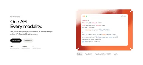
Pair left-aligned API copy and compact actions with a vivid code illustration on the opposite side.
Metrics band
Present three prominent numeric proof points in a horizontal row, divided by light vertical rules.
News cards
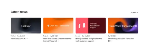
Use a row of editorial thumbnail cards with category/date metadata, concise titles, and a light overall treatment.
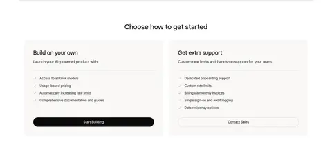
Onboarding cards
Show self-serve and supported-start options as two warm-neutral panels with short lists and a clear action per panel.
Imagery · Use product interfaces as the primary visual evidence: chat conversations, a dark code terminal, and a bot prompt appear as a three-column showcase. Mix these with editorial news thumbnails and the warm orange code illustration. Keep imagery within cards or framed previews; saturated color is mostly confined to the artwork, while the surrounding interface remains white and neutral.
Keep the canvas white and primary copy near-black.
Use warm off-white panels for product and onboarding cards.
Make the hero statement centered and visually dominant.
Use dark pill styling for the primary CTA.
Let product screenshots and previews carry the visual variety.
Separate major sections with generous whitespace.
✕ 不该做
Do not turn orange accents into a page-wide color system.
Do not use heavy borders or pronounced shadows on every card.
Do not crowd the hero with secondary content.
Do not make every section centered; retain left-aligned content modules.
Do not use saturated artwork as a substitute for product examples.
Do not introduce dense decorative patterns into the quiet canvas.
给 AI 的提示词
想快速出一个同风格的新页面,把这段话连同 DESIGN.md 一起发给 AI。
Build a new AI product page in this style using a white Gallery White (#ffffff) canvas and Jet Ink (#0a0a0a) typography. Start with a centered, confident headline, a short supporting sentence, and a black pill CTA with a pale secondary action. Use Warm Porcelain (#f9f8f6) for product and onboarding cards, and keep Soft Hairline (#f1f1f1) borders subtle. Organize content into spacious editorial sections: product previews, a developer feature split, metrics, news, and a clear onboarding choice. Use GeistMono for code samples and the primary sans-serif for all other content. Keep orange tones such as Apricot Glow (#ff9c6a) confined to illustrations or product artwork. Use rounded cards, restrained elevation, and clear alignment changes between centered hero content and left-aligned sections.