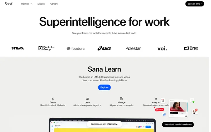
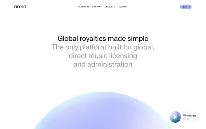
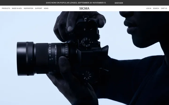
North star · Keep the interface quiet and spacious, using crisp neutral surfaces to frame immersive architectural photography.
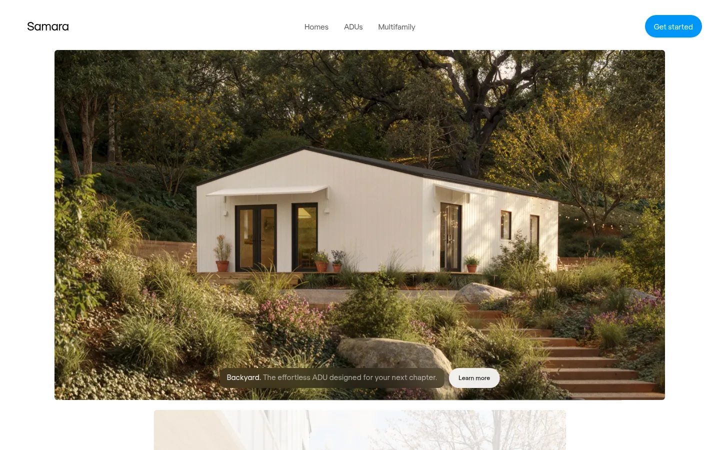
The visual strategy keeps interface chrome quiet so the homes and landscapes lead. A white header sits against a pale gray canvas, while the first feature is a broad, rounded photograph with a subtle dark overlay behind its caption. The palette is mostly white, soft gray, and black; Signal Blue appears sparingly on the primary “Get started” button and text links. Regola’s clean sans-serif forms support compact navigation and unobtrusive captions, with a slightly larger, airy feel in the nav. The composition favors generous open space around a centered, wide media frame rather than a dense card grid. Photo color is intentionally earthy and should be treated as imagery, not as brand palette. Pill-shaped buttons and restrained shadows create small, tactile controls without adding heavy borders or decorative effects.
配色
点色块复制色值。用途说明来自对页面的实测位置(背景、文字、描边、按钮)与截图判读。
强调色
表层色
中性色
功能色
页面底色 · Soft Canvas表层 · Gallery White主文字 · Ink次要文字 · Quiet Gray弱文字 · Slate Gray强调 · Signal Blue
Primary site face for body copy, navigation, captions, buttons, and links.
Aa 设计
regola-regular
网络字体 · 字重 300 / 400 · 占比 23%
免费替代:Inter
Used for the compact secondary “Learn more” button label.
角色
示例
字号
字重
行高
字距
正文
General product and supporting copy.
The quick brown fox 敏捷的狐狸
15px
400
1.27
0
辅助文字
Hero image caption and compact descriptive text.
The quick brown fox 敏捷的狐狸
14px
300
1.29
-0.01em
按钮
Primary CTA label and interactive button text.
The quick brown fox 敏捷的狐狸
15px
300
1.2
-0.01em
导航
Main navigation links.
The quick brown fox 敏捷的狐狸
18px
300
1.33
-0.01em
间距与布局
基准单位 4px · 密度:适中
48px版块间距
12px元素间距
—卡片内边距
1221px内容最大宽度
2px
3px
4px
9px
12px
14px
18px
20px
21px
32px
48px
The page uses a centered, wide content frame with a measured maximum width of 1221px and a comfortable density. The header aligns the brand left, navigation near the center, and primary action right. Below it, a large landscape image dominates the first viewport, with its caption and secondary action anchored over the lower image area. Preserve broad breathing room between the header, media, and following content; keep alignment clean and avoid adding dense columns or visible card borders.
圆角与层次
按钮 · 9999px
导航 · 18px
hairline · nav
hairline · button
md · button
The design is mostly flat, with no prominent border treatment. Small pill controls use restrained shadows for separation, while the navigation has a barely visible hairline-level shadow. Image overlays add caption contrast; avoid card-like elevation or heavy outlines.
组件
下面的预览按实测的按钮、输入框、徽标、卡片样式重建(字体用替代字体)。
Header navigation
Minimal white header with Samara wordmark at left, compact Homes, ADUs, and Multifamily links, and a right-aligned blue pill CTA.
Primary CTA
“Get started” uses Signal Blue #0096f7, white text, rounded pill styling, and a subtle shadow.
Hero image feature
A wide architectural photograph with softly rounded corners, filling most of the content frame.
Image caption
Concise white descriptive copy sits over a subtle dark image treatment near the bottom of the hero.
Secondary action
“Learn more” appears as a compact white pill with dark text and a restrained elevated shadow.
Text links
Use Signal Blue #0096f7 for a small number of link treatments rather than coloring all navigation.
Imagery · Use high-quality architectural photography as the main visual content: contemporary homes situated in landscaped settings, framed wide and close to full content width. The first image has softly rounded corners and natural, earthy tones. Captions sit over the photo with a subtle darkened treatment for legibility. The measured earthy screenshot colors belong to photography, not the core brand palette.
Lead with large, authentic architectural photography.
Keep the header sparse and visually quiet.
Use #f2f2f2 and #ffffff for calm neutral surfaces.
Reserve #0096f7 for primary actions and selective links.
Use rounded pill controls with subtle shadows.
Keep captions legible over images with restrained contrast treatment.
✕ 不该做
Do not turn the earthy photo colors into interface brand colors.
Do not crowd the header with extra controls.
Do not add heavy borders or strong card shadows.
Do not use bright blue as a large section background.
Do not impose uppercase labels or decorative display typography.
Do not shrink the hero into a small card.
给 AI 的提示词
想快速出一个同风格的新页面,把这段话连同 DESIGN.md 一起发给 AI。
Build a new Samara-style page with a quiet, architectural editorial feel. Use Gallery White #ffffff and Soft Canvas #f2f2f2 as the main surfaces, Ink #000000 for primary text, and Signal Blue #0096f7 only for the primary action and selective links. Use a clean sans-serif close to Regola/Inter, with natural casing and restrained weights. Create a minimal header with brand, a small centered navigation group, and a right-aligned pill CTA. Give the main content a centered, broad frame and let one immersive landscape-oriented home photograph dominate. Add concise over-image caption copy with subtle darkening for contrast and a small white secondary pill. Keep spacing generous, surfaces flat, shadows faint, and all photographic earth tones confined to imagery.