North star · Keep the interface quiet and spacious; let concise dark typography and vivid music imagery provide the contrast.
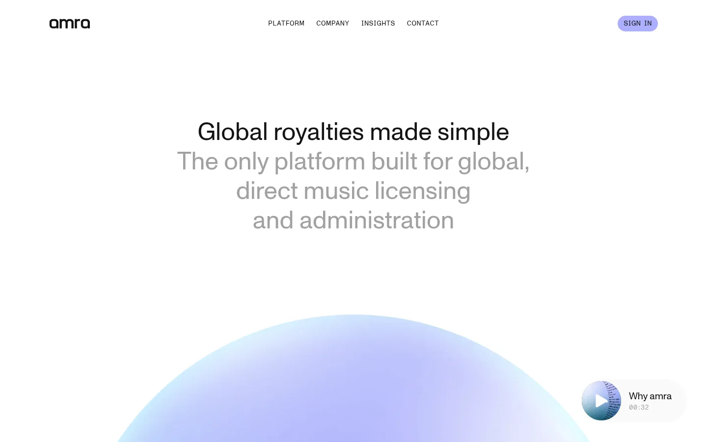
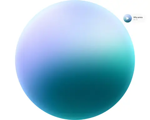
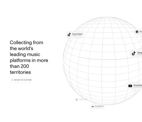
The page is built around a bright, nearly white canvas, with dark near-black headlines and muted gray supporting copy creating a clear reading hierarchy. Lavender is reserved for small, high-visibility actions such as the sign-in pill; pale gray outlines define secondary actions without adding visual weight. Typography is lightweight and unhurried: large centered hero copy gives way to compact uppercase navigation and button labels. The layout uses broad, single-column stretches and substantial vertical pauses, then shifts to side-by-side text and media for selected content. Photography is vivid and cinematic, often framed in rounded rectangles, while a large luminous sphere and a fine wireframe globe provide distinctive visual anchors. Most sections remain flat and shadowless, so imagery, whitespace, and subtle hairlines—not card elevation—create structure.
配色
点色块复制色值。用途说明来自对页面的实测位置(背景、文字、描边、按钮)与截图判读。
品牌色
强调色
表层色
中性色
功能色
页面底色 · Mist Canvas表层 · Gallery White主文字 · Midnight Ink次要文字 · Quiet Gray描边 · Fine Silver强调 · Lavender Signal
Headings, body copy, and the larger contact-style navigation text.
Aa 设计
__secondaryFont_85f780
网络字体 · 字重 400 · 占比 48%
免费替代:DM Sans
Uppercase navigation, buttons, and compact song or activity labels.
角色
示例
字号
字重
行高
字距
一级标题
Centered hero headline introducing global royalty administration.
amra
50px
400
1.2
0
二级标题
Section headings for benefits and platform coverage.
amra
30px
400
1.2
-0.01em
正文
Explanatory copy beside feature imagery and audience sections.
The quick brown fox 敏捷的狐狸
20px
400
1.2
-0.01em
辅助文字
Compact metadata and fine-print labels.
The quick brown fox 敏捷的狐狸
10px
400
1
-0.01em
按钮
Uppercase labels on sign-in and platform exploration actions.
The quick brown fox 敏捷的狐狸
14px
400
1
0.029em
导航
Primary navigation and larger contact text.
The quick brown fox 敏捷的狐狸
20px
400
1.2
-0.01em
眉题
Small uppercase labels above press and editorial items.
The quick brown fox 敏捷的狐狸
5px
400
1
0.03em
间距与布局
基准单位 4px · 密度:宽松
160px版块间距
8px元素间距
6px卡片内边距
1152px内容最大宽度
1px
2px
4px
8px
12px
A spacious, centered composition with a measured maximum content width of 1152px. The header places the wordmark, uppercase navigation, and sign-in action across one line. The hero is centered, while later sections alternate broad full-bleed media with two-column text-and-image layouts. Sections have pronounced vertical separation; content density stays low, and alignment shifts between centered hero or statistics and left-aligned editorial content. Use measured spacing relationships rather than compressing the large pauses.
圆角与层次
按钮 · 9999px
卡片 · 20px
导航 · 8px
没有测到阴影:页面是扁平的,层次靠底色和描边区分。
The interface is predominantly flat, with no measured shadows. Use white space and occasional fine gray outlines to separate content, not stacked panels. Rounded cards and pill-shaped actions provide the main depth cues; imagery and the sphere create visual layering without UI drop shadows.
组件
下面的预览按实测的按钮、输入框、徽标、卡片样式重建(字体用替代字体)。
Header navigation
Single-line wordmark, uppercase links, and a right-aligned lavender SIGN IN pill; preserve the quiet white header.
Hero statement
Centered large headline with a lighter gray supporting statement beneath it, followed by generous space for the hero media.
Platform exploration action
Uppercase secondary action with a thin #d0d0d0 outline, dark text, and a rounded pill silhouette.
Song activity card
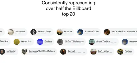
Compact music or territory metadata card on a #f3f4f5 backing, with small media details and rounded treatment.
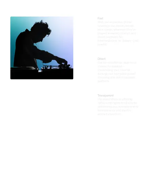
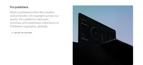
Audience feature split
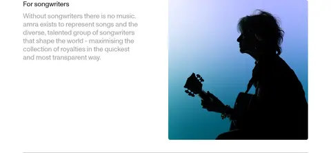
Left-aligned heading and muted explanatory copy paired with a large rounded image; separate adjacent rows with a fine hairline.
Editorial cards
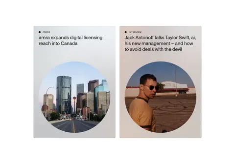
Press and interview entries combine concise uppercase category labels, short headlines, and image-led card surfaces.
Imagery · Imagery is central to the page: cinematic musician and artist photography, platform-related media, and a large softly luminous 3D sphere. A fine wireframe globe supports the worldwide-coverage message. Images are typically rectangular with rounded corners, while song artwork and moving content appear as small chips. Keep photography colorful and high contrast; treat these colors as image content, not the brand palette.
Use a white-dominant canvas and reserve #acafff for small actions.
Keep headline and body typography regular-weight and easy to scan.
Preserve generous vertical pauses between major sections.
Pair concise copy with cinematic music-related imagery.
Use muted gray for supporting text, not primary headings.
Favor flat surfaces, fine borders, and rounded action shapes.
✕ 不该做
Do not turn every section into a boxed card.
Do not use saturated accent colors for large UI backgrounds.
Do not compress the page into a dense dashboard.
Do not use heavy bold typography or decorative display lettering.
Do not add shadows that are absent from the measured design.
Do not mistake colors inside photography or 3D artwork for UI palette colors.
给 AI 的提示词
想快速出一个同风格的新页面,把这段话连同 DESIGN.md 一起发给 AI。
Build a new amra page as a calm, editorial music-rights experience. Use Gallery White (#ffffff) as the dominant canvas, Midnight Ink (#141414) for headings and controls, Quiet Gray (#838484) for supporting copy, and Lavender Signal (#acafff) only for a restrained primary action. Set regular-weight typography with a clean sans-serif feel, compact tracked uppercase labels, and centered hero messaging. Maintain broad content areas and generous vertical pauses; alternate centered statements with left-aligned two-column text and image sections. Use cinematic music photography, rounded image framing, and, where appropriate, a luminous 3D or wireframe visual. Keep UI surfaces flat, use Fine Silver (#d0d0d0) for subtle outlines, and avoid heavy shadows, dense card grids, or excessive color.