North star · Let spacious near-black surfaces and precise, low-contrast typography carry the page; use borders and gradients only as quiet structure.
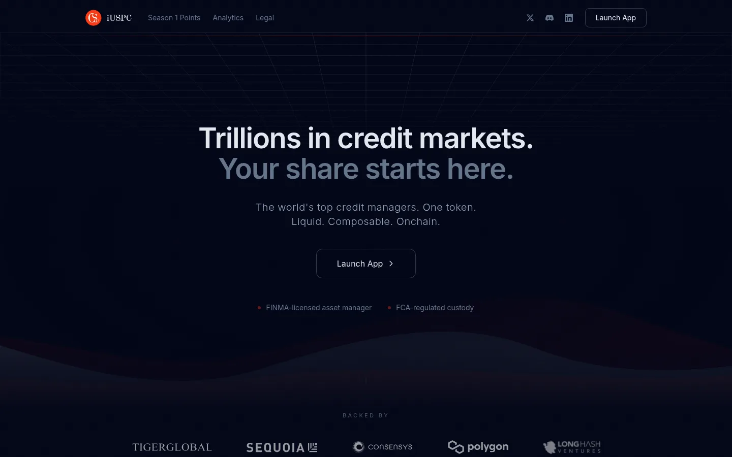
The visual strategy is built around a near-black navy canvas (#020617), with a darker-blue alternate band (#0a0e1a) creating subtle sectional separation rather than conspicuous cards. Pale slate headings (#e2e8f0) contrast with muted slate supporting copy, while the opening hero uses an understated tonal gradient and a wave-like graphic to add depth without breaking the restrained palette. Inter is used throughout; large, semibold, tightly tracked headings are balanced by compact, regular-weight body copy and small uppercase eyebrow labels. The page is unusually spacious: content sits in a centered, bounded column, while long sections and wide gaps give the dark canvas room to dominate. Layouts shift between centered hero content, a two-column explanatory section, and a three-column feature area. Buttons remain transparent and outlined, with restrained corner rounding; cards and section divisions rely on thin borders instead of filled panels or prominent shadows. Partner marks are supporting proof, not decorative color sources.
配色
点色块复制色值。用途说明来自对页面的实测位置(背景、文字、描边、按钮)与截图判读。
品牌色
表层色
中性色
功能色
页面底色 · Midnight Canvas表层 · Deep Navy主文字 · Frosted Text次要文字 · Slate Copy弱文字 · Quiet Slate描边 · Night Hairline
All page typography, from navigation and body copy to headings and buttons.
角色
示例
字号
字重
行高
字距
特大标题
Large centered hero headline.
Coinshift
56px
600
1.08
-0.025em
一级标题
Primary page or major section headline.
Coinshift
48px
600
1
-0.025em
二级标题
Prominent section headings, including explanatory content.
Coinshift
36px
600
1.11
-0.025em
三级标题
Feature and card-level headings.
Coinshift
30px
600
1.2
-0.025em
四级标题
Smaller subsection and supporting headings.
The quick brown fox 敏捷的狐狸
24px
500
1.33
-0.025em
正文
Main explanatory paragraphs and descriptive copy.
The quick brown fox 敏捷的狐狸
14px
400
1.63
0
辅助文字
Compact supporting details and footer metadata.
The quick brown fox 敏捷的狐狸
12px
400
1.33
0
按钮
Launch App call-to-action labels.
The quick brown fox 敏捷的狐狸
16px
500
1.5
0
导航
Header and footer navigation links.
The quick brown fox 敏捷的狐狸
14px
400
1.43
0
链接
Inline strategy and legal links.
The quick brown fox 敏捷的狐狸
14px
400
1.63
0
眉题
Small uppercase section labels such as BACKED BY.
The quick brown fox 敏捷的狐狸
12px
400
1.33
0.2em
间距与布局
基准单位 8px · 密度:宽松
160px版块间距
10px元素间距
20px卡片内边距
1152px内容最大宽度
2px
4px
6px
8px
10px
12px
16px
20px
24px
32px
40px
48px
64px
80px
96px
160px
Use a centered content frame capped at the measured 1152px maximum, with generous horizontal breathing room and spacious vertical section rhythm. The hero is centered, while explanatory content uses a two-column split and a later feature area uses three columns. Keep large stretches of dark canvas between content groups; measured section spacing is 160px, with a spacious overall density. Align section headings consistently to their content grid and avoid crowding the viewport with panels.
圆角与层次
按钮 · 12px
导航 · 8px
sm · other
The interface is largely flat: broad background bands, hairline borders, and tonal gradients provide hierarchy instead of raised cards. Outlined buttons sit directly on the canvas, and card-like rows are separated by thin borders. Avoid prominent drop shadows; any glow should be barely perceptible and subordinate to the dark surface.
组件
下面的预览按实测的按钮、输入框、徽标、卡片样式重建(字体用替代字体)。
Header navigation
Compact horizontal navigation on the dark canvas, with the iUSPC mark, muted links, social icons, and an outlined Launch App button.
Hero headline
Centered two-line display message; the second line is visibly more muted than the main pale heading.
Primary CTA
Transparent Launch App button with #e2e8f0 text, #353845 outline, and measured 12px corner radius in the hero.
Trust markers
Small muted regulatory claims sit below the hero action, introduced by tiny warm-colored dots.
Partner logo row
A small uppercase BACKED BY label precedes a centered row of investor and ecosystem logos.
Content rows
Feature and tier-like entries use thin #1c1f2f borders and open layouts rather than filled, rounded cards.
Footer
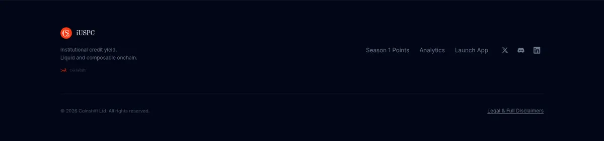
A quiet dark closing band with brand mark, brief product statement, navigation links, and compact legal text.
Imagery · The opening view uses an abstract, low-contrast wave and faint technical linework against the dark canvas, not photography. Partner logos appear in a restrained horizontal proof row. Their individual colors belong to the marks themselves; keep the surrounding interface monochrome and dark. Avoid prominent illustrations, glossy 3D, or large product screenshots that would overpower the typography.
Keep the canvas near-black navy and the overall contrast restrained.
Use pale slate for primary headings and muted slate for supporting copy.
Center the hero and preserve generous negative space around it.
Use thin borders to divide rows and outline actions.
Keep gradients subtle and confined to background atmosphere.
Use Inter consistently with compact, precise heading typography.
✕ 不该做
Do not introduce bright accent colors across interface surfaces.
Do not turn every content group into a filled card.
Do not use heavy shadows or glossy elevation.
Do not compress the long vertical rhythm into a dense dashboard.
Do not make supporting copy as bright as the main heading.
Do not treat partner-logo colors as brand interface colors.
给 AI 的提示词
想快速出一个同风格的新页面,把这段话连同 DESIGN.md 一起发给 AI。
Build a new institutional crypto-finance page in Coinshift's restrained dark style. Use Midnight Canvas (#020617) as the dominant background and Deep Navy (#0a0e1a) for occasional broad section bands. Set all copy in Inter; use Frosted Text (#e2e8f0) for important headings and CTA labels, Slate Copy (#94a3b8) and Quiet Slate (#64748b) for secondary text. Create hierarchy with spacious section gaps, centered hero content, and clear grid alignment rather than decorative cards. Keep outlined actions transparent with Button Outline (#353845); use Night Hairline (#111525) or Card Edge (#1c1f2f) for subtle divisions. Add only restrained tonal gradients and abstract background detail. Favor flat surfaces, precise typography, and quiet institutional confidence over bright accents, heavy shadows, or dense layouts.