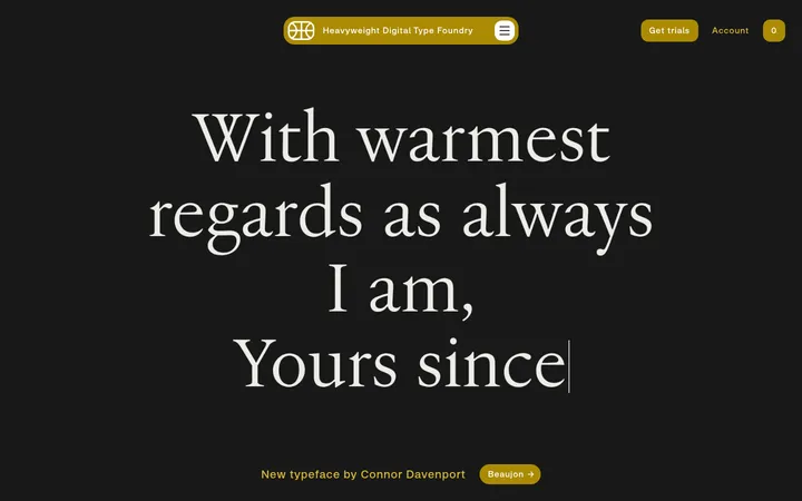
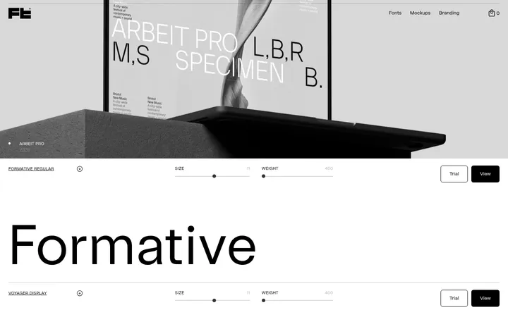
North star · Let oversized type and art-directed imagery carry the expression, while keeping the catalogue interface nearly monochrome and unboxed.
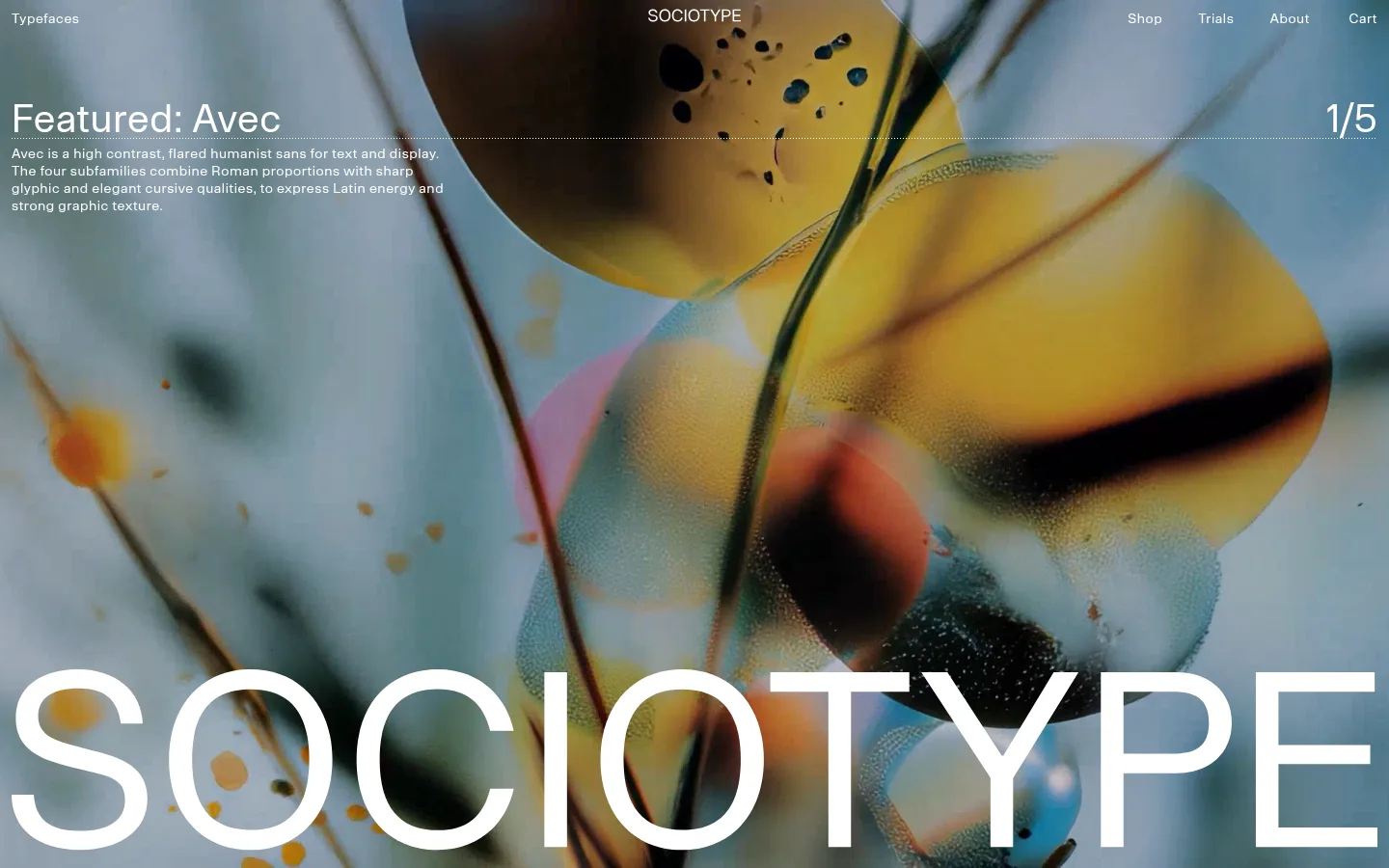
The opening is a full-bleed video canvas, with small white navigation and feature copy placed directly over vivid abstract motion; a huge white SOCIOTYPE wordmark anchors the lower edge. Beyond the hero, the page shifts to a clean white canvas with black specimen lettering and restrained gray hairlines. The measured palette is deliberately narrow: white and black define the interface, while pale gray separates content without introducing card-like decoration. Typography is the primary visual material: very large family names alternate with compact metadata and readable explanatory copy, all set in a light, carefully tracked sans. A long, loose editorial sequence gives each type family room to breathe, placing text and specimen images at varied positions rather than repeating a rigid card grid. Photographic and rendered visuals bring color and texture, but remain supporting artwork rather than interface colors. The result balances a highly expressive opening with a quiet, gallery-like catalogue.
Primary sans-serif for navigation, headings, catalogue descriptions, metadata, links and controls.
角色
示例
字号
字重
行高
字距
特大标题
Oversized SOCIOTYPE wordmark across the lower hero.
Sociotype
250.5px
400
1.25
0.001em
一级标题
Prominent page-level or featured type-family headings.
Sociotype
40px
400
1.13
0.015em
二级标题
Secondary section and family headings.
The quick brown fox 敏捷的狐狸
26px
400
1.19
0.025em
三级标题
Supporting subheads within specimen descriptions.
The quick brown fox 敏捷的狐狸
18px
400
1.22
0.04em
正文
Type-family descriptions and explanatory catalogue copy.
The quick brown fox 敏捷的狐狸
14px
400
1.29
0.04em
辅助文字
Small specimen labels and image captions.
The quick brown fox 敏捷的狐狸
12px
400
1.33
0.08em
按钮
Compact navigation and interface control text.
The quick brown fox 敏捷的狐狸
14px
400
1.29
0.04em
链接
Catalogue links such as More Info.
The quick brown fox 敏捷的狐狸
18px
400
1.22
0.04em
眉题
Uppercase micro-labels and specimen metadata.
The quick brown fox 敏捷的狐狸
12px
400
1.33
0.08em
间距与布局
基准单位 2px · 密度:宽松
100px版块间距
12px元素间距
—卡片内边距
1416px内容最大宽度
6px
8px
9px
12px
24px
30px
37px
55px
120px
140px
The measured page uses a spacious density and a maximum content width of 1416px. The first section fills the viewport with five media columns and overlays its navigation and featured-family copy on the moving image. Below it, a long editorial catalogue places oversized family names, metadata, descriptions and specimen artwork in varied positions, leaving broad areas of white canvas between elements. Use an asymmetric, gallery-like rhythm rather than uniform cards; align small labels and hairlines precisely, while allowing the specimen artwork to shift across the page.
圆角与层次
没有测到阴影:页面是扁平的,层次靠底色和描边区分。
The interface is flat: measured styles show no shadows and no radius scale. Separate catalogue content with white space and occasional thin #d6d6d6 rules rather than cards. In the hero, video supplies depth and contrast behind directly overlaid white text; keep other layers restrained.
组件
下面的预览按实测的按钮、输入框、徽标、卡片样式重建(字体用替代字体)。
Hero navigation
A small, light navigation row sits over the full-bleed video, with links distributed across the top and white lettering for contrast.
Featured type callout
Place a concise family headline and short descriptive copy near the upper left over the hero; a slide counter sits opposite.
Oversized wordmark
Set the SOCIOTYPE name in extremely large white sans lettering along the hero’s bottom edge.
Type-family specimen
Show each family name as oversized black type on white, followed by fine metadata, a short description and a More Info link.
Specimen artwork
Interleave type tests, photography and graphic compositions throughout the catalogue, with small captions where appropriate.
Section divider
Use a subtle #d6d6d6 hairline between specimen areas instead of raised cards or boxed panels.
Imagery · The hero is full-bleed motion imagery with abstract, saturated forms and layered texture. Further down, type specimens sit alongside art-directed photographs and graphic compositions, including print-like layouts and rendered objects. Keep images crisp and varied in scale; treat their colors as artwork, not as additions to the interface palette.
Use #ffffff and #000000 as the core interface colors.
Make type specimens the dominant catalogue element.
Keep the hero media full-bleed and place navigation over it.
Use spacious, irregular editorial positioning below the hero.
Add restrained #d6d6d6 hairlines only where separation helps.
Use artwork for color and texture, not interface chrome.
✕ 不该做
Do not introduce unmeasured interface colors.
Do not turn the catalogue into a uniform card grid.
Do not add shadows, rounded cards or decorative gradients.
Do not let captions compete with oversized specimens.
Do not crowd the page with dense navigation or copy.
Do not treat image colors as brand palette tokens.
给 AI 的提示词
想快速出一个同风格的新页面,把这段话连同 DESIGN.md 一起发给 AI。
Build a new page in Sociotype’s editorial type-foundry style. Use Gallery White (#ffffff) as the main canvas, Foundry Ink (#000000) for text and specimens, and Soft Rule (#d6d6d6) for occasional hairlines. Start with a full-bleed motion or image hero, placing small white navigation and concise feature copy over the media, with a very large wordmark near the bottom. Below, create a spacious, asymmetric catalogue rather than a card grid: oversized type-family names, compact metadata, short descriptions, simple More Info links and art-directed specimen images. Use a light, carefully tracked sans-serif; let font specimens provide the visual drama. Keep elevation flat, avoid decorative interface color, and give each content group generous breathing room. Image colors should remain artwork, not become UI tokens.