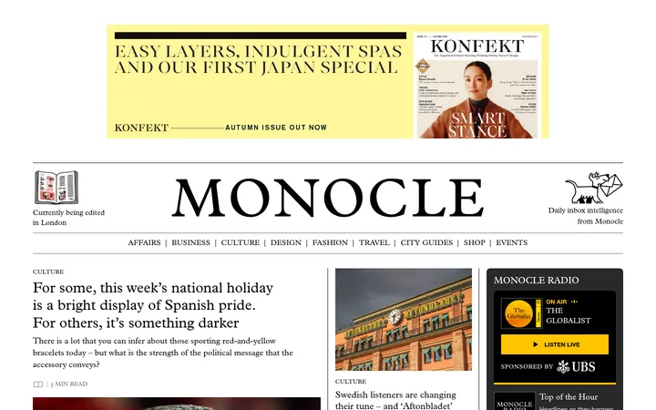
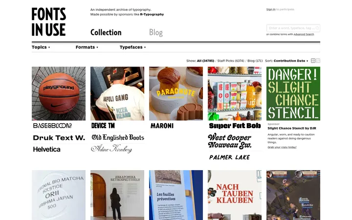
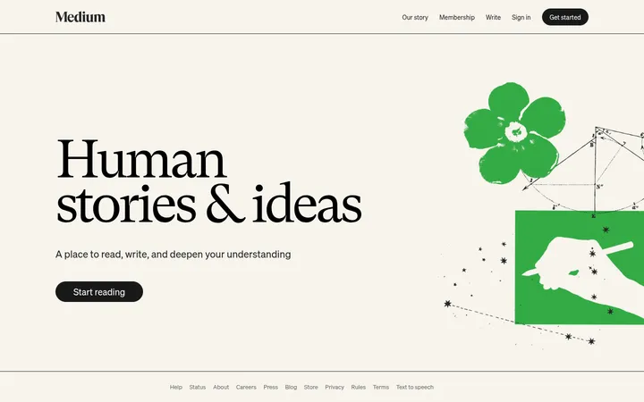
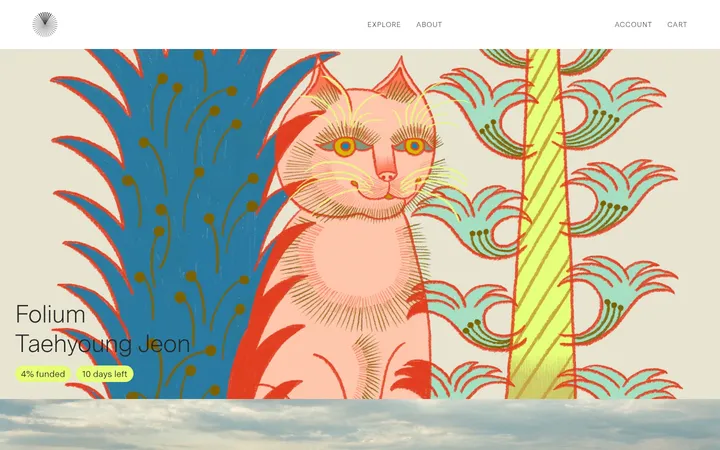
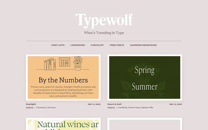
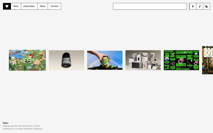
North star · Keep the interface neutral and spacious so typography-led content imagery, not decoration, carries the page.
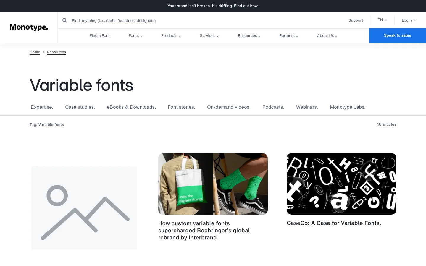
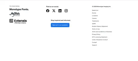
The page uses a predominantly white canvas, with dark charcoal reserved for headings, article titles, and the narrow announcement strip at the top. Muted slate gray handles navigation and secondary information, while clear blue is reserved for high-salience actions such as “Speak to sales” and “Load More.” Thin pale-gray rules separate navigation and content areas without turning the page into a boxed UI. Typography is clean, sans-serif, and notably type-led: a large, lightweight page title establishes the subject, while medium-weight article titles stay readable beneath thumbnails. The main resource feed is an airy three-column grid with generous gaps and consistent image framing; the asset variety supplies color and texture rather than the interface. Breadcrumbs and a horizontal category list orient users above the feed. A restrained footer groups brand marks, social links, newsletter signup, and company links into columns.
Main text font for resource links and prominent article titles.
Aa 设计
HelveticaNowMTTextRegular
网络字体 · 字重 400 · 占比 25%
免费替代:Inter
Navigation, captions, labels, buttons, and supporting copy.
Aa 设计
HelveticaNowMTTextBold
网络字体 · 字重 400 · 占比 5%
免费替代:Inter
Bold text emphasis where present in the measured font set.
Aa 设计
HelveticaNowMTMicroRegular
网络字体 · 字重 400 · 占比 3%
免费替代:Inter
Micro-sized interface or supporting text.
角色
示例
字号
字重
行高
字距
特大标题
Large page-level display text and prominent headings.
Monotype
57px
400
1.12
0
一级标题
Variable fonts page heading.
The quick brown fox 敏捷的狐狸
26px
400
1.2
0
正文
Article descriptions and primary reading text.
The quick brown fox 敏捷的狐狸
19px
400
1.26
0
辅助文字
Small metadata, breadcrumbs, and supporting labels.
The quick brown fox 敏捷的狐狸
13px
400
1.85
0
按钮
Load More and other button labels.
The quick brown fox 敏捷的狐狸
16px
400
1.5
0
导航
Primary navigation and category navigation.
The quick brown fox 敏捷的狐狸
13px
400
1.85
0
链接
Article titles and prominent text links.
The quick brown fox 敏捷的狐狸
19px
400
1.26
0
间距与布局
基准单位 8px · 密度:宽松
104px版块间距
16px元素间距
—卡片内边距
1240px内容最大宽度
4px
6px
8px
10px
12px
16px
24px
32px
48px
104px
The desktop page uses a centered content area with a measured maximum width of 1240px and left-aligned content. A stacked header leads into breadcrumbs, a large page title, and a horizontal resource-category row; a hairline separates this introduction from the feed. The content feed uses three columns, with image-led cards and generous whitespace between rows. The page feels spacious rather than dense, using a measured 104px section rhythm and 16px element gap as system cues. Footer content resolves into three broad columns.
圆角与层次
按钮 · 8px
图片 · 16px
导航 · 8px
md · nav
The interface is mostly flat. Pale hairlines divide header and content bands, and cards rely on whitespace rather than visible outlines or shadows. A soft measured shadow appears around navigation, adding slight separation from the page without creating a raised-card system. Rounded media and navigation elements provide the main edge treatment.
组件
下面的预览按实测的按钮、输入框、徽标、卡片样式重建(字体用替代字体)。
Announcement strip
A narrow dark band above the main navigation, with centered white message text.
Global navigation
White multi-row header with logo, search field, utility links, primary navigation, and a blue sales CTA.
Resource heading
Breadcrumbs above a large, left-aligned “Variable fonts” heading and a horizontal category navigation row.
Article feed
Three-column editorial grid with image thumbnails and dark article titles; media uses the measured 16px radius.
Load More button
Centered blue action with white text, rounded corners, and a compact label.
Footer
Three-column closing area for brand family, social and newsletter links, and corporate navigation.
Imagery · The feed is built from varied editorial thumbnails: campaign photography, type specimens, brand graphics, and webinar or event imagery. Images sit in consistent card frames with rounded media corners, while the artwork retains its own color and contrast. The first card includes a pale placeholder-style illustration, but this is content imagery rather than a defining brand motif. Keep imagery secondary to the clean page shell.
Use muted slate for secondary navigation and labels.
Organize editorial content in a spacious three-column grid.
Use thin rules instead of boxed section containers.
✕ 不该做
Do not introduce gradients or decorative background treatments.
Do not make every card look elevated.
Do not use accent blue as a large page background.
Do not crowd the title, category links, or article cards.
Do not treat thumbnail colors as part of the core brand palette.
Do not replace the restrained typography hierarchy with display effects.
给 AI 的提示词
想快速出一个同风格的新页面,把这段话连同 DESIGN.md 一起发给 AI。
Build a new editorial resource page in Monotype’s visual style. Use Gallery White (#ffffff) as the canvas, Monotype Ink (#1e242c) for headings and content links, Slate Mist (#576579) for secondary navigation, and Signal Blue (#1a73e8) only for primary actions. Use a quiet sans-serif hierarchy, a compact utility header, breadcrumbs, a prominent page title, and a horizontal category row. Arrange content in a spacious three-column feed with consistently framed editorial images and readable titles. Use Soft Divider (#e7eaee) for subtle hairlines; avoid card borders, heavy shadows, gradients, and decorative color blocks. Keep the footer informational and multi-column, with whitespace doing most of the structural work.