North star · Let one uninterrupted electric-blue field frame bold typography and clean, image-led product grids.
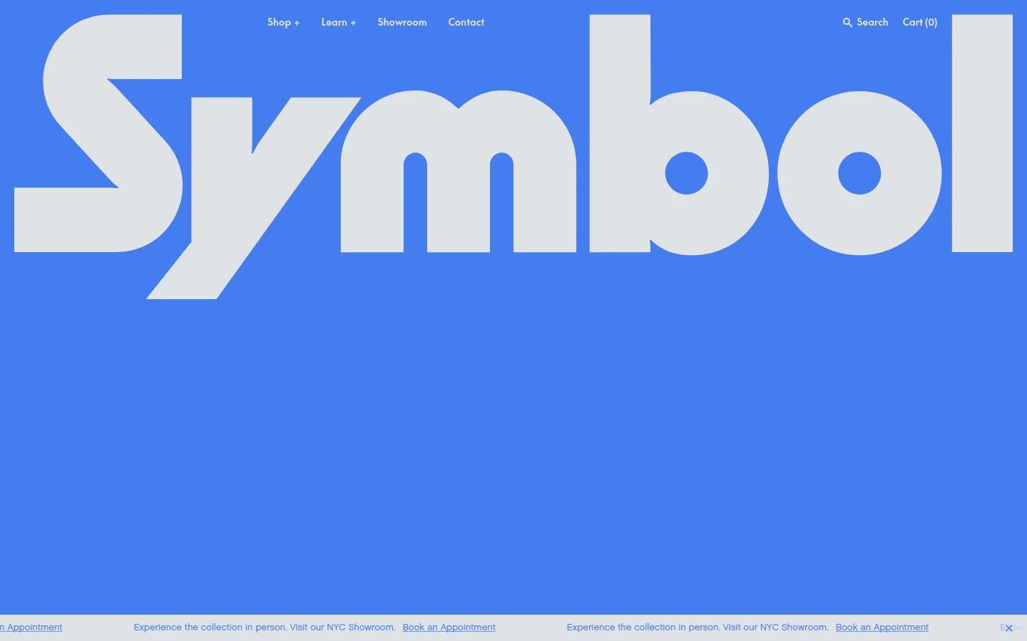
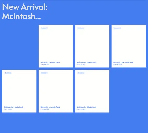
The homepage makes its electric-blue canvas the defining brand device, carrying through the hero, product grids, editorial copy, and footer rather than alternating into conventional white section bands. Pale gray typography gives the blue field a crisp, high-contrast reading layer; near-white product cards create distinct catalog windows, while a restrained warm red appears as a small badge accent. Oversized, tightly tracked display lettering dominates the opening composition and overlaps a vivid audio-room photograph. Below, section headings remain prominent but give way to a four-column product rhythm, with cards aligned in compact rows and ample blue space between collections. The typography mixes a bold geometric display face with softer sans-serif text for navigation, descriptions, and product details. Hairline dividers organize long sections without adding heavy boxes or shadows. Product photography supplies warm wood, upholstery, and equipment colors, while the surrounding interface remains flat and consistent.
配色
点色块复制色值。用途说明来自对页面的实测位置(背景、文字、描边、按钮)与截图判读。
品牌色
强调色
表层色
中性色
功能色
页面底色 · Electric Canvas表层 · Gallery White主文字 · Soft Silver描边 · Quiet Pewter强调 · Electric Canvas强调 2 · Signal Vermilion
Main body copy and some navigation and product-card text.
Aa 设计
SupremeLL-Bold
网络字体 · 字重 400 · 占比 31%
免费替代:Space Grotesk
Oversized display wordmark, section headings, navigation emphasis, and buttons.
Aa 设计
Chalet-NewYorkSixty
网络字体 · 字重 400 · 占比 18%
免费替代:Manrope
Captions, product links, and small supporting labels.
角色
示例
字号
字重
行高
字距
特大标题
Oversized opening brand wordmark layered over the hero photograph.
Symbol Audio
80px
400
1.13
-0.02em
一级标题
Primary hero or major homepage heading.
Symbol Audio
52px
400
1
-0.02em
二级标题
Product collection and editorial section headings.
Symbol Audio
34px
400
1.26
-0.02em
三级标题
Product names and smaller subheads.
The quick brown fox 敏捷的狐狸
20px
400
1.33
-0.02em
正文
Editorial descriptions and supporting storefront copy.
The quick brown fox 敏捷的狐狸
13px
400
1.31
0
辅助文字
Product metadata, small labels, and brief supporting details.
The quick brown fox 敏捷的狐狸
11px
400
1
0
按钮
Newsletter submit and compact shopping actions.
The quick brown fox 敏捷的狐狸
14px
400
1.33
0
导航
Header links such as Shop, Learn, Showroom, and Contact.
The quick brown fox 敏捷的狐狸
14px
400
1.33
0
链接
Product names and appointment or informational links.
The quick brown fox 敏捷的狐狸
15px
400
1.33
0
间距与布局
基准单位 4px · 密度:宽松
200px版块间距
5px元素间距
—卡片内边距
1400px内容最大宽度
1px
4px
5px
8px
10px
15px
20px
40px
50px
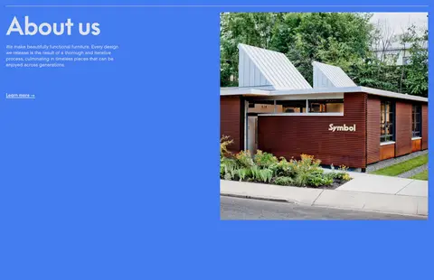
The page uses a spacious, wide desktop composition within a measured maximum width of 1400px. The hero is a single-column, full-bleed blue stage with centered imagery and an enormous wordmark. Catalog sections align headings to the left and arrange products in three- or four-column grids, with consistent card surfaces and generous blue gutters. Long sections are separated by thin rules and substantial vertical breathing room; the about area shifts to two columns. Despite the spacious shell, product cards create a dense, scannable shopping rhythm.
圆角与层次
inset · text
The interface is predominantly flat: no prominent card shadows or raised controls. Near-white rectangular product surfaces sit directly against the blue canvas, while thin pale rules separate content groups. The hero creates depth through the oversized overlapping wordmark and image, rather than conventional elevation or layered panels.
组件
下面的预览按实测的按钮、输入框、徽标、卡片样式重建(字体用替代字体)。
Oversized hero wordmark
A giant pale-gray Symbol wordmark spans the blue opening viewport and overlaps the centered audio-room image.
Header navigation
Compact, pale text links sit along the top edge of the hero, with shop and learn groupings plus showroom, contact, search, and cart.
Product collection grid
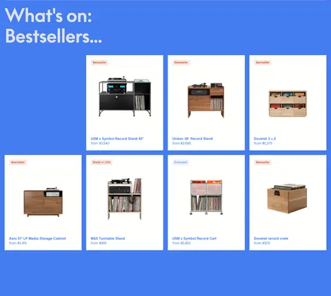
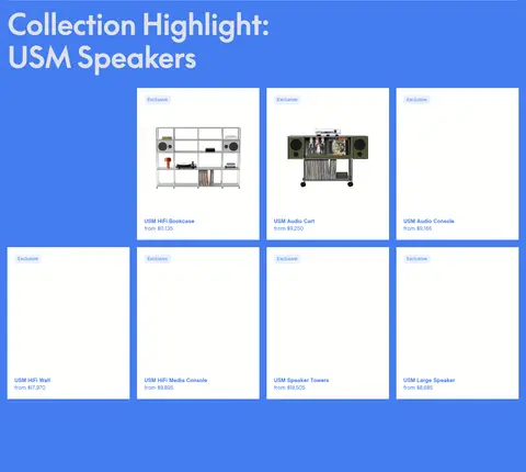
Catalog collections use three- or four-column rows of near-white cards, with product imagery, small badges, names, and prices.
Collection heading and divider
Left-aligned pale headings introduce product groups; thin horizontal hairlines distinguish major sections on the blue canvas.
Announcement strip
A slim horizontal showroom message runs beneath the hero with blue links for appointments.
Newsletter signup
A restrained email field and submit action appear on the blue background, finished with a fine underline rather than a filled button.
Footer
A compact blue footer pairs the brand mark with small informational and social link columns, separated by a pale rule.
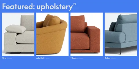
Imagery · Photography carries the product story: a dramatic audio-room image anchors the hero, while furniture and upholstery photography fills the catalog cards. The hero image is centered and partly obscured by the giant wordmark; product images sit inside clean near-white rectangles with product details at the bottom. Warm woods, orange equipment, and varied upholstery colors come from the photographs, not from extra interface bands.
Keep the blue canvas continuous across page sections.
Use pale gray for headings and primary text on blue.
Reserve near-white surfaces for product cards.
Let photography provide warm secondary color.
Use oversized display type as a graphic layer.
Separate major content groups with fine rules.
Keep product names and prices easy to scan.
✕ 不该做
Do not introduce large white section backgrounds.
Do not turn the small red badge accent into a broad color block.
Do not add heavy shadows or raised-card effects.
Do not let decorative UI compete with product imagery.
Do not replace the spacious blue gutters with dense separators.
Do not force all headings or navigation into uppercase.
给 AI 的提示词
想快速出一个同风格的新页面,把这段话连同 DESIGN.md 一起发给 AI。
Build a new storefront page in Symbol Audio’s visual language. Use Electric Canvas (#447cf0) as the continuous page background, Soft Silver (#dfe2e5) for primary type and hairlines, and Gallery White (#fffffd) only for product-card surfaces. Keep Signal Vermilion (#c72a00) to small product badges and Quiet Pewter (#7d7c78) to rare subtle borders. Pair a bold geometric display face with restrained sans-serif body and caption styles. Create a graphic, oversized opening wordmark over a strong audio or furniture photograph, then organize shopping content into clean three- or four-column image-led grids. Maintain generous blue space between sections, left-align collection headings, and favor flat surfaces over shadows. Keep navigation, labels, and shopping details compact and legible.