North star · Keep the interface quiet and light so full-width audio campaigns and product imagery—not decorative UI—command attention.
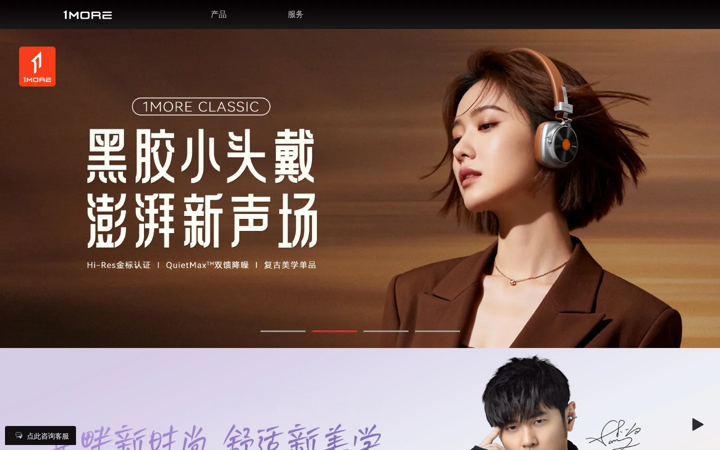
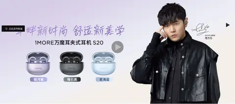
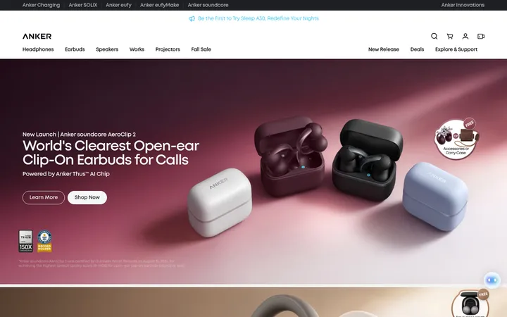
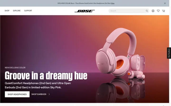
The visual strategy is campaign-first: broad photographic banners occupy the main canvas, with each image supplying its own atmosphere rather than relying on decorative interface color. The measured palette is anchored by white (#ffffff), pale gray (#eeeeee and #e8e8e8), and near-black text; the screenshots add warm brown tones and soft lavender within campaign photography, not as general UI colors. Red appears as a small, high-contrast signal in carousel indicators and customer-service controls. Chinese headlines are prominent and spare, while Gotham family faces and Book support product labels, navigation, and compact utility copy. Large, image-led sections alternate with quieter product and footer areas. The result is a restrained shell around expressive headphone imagery, with minimal visible borders, flat surfaces, and clear separation between campaigns.
配色
点色块复制色值。用途说明来自对页面的实测位置(背景、文字、描边、按钮)与截图判读。
强调色
表层色
中性色
功能色
页面底色 · Gallery White表层 · Soft Mist表层 2 · Footer Gray表层 3 · Night Panel主文字 · Deep Ink次要文字 · Slate Copy弱文字 · Graphite Copy强调 · Vermilion强调 2 · Signal Red强调 3 · Coral Red
Utility labels, captions, buttons, and compact links.
Aa 设计
GothamLight
系统字体 · 字重 400 · 占比 16%
免费替代:Montserrat
Light-weight supporting Latin copy and product messaging.
Aa 设计
GothamMedium
系统字体 · 字重 400 · 占比 11%
免费替代:Montserrat
Medium-weight body and product description text.
Aa 设计
Microsoft Yahei
系统字体 · 字重 400 · 占比 7%
免费替代:Noto Sans SC
Chinese primary heading and product text.
Aa 设计
GothamBold
系统字体 · 字重 700 · 占比 6%
免费替代:Montserrat
Bold section headings and product titles.
Aa 设计
Helvetica Neue
系统字体 · 字重 400 · 占比 2%
免费替代:Inter
Compact customer-service button text.
角色
示例
字号
字重
行高
字距
一级标题
Chinese campaign headline and primary page message.
1MORE
34.5px
400
normal
0
二级标题
Bold product or campaign section titles.
1MORE
29px
700
normal
0
正文
Product descriptions and supporting campaign copy.
The quick brown fox 敏捷的狐狸
20px
400
normal
0
辅助文字
Small product captions and footer details.
The quick brown fox 敏捷的狐狸
12px
400
normal
0
按钮
Customer-service and action labels.
The quick brown fox 敏捷的狐狸
16px
400
2.5
0
链接
Navigation, footer, and product links.
The quick brown fox 敏捷的狐狸
12px
400
normal
0
间距与布局
基准单位 2px · 密度:适中
62px版块间距
—元素间距
—卡片内边距
1200px内容最大宽度
1px
3px
8px
9px
10px
12px
14px
15px
20px
25px
29px
30px
44px
50px
62px
144px
Use a dark, compact top navigation strip above wide campaign panels. The measured page max width is 1200px, while hero and campaign media run full bleed. Stack large visual sections vertically, then divide product content into paired side-by-side panels where appropriate. Keep text aligned within each campaign image or product block instead of imposing a dense card grid. The measured spacing scale is comfortable, with a section gap of 62px; preserve generous separation around content and a quieter, compact footer.
圆角与层次
按钮 · 4px
没有测到阴影:页面是扁平的,层次靠底色和描边区分。
The page reads as mostly flat: measured data reports no shadow system, and the screenshots show little visible border treatment. Separate campaigns through changes in background tone and image composition rather than raised cards. Keep the navigation visually distinct with its dark strip and use the measured small button radius only where relevant; do not add broad shadow effects.
组件
下面的预览按实测的按钮、输入框、徽标、卡片样式重建(字体用替代字体)。
Top navigation
A slim dark header with the white 1MORE mark and a small set of centered, muted navigation links.
Campaign carousel
Full-width photographic hero with embedded campaign messaging and understated slide indicators, including a red active indicator.
Product campaign banner
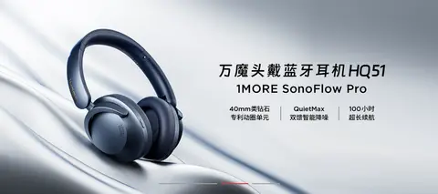
A separate full-width lifestyle or product image block; let the campaign artwork carry its own colors and typography.
Product showcase panels
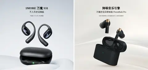
Paired image-led product areas with concise Chinese titles and descriptive copy on pale backgrounds.
Customer-service control
A compact dark consultation control and a coral-red online service button; measured service button text is white.
Footer
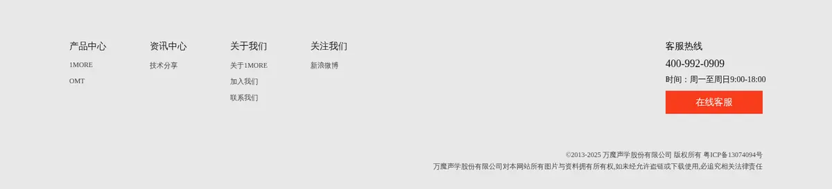
A light gray closing section with grouped product, company, and contact links, customer hotline details, and compact legal copy.
Imagery · Use high-quality product and lifestyle photography as the primary visual language: headphones, earbuds, and campaign talent are presented large, often inside full-width banners. Keep each campaign's photographic color grading intact; warm brown and lavender hues belong to the imagery rather than the UI palette. Product panels use clean, pale backgrounds and isolated product compositions. Avoid adding decorative illustration or interface overlays that compete with the photography.
Lead with wide, high-impact product or lifestyle photography.
Keep the surrounding interface predominantly white and pale gray.
Use red sparingly for active indicators and service actions.
Set Chinese campaign messaging large and uncluttered.
Keep product descriptions and utility links visibly secondary.
Separate sections with quiet changes of background and imagery.
✕ 不该做
Do not turn the measured palette into a multicolor UI theme.
Do not apply campaign-image brown or lavender tones to generic interface surfaces.
Do not add card shadows or decorative borders.
Do not crowd the hero with navigation, badges, or extra copy.
Do not replace the image-led rhythm with a dense product grid.
Do not use red as a large persistent page background.
给 AI 的提示词
想快速出一个同风格的新页面,把这段话连同 DESIGN.md 一起发给 AI。
Build a new 1MORE-style consumer audio page with a quiet interface around expressive product campaigns. Use Gallery White (#ffffff) as the main canvas, Soft Mist (#eeeeee) and Footer Gray (#e8e8e8) for occasional section bands, and Deep Ink (#010101) or Slate Copy (#484848) for text. Reserve Vermilion (#f93b1d), Signal Red (#ff0000), and Coral Red (#ff5138) for small, purposeful campaign or service accents. Place a compact dark navigation above broad, image-led hero content; use concise Chinese headlines and product copy. Alternate full-width lifestyle banners with clean product showcases and finish with a restrained footer. Keep surfaces flat, avoid decorative shadows, and let image color grading provide atmosphere rather than extending it into the UI.