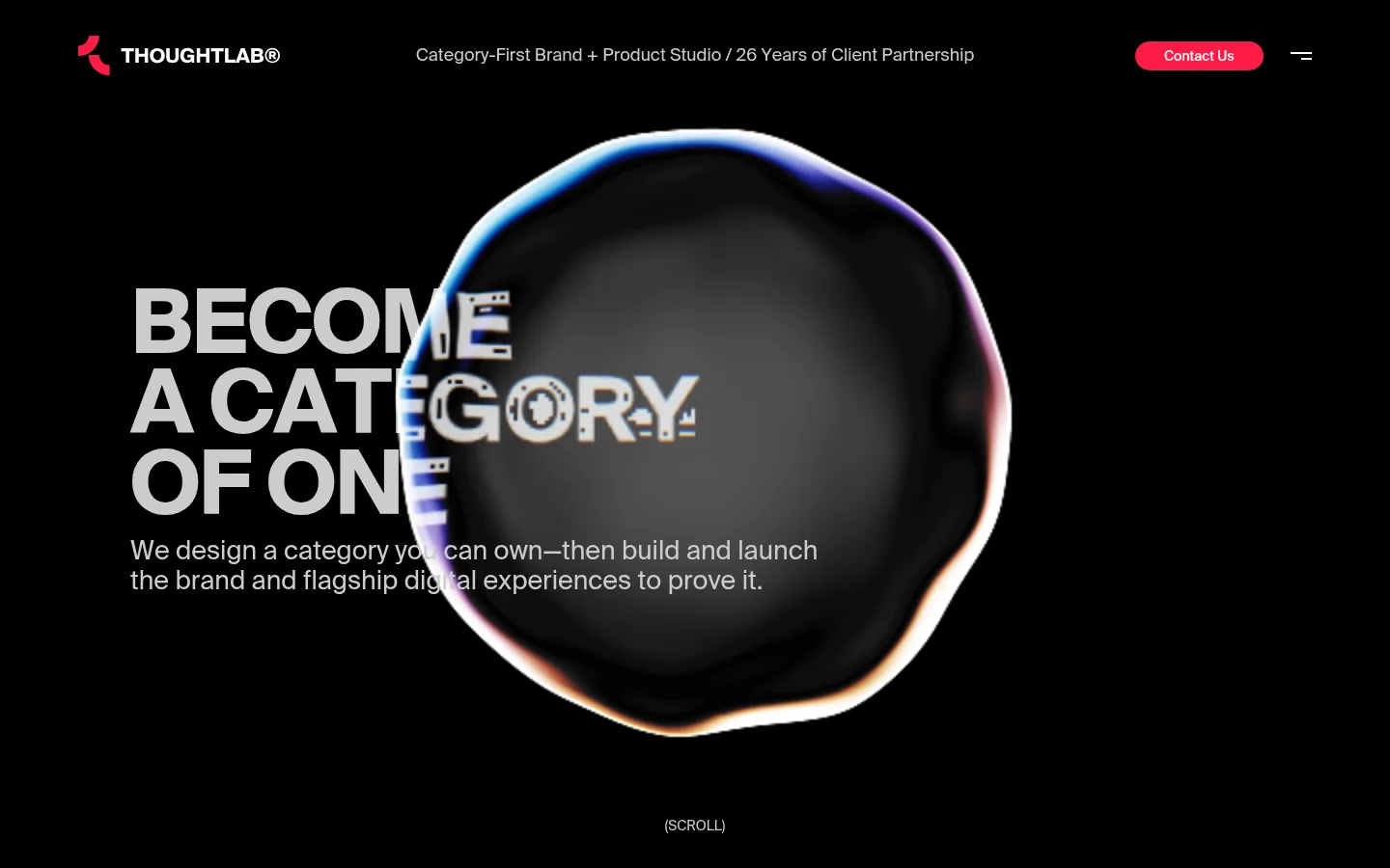
ThoughtLab 首页以近乎纯黑的画布、醒目的编辑式大标题和虹彩 3D 主视觉构成鲜明风格。克制的导航与一枚亮粉色联系按钮,让品牌的品类优先理念成为焦点。
North star · Keep the interface nearly monochrome and let one oversized message overlap a singular, vivid hero visual.
The page uses #000000 as an uninterrupted canvas, giving the hero room to feel cinematic rather than sectioned into conventional panels. Large uppercase display text sits left of center, with the iridescent organic 3D form layered across it; the image adds blue, violet, and warm edge colors, but these belong to the artwork rather than the measured brand palette. #cccccc carries the main headline and supporting copy, while #ffffff is reserved for smaller navigation and button text. The bright #fc1c46 Contact Us pill is the key interface accent and a compact counterpoint to the otherwise monochrome page. Sui provides a consistent typographic voice: tightly tracked, heavy display lettering contrasts with modest, regular-weight supporting text. The header spreads the logo, studio descriptor, CTA, and menu across the top. Broad areas of empty black space, a centered scroll cue, and minimal visible dividers preserve focus on the headline and hero artwork.
Display headline, navigation, body copy, links, and button labels.
角色
示例
字号
字重
行高
字距
特大标题
Oversized uppercase hero statement, bold and tightly tracked.
ThoughtLab
91px
700
0.92
-0.02em
一级标题
Primary supporting hero sentence beneath the headline.
The quick brown fox 敏捷的狐狸
27px
400
1.15
0
二级标题
Secondary section headings and supporting statements.
The quick brown fox 敏捷的狐狸
18px
400
1.15
0
正文
Compact uppercase labels and small supporting text.
The quick brown fox 敏捷的狐狸
14px
400
1.15
0
按钮
Contact Us CTA label.
The quick brown fox 敏捷的狐狸
14px
500
2.14
0
导航
Studio descriptor and header navigation text.
The quick brown fox 敏捷的狐狸
18px
400
1.15
0
间距与布局
基准单位 1px · 密度:宽松
216px版块间距
—元素间距
—卡片内边距
1188px内容最大宽度
4px
9px
22px
30px
43px
A spacious, single-column hero sits within a page canvas measured at a maximum width of 1188px. The header aligns the logo left, studio descriptor near the center, and CTA plus menu to the right. In the hero, left-aligned headline and explanatory copy occupy the left portion while the large 3D form overlaps them from the right. The section uses generous measured rhythm, with a small scroll cue centered near the bottom. Keep the composition sparse; there are no visible card grids or section bands in the supplied page view.
圆角与层次
按钮 · 9999px
没有测到阴影:页面是扁平的,层次靠底色和描边区分。
The measured interface is essentially flat: no shadows, card surfaces, or border system are recorded. Use the black canvas as the main depth field and create layering through the overlap between typography and the 3D artwork. The Contact Us button is a solid accent pill, not a raised control.
组件
下面的预览按实测的按钮、输入框、徽标、卡片样式重建(字体用替代字体)。
Header
Place the logo and mark at left, the 18px regular studio descriptor across the middle, then the Contact Us pill and compact menu control at right.
Hero headline
Set the main message in 91px bold uppercase Sui, with 0.92 line height and -0.02em tracking; align it left and let the artwork cross its right edge.
Supporting copy
Use regular Sui text beneath the headline, in a restrained two-line block that remains readable against the black canvas.
Contact Us button
Use #fc1c46 fill, #ffffff 14px medium text, a fully rounded 9999px radius, and measured horizontal padding of 30px.
Hero artwork
Layer one oversized, dark 3D form with an iridescent rim behind and across the headline; its color is image content, not interface palette.
Scroll cue
Center a small, muted scroll instruction low in the hero without enclosing it in a badge or panel.
Imagery · A single large, soft-edged 3D form dominates the hero, framed against black and layered over the headline. Its dark interior and luminous blue, violet, and warm rim create the page’s strongest visual contrast. Treat those hues as artwork rather than additional interface colors. Keep the image oversized and atmospheric; the supplied view shows no photography or illustration grid.
Keep the header compact and spread its elements horizontally.
Give the hero headline a bold uppercase editorial treatment.
Layer the hero artwork across the headline.
Reserve #fc1c46 for a focused primary action.
Preserve generous empty space around the hero.
Keep supporting text light and visually secondary.
✕ 不该做
Do not introduce colored section bands or card grids.
Do not use the artwork’s iridescent hues as interface accents.
Do not add decorative borders or shadows.
Do not make the header compete with the hero message.
Do not set every text element in the display style.
Do not surround the scroll cue with a container.
给 AI 的提示词
想快速出一个同风格的新页面,把这段话连同 DESIGN.md 一起发给 AI。
Build a new ThoughtLab-style studio page on a #000000 Stage Black canvas. Use Sui, or a close sans-serif substitute, throughout. Create a bold uppercase hero headline with tight tracking and a regular-weight supporting statement; keep the text left aligned and let one oversized, atmospheric 3D visual overlap it. Treat the visual’s blue, violet, or warm iridescence as artwork only. Use #cccccc Soft Silver for primary copy, #ffffff Clean White for compact navigation and button lettering, and reserve #fc1c46 Signal Pink for one pill-shaped primary CTA. Arrange a restrained header with branding, studio descriptor, CTA, and menu. Maintain generous measured spacing, minimal chrome, flat surfaces, and a centered, unobtrusive scroll cue. Avoid panels, shadows, and extra interface colors.