North star · Let one immersive dark image carry the atmosphere, then keep typography and controls crisp, sparse, and secondary.
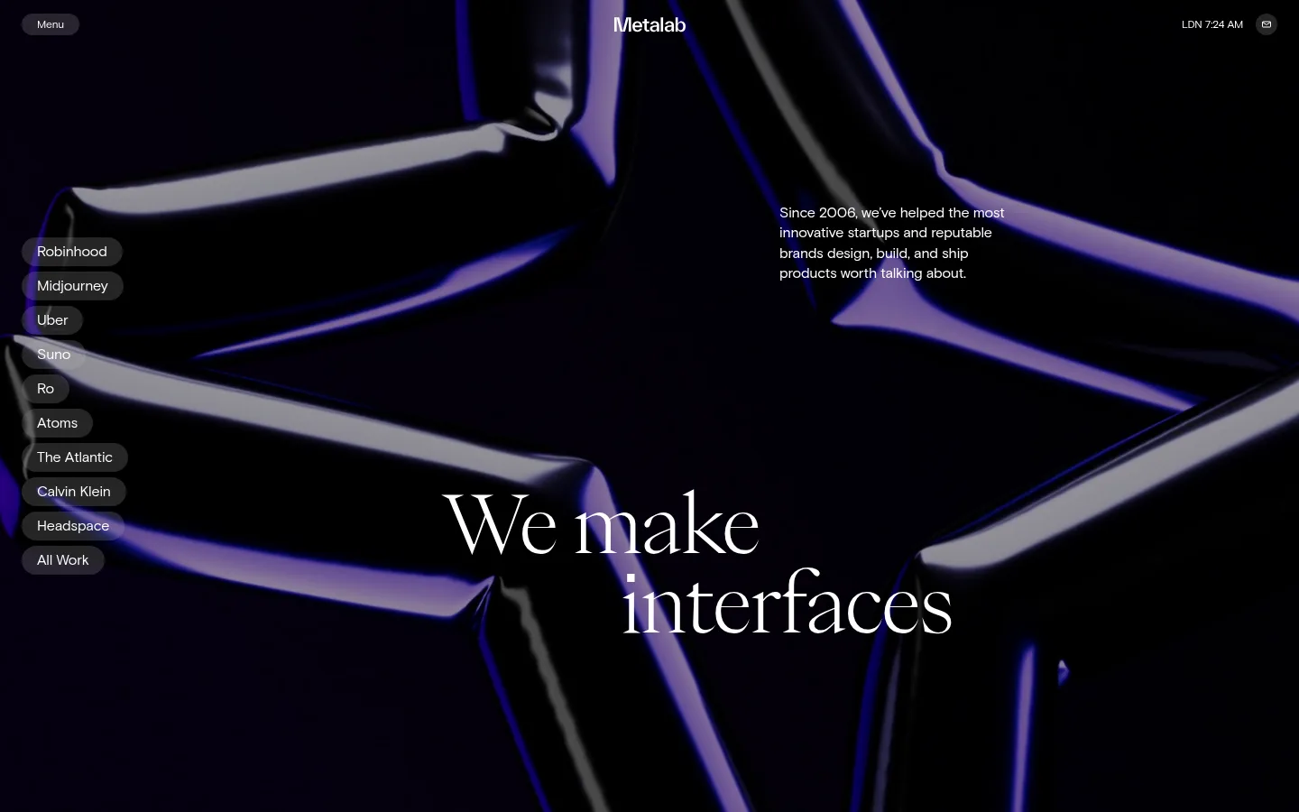
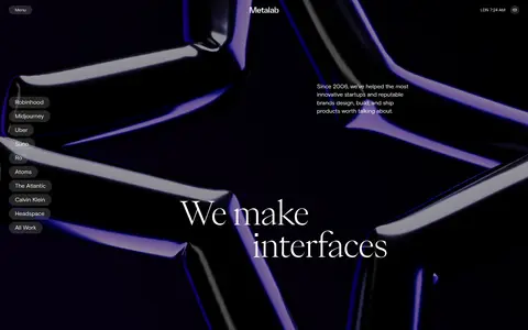
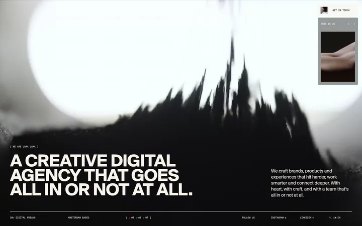
The page is anchored by a black canvas (#000000), with white (#ffffff) typography providing crisp contrast rather than relying on a broad colour palette. The image introduces vivid violet and cool highlights, but these belong to the cinematic hero artwork rather than the measured brand palette. A large, high-contrast PP Eiko serif headline is the focal point; Basis Grotesque Pro handles the compact navigation, client labels, and supporting copy. The layout uses a full-bleed visual as one continuous field, with small controls aligned to the perimeter and a short supporting paragraph placed in the upper-right area. A vertical list of rounded client links runs down the left, balancing the centered-lower headline. Dark charcoal (#252525) is reserved for pill controls, keeping interface elements legible without competing with the image. The result depends on restrained UI, strong typographic contrast, and generous visual openness.
Navigation, client-name pills, and supporting body copy.
Aa 设计
PP Eiko
网络字体 · 字重 240 · 占比 7%
免费替代:Cormorant Garamond
Oversized hero headline.
角色
示例
字号
字重
行高
字距
特大标题
Large two-line hero statement, centered in the lower portion.
Metalab
88px
240
1
-0.02em
正文
Short introductory paragraph positioned in the upper-right.
The quick brown fox 敏捷的狐狸
16px
400
1.4
-0.01em
辅助文字
Compact utility or metadata text where needed.
The quick brown fox 敏捷的狐狸
12px
350
1.2
-0.01em
导航
Small menu label and discreet top-edge navigation.
The quick brown fox 敏捷的狐狸
12px
350
1.2
-0.01em
间距与布局
基准单位 8px · 密度:适中
—版块间距
8px元素间距
—卡片内边距
—内容最大宽度
3px
8px
16px
24px
Treat the hero as a single full-bleed canvas rather than a conventional content container. Place compact navigation near the upper corners, the brand mark at top center, and the short introduction in the upper-right quadrant. A vertical stack of pill-shaped client links hugs the left edge. Position the large two-line display headline near the lower center. Preserve ample negative space between these elements; measurements do not establish a fixed page width or section gap.
圆角与层次
按钮 · 9999px
导航 · 9999px
没有测到阴影:页面是扁平的,层次靠底色和描边区分。
Keep the UI mostly flat: the measured palette shows no shadows or gradients, and no reliable border colour. Separate controls from the image with solid charcoal pill fills and white labels. The artwork itself supplies depth through highlights, reflections, and dark negative space rather than interface layering.
组件
下面的预览按实测的按钮、输入框、徽标、卡片样式重建(字体用替代字体)。
Top menu pill
A compact rounded dark control near the top-left, with a small white Basis Grotesque Pro label.
Client link stack
A vertical list of rounded charcoal pills on the left, using white client names and restrained spacing.
Brand mark
A small white Metalab wordmark centered along the top edge.
Hero headline
A large, delicate PP Eiko serif statement split across two lines and placed over the lower-central image.
Introductory copy
A short white paragraph in a compact sans-serif, positioned in the upper-right portion of the hero.
Utility status
Small location or time text at the top-right, paired with a discreet circular icon control.
Imagery · Use immersive, full-bleed abstract imagery with a glossy, sculptural feel and dramatic black, violet, and cool highlights. Frame it edge to edge as the hero’s atmosphere, allowing the headline and interface labels to sit directly over it. Treat violet tones as image content, not as measured interface colours.
Reserve the serif display face for the main statement.
Use compact sans-serif text for interface labels.
Place controls around the hero perimeter.
Keep client links as rounded dark pills.
✕ 不该做
Do not introduce unmeasured brand accent colours.
Do not turn image violet into an interface colour.
Do not crowd the headline with supporting content.
Do not add prominent shadows or decorative borders.
Do not replace the hero with a card-based layout.
Do not make navigation visually louder than the headline.
给 AI 的提示词
想快速出一个同风格的新页面,把这段话连同 DESIGN.md 一起发给 AI。
Build a new page using Metalab’s cinematic, editorial visual language. Use Midnight Canvas (#000000) for the dominant background and Gallery White (#ffffff) for text; reserve Soft Charcoal (#252525) for discreet pill controls. Create one immersive full-bleed image area, with any violet or reflective hues contained in the artwork rather than used as interface accents. Set the main statement in a refined, high-contrast serif similar to PP Eiko, and use a clean grotesque sans-serif similar to Basis Grotesque Pro for navigation and supporting copy. Keep the headline prominent but surrounded by negative space. Position compact utility navigation at the edges, and use small rounded client or category links. Avoid heavy borders, shadows, dense grids, and decorative UI that competes with the image.