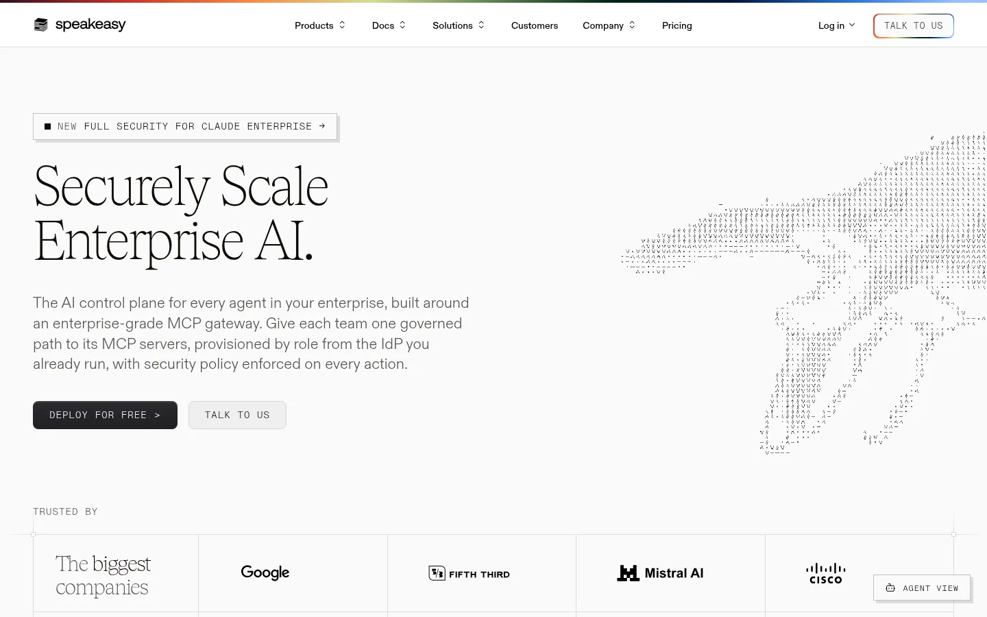
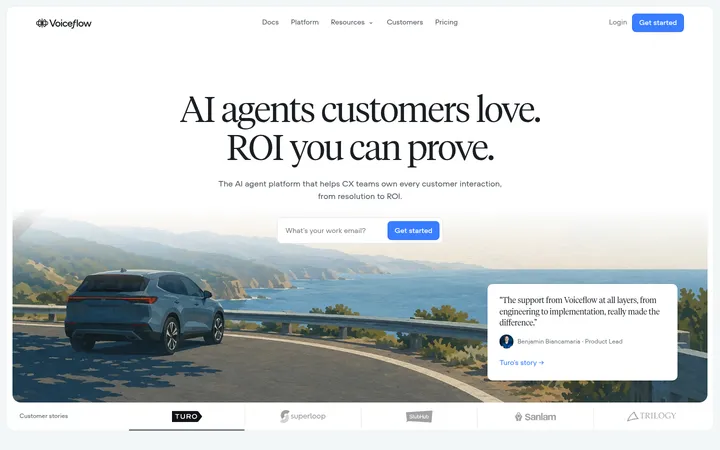
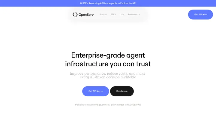
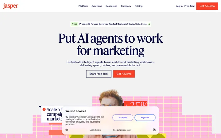
Speakeasy以克制的编辑式版面呈现企业AI治理,将大幅衬线标题、精准的等宽标签与产品界面图结合。浅色画布、细分隔线、紧凑控件和少量深色或彩色强调,让复杂的技术平台显得清晰有序。
North star · Pair editorial serif scale with quiet, precise interface structure, keeping the pale canvas and fine rules dominant.
The page is built on a nearly white canvas, with dark warm ink providing strong, calm contrast. Most content stays within pale, lightly ruled surfaces; a single near-black metrics band adds a deliberate shift in pace. The restrained green, rust, and red accents are used sparingly for badges, product details, and small status cues rather than broad decorative fields. Tobias serif headlines create an editorial voice, while ABCDiatype carries readable body copy and ABCDiatypeMono marks navigation, labels, and actions in uppercase. The layout is spacious and modular: large left-aligned headings introduce sections, followed by bordered grids, customer logos, interface captures, and occasional testimonial or metric panels. Product visuals are treated as evidence of the platform, not as glossy hero photography. Hairline borders and subtle shadows define structure without making the page feel card-heavy.
配色 点色块复制色值。用途说明来自对页面的实测位置(背景、文字、描边、按钮)与截图判读。
品牌色
Roasted Ink
#0f0a07
Primary headings, body text, links, and the dark metrics-section surface.
强调色
Moss Signal
#44663c
Verification and deployment badges, plus occasional small status accents.
Burnt Copper
#b25014
Small editorial and interface accents, including occasional status details.
Leaf Highlight
#8fc27a
Rare green detail in badges or product illustrations; not a primary page color.
Citrus Ember
#fa873c
Occasional warm highlight within accent treatments and interface details.
Signal Brick
#b22c23
Small red status and interface accents, not broad section fills.
表层色
Gallery White
#fafafa
Dominant page canvas and light content surfaces across the hero, sections, and footer.
Mist Surface
#e9e9e8
Secondary pale card and badge surfaces, particularly around product UI.
Charcoal Edge
#1f1e1d
Near-black interface and gradient detail, supporting dark product or CTA treatments.
Deep Charcoal
#141413
Very dark card and button detail, most noticeable in compact interface treatments.
中性色
Warm Graphite
#575251
Muted body copy, secondary links, and low-emphasis footer text.
Soft Divider
#dddcdc
Fine borders and dividers around grids, cards, navigation, and section boundaries.
Quiet Border
#c6c4c4
Subtle outlines and low-contrast edges in cards and product mockups.
Neutral Gray
#808080
Secondary text and muted interface details.
Pale Rule
#e2e1e1
Faint separators and borders within interface and grid treatments.
Soft Pewter
#b3b2b1
Low-emphasis text and fine details in interface-oriented content.
文字 背景 对比度 WCAG #0f0a07 Roasted Ink#fafafa Gallery White18.86:1 AAA #0f0a07 Roasted Ink#dddcdc Soft Divider14.38:1 AAA #0f0a07 Roasted Ink#e9e9e8 Mist Surface16.2:1 AAA #575251 Warm Graphite#fafafa Gallery White7.37:1 AAA #575251 Warm Graphite#0f0a07 Roasted Ink2.56:1 不达标 #575251 Warm Graphite#dddcdc Soft Divider5.62:1 AA
字体 字号阶梯:Perfect Fifth(比例约 1.481,正文 18px)。示例用免费替代字体渲染,数值为实测。
Aa 设计
ABCDiatype 网络字体 · 字重 300 / 400 / 500 / 600 · 占比 64%
免费替代:Inter
Body copy, supporting text, and product-interface descriptions.
Aa 设计
ABCDiatypeMono 网络字体 · 字重 300 / 400 / 500 · 占比 30%
免费替代:IBM Plex Mono
Navigation, eyebrows, buttons, links, and compact technical labels.
Aa 设计
Tobias 网络字体 · 字重 100 · 占比 7%
免费替代:Newsreader
Display and section headlines, including large editorial statements.
角色 示例 字号 字重 行高 字距 特大标题 Oversized editorial statement headlines in major page moments.
Speakeasy
86.5px 100 1.02 -0.035em 一级标题 Primary hero headline and other top-level section statements.
Speakeasy
65px 100 1.04 -0.035em 二级标题 Section headings introducing features, governance, and proof points.
Speakeasy
34.5px 100 1 -0.035em 三级标题 Feature titles and supporting product-section headings.
The quick brown fox 敏捷的狐狸
22px 300 1.4 0 正文 Explanatory paragraphs and customer-story supporting copy.
The quick brown fox 敏捷的狐狸
18px 300 1.45 0 辅助文字 Compact descriptions, attribution details, and secondary content.
The quick brown fox 敏捷的狐狸
16px 300 1.5 0 按钮 Uppercase CTA labels in monospace.
The quick brown fox 敏捷的狐狸
14px 300 1.2 0.08em 导航 Uppercase primary navigation labels.
The quick brown fox 敏捷的狐狸
12px 300 1.66 0.03em 链接 Uppercase inline actions and feature exploration links.
The quick brown fox 敏捷的狐狸
14px 300 1.2 0.08em 眉题 Compact uppercase announcement and section labels.
The quick brown fox 敏捷的狐狸
14px 300 1.2 0.08em 代码 Tiny monospace details inside product-interface visuals.
const style = 1;
4.5px 300 1.1 0
间距与布局 基准单位 4px · 密度:宽松
96px 版块间距
8px 元素间距
32px 卡片内边距
1344px 内容最大宽度
1px
2px
4px
6px
8px
10px
12px
14px
16px
20px
24px
32px
40px
48px
96px
Use a spacious, centered page framework with a measured maximum width of 1344px and strong left alignment for headlines and copy. The long homepage alternates broad editorial sections with structured grids, logo tables, product screenshots, testimonials, and metrics. The section rhythm is generous, with a measured section gap of 96px and compact 8px element gaps. Keep cards and content aligned to clear columns; use thin rules to separate modules rather than adding heavy containers. The visual density stays low outside interface mockups.
圆角与层次 lg · card, other
hairline · button
inset · button
xl · card
The design is primarily flat, using fine gray borders to define tables, cards, and section divisions. Product panels may receive a restrained soft shadow, while buttons can use a crisp offset edge. Keep depth subordinate to typography and rules; avoid floating-card stacks or dramatic ambient shadows.
组件 下面的预览按实测的按钮、输入框、徽标、卡片样式重建(字体用替代字体)。
Announcement strip An uppercase monospace release notice sits in a lightly outlined rectangular control with a right arrow and a subtle offset edge.
Primary CTA A dark rounded button with light uppercase monospace text; the hero pairs it with a pale secondary contact button.
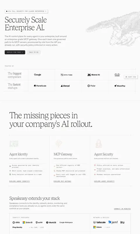
Trust logo grid Customer marks sit in a ruled multi-column table beneath a small uppercase trust label.
Feature cards Three product capabilities are presented in adjacent lightly bordered columns with small illustrations, concise copy, and uppercase links.
Verification badges Compact green-tinted status chips use uppercase monospace text, pale green fill, and a thin green border.
Testimonial panel Large serif quotation is paired with a small colored quote mark, portrait, attribution, and customer logo.
Product interface panel Dashboard and workflow captures are framed by subtle rules and pale surfaces, with dark interface content used selectively.
Imagery · Use product-interface screenshots and technical illustrations as evidence of the AI governance platform. The hero pairs copy with a delicate ASCII-like hand illustration; other sections show dashboard panels, workflows, and compliance details. Keep imagery mostly pale, precise, and integrated into the grid. Customer logos and small status marks support credibility; avoid lifestyle photography or glossy 3D treatments.
页面版块 共 2 个版块,按页面从上到下排列,每个都标了类型、布局和交互套路。
该做与不该做 ✓ 该做 Use Gallery White as the dominant canvas. Set major headlines in a light editorial serif. Use uppercase monospace for labels and actions. Organize content with fine rules and aligned grids. Reserve accent colors for small status or interface cues. Give sections generous breathing room. ✕ 不该做 Do not fill large areas with accent colors. Do not use heavy shadows to separate every card. Do not replace the editorial headlines with generic bold sans-serif. Do not crowd the page with dense decorative elements. Do not present product interfaces as glossy device mockups. Do not use rounded pills where the page uses restrained rectangular controls. 给 AI 的提示词 想快速出一个同风格的新页面,把这段话连同 DESIGN.md 一起发给 AI。
复制 Build a new enterprise AI product page in Speakeasy’s restrained editorial style. Use Gallery White (#fafafa) as the dominant canvas, Roasted Ink (#0f0a07) for headlines and primary text, Warm Graphite (#575251) for secondary copy, and Soft Divider (#dddcdc) for fine grid rules. Set large, light serif headlines in a Tobias-like face and use a clean sans for body copy; reserve a tracked uppercase monospace for navigation, labels, and buttons. Compose spacious, left-aligned sections with clear columns, generous separation, and product-interface imagery that feels precise rather than glossy. Use Moss Signal (#44663c), Burnt Copper (#b25014), and Signal Brick (#b22c23) only as restrained status or interface accents. Keep surfaces mostly flat, using subtle borders and occasional soft shadows. Make CTAs compact and clear.
DESIGN.md Tailwind v4 CSS 变量 Design Tokens
---
title: "Speakeasy design system"
variant: extended
source: https://www.speakeasy.com/
captured_at: 2026-10-12
theme: light
industry: ai
generator: Design DNA (https://four.wiralomi.com/style/speakeasy-com)
ai_generated: true
ai_label: "本文件由 AI 辅助生成:数值取自公开网页的实测样式,命名、用途说明与建议为模型解读。商标归原所有者。 / AI-assisted content"
---
# Speakeasy · Design System
> Quiet editorial design for enterprise AI control
**Theme:** light · **Industry:** ai · **Source:** https://www.speakeasy.com/ · **Captured:** 2026-10-12 (1440×900 desktop)
_AI-assisted content: values are measured from the public page at capture time; names, roles and guidance are model-written interpretations. Trademarks belong to their owners._
Speakeasy presents enterprise AI governance through a restrained editorial layout, combining oversized serif headlines with precise monospace labels and product-interface imagery. Pale canvas, fine rules, compact controls, and occasional dark or colored accents make a complex technical platform feel orderly and legible.
## North star
Pair editorial serif scale with quiet, precise interface structure, keeping the pale canvas and fine rules dominant.
## Overview
The page is built on a nearly white canvas, with dark warm ink providing strong, calm contrast. Most content stays within pale, lightly ruled surfaces; a single near-black metrics band adds a deliberate shift in pace. The restrained green, rust, and red accents are used sparingly for badges, product details, and small status cues rather than broad decorative fields. Tobias serif headlines create an editorial voice, while ABCDiatype carries readable body copy and ABCDiatypeMono marks navigation, labels, and actions in uppercase. The layout is spacious and modular: large left-aligned headings introduce sections, followed by bordered grids, customer logos, interface captures, and occasional testimonial or metric panels. Product visuals are treated as evidence of the platform, not as glossy hero photography. Hairline borders and subtle shadows define structure without making the page feel card-heavy.
## Colors
| Name | Hex | Token | Group | Role |
|---|---|---|---|---|
| Gallery White | ` | `--color-gallery-white` | surface | Dominant page canvas and light content surfaces across the hero, sections, and footer. |
| Warm Graphite | ` | `--color-warm-graphite` | neutral | Muted body copy, secondary links, and low-emphasis footer text. |
| Moss Signal | ` | `--color-moss-signal` | accent | Verification and deployment badges, plus occasional small status accents. |
| Roasted Ink | ` | `--color-roasted-ink` | brand | Primary headings, body text, links, and the dark metrics-section surface. |
| Soft Divider | ` | `--color-soft-divider` | neutral | Fine borders and dividers around grids, cards, navigation, and section boundaries. |
| Burnt Copper | ` | `--color-burnt-copper` | accent | Small editorial and interface accents, including occasional status details. |
| Leaf Highlight | ` | `--color-leaf-highlight` | accent | Rare green detail in badges or product illustrations; not a primary page color. |
| Citrus Ember | ` | `--color-citrus-ember` | accent | Occasional warm highlight within accent treatments and interface details. |
| Mist Surface | ` | `--color-mist-surface` | surface | Secondary pale card and badge surfaces, particularly around product UI. |
| Signal Brick | ` | `--color-signal-brick` | accent | Small red status and interface accents, not broad section fills. |
| Quiet Border | ` | `--color-quiet-border` | neutral | Subtle outlines and low-contrast edges in cards and product mockups. |
| Neutral Gray | ` | `--color-neutral-gray` | neutral | Secondary text and muted interface details. |
| Pale Rule | ` | `--color-pale-rule` | neutral | Faint separators and borders within interface and grid treatments. |
| Soft Pewter | ` | `--color-soft-pewter` | neutral | Low-emphasis text and fine details in interface-oriented content. |
| Charcoal Edge | ` | `--color-charcoal-edge` | surface | Near-black interface and gradient detail, supporting dark product or CTA treatments. |
| Deep Charcoal | ` | `--color-deep-charcoal` | surface | Very dark card and button detail, most noticeable in compact interface treatments. |
### Semantic aliases
`--color-canvas` → ` (Gallery White) · `--color-surface` → ` (Roasted Ink) · `--color-surface-2` → ` (Soft Divider) · `--color-surface-3` → ` (Mist Surface) · `--color-text` → ` (Roasted Ink) · `--color-text-muted` → ` (Warm Graphite) · `--color-text-subtle` → ` (Moss Signal) · `--color-border` → ` (Soft Divider) · `--color-accent` → ` (Moss Signal) · `--color-accent-2` → ` (Burnt Copper) · `--color-accent-3` → ` (Signal Brick)
### Contrast (WCAG 2.x)
| Text | Background | Ratio | Level |
|---|---|---|---|
| ` | ` | 18.86:1 | AAA |
| ` | ` | 14.38:1 | AAA |
| ` | ` | 16.2:1 | AAA |
| ` | ` | 7.37:1 | AAA |
| ` | ` | 2.56:1 | fail |
| ` | ` | 5.62:1 | AA |
| ` | ` | 6.33:1 | AA |
| ` | ` | 6.26:1 | AA |
| ` | ` | 3.01:1 | AA-large |
| ` | ` | 4.78:1 | AA |
### Gradients
- `url("https://www.speakeasy.com/webgl/hand-ascii-poster.webp"), linear-gradient(rgb(250, 250, 250) 90%, rgba(0, 0, 0, 0) 92%)`
- `linear-gradient(rgb(42, 42, 46) 0%, rgb(31, 31, 34) 100%)`
- `linear-gradient(90deg, rgb(51, 15, 31) 0%, rgb(200, 50, 40) 12.56%, rgb(251, 136, 65) 25.06%, rgb(211, 221, 146) 37.56%, rgb(89, 130, 79) 50.06%, rgb(0, 36, 20) 62.06%, rgb(0, 20, 61) 74.06%, rgb(40, 116, 215) 86.06%, rg`
- `linear-gradient(rgb(50, 15, 30) 0%, rgb(200, 50, 40) 13%, rgb(251, 135, 63) 25%, rgb(210, 220, 145) 38%, rgb(90, 130, 80) 50%, rgb(0, 35, 20) 62%, rgb(0, 20, 60) 74%, rgb(40, 115, 215) 86%, rgb(155, 195, 255) 100%)`
## Typography
| Family | Token | Source | Weights | Role | Free substitute |
|---|---|---|---|---|---|
| ABCDiatype | `--font-body` | webfont | 300, 400, 500, 600 | Body copy, supporting text, and product-interface descriptions. | Inter |
| ABCDiatypeMono | `--font-mono` | webfont | 300, 400, 500 | Navigation, eyebrows, buttons, links, and compact technical labels. | IBM Plex Mono |
| Tobias | `--font-display` | webfont | 100 | Display and section headlines, including large editorial statements. | Newsreader |
- **ABCDiatype:** Light weights dominate; use restrained, natural tracking and sentence case for readable copy.
- **ABCDiatypeMono:** Light monospace, typically uppercase, with visibly expanded tracking for controls and labels.
- **Tobias:** Very light serif with tight negative tracking; use generous scale and concise line breaks.
### Type scale — Perfect Fifth (ratio ≈ 1.481, base 18px)
| Role | Size | Weight | Line height | Letter spacing | Case | Family | Used for |
|---|---|---|---|---|---|---|---|
| display | 86.5px | 100 | 1.02 | -0.035em | — | Tobias | Oversized editorial statement headlines in major page moments. |
| h1 | 65px | 100 | 1.04 | -0.035em | — | Tobias | Primary hero headline and other top-level section statements. |
| h2 | 34.5px | 100 | 1 | -0.035em | — | Tobias | Section headings introducing features, governance, and proof points. |
| h3 | 22px | 300 | 1.4 | 0 | — | ABCDiatype | Feature titles and supporting product-section headings. |
| body | 18px | 300 | 1.45 | 0 | — | ABCDiatype | Explanatory paragraphs and customer-story supporting copy. |
| caption | 16px | 300 | 1.5 | 0 | — | ABCDiatype | Compact descriptions, attribution details, and secondary content. |
| button | 14px | 300 | 1.2 | 0.08em | uppercase | ABCDiatypeMono | Uppercase CTA labels in monospace. |
| nav | 12px | 300 | 1.66 | 0.03em | uppercase | ABCDiatypeMono | Uppercase primary navigation labels. |
| link | 14px | 300 | 1.2 | 0.08em | uppercase | ABCDiatypeMono | Uppercase inline actions and feature exploration links. |
| eyebrow | 14px | 300 | 1.2 | 0.08em | uppercase | ABCDiatypeMono | Compact uppercase announcement and section labels. |
| code | 4.5px | 300 | 1.1 | 0 | — | ABCDiatypeMono | Tiny monospace details inside product-interface visuals. |
## Spacing & layout
- Base unit **4px**, density **spacious**.
- Scale (most used values): 1, 2, 4, 6, 8, 10, 12, 14, 16, 20, 24, 32, 40, 48, 96 px.
- Section rhythm 96px · element gap 8px · card padding 32px · max content width 1344px.
Use a spacious, centered page framework with a measured maximum width of 1344px and strong left alignment for headlines and copy. The long homepage alternates broad editorial sections with structured grids, logo tables, product screenshots, testimonials, and metrics. The section rhythm is generous, with a measured section gap of 96px and compact 8px element gaps. Keep cards and content aligned to clear columns; use thin rules to separate modules rather than adding heavy containers. The visual density stays low outside interface mockups.
## Shape & elevation
- Radius: button `8px` · card `4px` · badge `3px` · nav `8px` · xs `2px` · sm `3px` · md `4px` · lg `5px` · xl `6px` · 2xl `8px` · pill `9999px`
- Shadow `lg` (card, other): `rgba(0, 0, 0, 0) 0px 0px 0px 0px, rgba(0, 0, 0, 0) 0px 0px 0px 0px, rgba(0, 0, 0, 0) 0px 0px 0px 0px, rgba(0, 0, 0, 0) 0px 0px 0px 0px, rgba(15, 10, 7, 0.04) 0px 1px 2px 0px, rgba(15, 10, 7, 0.18) 0px`
- Shadow `hairline` (button): `rgba(0, 0, 0, 0) 0px 0px 0px 0px, rgba(0, 0, 0, 0) 0px 0px 0px 0px, rgba(0, 0, 0, 0) 0px 0px 0px 0px, rgba(0, 0, 0, 0) 0px 0px 0px 0px, rgba(15, 10, 7, 0.12) 4px 4px 0px 0px`
- Shadow `inset` (button): `rgb(65, 65, 65) 0px 2px 1px 0px inset`
- Shadow `xl` (card): `rgba(0, 0, 0, 0) 0px 0px 0px 0px, rgba(0, 0, 0, 0) 0px 0px 0px 0px, rgba(0, 0, 0, 0) 0px 0px 0px 0px, rgba(0, 0, 0, 0) 0px 0px 0px 0px, rgba(15, 10, 7, 0.12) 0px 0px 0px 1px, rgba(15, 10, 7, 0.28) 0px`
- Shadow `xl-2` (card): `rgba(0, 0, 0, 0) 0px 0px 0px 0px, rgba(0, 0, 0, 0) 0px 0px 0px 0px, rgba(0, 0, 0, 0) 0px 0px 0px 0px, rgba(0, 0, 0, 0) 0px 0px 0px 0px, rgba(15, 10, 7, 0.1) 0px 20px 50px 0px`
- Shadow `sm` (other): `rgba(0, 0, 0, 0) 0px 0px 0px 0px, rgba(0, 0, 0, 0) 0px 0px 0px 0px, rgba(0, 0, 0, 0) 0px 0px 0px 0px, rgba(0, 0, 0, 0) 0px 0px 0px 0px, rgba(0, 0, 0, 0.06) 0px 1px 4px 0px`
- Motion: standard transition `0.15s cubic-bezier(0.4, 0, 0.2, 1)` on interactive elements.
The design is primarily flat, using fine gray borders to define tables, cards, and section divisions. Product panels may receive a restrained soft shadow, while buttons can use a crisp offset edge. Keep depth subordinate to typography and rules; avoid floating-card stacks or dramatic ambient shadows.
## Imagery
Use product-interface screenshots and technical illustrations as evidence of the AI governance platform. The hero pairs copy with a delicate ASCII-like hand illustration; other sections show dashboard panels, workflows, and compliance details. Keep imagery mostly pale, precise, and integrated into the grid. Customer logos and small status marks support credibility; avoid lifestyle photography or glossy 3D treatments.
## Components
### Announcement strip
An uppercase monospace release notice sits in a lightly outlined rectangular control with a right arrow and a subtle offset edge.
### Primary CTA
A dark rounded button with light uppercase monospace text; the hero pairs it with a pale secondary contact button.
### Trust logo grid
Customer marks sit in a ruled multi-column table beneath a small uppercase trust label.
### Feature cards
Three product capabilities are presented in adjacent lightly bordered columns with small illustrations, concise copy, and uppercase links.
### Verification badges
Compact green-tinted status chips use uppercase monospace text, pale green fill, and a thin green border.
### Testimonial panel
Large serif quotation is paired with a small colored quote mark, portrait, attribution, and customer logo.
### Product interface panel
Dashboard and workflow captures are framed by subtle rules and pale surfaces, with dark interface content used selectively.
### Measured component styles
- **Primary button** (“TALK TO US”): background ## Do
- Use Gallery White as the dominant canvas.
- Set major headlines in a light editorial serif.
- Use uppercase monospace for labels and actions.
- Organize content with fine rules and aligned grids.
- Reserve accent colors for small status or interface cues.
- Give sections generous breathing room.
## Don't
- Do not fill large areas with accent colors.
- Do not use heavy shadows to separate every card.
- Do not replace the editorial headlines with generic bold sans-serif.
- Do not crowd the page with dense decorative elements.
- Do not present product interfaces as glossy device mockups.
- Do not use rounded pills where the page uses restrained rectangular controls.
## Agent prompt
Build a new enterprise AI product page in Speakeasy’s restrained editorial style. Use Gallery White (## Page sections (top to bottom)
| # | Type | Layout | UX patterns | UI patterns |
|---|---|---|---|---|
| 1 | hero | Long, spacious landing page beginning with a left-aligned hero, followed by logos, feature grids, product panels, testimonials, and proof sections. | Announcement link, Primary and secondary CTAs, Customer trust marks, Feature exploration links | Serif display headline, Monospace uppercase labels, Fine ruled grids, Product interface captures, Occasional dark metrics band |
| 2 | footer | Multi-column footer with brand and social controls at left and grouped navigation links across the remaining columns. | Grouped site navigation, Social links, Display-theme control, Legal links | Light surface, Small monospace labels, Thin top divider, Compact link columns |
## Source CSS custom properties (selected)
```css
--color-base-white: #fff;
--color-base-black: #000;
--color-bsmnt-neutral-100: