North star · Keep the interface quiet and dark so colorful, tangible 3D work remains the unmistakable focal point.
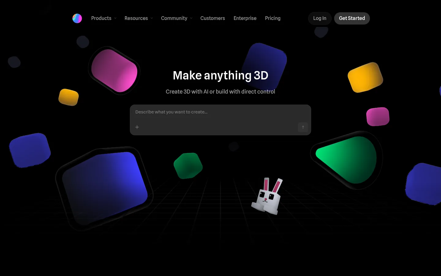
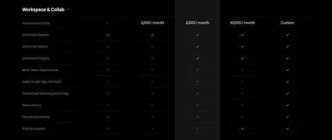
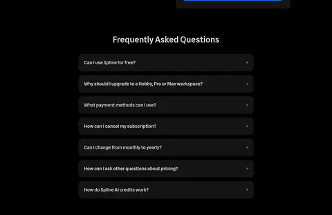
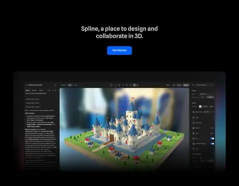
The visual strategy pairs a nearly black canvas with restrained gray interface surfaces, letting colorful 3D work carry most of the visual energy. #e6e6e6 and white establish a crisp hierarchy for centered headlines, navigation, and calls to action; muted grays support secondary copy without competing with the renders. Blue is reserved for prominent conversion buttons, while sampled warm and green accents are minor text colors rather than defining brand surfaces. Spline Sans gives headings and interface copy a consistent, contemporary voice, with monospace used for code. The layout alternates centered introductions with compact modular grids and wide product demonstrations. Generous black space separates dense content groups, while dark cards, subtle hairlines, and rounded corners keep examples organized. The hero's floating, saturated 3D shapes are illustrative product imagery, not a page-wide background color system.
Headings, paragraphs, navigation, links, and buttons throughout the page.
Aa 设计
ui-monospace
系统字体 · 字重 400 · 占比 6%
免费替代:Roboto Mono
Code examples and technical snippets in integration or embed content.
角色
示例
字号
字重
行高
字距
一级标题
Centered hero headline and primary page-level statement.
Spline
40px
500
1.35
0
二级标题
Centered section introductions and major product feature headings.
Spline
38.5px
500
1.25
0
三级标题
Feature, showcase, and lower-level content headings.
Spline
36px
500
1.22
0
四级标题
Compact card titles and supporting section labels.
The quick brown fox 敏捷的狐狸
24px
400
1.5
0
正文
Main explanatory paragraphs and product descriptions.
The quick brown fox 敏捷的狐狸
18px
400
1.56
0
辅助文字
Small labels, credits, and supporting card copy.
The quick brown fox 敏捷的狐狸
16px
400
1.5
0
按钮
Short labels on primary and secondary action controls.
The quick brown fox 敏捷的狐狸
14px
400
1.15
0
导航
Top-level navigation and menu labels.
The quick brown fox 敏捷的狐狸
16px
400
1.15
0
链接
Inline links and compact secondary actions.
The quick brown fox 敏捷的狐狸
14px
400
1.15
0
代码
Embed snippets and technical implementation examples.
const style = 1;
14px
400
1.5
0
间距与布局
基准单位 4px · 密度:紧凑
32px版块间距
12px元素间距
—卡片内边距
1080px内容最大宽度
4px
6px
8px
10px
12px
16px
20px
24px
32px
40px
Use a centered content area capped at the measured 1080px maximum, with a compact 12-column rhythm where grids appear. The hero centers its message and input over a full-bleed black stage. Lower sections alternate centered introductions with paired product content and modular card grids. Maintain a compact measured spacing system, but preserve conspicuous black breathing room between major blocks. Align most headings centrally; let feature-card copy align to the card's content. The page is long-form and dense in examples, yet its generous dark intervals keep the overall composition calm.
圆角与层次
按钮 · 12px
卡片 · 16px
图片 · 50%
导航 · 9999px
链接 · 16px
inset · card
The interface favors flat black surfaces and subtle contrast over pronounced elevation. Cards use dark fills, thin near-black borders, and restrained rounding; the measured card shadow is a faint inset white outline. Layer 3D renders and interface screenshots inside panels, but avoid heavy drop shadows or bright borders that compete with the artwork.
组件
下面的预览按实测的按钮、输入框、徽标、卡片样式重建(字体用替代字体)。
Top navigation
Centered horizontal menu with white or muted labels, a colorful brand mark, and compact pill-shaped Log In and Get Started controls.
Hero prompt
Centered headline and supporting line above a wide dark prompt field, with subdued placeholder text and small utility controls.
Primary CTA
Use Spline Blue #0062ff with white text and a measured 12px radius; the main free-start action has measured 16px type.
Community gallery
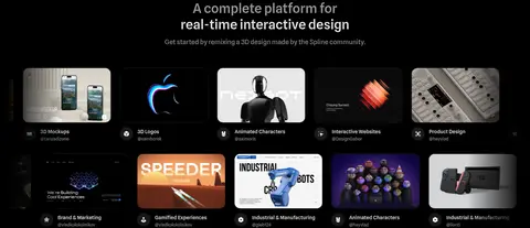
Compact grid of creator-made 3D and interactive website thumbnails, each presented as a dark media card with a short title and credit.
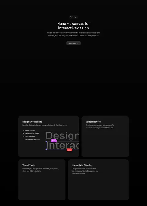
Feature cards
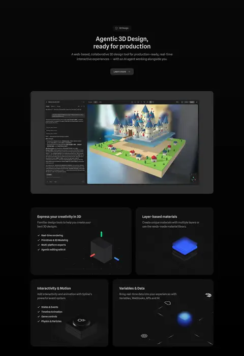
Dark rounded panels combine concise feature copy, optional checklists, and a 3D render or product visual.
Testimonial
Centered customer quote with company mark, concise attribution, and a small portrait, surrounded by ample black space.
Integration showcase
Pair a rendered or interactive preview with a dark code panel; use monospace text for embed snippets and compact integration marks.
Imagery · Treat 3D renders as the page's signature artwork: saturated, softly lit forms float against black in the hero, while product demos show the actual design interface and interactive scenes. Use media previews and community-created work in compact galleries. Feature cards may pair concise copy with small rendered objects. Keep imagery carefully framed within dark rounded panels; don't mistake illustration colors for the site's UI palette.
Keep navigation and section introductions visually restrained.
Let saturated 3D renders provide most of the color.
Use blue only for high-priority conversion actions.
Organize examples in dark, subtly bordered rounded cards.
Separate major content groups with generous black space.
✕ 不该做
Don't apply bright gradients to large interface surfaces.
Don't treat artwork colors as core brand colors.
Don't use heavy shadows or bright card outlines.
Don't make every section or card equally prominent.
Don't replace the quiet dark canvas with alternating bright bands.
Don't use decorative typography that competes with product imagery.
给 AI 的提示词
想快速出一个同风格的新页面,把这段话连同 DESIGN.md 一起发给 AI。
Build a new Spline-style product page on a deep black canvas using Canvas Black (#000000) as the dominant surface. Set headlines and core copy in Spline Sans or a close sans-serif alternative; use Interface White (#ffffff) and Soft Chalk (#e6e6e6) for primary contrast, with Quiet Gray (#999999) for supporting text. Reserve Spline Blue (#0062ff) for the main conversion action. Create a centered hero, then alternate concise centered introductions with product demonstrations, modular dark feature cards, and community or customer proof. Use Graphite Hairline (#1a1a1a) and Night Panel (#141414) for subtle card separation, restrained rounded corners, and minimal elevation. Make vivid, high-quality 3D media the visual focal point. Keep the interface uncluttered, spacing deliberate, and major sections separated by black breathing room.