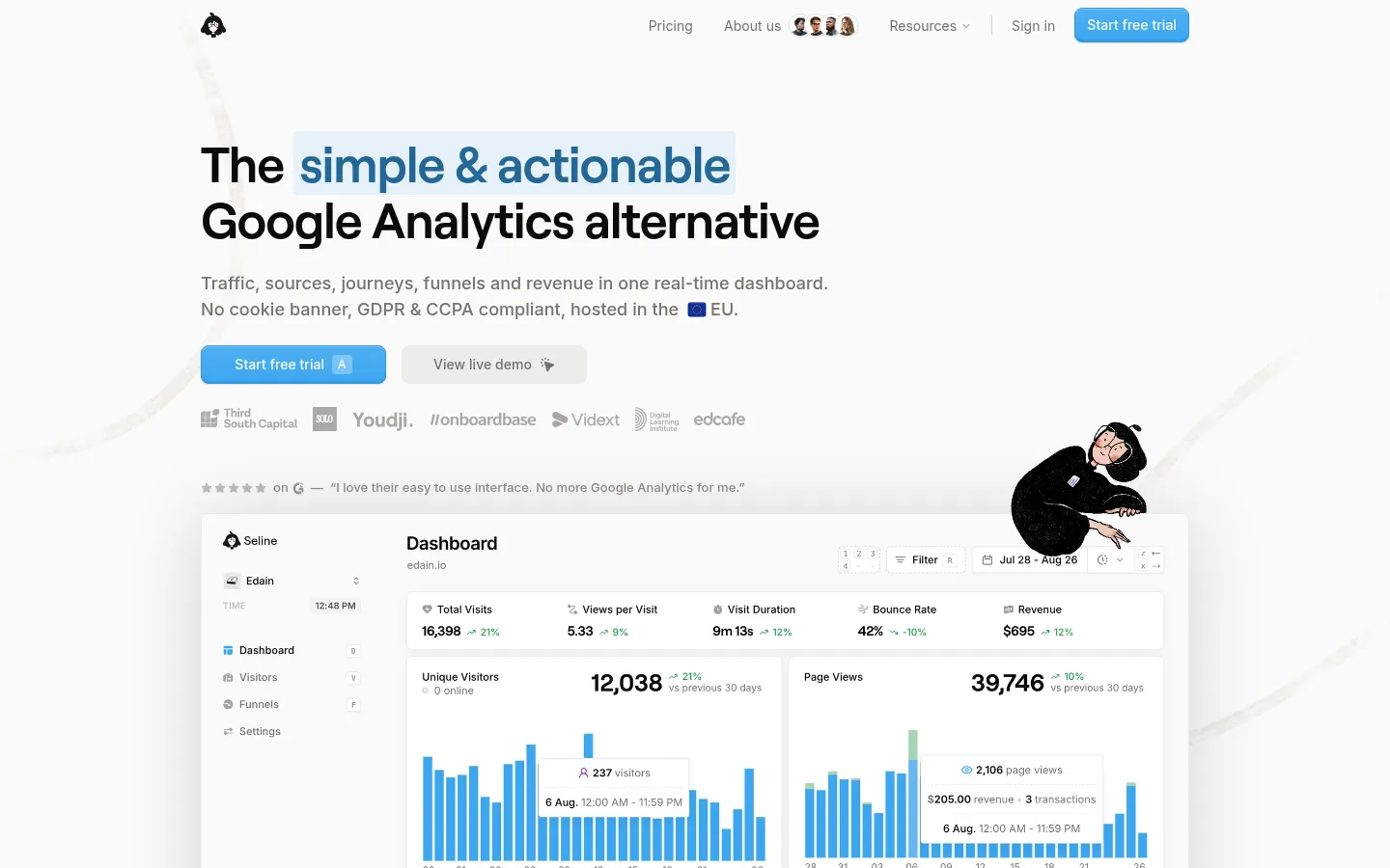
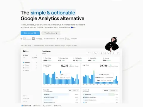
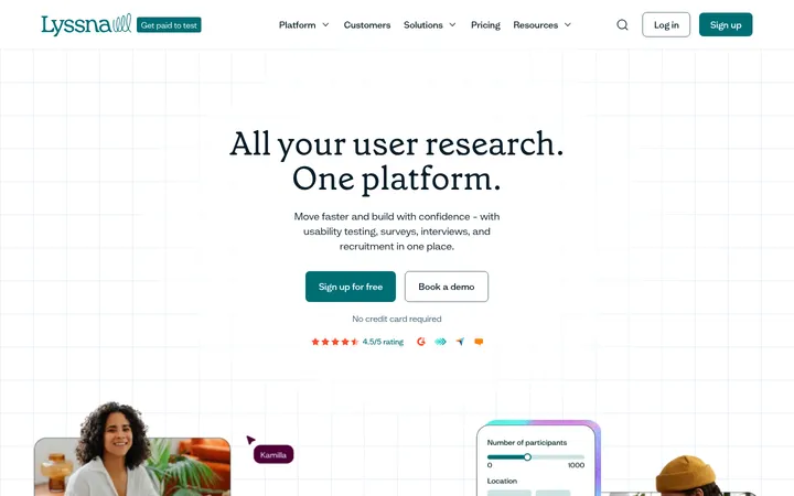
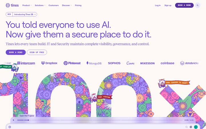
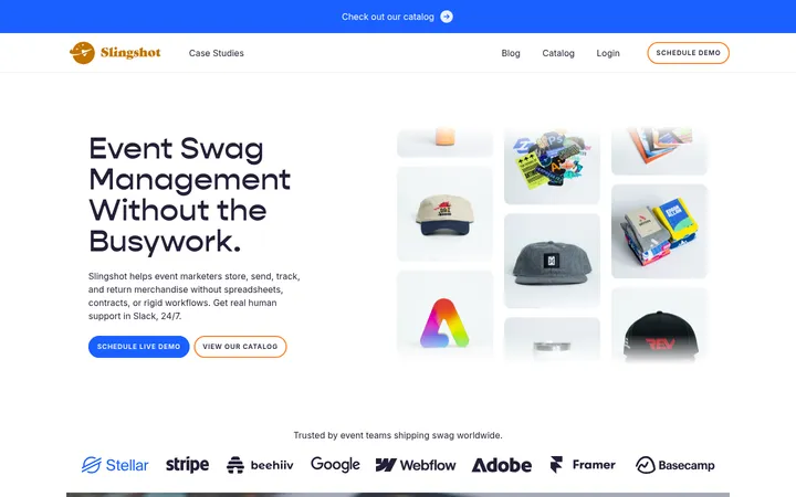
Seline以近白色画布、克制的字体和清晰的蓝色行动按钮,呈现注重隐私的网站分析产品。仪表盘画面与手绘插画增添亲和力,同时始终突出软件产品本身。
North star · Keep the canvas quiet and nearly white; use blue sparingly to direct attention to actions and meaningful product details.
The page uses a warm near-white canvas (#fafaf9) almost throughout, with white cards and restrained pale gray bands keeping the long homepage visually continuous. Deep near-black headings provide contrast; muted stone-gray text carries navigation, body copy, and supporting details. Bright blue (#3ba6f1) marks primary actions, links, and selected product data, while darker and paler blues appear as secondary accents. Roobert gives large headings a soft, distinctive shape, paired with Inter for compact, readable interface text. The layout is centered within a measured 1024px maximum width, alternating between focused text blocks and broad product demonstrations. White dashboard panels, fine borders, and subtle shadows organize dense information without heavy framing. Hand-drawn character illustrations and realistic interface captures bring warmth and product proof; they remain supporting elements rather than competing with the clean, quiet interface.
配色 点色块复制色值。用途说明来自对页面的实测位置(背景、文字、描边、按钮)与截图判读。
品牌色
Warm Canvas
#fafaf9
Dominant page canvas and pale section ground throughout the homepage.
强调色
Signal Blue
#3ba6f1
Primary trial buttons, inline links, and highlighted interface details.
Button Edge
#3398e1
Border and edge color on the primary blue CTA.
Deep Blue
#0a558a
Occasional dark-blue text and contrast within blue accent treatments.
表层色
Clean Surface
#ffffff
Cards, dashboard panels, and other elevated white surfaces.
Mist Gray
#f3f3f2
Subtle control and media background details.
中性色
Stone Text
#78716c
Main supporting copy, navigation, and muted labels.
Soft Divider
#e7e6e5
Fine card borders and understated interface separators.
Near Ink
#0c0a09
Headlines and high-contrast primary text.
Light Stone
#a8a29e
Tertiary copy, footer links, and low-emphasis labels.
功能色
Pale Signal
#76c1f5
Minor pale-blue badge and interface detail; not a defining page-wide color.
Sky Tint
#c1e1f7
Small pale-blue badge and illustration details, not a structural surface.
文字 背景 对比度 WCAG #0c0a09 Near Ink#fafaf9 Warm Canvas18.92:1 AAA #0c0a09 Near Ink#ffffff Clean Surface19.76:1 AAA #78716c Stone Text#fafaf9 Warm Canvas4.59:1 AA #78716c Stone Text#ffffff Clean Surface4.8:1 AA #a8a29e Light Stone#fafaf9 Warm Canvas2.41:1 不达标 #a8a29e Light Stone#ffffff Clean Surface2.52:1 不达标
字体 字号阶梯:Augmented Fourth(比例约 1.388,正文 14px)。示例用免费替代字体渲染,数值为实测。
Aa 设计
Inter 网络字体 · 字重 400 / 500 / 600 · 占比 92%
免费替代:Inter
Body copy, navigation, links, captions, and compact interface text.
Aa 设计
roobert 网络字体 · 字重 400 / 500 · 占比 8%
免费替代:DM Sans
Hero and section headings, plus primary CTA lettering.
角色 示例 字号 字重 行高 字距 一级标题 Homepage hero headline, split across prominent lines.
Seline
52px 400 1.12 -0.021em 二级标题 Major section headings introducing features and conversion content.
Seline
32px 400 1.25 -0.025em 三级标题 Feature-card and smaller content-block headings.
The quick brown fox 敏捷的狐狸
20px 400 1.2 -0.005em 四级标题 Compact emphasized headings inside supporting content.
The quick brown fox 敏捷的狐狸
18px 500 1.5 0.003em 正文 Descriptions, testimonials, FAQ answers, and longer supporting copy.
The quick brown fox 敏捷的狐狸
14px 400 1.64 0.004em 辅助文字 Small dashboard labels, annotations, and fine-print details.
The quick brown fox 敏捷的狐狸
11px 400 1.27 0.005em 按钮 Primary trial and secondary demo actions.
The quick brown fox 敏捷的狐狸
16px 500 1.69 0 导航 Header navigation and menu links.
The quick brown fox 敏捷的狐狸
14px 400 1.64 0.004em 链接 Inline documentation, product, and footer links.
The quick brown fox 敏捷的狐狸
14px 400 1.64 0.004em
间距与布局 基准单位 4px · 密度:紧凑
40px 版块间距
4px 元素间距
24px 卡片内边距
1024px 内容最大宽度
1px
2px
4px
6px
8px
10px
12px
16px
24px
32px
40px
Use a centered content frame with a measured maximum width of 1024px. The homepage alternates between a two-column hero, wide product demonstrations, multi-column feature cards, centered comparison and integration content, and single-column FAQ and letter-style sections. Most blocks align to a common left edge, with selected conversion sections centered. The measured spacing scale is based on a 4px unit, with a 40px section gap and 24px card padding. The overall density is compact, but large canvas gaps keep the long page from feeling crowded.
圆角与层次 md · card, other
inset · other, text
md · media, other
hairline · button
Cards use white surfaces, fine pale borders, and subtle soft shadows to separate interface examples from the near-white canvas. Layering is restrained: dashboard media may sit above the page ground, while most text sections remain flat. Avoid dramatic shadow stacks or dark panels; use borders and surface contrast first.
组件 下面的预览按实测的按钮、输入框、徽标、卡片样式重建(字体用替代字体)。
Primary CTA Bright blue trial button with pale text, a blue edge, compact padding, and a softly rounded rectangle.
Secondary action Quiet light-gray demo button placed alongside the primary CTA without competing for emphasis.
Feature card White card with a fine gray border, 10px measured radius, 24px padding, and restrained shadow.
Dashboard showcase Large product interface capture in a white, softly elevated frame, with blue charts and compact Inter labels.
Feature badge Small light-neutral label with muted text and a compact, subtly rounded shape.
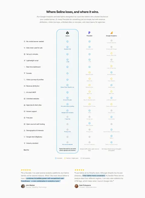
Comparison table Three-product comparison with simple rows, restrained status marks, and a light-blue outlined emphasis for Seline.
FAQ row Single-column question list with compact typography and subtle blue disclosure indicators.
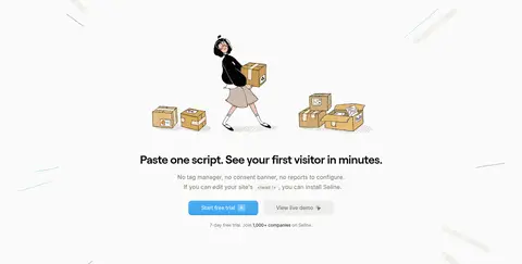
Imagery · Product dashboards are shown as detailed interface captures in broad, clean frames, with blue charts and small labels providing visual evidence. Hand-drawn character illustrations appear around the hero, installation prompt, and final CTA; they are light, playful accents rather than full-bleed art. Logos and testimonial portraits are small and subdued. Media stays within the centered content frame, with pale backgrounds and restrained framing.
页面版块 共 10 个版块,按页面从上到下排列,每个都标了类型、布局和交互套路。
该做与不该做 ✓ 该做 Use Warm Canvas (#fafaf9) as the main page ground. Reserve Signal Blue (#3ba6f1) for actions, links, and selected data. Use Near Ink (#0c0a09) for prominent headlines. Set display headings in Roobert or a close substitute. Place detailed product UI on Clean Surface (#ffffff) cards. Use Soft Divider (#e7e6e5) for unobtrusive card edges. ✕ 不该做 Don't introduce dark full-width section backgrounds. Don't use bright colors beyond the measured palette. Don't let illustrations overwhelm the product interface. Don't add heavy borders or conspicuous shadow stacks. Don't use all-caps headings or dense blocks of tiny copy. Don't treat dashboard-only colors as brand-wide surfaces. 给 AI 的提示词 想快速出一个同风格的新页面,把这段话连同 DESIGN.md 一起发给 AI。
复制 Build a new page in Seline's visual style: a quiet, product-led analytics site on Warm Canvas (#fafaf9), with Near Ink (#0c0a09) headings and Stone Text (#78716c) supporting copy. Use Roobert-like display typography and Inter for navigation, body, and compact interface labels. Keep the content in a centered, 1024px maximum-width frame, varying between focused copy, feature grids, and broad dashboard demonstrations. Put product UI on Clean Surface (#ffffff) cards with Soft Divider (#e7e6e5) borders and restrained shadows. Use Signal Blue (#3ba6f1) for primary actions, links, and meaningful chart highlights; keep Button Edge (#3398e1) as a subtle CTA edge. Add small, hand-drawn illustrations only where they lend warmth. Maintain generous canvas breathing room, compact readable details, and clear action hierarchy.
DESIGN.md Tailwind v4 CSS 变量 Design Tokens
---
title: "Seline design system"
variant: extended
source: https://seline.com/
captured_at: 2026-10-12
theme: light
industry: saas
generator: Design DNA (https://four.wiralomi.com/style/seline-so)
ai_generated: true
ai_label: "本文件由 AI 辅助生成:数值取自公开网页的实测样式,命名、用途说明与建议为模型解读。商标归原所有者。 / AI-assisted content"
---
# Seline · Design System
> Quiet analytics, made clear with a vivid blue signal.
**Theme:** light · **Industry:** saas · **Source:** https://seline.com/ · **Captured:** 2026-10-12 (1440×900 desktop)
_AI-assisted content: values are measured from the public page at capture time; names, roles and guidance are model-written interpretations. Trademarks belong to their owners._
Seline presents privacy-friendly analytics through a calm, near-white canvas, restrained typography, and clear blue calls to action. Product dashboard imagery and hand-drawn illustrations add character while keeping the software itself central.
## North star
Keep the canvas quiet and nearly white; use blue sparingly to direct attention to actions and meaningful product details.
## Overview
The page uses a warm near-white canvas (## Colors
| Name | Hex | Token | Group | Role |
|---|---|---|---|---|
| Warm Canvas | ` | `--color-warm-canvas` | brand | Dominant page canvas and pale section ground throughout the homepage. |
| Signal Blue | ` | `--color-signal-blue` | accent | Primary trial buttons, inline links, and highlighted interface details. |
| Button Edge | ` | `--color-button-edge` | accent | Border and edge color on the primary blue CTA. |
| Stone Text | ` | `--color-stone-text` | neutral | Main supporting copy, navigation, and muted labels. |
| Clean Surface | ` | `--color-clean-surface` | surface | Cards, dashboard panels, and other elevated white surfaces. |
| Soft Divider | ` | `--color-soft-divider` | neutral | Fine card borders and understated interface separators. |
| Near Ink | ` | `--color-near-ink` | neutral | Headlines and high-contrast primary text. |
| Pale Signal | ` | `--color-pale-signal` | semantic | Minor pale-blue badge and interface detail; not a defining page-wide color. |
| Mist Gray | ` | `--color-mist-gray` | surface | Subtle control and media background details. |
| Light Stone | ` | `--color-light-stone` | neutral | Tertiary copy, footer links, and low-emphasis labels. |
| Deep Blue | ` | `--color-deep-blue` | accent | Occasional dark-blue text and contrast within blue accent treatments. |
| Sky Tint | ` | `--color-sky-tint` | semantic | Small pale-blue badge and illustration details, not a structural surface. |
### Semantic aliases
`--color-canvas` → ` (Warm Canvas) · `--color-surface` → ` (Clean Surface) · `--color-text` → ` (Near Ink) · `--color-text-muted` → ` (Stone Text) · `--color-text-subtle` → ` (Light Stone) · `--color-border` → ` (Soft Divider) · `--color-accent` → ` (Signal Blue) · `--color-accent-2` → ` (Deep Blue) · `--color-on-accent` → `
### Contrast (WCAG 2.x)
| Text | Background | Ratio | Level |
|---|---|---|---|
| ` | ` | 18.92:1 | AAA |
| ` | ` | 19.76:1 | AAA |
| ` | ` | 4.59:1 | AA |
| ` | ` | 4.8:1 | AA |
| ` | ` | 2.41:1 | fail |
| ` | ` | 2.52:1 | fail |
| ` | ` | 2.54:1 | fail |
| ` | ` | 2.65:1 | fail |
### Gradients
- `linear-gradient(rgb(255, 255, 255) 0%, rgba(245, 245, 245, 0.5) 70%, rgba(238, 238, 238, 0.2) 100%)`
- `linear-gradient(rgb(255, 255, 255) 0%, rgba(245, 245, 245, 0.7) 70%, rgba(238, 238, 238, 0.6) 100%)`
- `linear-gradient(rgba(255, 255, 255, 0.1), rgba(0, 0, 0, 0))`
## Typography
| Family | Token | Source | Weights | Role | Free substitute |
|---|---|---|---|---|---|
| Inter | `--font-body` | webfont | 400, 500, 600 | Body copy, navigation, links, captions, and compact interface text. | Inter |
| roobert | `--font-display` | webfont | 400, 500 | Hero and section headings, plus primary CTA lettering. | DM Sans |
- **Inter:** Mostly regular weight with selective medium and semibold; sentence case and readable, compact line spacing.
- **roobert:** Regular-weight display headings with tight negative tracking; sentence case, without all-caps styling.
### Type scale — Augmented Fourth (ratio ≈ 1.388, base 14px)
| Role | Size | Weight | Line height | Letter spacing | Case | Family | Used for |
|---|---|---|---|---|---|---|---|
| h1 | 52px | 400 | 1.12 | -0.021em | — | roobert | Homepage hero headline, split across prominent lines. |
| h2 | 32px | 400 | 1.25 | -0.025em | — | roobert | Major section headings introducing features and conversion content. |
| h3 | 20px | 400 | 1.2 | -0.005em | — | roobert | Feature-card and smaller content-block headings. |
| h4 | 18px | 500 | 1.5 | 0.003em | — | Inter | Compact emphasized headings inside supporting content. |
| body | 14px | 400 | 1.64 | 0.004em | — | Inter | Descriptions, testimonials, FAQ answers, and longer supporting copy. |
| caption | 11px | 400 | 1.27 | 0.005em | — | Inter | Small dashboard labels, annotations, and fine-print details. |
| button | 16px | 500 | 1.69 | 0 | — | roobert | Primary trial and secondary demo actions. |
| nav | 14px | 400 | 1.64 | 0.004em | — | Inter | Header navigation and menu links. |
| link | 14px | 400 | 1.64 | 0.004em | — | Inter | Inline documentation, product, and footer links. |
## Spacing & layout
- Base unit **4px**, density **compact**.
- Scale (most used values): 1, 2, 4, 6, 8, 10, 12, 16, 24, 32, 40 px.
- Section rhythm 40px · element gap 4px · card padding 24px · max content width 1024px.
Use a centered content frame with a measured maximum width of 1024px. The homepage alternates between a two-column hero, wide product demonstrations, multi-column feature cards, centered comparison and integration content, and single-column FAQ and letter-style sections. Most blocks align to a common left edge, with selected conversion sections centered. The measured spacing scale is based on a 4px unit, with a 40px section gap and 24px card padding. The overall density is compact, but large canvas gaps keep the long page from feeling crowded.
## Shape & elevation
- Radius: button `4px` · input `6px` · card `10px` · media `50%` · badge `4px` · link `8px` · xs `2px` · sm `3px` · md `4px` · lg `6px` · xl `8px` · 2xl `10px` · pill `9999px`
- Shadow `md` (card, other): `rgba(0, 0, 0, 0) 0px 0px 0px 0px, rgba(0, 0, 0, 0) 0px 0px 0px 0px, rgba(0, 0, 0, 0.05) 0px 4px 16px 0px`
- Shadow `inset` (other, text): `rgba(0, 0, 0, 0) 0px 0px 0px 0px, rgba(0, 0, 0, 0) 0px 0px 0px 0px, rgba(59, 166, 241, 0.1) 0px 1px 0px 0px inset`
- Shadow `md-2` (media, other): `rgba(0, 0, 0, 0) 0px 0px 0px 0px, rgba(0, 0, 0, 0) 0px 0px 0px 0px, rgba(0, 0, 0, 0.1) 0px 4px 6px -1px, rgba(0, 0, 0, 0.1) 0px 2px 4px -2px`
- Shadow `hairline` (button): `rgba(0, 0, 0, 0) 0px 0px 0px 0px, rgba(0, 0, 0, 0) 0px 0px 0px 0px, rgba(0, 0, 0, 0) 0px 0px 0px 0px`
- Shadow `hairline-2` (media, other): `rgba(0, 0, 0, 0) 0px 0px 0px 0px, rgba(0, 0, 0, 0) 0px 0px 0px 0px, rgba(0, 0, 0, 0.05) 0px 1px 2px 0px`
- Shadow `inset-2` (button): `rgba(0, 0, 0, 0) 0px 0px 0px 0px, rgba(0, 0, 0, 0) 0px 0px 0px 0px, rgba(255, 255, 255, 0.3) 0px 1px 0px 0px inset, rgba(10, 85, 138, 0.14) 0px -2px 1px 0px inset, rgba(0, 0, 0, 0.12) 0px 1px 2px 0px`
- Motion: standard transition `0.15s cubic-bezier(0.4, 0, 0.2, 1)` on interactive elements.
Cards use white surfaces, fine pale borders, and subtle soft shadows to separate interface examples from the near-white canvas. Layering is restrained: dashboard media may sit above the page ground, while most text sections remain flat. Avoid dramatic shadow stacks or dark panels; use borders and surface contrast first.
## Imagery
Product dashboards are shown as detailed interface captures in broad, clean frames, with blue charts and small labels providing visual evidence. Hand-drawn character illustrations appear around the hero, installation prompt, and final CTA; they are light, playful accents rather than full-bleed art. Logos and testimonial portraits are small and subdued. Media stays within the centered content frame, with pale backgrounds and restrained framing.
## Components
### Primary CTA
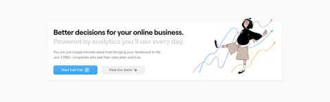
Bright blue trial button with pale text, a blue edge, compact padding, and a softly rounded rectangle.
### Secondary action
Quiet light-gray demo button placed alongside the primary CTA without competing for emphasis.
### Feature card
White card with a fine gray border, 10px measured radius, 24px padding, and restrained shadow.
### Dashboard showcase
Large product interface capture in a white, softly elevated frame, with blue charts and compact Inter labels.
### Feature badge
Small light-neutral label with muted text and a compact, subtly rounded shape.
### Comparison table
Three-product comparison with simple rows, restrained status marks, and a light-blue outlined emphasis for Seline.
### FAQ row
Single-column question list with compact typography and subtle blue disclosure indicators.
### Measured component styles
- **Primary button** (“Start free trial”): background ## Do
- Use Warm Canvas (## Don't
- Don't introduce dark full-width section backgrounds.
- Don't use bright colors beyond the measured palette.
- Don't let illustrations overwhelm the product interface.
- Don't add heavy borders or conspicuous shadow stacks.
- Don't use all-caps headings or dense blocks of tiny copy.
- Don't treat dashboard-only colors as brand-wide surfaces.
## Agent prompt
Build a new page in Seline's visual style: a quiet, product-led analytics site on Warm Canvas (## Page sections (top to bottom)
| # | Type | Layout | UX patterns | UI patterns |
|---|---|---|---|---|
| 1 | hero | Two-column hero with left-aligned headline and copy above a wide dashboard showcase. | primary trial CTA, secondary demo action, social proof | highlighted headline phrase, blue CTA, dashboard frame, character illustration |
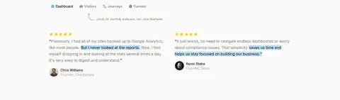
| 2 | testimonials | Two-column testimonial blocks on the shared pale canvas. | customer quotes, attributed endorsements | small portraits, star ratings, highlighted quote fragments |
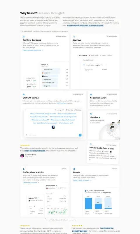
| 3 | feature-grid | Long three-column feature sequence with varied white cards and embedded product UI. | feature explanations, example links, testimonial interludes | white bordered cards, dashboard snippets, small badges, blue data accents |
| 4 | how-it-works | Centered two-column section with illustration above or alongside concise copy and actions. | quick setup explanation, trial CTA, demo action | hand-drawn character, short heading, paired buttons |
| 5 | comparison | Centered introduction followed by a broad, multi-column comparison table. | side-by-side comparison, feature-by-feature evaluation | highlighted Seline column, status icons, light-blue emphasis |
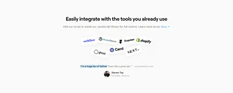
| 6 | integrations | Centered heading, compact explanatory copy, and a horizontal grouping of tool logos. | integration discovery, documentation link | logo cluster, light surface, small testimonial |
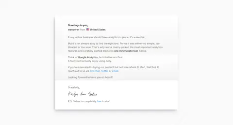
| 7 | other | Single-column, letter-like content presented in a centered white card. | founder message, personal sign-off | paper-like surface, quiet typography, signature |
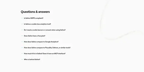
| 8 | faq | Left-aligned heading and single-column question list. | expandable questions, privacy and setup answers | compact rows, small disclosure marks, subtle blue detail |
| 9 | cta | Wide conversion banner with copy and actions on the left, illustration on the right. | closing value proposition, trial CTA, demo action | white card, character illustration, blue primary button |
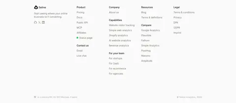
| 10 | footer | Four-column link directory below the final CTA with brand details and a low-key legal row. | grouped site navigation, contact routes | muted link text, small brand mark, fine-print baseline |
## Source CSS custom properties (selected)
```css
--background: 0deg 0% 100%;
--foreground: 222.2deg 84% 4.9%;
--card-foreground: 222.2deg 84% 4.9%;
--popover-foreground: 222.2deg 84% 4.9%;
--primary: 205deg 87% 59%;
--primary-foreground: 210deg 40% 98%;
--primary-dark: 205deg 87% 29%;
--primary-darker: 205deg 74% 54%;
--secondary: 25deg 5% 45%;
--secondary-foreground: 25deg 5% 45%;
--text-primary: 20deg 14% 4%;
--text-secondary: 25deg 5% 45%;
--muted-foreground: 24deg 5.75% 82.94%;
--accent: 60deg 5% 96%;
--accent-foreground: 222.2deg 47.4% 11.2%;
--destructive-foreground: 210deg 40% 98%;
--border: 24deg 6% 83%;
--radius: .5rem;
```
---
本文件由 AI 辅助生成:数值取自公开网页的实测样式,命名、用途说明与建议为模型解读。商标归原所有者。
Generated by Design DNA · https://four.wiralomi.com/style/seline-so