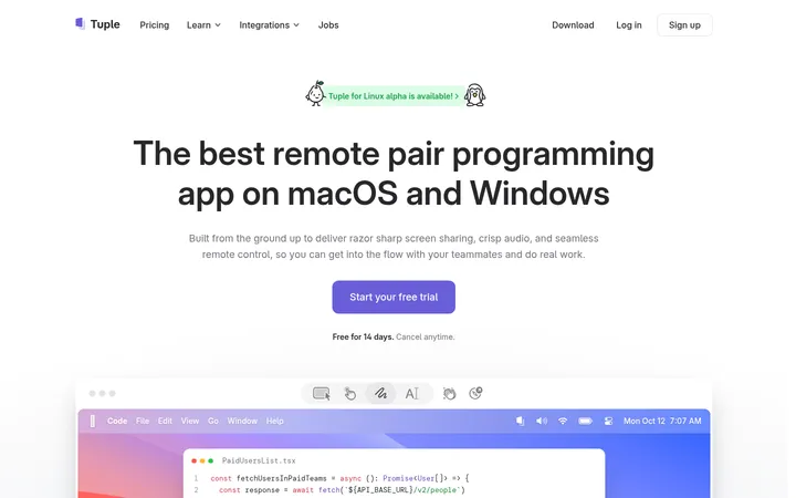
North star · Keep the content calm and legible on white, then use saturated blue gradients and real product UI to create focused moments of visual impact.
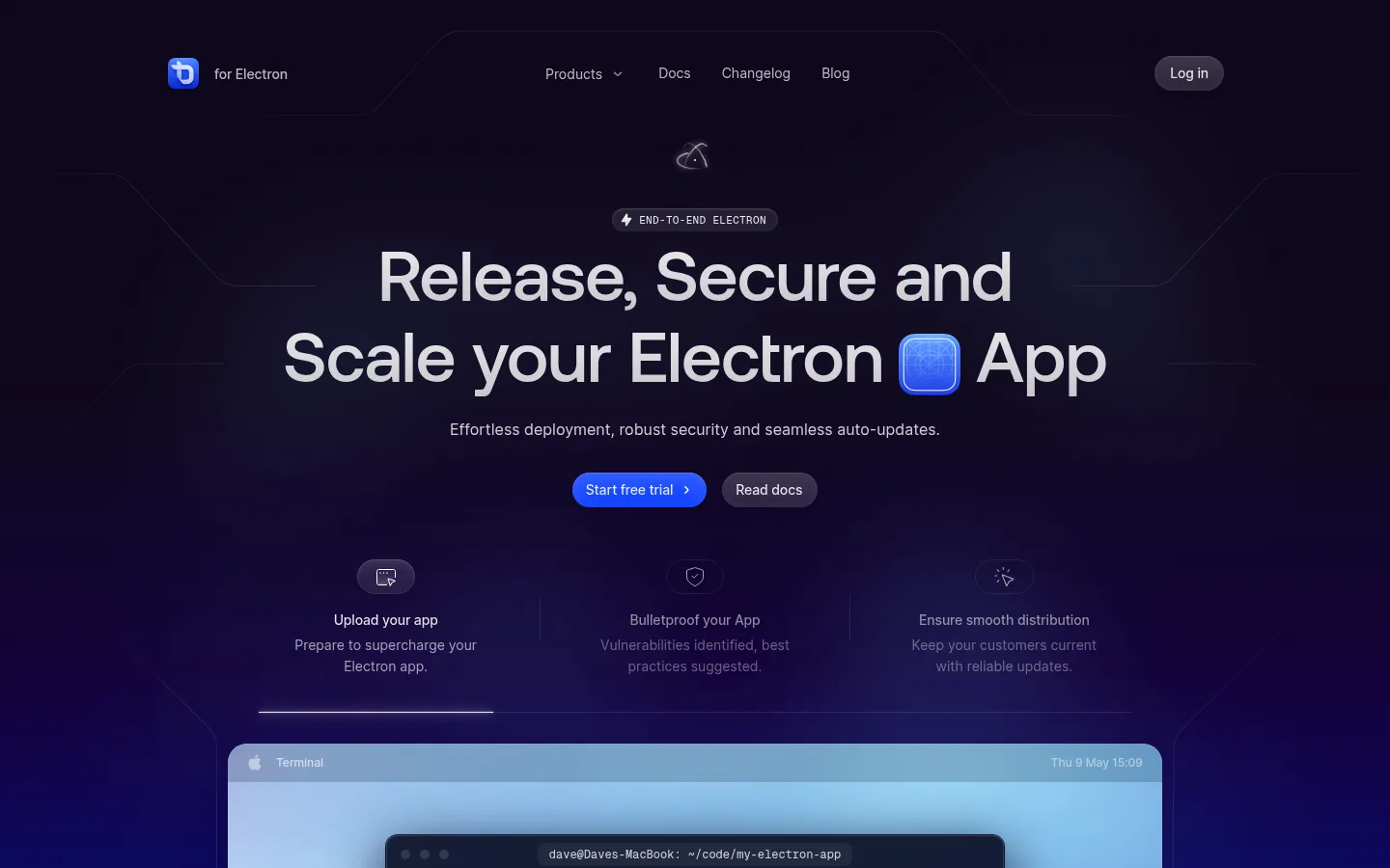
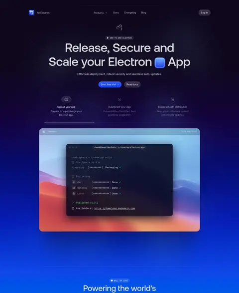
The page contrasts a spacious white canvas with a dramatic, dark-to-blue gradient hero that continues into the customer-logo showcase. The gradient belongs to the visual backdrop and product presentation; the measured interface palette remains anchored by white, near-black text, muted gray, and a vivid blue CTA. Large centered headlines use Aeonik Pro with tight tracking, while Inter handles navigation, body copy, and buttons. Geist Mono marks small uppercase section labels and technical details, giving the page a subtle developer-tool character. Layout moves from a centered hero and large product preview into a compact logo band, then a generous feature-card grid. Later sections alternate broad product imagery, pricing, FAQ, and a softer Builder promotion. Rounded pills, understated hairlines, and restrained shadows keep cards and controls polished without making the mostly white sections feel dense.
配色
点色块复制色值。用途说明来自对页面的实测位置(背景、文字、描边、按钮)与截图判读。
品牌色
强调色
表层色
中性色
功能色
页面底色 · Gallery White表层 · Deep Ink表层 2 · Midnight Slate表层 3 · Pale Mint表层 4 · Blush Mist主文字 · Deep Ink次要文字 · Soft Graphite描边 · Cloud Hairline强调 · Electric Cobalt强调 2 · Link Blue强调 3 · Sky Current
Eyebrows, captions, and code-like interface labels
Aa 设计
Aeonik Pro
网络字体 · 字重 500 / 400 · 占比 3%
免费替代:Manrope
Display headings and section titles
角色
示例
字号
字重
行高
字距
特大标题
Oversized hero headline and prominent display messaging.
ToDesktop
74px
500
1.14
-0.015em
一级标题
Primary page headline and major promotional heading.
ToDesktop
64px
500
1.13
-0.015em
二级标题
Main feature, pricing, FAQ, and promotional section titles.
ToDesktop
48px
500
1.08
-0.015em
三级标题
Card and subsection headings within product and feature content.
ToDesktop
36px
400
1.22
-0.028em
正文
Feature descriptions, explanatory copy, and supporting paragraphs.
The quick brown fox 敏捷的狐狸
14px
400
1.57
0
辅助文字
Compact technical captions and interface microcopy.
The quick brown fox 敏捷的狐狸
10px
500
2.4
-0.01em
按钮
Trial, sign-up, and secondary action labels.
The quick brown fox 敏捷的狐狸
14px
400
1.5
0
导航
Header navigation and product links.
The quick brown fox 敏捷的狐狸
14px
400
1.57
0
链接
Inline links and subdued secondary navigation.
The quick brown fox 敏捷的狐狸
14px
400
1.57
0
眉题
Small uppercase section labels above headings.
The quick brown fox 敏捷的狐狸
11px
500
1.45
0.03em
代码
Code snippets and technical interface labels.
const style = 1;
10px
500
2.4
-0.01em
间距与布局
基准单位 4px · 密度:宽松
120px版块间距
12px元素间距
—卡片内边距
1128px内容最大宽度
1px
2px
3px
4px
6px
7px
8px
9px
10px
12px
14px
15px
16px
20px
23px
24px
A centered, spacious page uses a measured maximum content width of 1128px and generous separation between major sections. The hero centers its headline, supporting sentence, and paired actions above a wide product preview; the customer band follows before a centered feature grid. Later sections use broad product imagery, multi-column pricing and FAQ layouts, then a split Builder promotion and multi-column footer. The white sections stay visually calm, with compact text and generous whitespace around cards.
圆角与层次
按钮 · 9999px
卡片 · 14px
图片 · 50%
徽标 · 9999px
导航 · 9999px
链接 · 9999px
hairline · other
inset · other
inset · button, other
md · card
Most content sits directly on the white canvas, with faint hairline borders defining cards and FAQ rows. Product previews and selected cards use soft, layered shadows to lift them from the background. Rounded corners and inset interface highlights add depth to media and buttons without introducing heavy outlines.
组件
下面的预览按实测的按钮、输入框、徽标、卡片样式重建(字体用替代字体)。
Primary CTA
A vivid #0036ff pill with dark label text, subtle inset highlight, and a small directional icon on the trial action.
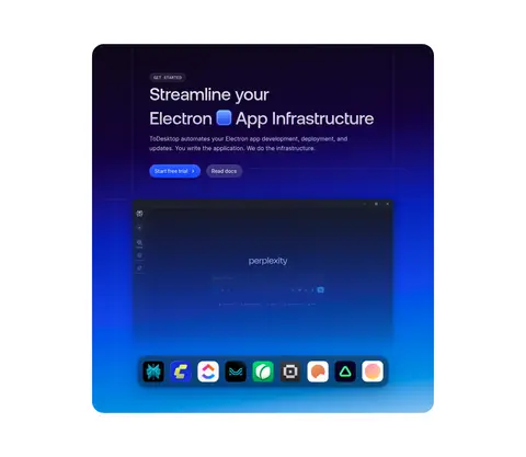
Hero product preview
A wide desktop-interface image sits beneath centered messaging and actions, framed by a dark-to-blue gradient backdrop.
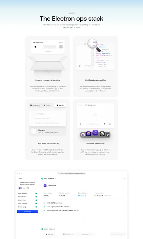
Feature cards
A spacious multi-column grid pairs small product illustrations with concise headings and muted explanatory copy.
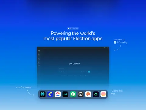
Customer logo strip
A centered customer-app showcase combines a product preview with a row of compact app icons and short annotations.
Pricing cards
Three plan columns contrast a dark featured option with light neighboring cards, concise benefit lists, and rounded actions.
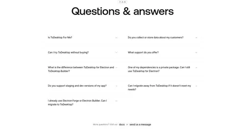
FAQ list
A centered title introduces two aligned columns of compact questions with subtle dividers and disclosure affordances.
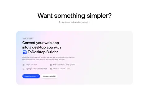
Builder promotion
A rounded pale promotional panel presents a low-code product, short benefit list, and primary and secondary actions.
Imagery · Product interface imagery is the main visual asset: terminal windows, desktop-app previews, and dashboard-like screens appear in large framed compositions. The hero and infrastructure CTA place these previews over vivid blue gradients, while feature cards use smaller isolated UI illustrations. Customer app marks form a compact logo strip. Treat illustration colors as product artwork, not as additions to the core interface palette.
Keep large content areas white and visually quiet.
Use #0036ff for the principal conversion action.
Reserve blue gradients for hero and product-showcase moments.
Use Aeonik Pro for large, tightly tracked headings.
Set developer labels and section eyebrows in Geist Mono.
Give product previews room to breathe.
Use borders and shadows sparingly to define cards.
✕ 不该做
Do not turn the whole page into a dark interface.
Do not use saturated accents across every section.
Do not let product mockup colors redefine the brand palette.
Do not crowd cards with oversized body copy.
Do not replace the rounded pill CTA with a sharp rectangular button.
Do not add heavy borders or dramatic shadows to ordinary content.
给 AI 的提示词
想快速出一个同风格的新页面,把这段话连同 DESIGN.md 一起发给 AI。
Build a polished developer-tools SaaS page with a spacious #ffffff canvas, centered content, and generous separation between sections. Use Deep Ink (#141414) for headings and primary text, Soft Graphite (#656565) for supporting copy, and Electric Cobalt (#0036ff) for pill-shaped primary actions. Set large headlines in a close-tracked Aeonik Pro-like sans serif; use Inter for interface text and a restrained monospace for uppercase eyebrows and technical labels. Create a dramatic gradient backdrop only around hero and product showcase areas, using the measured blue accent family, and foreground real-looking desktop-app or terminal UI previews. Keep feature cards light with faint #f2f2f2 hairlines, soft elevation, and rounded corners. Alternate centered product sections with practical grids, pricing, FAQ, and a quiet footer. Preserve readable contrast and ample whitespace.