STRUT以暖调、杂志式的页面展示AI写作工作区,重点使用醒目的大字标题与克制的产品界面画面。荧光绿按钮、深色功能区和紧凑内容网格,为较长的首页建立清晰节奏。
North star · Build a calm editorial canvas, then use oversized type, real product context, and lime accents to direct attention.
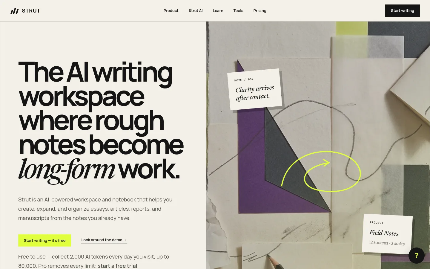
The visual system is built around a warm ivory canvas (#f3f0e8), near-black text, and a vivid lime signal reserved for primary actions and occasional emphasis. Dark bands interrupt the pale editorial flow to frame product context, learning resources, and the final conversion moment. Manrope carries nearly all interface and headline work: headings are heavy, tightly tracked, and deliberately oversized, while body copy stays compact and muted. Newsreader and Georgia provide italic serif contrast in selected headline phrases, lending a print-like, long-form character. The hero pairs a large asymmetric text column with a tactile overhead collage; later sections alternate full-width product imagery, split feature cards, article thumbnails, and thinly bordered content grids. Spacing is generous around major sections but denser inside resource cards and footer navigation. Surfaces remain mostly flat, with crisp rules and square corners rather than soft elevation.
配色 点色块复制色值。用途说明来自对页面的实测位置(背景、文字、描边、按钮)与截图判读。
品牌色
Draft Ink
#151515
Primary text, dark content sections, product card outlines, and prominent links.
强调色
Signal Lime
#dfff3f
Primary CTA fill, closing conversion section, and small emphasis marks.
Lime Wash
#e7fc73
Measured highlight gradient; use sparingly for highlighted words, not as a dominant page fill.
Violet Panel
#7e57ff
Feature-card illustration color, visible in the feature showcase rather than core UI.
Apricot Panel
#e6a868
Warm feature-card illustration fill, not a recurring brand-wide accent.
Sky Panel
#b8d8fe
Blue feature-card illustration fill, isolated to the feature showcase.
表层色
Warm Paper
#f3f0e8
Main page canvas and the majority of editorial sections.
Footer Black
#111111
Deep footer and dark CTA surfaces, with white or subdued text.
Card White
#ffffff
Writing-interface mockups and white feature or content cards.
Pale Linen
#f7f5ef
Occasional subtly lighter section canvas behind product-context content.
中性色
Soft Graphite
#4f4d48
Muted body copy and secondary explanatory text.
Quiet Taupe
#6c6a64
Lower-emphasis links and supporting text.
Footer Silver
#bbbbbb
Low-priority footer text and small legal details.
Button Charcoal
#191919
Secondary interface labels, selected controls, and compact links.
Muted Silver
#aaaaaa
Minor subdued text detail, not a primary text color.
功能色
Paper Rule
#cbc7bd
Fine dividers, navigation rules, and subtle card or badge borders.
Mockup Umber
#211d1c
Small dark product-card or interface detail; not a defining brand surface.
Rule Charcoal
#444444
Occasional dark borders or interface marks within mockups.
文字 背景 对比度 WCAG #151515 Draft Ink#f3f0e8 Warm Paper16.04:1 AAA #151515 Draft Ink#111111 Footer Black1.03:1 不达标 #151515 Draft Ink#ffffff Card White18.26:1 AAA #4f4d48 Soft Graphite#f3f0e8 Warm Paper7.41:1 AAA #4f4d48 Soft Graphite#151515 Draft Ink2.16:1 不达标 #4f4d48 Soft Graphite#111111 Footer Black2.24:1 不达标
字体 字号阶梯:Perfect Fifth(比例约 1.457,正文 14px)。示例用免费替代字体渲染,数值为实测。
Aa 设计
Manrope 网络字体 · 字重 400 / 700 / 600 / 800 / 900 · 占比 87%
免费替代:Plus Jakarta Sans
Primary headlines, navigation, body copy, cards, and buttons
Aa 设计
DM Mono 网络字体 · 字重 400 / 500 · 占比 7%
免费替代:Space Mono
Tiny code-like labels and technical interface details
Aa 设计
Georgia 系统字体 · 字重 400 · 占比 5%
免费替代:Lora
Occasional serif fallback and editorial italic contrast
Aa 设计
Newsreader 网络字体 · 字重 500 · 占比 2%
免费替代:Newsreader
Editorial serif accents within display and section headlines
角色 示例 字号 字重 行高 字距 特大标题 Oversized hero headline and key editorial statements.
STRUT
92px 700 0.88 -0.075em 一级标题 Main hero title and major page-level headings.
STRUT
72px 700 0.95 -0.06em 二级标题 Section titles for features, resources, and FAQ.
STRUT
48px 700 1.05 -0.045em 三级标题 Feature, guide, and audience-card headings.
The quick brown fox 敏捷的狐狸
27px 700 1.15 0 四级标题 Smaller content-card and utility headings.
The quick brown fox 敏捷的狐狸
24px 700 1.17 0 正文 Descriptions, explanatory copy, and paragraph text.
The quick brown fox 敏捷的狐狸
14px 400 1.65 0 辅助文字 Metadata, image labels, and subdued supporting details.
The quick brown fox 敏捷的狐狸
13px 400 1.65 0 按钮 Primary and secondary CTA labels.
The quick brown fox 敏捷的狐狸
13px 600 1 0 链接 Prominent text links and navigation destinations.
The quick brown fox 敏捷的狐狸
17px 700 1.65 -0.02em 代码 Tiny utility or technical labels in product contexts.
const style = 1;
10px 400 normal 0.12em
间距与布局 基准单位 2px · 密度:宽松
120px 版块间距
10px 元素间距
26px 卡片内边距
1278px 内容最大宽度
3px
4px
6px
7px
8px
9px
10px
12px
13px
14px
16px
18px
20px
22px
24px
28px
A spacious single-page sequence uses a broad centered content area capped at the measured page width, with strong left alignment and occasional asymmetric splits. The hero divides text and collage imagery into contrasting columns. Large section gaps separate alternating pale and near-black bands; feature cards, article thumbnails, audience tables, and FAQ rows become denser within each band. Thin rules organize grids without adding heavy containers. Keep broad outer margins and generous breathing room around headline blocks, while letting the footer hold dense, multi-column navigation.
圆角与层次 hairline · card
lg · button
Most surfaces are flat, with square-edged cards and fine measured borders doing the organizational work. Product-interface imagery supplies depth through its own layered paper and screen details. Use the measured hard card shadow only as a restrained exception; avoid generalized soft shadows, pills, or rounded containers.
组件 下面的预览按实测的按钮、输入框、徽标、卡片样式重建(字体用替代字体)。
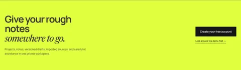
Primary CTA Square-corner button in Signal Lime (#dfff3f) with dark label; the alternate CTA is Draft Ink (#151515) with white text.
Navigation Minimal header with STRUT wordmark, compact Manrope links, and a contrasting writing CTA.
Editorial hero Large, tightly tracked sans headline with selective serif italic phrase, supporting copy, CTA, and a tactile collage image.
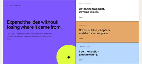
Feature cards Rectangular blocks with thin dark outlines; selected cards use violet, apricot, or blue illustration fills.
Resource cards Compact white or canvas cards pairing concise titles, brief descriptions, and understated text links.
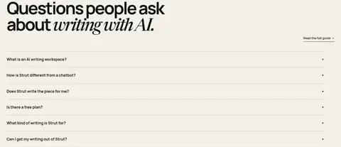
FAQ rows Left-aligned question rows separated by pale hairlines, with a compact expand indicator.
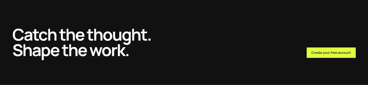
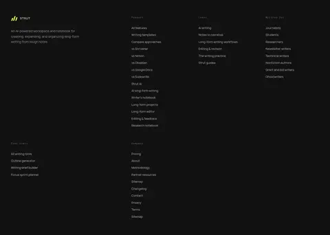
Dark footer Near-black closing area with a white headline, lime CTA, and dense, subdued multi-column link groups.
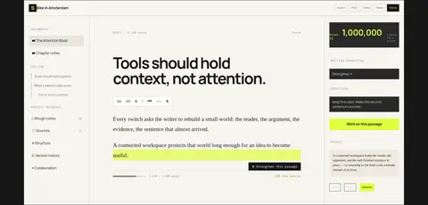
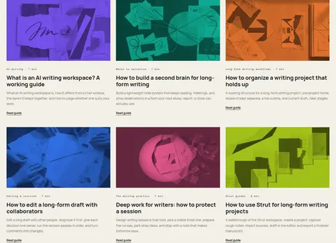
Imagery · The hero uses a tactile overhead collage of paper, notes, geometric scraps, and a hand-drawn lime mark. Product sections show the writing interface in context, framed as a wide, legible workspace rather than a floating device mockup. Article thumbnails use colorful, abstract editorial imagery. Keep imagery rectangular and integrated into the page grid; bright colors inside feature cards and thumbnails are illustrative, not replacements for the core palette.
页面版块 共 18 个版块,按页面从上到下排列,每个都标了类型、布局和交互套路。
首页
首屏 首页主视觉
Header above asymmetric two-column hero: text left, tactile collage right.
使用步骤 写作流程
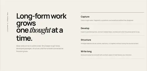
Pale editorial section with a large left headline and ordered steps alongside.
产品展示 工作区预览
Full-width dark band with a headline, short copy, and broad interface image.
功能网格 核心功能卡
Pale inset feature area with one large colored card and stacked smaller cards.
其他 功能导航
Short pale transition band with a large heading and a small aligned link.
图文交替 写作功能
Pale section combining a large feature headline with supporting content blocks.
数据亮点 写作资源库
Compact full-width dark strip with headline, lime statistic, and browse action.
其他 免费工具引导
Short pale title band with a prominent heading and a small right-side link.
商品网格 免费写作工具
Pale area with a row of compact, outlined tool cards.
其他 文章导读
Pale transition band with a large editorial title and browse link.
内容列表 写作指南
Pale multi-column article grid with thumbnail images, titles, and metadata.
其他 适用人群
Pale headline transition into a structured audience comparison grid.
对比表 写作场景
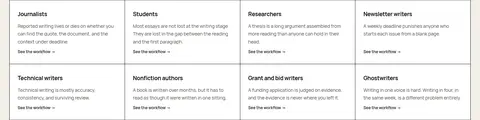
Pale-backed audience grid with bordered cells and concise descriptions.
功能网格 使用原则
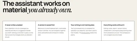
Dark feature section with a headline and a row of compact bordered principles.
常见问题 常见问题
Pale FAQ section with a large heading and vertically divided question rows.
行动号召 创建免费账户
Full-width lime band with left-aligned message and right-aligned actions.
行动号召 品牌收尾
Near-black horizontal band with white headline and lime signup button.
页脚 页脚导航
Large near-black footer with brand summary, grouped columns, and a subdued bottom rule.
该做与不该做 ✓ 该做 Keep the warm paper canvas dominant. Use lime for primary actions and rare emphasis. Set headlines in heavy, tightly tracked Manrope. Mix serif italics into selected editorial phrases. Alternate pale sections with deliberate dark bands. Use square cards and fine rules to organize content. Show the product interface in a believable workspace context. ✕ 不该做 Do not turn every section into a dark block. Do not use gradients as the main visual language. Do not round cards into pills or soft containers. Do not promote illustration colors to core brand accents. Do not crowd major headlines with dense copy. Do not add decorative shadows to every card. Do not make the interface imagery look like generic stock art. 给 AI 的提示词 想快速出一个同风格的新页面,把这段话连同 DESIGN.md 一起发给 AI。
复制 Build a new STRUT page in a warm editorial SaaS style. Use Warm Paper (#f3f0e8) as the main canvas, Draft Ink (#151515) for headings and dark bands, and Signal Lime (#dfff3f) only for primary actions or precise emphasis. Set most text in Manrope, with bold, tightly tracked display headings and selective Newsreader-style italic phrases. Compose generous, left-aligned sections with asymmetric splits, thin rules, square cards, and occasional full-width dark interruptions. Use realistic writing-workspace imagery and restrained editorial thumbnails; treat Violet Panel (#7e57ff), Apricot Panel (#e6a868), and Sky Panel (#b8d8fe) as isolated illustration fills. Keep body copy compact and muted, layouts spacious, surfaces flat, and the footer dense but orderly.
DESIGN.md Tailwind v4 CSS 变量 Design Tokens
---
title: "STRUT design system"
variant: extended
source: https://strut.so/
captured_at: 2026-10-12
theme: light
industry: ai
generator: Design DNA (https://four.wiralomi.com/style/strut-so)
ai_generated: true
ai_label: "本文件由 AI 辅助生成:数值取自公开网页的实测样式,命名、用途说明与建议为模型解读。商标归原所有者。 / AI-assisted content"
---
# STRUT · Design System
> Warm editorial clarity with a sharp lime signal.
**Theme:** light · **Industry:** ai · **Source:** https://strut.so/ · **Captured:** 2026-10-12 (1440×900 desktop)
_AI-assisted content: values are measured from the public page at capture time; names, roles and guidance are model-written interpretations. Trademarks belong to their owners._
STRUT presents its AI writing workspace through a warm, editorial layout grounded in oversized typography and restrained product-interface imagery. A vivid lime CTA, black feature bands, and compact content grids give the long homepage a clear visual rhythm.
## North star
Build a calm editorial canvas, then use oversized type, real product context, and lime accents to direct attention.
## Overview
The visual system is built around a warm ivory canvas (## Colors
| Name | Hex | Token | Group | Role |
|---|---|---|---|---|
| Signal Lime | ` | `--color-signal-lime` | accent | Primary CTA fill, closing conversion section, and small emphasis marks. |
| Draft Ink | ` | `--color-draft-ink` | brand | Primary text, dark content sections, product card outlines, and prominent links. |
| Warm Paper | ` | `--color-warm-paper` | surface | Main page canvas and the majority of editorial sections. |
| Lime Wash | ` | `--color-lime-wash` | accent | Measured highlight gradient; use sparingly for highlighted words, not as a dominant page fill. |
| Soft Graphite | ` | `--color-soft-graphite` | neutral | Muted body copy and secondary explanatory text. |
| Quiet Taupe | ` | `--color-quiet-taupe` | neutral | Lower-emphasis links and supporting text. |
| Footer Black | ` | `--color-footer-black` | surface | Deep footer and dark CTA surfaces, with white or subdued text. |
| Card White | ` | `--color-card-white` | surface | Writing-interface mockups and white feature or content cards. |
| Paper Rule | ` | `--color-paper-rule` | semantic | Fine dividers, navigation rules, and subtle card or badge borders. |
| Footer Silver | ` | `--color-footer-silver` | neutral | Low-priority footer text and small legal details. |
| Pale Linen | ` | `--color-pale-linen` | surface | Occasional subtly lighter section canvas behind product-context content. |
| Mockup Umber | ` | `--color-mockup-umber` | semantic | Small dark product-card or interface detail; not a defining brand surface. |
| Button Charcoal | ` | `--color-button-charcoal` | neutral | Secondary interface labels, selected controls, and compact links. |
| Violet Panel | ` | `--color-violet-panel` | accent | Feature-card illustration color, visible in the feature showcase rather than core UI. |
| Muted Silver | ` | `--color-muted-silver` | neutral | Minor subdued text detail, not a primary text color. |
| Rule Charcoal | ` | `--color-rule-charcoal` | semantic | Occasional dark borders or interface marks within mockups. |
| Apricot Panel | ` | `--color-apricot-panel` | accent | Warm feature-card illustration fill, not a recurring brand-wide accent. |
| Sky Panel | ` | `--color-sky-panel` | accent | Blue feature-card illustration fill, isolated to the feature showcase. |
### Semantic aliases
`--color-canvas` → ` (Warm Paper) · `--color-surface` → ` (Draft Ink) · `--color-surface-2` → ` (Footer Black) · `--color-surface-3` → ` (Card White) · `--color-surface-4` → ` (Pale Linen) · `--color-text` → ` (Draft Ink) · `--color-text-muted` → ` (Soft Graphite) · `--color-text-subtle` → ` (Quiet Taupe) · `--color-border` → ` (Paper Rule) · `--color-accent` → ` (Violet Panel) · `--color-accent-2` → ` (Apricot Panel) · `--color-accent-3` → ` (Sky Panel)
### Contrast (WCAG 2.x)
| Text | Background | Ratio | Level |
|---|---|---|---|
| ` | ` | 16.04:1 | AAA |
| ` | ` | 1.03:1 | fail |
| ` | ` | 18.26:1 | AAA |
| ` | ` | 7.41:1 | AAA |
| ` | ` | 2.16:1 | fail |
| ` | ` | 2.24:1 | fail |
| ` | ` | 8.44:1 | AAA |
| ` | ` | 4.75:1 | AA |
| ` | ` | 3.38:1 | AA-large |
| ` | ` | 3.49:1 | AA-large |
### Gradients
- `linear-gradient(rgba(0, 0, 0, 0) 45%, rgba(223, 255, 63, 0.7) 45%)`
## Typography
| Family | Token | Source | Weights | Role | Free substitute |
|---|---|---|---|---|---|
| Manrope | `--font-body` | webfont | 400, 700, 600, 800, 900 | Primary headlines, navigation, body copy, cards, and buttons | Plus Jakarta Sans |
| DM Mono | `--font-mono` | webfont | 400, 500 | Tiny code-like labels and technical interface details | Space Mono |
| Georgia | `--font-georgia` | system | 400 | Occasional serif fallback and editorial italic contrast | Lora |
| Newsreader | `--font-newsreader` | webfont | 500 | Editorial serif accents within display and section headlines | Newsreader |
- **Manrope:** Heavy bold headlines use tight negative tracking; body copy is regular and compact, with medium-weight controls.
- **DM Mono:** Use sparingly for small utility labels; retain monospace character and measured open tracking.
- **Georgia:** Use selectively alongside sans headlines, particularly for italic emphasis.
- **Newsreader:** Use medium-weight italic phrases to contrast the strong geometric sans.
### Type scale — Perfect Fifth (ratio ≈ 1.457, base 14px)
| Role | Size | Weight | Line height | Letter spacing | Case | Family | Used for |
|---|---|---|---|---|---|---|---|
| display | 92px | 700 | 0.88 | -0.075em | — | Manrope | Oversized hero headline and key editorial statements. |
| h1 | 72px | 700 | 0.95 | -0.06em | — | Manrope | Main hero title and major page-level headings. |
| h2 | 48px | 700 | 1.05 | -0.045em | — | Manrope | Section titles for features, resources, and FAQ. |
| h3 | 27px | 700 | 1.15 | 0 | — | Manrope | Feature, guide, and audience-card headings. |
| h4 | 24px | 700 | 1.17 | 0 | — | Manrope | Smaller content-card and utility headings. |
| body | 14px | 400 | 1.65 | 0 | — | Manrope | Descriptions, explanatory copy, and paragraph text. |
| caption | 13px | 400 | 1.65 | 0 | — | Manrope | Metadata, image labels, and subdued supporting details. |
| button | 13px | 600 | 1 | 0 | — | Manrope | Primary and secondary CTA labels. |
| link | 17px | 700 | 1.65 | -0.02em | — | Manrope | Prominent text links and navigation destinations. |
| code | 10px | 400 | normal | 0.12em | — | DM Mono | Tiny utility or technical labels in product contexts. |
## Spacing & layout
- Base unit **2px**, density **spacious**.
- Scale (most used values): 3, 4, 6, 7, 8, 9, 10, 12, 13, 14, 16, 18, 20, 22, 24, 28 px.
- Section rhythm 120px · element gap 10px · card padding 26px · max content width 1278px.
A spacious single-page sequence uses a broad centered content area capped at the measured page width, with strong left alignment and occasional asymmetric splits. The hero divides text and collage imagery into contrasting columns. Large section gaps separate alternating pale and near-black bands; feature cards, article thumbnails, audience tables, and FAQ rows become denser within each band. Thin rules organize grids without adding heavy containers. Keep broad outer margins and generous breathing room around headline blocks, while letting the footer hold dense, multi-column navigation.
## Shape & elevation
- Radius: button `4px` · link `4px` · xs `4px`
- Shadow `hairline` (card): `rgba(0, 0, 0, 0.22) 8px 10px 0px 0px`
- Shadow `lg` (button): `rgba(0, 0, 0, 0.28) 0px 10px 30px 0px`
- Motion: standard transition `0.2s ease` on interactive elements.
Most surfaces are flat, with square-edged cards and fine measured borders doing the organizational work. Product-interface imagery supplies depth through its own layered paper and screen details. Use the measured hard card shadow only as a restrained exception; avoid generalized soft shadows, pills, or rounded containers.
## Imagery
The hero uses a tactile overhead collage of paper, notes, geometric scraps, and a hand-drawn lime mark. Product sections show the writing interface in context, framed as a wide, legible workspace rather than a floating device mockup. Article thumbnails use colorful, abstract editorial imagery. Keep imagery rectangular and integrated into the page grid; bright colors inside feature cards and thumbnails are illustrative, not replacements for the core palette.
## Components
### Primary CTA
Square-corner button in Signal Lime (### Navigation
Minimal header with STRUT wordmark, compact Manrope links, and a contrasting writing CTA.
### Editorial hero
Large, tightly tracked sans headline with selective serif italic phrase, supporting copy, CTA, and a tactile collage image.
### Feature cards
Rectangular blocks with thin dark outlines; selected cards use violet, apricot, or blue illustration fills.
### Resource cards
Compact white or canvas cards pairing concise titles, brief descriptions, and understated text links.
### FAQ rows
Left-aligned question rows separated by pale hairlines, with a compact expand indicator.
### Dark footer
Near-black closing area with a white headline, lime CTA, and dense, subdued multi-column link groups.
### Measured component styles
- **Primary button** (“Start writing — it's free”): background ## Do
- Keep the warm paper canvas dominant.
- Use lime for primary actions and rare emphasis.
- Set headlines in heavy, tightly tracked Manrope.
- Mix serif italics into selected editorial phrases.
- Alternate pale sections with deliberate dark bands.
- Use square cards and fine rules to organize content.
- Show the product interface in a believable workspace context.
## Don't
- Do not turn every section into a dark block.
- Do not use gradients as the main visual language.
- Do not round cards into pills or soft containers.
- Do not promote illustration colors to core brand accents.
- Do not crowd major headlines with dense copy.
- Do not add decorative shadows to every card.
- Do not make the interface imagery look like generic stock art.
## Agent prompt
Build a new STRUT page in a warm editorial SaaS style. Use Warm Paper (## Page sections (top to bottom)
| # | Type | Layout | UX patterns | UI patterns |
|---|---|---|---|---|
| 1 | hero | Header above asymmetric two-column hero: text left, tactile collage right. | primary writing CTA, demo link, free-plan reassurance | oversized headline, italic serif phrase, collage image |
| 2 | how-it-works | Pale editorial section with a large left headline and ordered steps alongside. | step-by-step explanation, progressive workflow | numbered or labeled steps, fine horizontal dividers |
| 3 | product-showcase | Full-width dark band with a headline, short copy, and broad interface image. | product context, feature demonstration | dark background, wide workspace screenshot |
| 4 | feature-grid | Pale inset feature area with one large colored card and stacked smaller cards. | feature discovery, explore links | outlined rectangular cards, violet, apricot, and blue fills |
| 5 | other | Short pale transition band with a large heading and a small aligned link. | browse all features | headline-led section, understated text link |
| 6 | feature-split | Pale section combining a large feature headline with supporting content blocks. | feature explanation, follow-up pathways | editorial heading, text links |
| 7 | stats | Compact full-width dark strip with headline, lime statistic, and browse action. | resource discovery, library navigation | high-contrast number, dark band |
| 8 | other | Short pale title band with a prominent heading and a small right-side link. | tool discovery | editorial heading, minimal link |
| 9 | product-grid | Pale area with a row of compact, outlined tool cards. | open tool, compare utilities | three-column cards, brief summaries |
| 10 | other | Pale transition band with a large editorial title and browse link. | browse guides | large heading, understated text link |
| 11 | content-feed | Pale multi-column article grid with thumbnail images, titles, and metadata. | read guide, scan by topic | color-treated thumbnails, compact metadata |
| 12 | other | Pale headline transition into a structured audience comparison grid. | compare workflows | large headline, compact link |
| 13 | comparison | Pale-backed audience grid with bordered cells and concise descriptions. | scan by profession, view workflow | thin grid borders, text-only cards |
| 14 | feature-grid | Dark feature section with a headline and a row of compact bordered principles. | build trust, explain safeguards | dark canvas, small white cards |
| 15 | faq | Pale FAQ section with a large heading and vertically divided question rows. | expand answers, read full guide | hairline separators, plus indicators |
| 16 | cta | Full-width lime band with left-aligned message and right-aligned actions. | create account, preview demo | lime canvas, black primary button |
| 17 | cta | Near-black horizontal band with white headline and lime signup button. | final signup action | high-contrast type, lime button |
| 18 | footer | Large near-black footer with brand summary, grouped columns, and a subdued bottom rule. | navigate product resources, browse audiences, legal navigation | multi-column links, muted text, thin bottom divider |
---
本文件由 AI 辅助生成:数值取自公开网页的实测样式,命名、用途说明与建议为模型解读。商标归原所有者。
Generated by Design DNA · https://four.wiralomi.com/style/strut-so