North star · Keep the page calm and editorial, using warm gradients to frame product UI rather than overwhelm the neutral canvas.
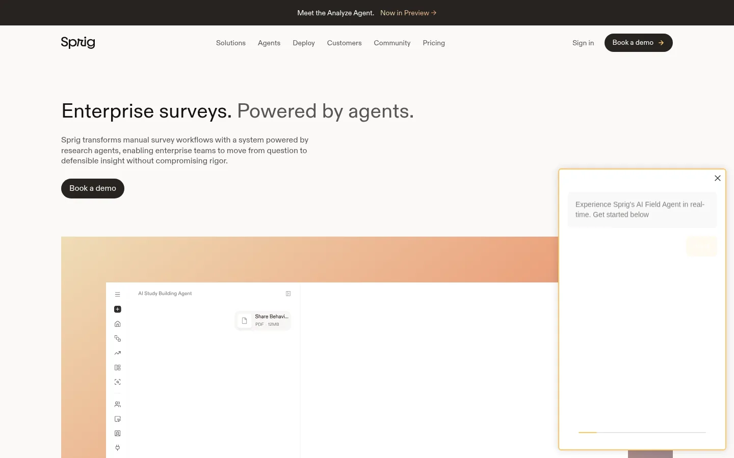
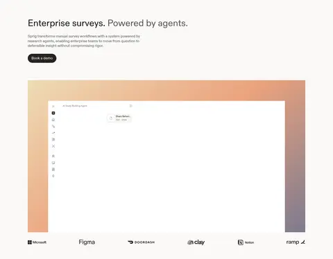
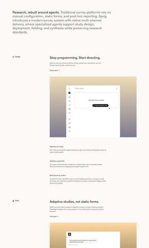
The visual system is built on a warm off-white canvas (#faf9f8), with dark ink text (#141312) and muted gray copy that keeps the page calm and readable. Large, regular-weight ABC Diatype headings establish an editorial rhythm; body copy remains compact and understated. Soft peach, sand, and muted violet gradients frame product screenshots, rather than acting as broad brand-color fills. The page uses a single main content axis with spacious vertical intervals and alternating product demonstrations, text, and capability summaries. A near-black section interrupts the pale flow to foreground enterprise use cases. Rounded dark CTA pills are visually distinct without feeling loud. Fine gray borders define cards and separations, while most sections remain flat and shadow-free. Product UI imagery is clean, white, and presented within generous gradient backdrops; testimonial and event imagery add occasional human color.
Page headings, navigation, body copy, captions, links, and CTA labels.
角色
示例
字号
字重
行高
字距
一级标题
Hero headline and primary page statement.
Sprig
40px
400
1.2
0
二级标题
Major section headings and closing CTA headline.
Sprig
32px
400
1.2
0
三级标题
Feature and capability subsection headings.
The quick brown fox 敏捷的狐狸
24px
400
1.2
0
正文
Explanatory paragraphs, product descriptions, and testimonials.
The quick brown fox 敏捷的狐狸
16px
400
1.3
0
辅助文字
Small labels and supporting details near product imagery.
The quick brown fox 敏捷的狐狸
14px
400
1.3
0
按钮
CTA labels, especially the dark pill demo action.
The quick brown fox 敏捷的狐狸
16px
400
1.4
0
导航
Header links and primary site navigation.
The quick brown fox 敏捷的狐狸
14px
400
1.3
0
链接
Inline product links and secondary calls to action.
The quick brown fox 敏捷的狐狸
14px
400
1.3
0
间距与布局
基准单位 8px · 密度:适中
48px版块间距
8px元素间距
48px卡片内边距
1200px内容最大宽度
2px
4px
6px
8px
12px
16px
24px
32px
48px
64px
80px
96px
100px
160px
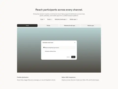
The page follows a broad single-column content axis within a measured 1200px maximum width, with text aligned left in most sections and centered headings where a band or showcase calls for emphasis. Feature stories alternate concise copy with large interface demonstrations, leaving generous open canvas between them. A four-column capability band and two-column distribution section add local variety without changing the overall spacious rhythm. Keep density comfortable: short text blocks, clear hierarchy, and room around media.
圆角与层次
按钮 · 9999px
卡片 · 4px
图片 · 50%
导航 · 9999px
没有测到阴影:页面是扁平的,层次靠底色和描边区分。
The design is mostly flat, with no measured shadows. Use hairline gray borders for cards and separators, and rely on contrast, spacing, and gradient backdrops for depth. Product panels layer cleanly over gradient fields; dark bands and pill CTAs create the strongest visual separation.
组件
下面的预览按实测的按钮、输入框、徽标、卡片样式重建(字体用替代字体)。
Primary demo CTA
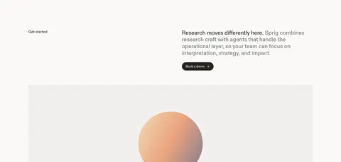
Use a charcoal pill (#272420) with white label text, compact horizontal padding, and a dark, high-contrast silhouette.
Top navigation
Place the wordmark at the left, muted navigation links across the center, and sign-in plus demo CTA at the right.
Gradient product frame
Set a clean white product screenshot over a soft sand, apricot, or violet gradient backdrop.
Feature story
Pair a small workflow label and heading with concise explanatory copy, a text link, and a large UI demonstration.
Dark capability band
Use a full-width #1c1a17 section, centered light heading, then four compact capability cards.
Testimonial panel
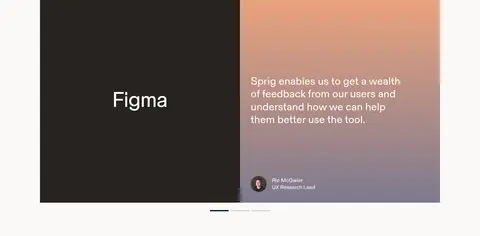
Combine a dark brand panel with a warm gradient quote panel, white copy, and a small speaker attribution.
Imagery · Product screenshots are the central visual asset: crisp white interface panels sit inside soft, atmospheric gradients in peach, sand, violet, or cool green-blue. The framing is rectangular and generous, with the UI kept legible rather than heavily decorated. Small customer logos and certification marks provide proof points; testimonial portraits and event thumbnails add human color later in the page.
Use Warm Canvas (#faf9f8) as the default page background.
Keep headings in regular-weight, sentence-case typography.
Frame product UI with restrained warm or cool gradients.
Use Charcoal Button (#272420) for the primary demo CTA.
Separate stories with generous whitespace and concise copy.
Reserve Night Section (#1c1a17) for a strong full-width contrast break.
✕ 不该做
Do not turn accent gradients into full-page background fills.
Do not add heavy shadows or glossy effects.
Do not crowd product screenshots with decorative elements.
Do not use saturated colors for ordinary text or navigation.
Do not make every section a card grid.
Do not replace the calm editorial rhythm with dense dashboard-like layouts.
给 AI 的提示词
想快速出一个同风格的新页面,把这段话连同 DESIGN.md 一起发给 AI。
Build a new page in Sprig’s calm, editorial SaaS style. Use Warm Canvas (#faf9f8) as the main background, Ink Black (#141312) for headings, and Soft Graphite (#575653) or Warm Gray (#6e6d6a) for supporting copy. Use ABC Diatype or a close sans-serif substitute with regular-weight, sentence-case typography. Keep a broad centered content axis and generous vertical breathing room. Present product interfaces as clean white panels framed by restrained Sand Glow (#efdcb6), Apricot Glow (#eba37e), or Muted Violet (#7d7a8f) gradients. Use Charcoal Button (#272420) for compact pill CTAs. Add an occasional Night Section (#1c1a17) band for strong contrast, with light text and simple capability cards. Favor hairline borders and flat surfaces; avoid heavy shadows, dense grids, and decorative clutter.