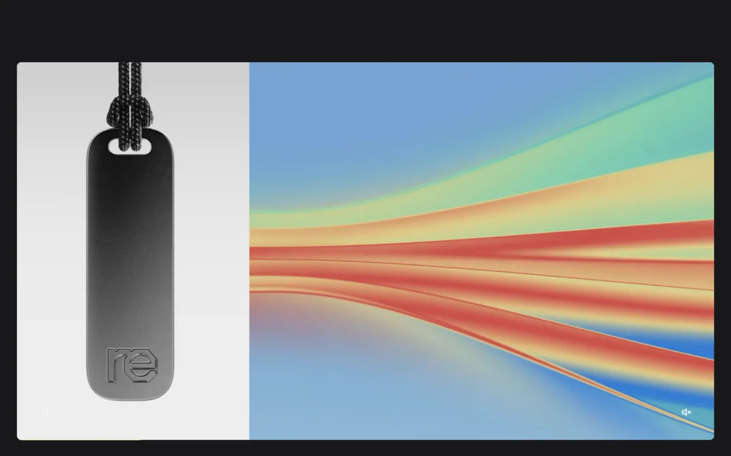
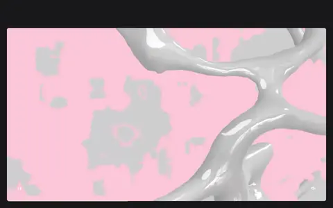
Studio Gruhl 以深色背景和鲜明字体展示品牌与数字设计项目。页面由大幅作品视觉和精简文案构成,鲜艳色彩主要来自项目作品本身。
North star · Keep the dark canvas and oversized white type quiet enough for each project’s artwork to provide the page’s colour and visual drama.
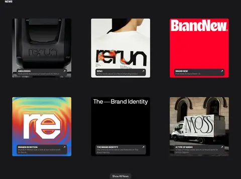
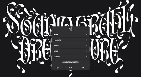
The page uses an almost-black canvas (#18181b) as a continuous frame for white display typography and a long sequence of project imagery. Muted grey (#969696) is reserved for quieter supporting text; vivid violet (#c92bf6) is measured as an accent, but the screenshots show the featured artwork—not violet UI—as the main source of colour variation. GreedStandard supplies both oversized uppercase display statements and compact body copy, creating a deliberately compressed hierarchy without introducing a second type family. The layout is a spacious, single-column editorial flow: a cinematic media-led opening, a blunt studio statement, then broad project previews separated by generous dark intervals. News coverage shifts to a three-column grid, while the closing navigation sits over expressive white lettering. Rounded media corners and subdued dark buttons soften the otherwise flat, high-contrast composition.
配色
点色块复制色值。用途说明来自对页面的实测位置(背景、文字、描边、按钮)与截图判读。
品牌色
强调色
表层色
中性色
页面底色 · Studio Charcoal表层 · Button Slate主文字 · Paper White次要文字 · Soft Graphite描边 · Studio Charcoal强调 · Electric Violet
文字
背景
对比度
WCAG
#ffffff Paper White
#18181b Studio Charcoal
17.72:1
AAA
#ffffff Paper White
#2e2e30 Button Slate
13.55:1
AAA
#969696 Soft Graphite
#18181b Studio Charcoal
5.99:1
AA
#969696 Soft Graphite
#2e2e30 Button Slate
4.58:1
AA
#c92bf6 Electric Violet
#18181b Studio Charcoal
4.35:1
AA-large
#c92bf6 Electric Violet
#2e2e30 Button Slate
3.33:1
AA-large
字体
字号阶梯:Custom(比例约 5,正文 16px)。示例用免费替代字体渲染,数值为实测。
Aa 设计
GreedStandard
网络字体 · 字重 400 / 700 · 占比 100%
免费替代:Space Grotesk
Site-wide typeface for display headlines, body copy, captions, links, and navigation.
角色
示例
字号
字重
行高
字距
特大标题
Oversized uppercase studio statement and major editorial headlines.
Studio Gruhl
80px
700
1
0
正文
Project descriptions, supporting copy, and general page text.
The quick brown fox 敏捷的狐狸
16px
400
1.15
0
辅助文字
Compact uppercase labels, including section and news labels.
The quick brown fox 敏捷的狐狸
15px
700
normal
0
链接
Large uppercase email callout and prominent contact link.
Studio Gruhl
80px
700
1
0
间距与布局
基准单位 4px · 密度:宽松
120px版块间距
29px元素间距
—卡片内边距
1105px内容最大宽度
1px
6px
8px
9px
12px
16px
24px
28px
29px
30px
32px
59px
120px
Use a spacious, predominantly single-column flow with a measured page maximum width of 1105px. The opening is full-bleed media within the dark canvas; subsequent sections return to a centered, editorial rhythm. Project previews are stacked and given generous separation, while the news area changes to three columns. Align large statements and project titles to the start rather than centering them. The measured section gap is 120px and element gap is 29px; preserve this roomy pacing instead of filling every band with content.
圆角与层次
按钮 · 12px
图片 · 7px
没有测到阴影:页面是扁平的,层次靠底色和描边区分。
The interface is predominantly flat: the dark canvas does the framing, with no measured shadows or gradient treatments. Use subtle separation through spacing rather than cards or outlines. Media uses a measured 7px radius and buttons a 12px radius; dark slate button surfaces provide the main visible layer above the canvas.
组件
下面的预览按实测的按钮、输入框、徽标、卡片样式重建(字体用替代字体)。
Media-led opening
A large, cinematic visual sits inside the dark canvas, with the first viewport dominated by imagery rather than a conventional text-heavy hero.
Studio statement
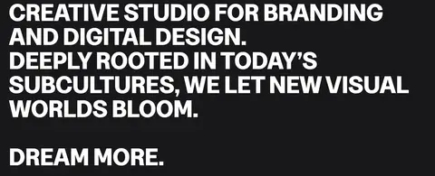
A bold uppercase introduction and short follow-up line use white GreedStandard display type, with a compact dark-slate “More About Us” button.
Project feature
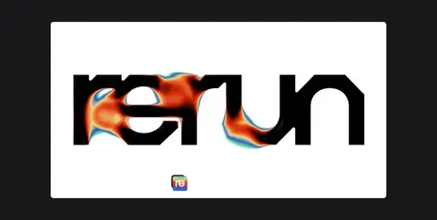
Stacked project previews pair prominent artwork with a large project title and concise descriptive link; media corners use the measured 7px radius.
Contact callout
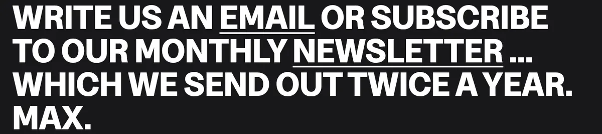
An oversized uppercase email and newsletter prompt acts as a typographic CTA, with selected phrases presented as links.
News grid
A three-column image-led coverage grid uses compact uppercase headings and short summaries beneath the section label.
Footer navigation
A closing visual and compact navigation links sit on the dark canvas, followed by small legal links.
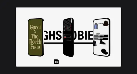
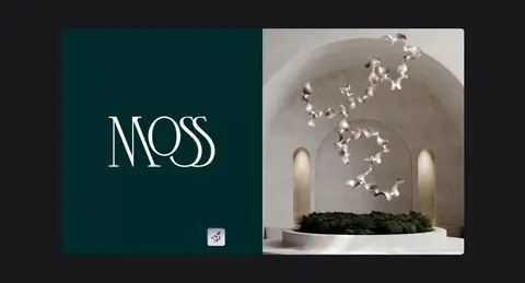
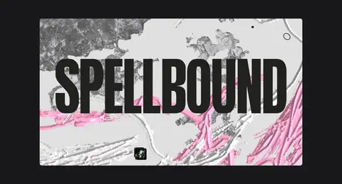
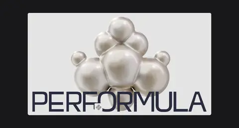
Imagery · Lead with large cinematic project media, including video, then alternate between full-width and split compositions within individual project artwork. The imagery ranges from product mockups and brand graphics to atmospheric 3D scenes. Keep images crisp and prominent, with restrained rounded corners; let each project retain its own palette rather than recolouring everything to match the site. News thumbnails form a compact image-led grid.
Give project artwork room to dominate each preview.
Preserve generous vertical gaps between editorial sections.
Use #2e2e30 for subdued compact action surfaces.
Keep news coverage image-led and arranged in three columns.
✕ 不该做
Do not add a bright global background or broad colour bands.
Do not let decorative UI compete with the project artwork.
Do not turn every section into a card grid.
Do not use violet as a pervasive interface colour.
Do not center all headlines or project descriptions.
Do not add heavy shadows or ornamental borders.
给 AI 的提示词
想快速出一个同风格的新页面,把这段话连同 DESIGN.md 一起发给 AI。
Build a new creative-studio page using Studio Gruhl’s restrained dark editorial language. Make #18181b the continuous canvas; use #ffffff for large uppercase GreedStandard-style headlines and primary copy, and #969696 only for quieter supporting text. Treat #c92bf6 as a restrained accent, not a page-wide treatment, and use #2e2e30 for understated buttons. Organize the page as a spacious single-column narrative with a cinematic opening, concise studio statement, prominent project previews, and a compact three-column editorial grid where useful. Let original project visuals retain their own palettes and compositions. Keep corners subtle, surfaces mostly flat, and spacing generous. Use scale and contrast—not shadows, borders, or decorative UI—to establish hierarchy.