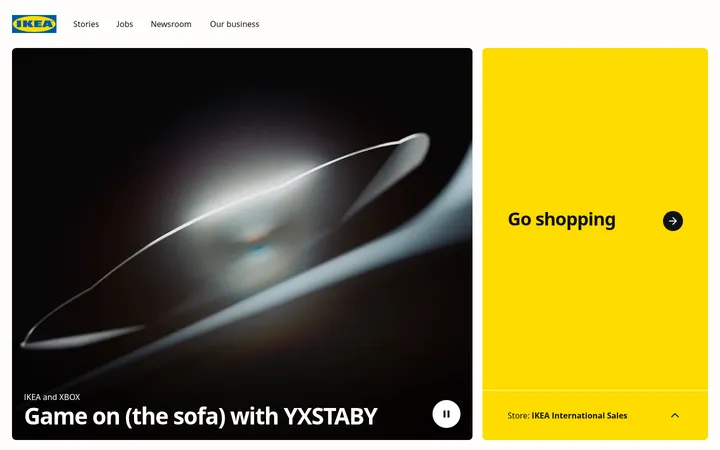
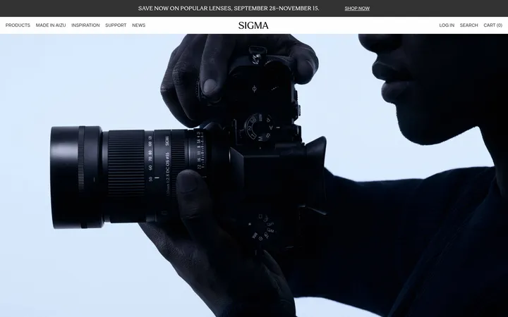
North star · Keep the interface quiet and precise so full-frame photographs of real materials and kitchens remain the primary source of colour and emotion.
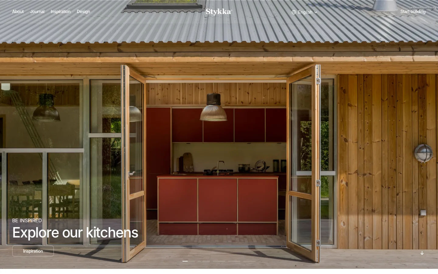
The visual strategy is deliberately quiet: a white canvas and black typography let the kitchens’ timber, plywood, and muted red cabinetry supply nearly all of the page’s visual colour. The opening is a full-bleed architectural photograph with navigation and headline layered over the image; subtle dark image gradients help white text remain legible. Inter is used throughout in compact, medium-weight headings and small, closely tracked body copy, keeping the interface crisp without competing with the interiors. The content below moves into white space, with a concise introductory heading and a four-column feature row of tightly framed kitchen photographs and short captions. Larger image cards then introduce customer, architect, and developer pathways. Testimonials and partner logos are presented with a lighter touch before a dense multi-column footer. The rhythm alternates between immersive imagery and calm, compact information blocks; restrained black-and-white UI keeps material and product photography in the foreground.
配色
点色块复制色值。用途说明来自对页面的实测位置(背景、文字、描边、按钮)与截图判读。
表层色
中性色
功能色
页面底色 · Gallery White表层 · Material Ink主文字 · Material Ink次要文字 · Gallery White弱文字 · Soft Graphite
Primary interface type for navigation, headings, captions, and body copy.
Aa 设计
sans-serif
系统字体 · 字重 400 · 占比 1%
免费替代:Inter
System fallback for small interface and link text.
角色
示例
字号
字重
行高
字距
一级标题
Hero headline over the kitchen photograph.
Stykka
46px
500
1
-0.04em
二级标题
Section headings introducing major homepage content.
Stykka
30px
500
1.05
-0.042em
三级标题
Feature or content-card headings.
The quick brown fox 敏捷的狐狸
24px
500
1.2
-0.042em
四级标题
Smaller supporting headings and testimonial titles.
The quick brown fox 敏捷的狐狸
22px
500
1.1
-0.023em
正文
Feature descriptions, testimonial copy, and supporting text.
The quick brown fox 敏捷的狐狸
14px
400
1.25
-0.036em
辅助文字
Small uppercase overlines and category labels.
The quick brown fox 敏捷的狐狸
11px
500
1
0
导航
Header and footer navigation labels.
The quick brown fox 敏捷的狐狸
14px
500
1.25
-0.036em
链接
Inline links and secondary navigation actions.
The quick brown fox 敏捷的狐狸
16px
400
1.5
0
代码
Technical uppercase label style; not prominent in the screenshot.
const style = 1;
18px
400
1
-0.01em
间距与布局
基准单位 2px · 密度:紧凑
40px版块间距
10px元素间距
—卡片内边距
1360px内容最大宽度
1px
2px
3px
5px
8px
10px
15px
20px
24px
33px
40px
The opening hero spans the viewport, with navigation aligned across its top and headline content anchored near the lower left. Below, the white content area uses a measured maximum page width of 1360px and a compact, image-led grid: four feature tiles sit together, followed by larger audience pathway cards. Testimonial and partner areas are more open and lightly populated. The measured spacing system is compact, with a 40px section gap and 10px element gap; preserve clear grouping while keeping the overall rhythm airy.
圆角与层次
导航 · 9999px
链接 · 8px
没有测到阴影:页面是扁平的,层次靠底色和描边区分。
The interface is primarily flat: white content sections sit directly on the canvas, with no measured shadows. Image boundaries and spacing provide separation rather than elevated cards or decorative borders. In the hero, text overlays the photograph with subtle dark gradient layers for contrast; keep these overlays confined to media rather than turning them into general surface treatments.
组件
下面的预览按实测的按钮、输入框、徽标、卡片样式重建(字体用替代字体)。
Overlay navigation
Compact white links sit across the hero image, with the Stykka wordmark centered and the build action aligned to the right.
Full-bleed hero
A wide architectural kitchen photograph carries a small uppercase overline, large white heading, rounded Inspiration link, and downward cue.
Feature tiles
Four image-led cards pair close kitchen photography with short uppercase category labels and compact explanatory copy.
Audience image cards
Larger photographs direct visitors toward Stykka Home, Architects, and Developers, with concise text over the image.
Testimonial
A customer quote uses a direct heading, short supporting sentence, attribution, and simple previous/next controls.
Partner marks
A lightly weighted trust area presents partner logos with ample white space rather than decorative containers.
Multi-column footer
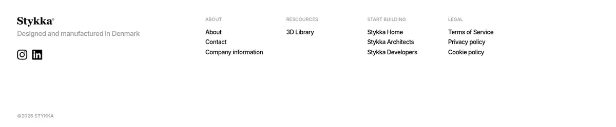
A white footer groups company, resources, product pathways, and legal links beneath the Danish manufacturing statement.
Imagery · Photography defines the page: full-width views of real kitchens and buildings establish place, while closer interior images show cabinetry, finishes, and hardware. Images are naturally lit and warm, framed as edge-to-edge hero media or consistent rectangular cards. Customer and professional pathway cards include people in context. No illustration or 3D style dominates; the measured earthy screenshot colours belong to the photography rather than interface accents.
Let real kitchen photography provide the dominant colour.
Use black text on clean white content sections.
Place concise white hero copy directly over imagery.
Keep feature copy short and easy to scan.
Use compact Inter typography with measured tracking habits.
Separate content groups with whitespace, not decoration.
✕ 不该做
Do not invent a bright interface accent palette.
Do not treat photographic browns as brand colours.
Do not add heavy shadows or raised-card effects.
Do not crowd the hero with dense copy.
Do not compete with product imagery using ornamental graphics.
Do not use oversized, loose, decorative typography.
给 AI 的提示词
想快速出一个同风格的新页面,把这段话连同 DESIGN.md 一起发给 AI。
Build a new Stykka-style page with a restrained, architectural feel. Use Gallery White (#ffffff) for the main canvas and Material Ink (#000000) for key text; reserve Soft Graphite (#515154) for subdued supporting copy. Let warm interior photography—not UI fills—supply colour. Start with a full-width image and a light, compact navigation overlay, then use clear white content sections with image-led grids and concise labels. Set typography in Inter, using medium-weight, tightly tracked headings and small readable body text. Keep cards flat, avoid decorative shadows, and use spacing to distinguish groups. If text overlays an image, apply a subtle dark gradient only to that image. Prioritize real materials, clean alignment, quiet hierarchy, and practical paths into product information.