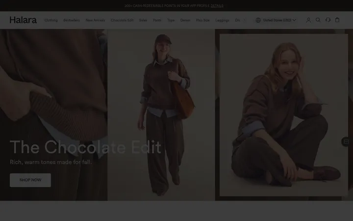
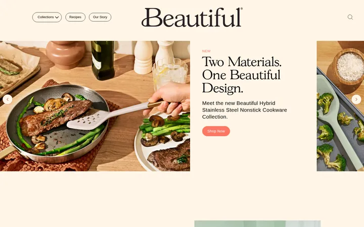
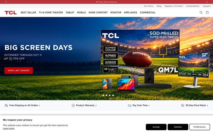
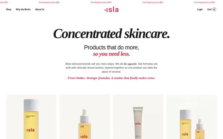
North star · Keep the warm neutral canvas quiet, then let one vivid product panel or image lead each browsing moment.
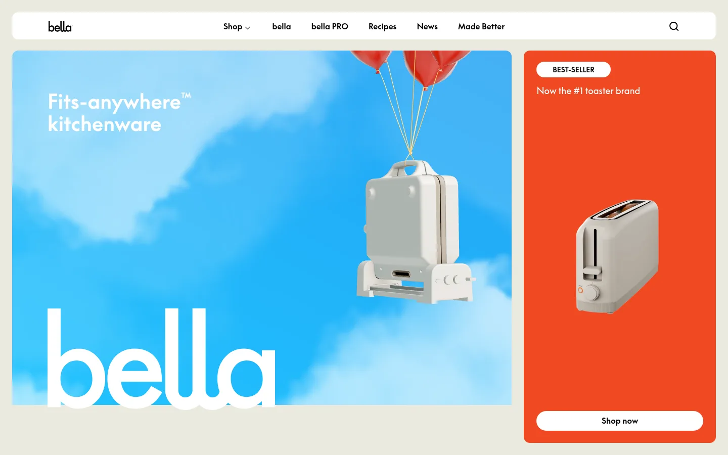
The visual system is anchored by a warm off-white canvas (#ebeadf), used across long stretches of the page so bright imagery and product panels stand out. Black carries navigation, body copy, and borders; white appears in compact pill buttons and badges. Saturated orange (#f04923) gives a toaster promotion a strong focal panel, while pale blue and beige mark smaller editorial cards. Supreme LL TT supplies the page’s rounded, modern sans-serif voice, with bold headings and navigation against restrained body copy. The measured Times New Roman styling appears on some buttons and links, adding a small contrasting note rather than defining the overall identity. Layout alternates broad media-led areas with centered product browsing and compact four-column editorial or press content. Images are treated as colorful campaign scenes and clear appliance displays, not as decorative backgrounds everywhere. Rounded corners and flat surfaces keep the composition friendly without introducing heavy shadows.
Primary brand type for headings, navigation, body text, and badges.
Aa 设计
Times New Roman
系统字体 · 字重 700 / 400 · 占比 2%
免费替代:Lora
Measured secondary styling for some links, card copy, and CTA labels.
角色
示例
字号
字重
行高
字距
一级标题
Primary campaign headline in the hero and leading page message.
bella
40px
700
1.1
0
二级标题
Large section heading; one measured instance uses a serif face.
bella
32px
700
0.5
0
三级标题
Feature and editorial card headings.
The quick brown fox 敏捷的狐狸
24px
700
1.2
0
四级标题
Secondary promotional or supporting headings.
The quick brown fox 敏捷的狐狸
22px
400
1.5
0
正文
Product descriptions, supporting copy, and general page text.
The quick brown fox 敏捷的狐狸
14px
400
1.5
0
辅助文字
Compact bold labels, including product and promotional metadata.
The quick brown fox 敏捷的狐狸
13px
700
1.5
0
导航
Bold primary navigation labels.
The quick brown fox 敏捷的狐狸
16px
700
1.5
0
间距与布局
基准单位 4px · 密度:适中
32px版块间距
30px元素间距
12px卡片内边距
1248px内容最大宽度
4px
5px
6px
7px
8px
10px
12px
16px
20px
22px
24px
25px
30px
32px
40px
48px
The measured page max width is 1248px, with a comfortable density and a 32px section gap. At the top, a compact rounded navigation bar sits above an asymmetrical hero: expansive campaign media beside a narrow orange product card. Lower sections shift between centered product browsing and four-column editorial or press content, then a two-column newsletter band and four-column footer. Keep alignment deliberate and preserve large calm areas of canvas between media-rich sections.
圆角与层次
按钮 · 50%
卡片 · 12px
徽标 · 9999px
导航 · 12px
inset · section
inset · section
The measured interface is primarily flat, with no conventional drop shadows. Separation comes from the Oat Canvas background and contrasting colored card surfaces. Use rounded corners on cards and navigation, pill-shaped buttons and badges, and black borders only where the measured controls call for them; avoid adding heavy outlines or layered elevation.
组件
下面的预览按实测的按钮、输入框、徽标、卡片样式重建(字体用替代字体)。
Top navigation
White rounded bar on the warm canvas; black bold sans-serif links, bella wordmark, and a search control.
Split hero
Large campaign media beside an orange rounded product card. The card uses a white BEST-SELLER pill and white Shop now pill with black text.
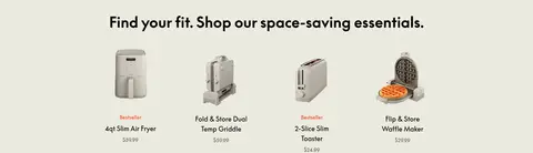
Product tile
Product image with concise name and price, arranged in a centered four-column assortment on the canvas.
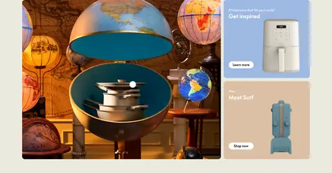
Editorial feature card
Rounded feature tiles use Powder Blue or Biscuit Beige surfaces, product imagery, short white copy, and white pill CTAs.
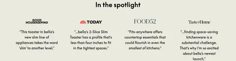
Press quotes
Centered section title above four compact press columns, each pairing a publication mark with a short quote.
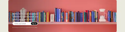
Newsletter band
Wide photographic signup area with overlaid invitation, email input, and a black Sign up control with white text.
Footer
Bella wordmark and grouped Shop, Collections, Support, Contact, and social links on the neutral canvas.
Imagery · Use vivid lifestyle photography or campaign video alongside clean, readable appliance product imagery. The hero pairs a sky-blue scene and oversized branding with an isolated toaster on orange. Product tiles favor clear cutouts; editorial cards combine images with concise copy. Images can be colorful, but keep the surrounding page neutral so the subject remains legible.
Reserve #f04923 for a focused promotional panel or accent.
Keep primary navigation and copy in #000000.
Use white pill buttons for clear, compact calls to action.
Pair product cutouts with colorful campaign imagery.
Give product and editorial sections generous visual breathing room.
✕ 不该做
Do not turn the whole page into a bright color field.
Do not introduce unmeasured colors into the interface palette.
Do not add heavy shadows or dense border treatments.
Do not use oversized blocks of decorative copy.
Do not crowd product imagery with competing labels.
Do not make every card the same color or visual weight.
给 AI 的提示词
想快速出一个同风格的新页面,把这段话连同 DESIGN.md 一起发给 AI。
Build a new bella-style ecommerce page with a warm, quiet #ebeadf Oat Canvas and Kitchen Ink #000000 for navigation and copy. Use Porcelain #ffffff for compact pill CTAs and badges. Let a focused product feature carry Toaster Flame #f04923; use Powder Blue #9eb9e1 and Biscuit Beige #dbbfa5 only for secondary editorial cards. Set the primary voice in Supreme LL TT, or a close modern sans-serif substitute, with bold headings and navigation. Favor a clean split hero, clear appliance cutouts, vivid campaign imagery, centered product browsing, and spacious editorial sections. Keep cards and navigation rounded, surfaces mostly flat, and page composition comfortable rather than dense. Follow the measured 1248px max-width and 32px section rhythm without adding unmeasured spacing or radius values.