North star · Let the exact brand red, editorial serif headlines, fine rules and generous white space define the page; keep photography vivid but UI chrome quiet.
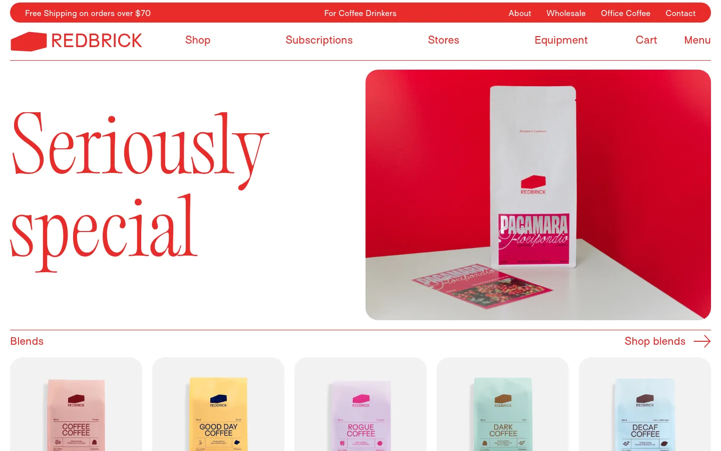
The page builds its identity around exact brand red #e82c2a against white, with a light gray canvas #f2f2f2 appearing as a restrained supporting neutral. Red carries the navigation, headings, links, section dividers and announcement bar; keep it consistent rather than adding new interface colours. Editorial Old, a light serif, supplies the oversized hero and feature headlines, while Surt handles navigation, product labels and supporting copy with generous letter spacing. The layout is a long, open storefront: thin red rules separate sections, compact section labels sit opposite shop links, and split feature blocks alternate imagery and copy. Product tiles repeat in horizontal rows, with rounded pale image backgrounds and little visible card chrome. Photography is central: coffee bags and lifestyle scenes bring in saturated reds and varied packaging colours, but those image colours should not be mistaken for interface palette tokens. The result feels distinctive through typography, repetition and restraint rather than shadows or decorative effects.
配色
点色块复制色值。用途说明来自对页面的实测位置(背景、文字、描边、按钮)与截图判读。
品牌色
表层色
中性色
页面底色 · Pale Ash表层 · Roaster White主文字 · Brick Signal次要文字 · Roaster White描边 · Brick Signal强调 · Brick Signal
Navigation, body copy, product names, links, captions, and compact section labels.
Aa 设计
Editorial Old
网络字体 · 字重 300 · 占比 7%
免费替代:Bodoni Moda
Oversized hero and editorial feature headlines.
角色
示例
字号
字重
行高
字距
特大标题
Large editorial campaign or feature statements.
Redbrick Coffee
150px
300
1.1
0.004em
一级标题
Primary oversized hero headline, split across short lines.
Redbrick Coffee
105px
300
0.99
-0.005em
二级标题
Large feature titles such as coffee subscriptions.
Redbrick Coffee
100px
300
1.2
0.006em
三级标题
Section-level headings and prominent supporting titles.
Redbrick Coffee
35px
400
1.5
0.017em
四级标题
Smaller subsection headings and editorial labels.
Redbrick Coffee
30px
400
1.5
0
正文
Product and service descriptions with airy leading.
The quick brown fox 敏捷的狐狸
20px
400
1.5
0.03em
辅助文字
Product names, image labels, and compact supporting details.
The quick brown fox 敏捷的狐狸
15px
400
1.5
0.04em
按钮
Interactive controls, rendered in the Surt sans-serif style.
The quick brown fox 敏捷的狐狸
0px
400
normal
0
导航
Primary and utility navigation links.
The quick brown fox 敏捷的狐狸
20px
400
1.3
0.03em
链接
Shop actions and inline calls to explore.
The quick brown fox 敏捷的狐狸
20px
400
1.2
0.03em
间距与布局
基准单位 2px · 密度:适中
45px版块间距
—元素间距
—卡片内边距
1420px内容最大宽度
5px
10px
12px
15px
20px
30px
50px
Use a single wide storefront column, measured to a 1420px maximum page width, with slim outer gutters and a comfortable density. The header stacks a rounded red announcement band above a separate navigation row, then a fine rule. Alternate full-width product rails with two-column editorial features; align section labels and shop links along shared horizontal rules. Preserve generous section breathing room and strong left/right image-copy contrasts instead of enclosing content in dense cards.
圆角与层次
按钮 · 9999px
输入框 · 9999px
图片 · 25px
链接 · 4px
没有测到阴影:页面是扁平的,层次靠底色和描边区分。
The interface is predominantly flat, with no measured shadows or gradients. Separate content using fine red hairlines and whitespace rather than raised cards. Product images sit in softly rounded pale frames, while larger editorial photographs have rounded corners. Avoid layered panels; the announcement bar is the notable pill-shaped element.
组件
下面的预览按实测的按钮、输入框、徽标、卡片样式重建(字体用替代字体)。
Announcement bar
A slim, rounded Brick Signal band with compact white shipping and audience messages distributed across the row.
Primary navigation
A white row with the red wordmark at left, widely spaced shop destinations, utility links, and a fine red baseline.
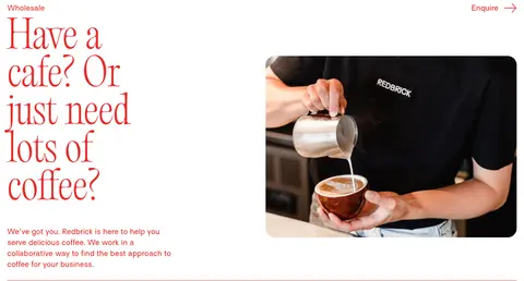
Editorial hero
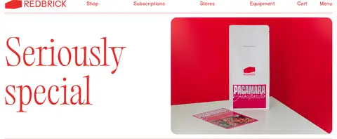
Pair a large light serif headline on the left with a wide, rounded product photograph on the right.
Section heading rail
Place a compact red section label at one edge and a shop or learn link with directional arrow at the other, divided by a fine red rule.
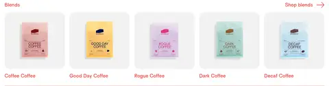
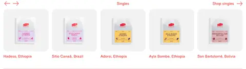
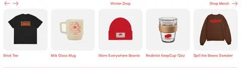
Product rail
Repeat evenly sized product images in a horizontal row; use pale rounded image fields and red names beneath.
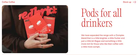
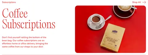
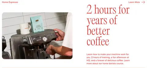
Split feature
Alternate rounded lifestyle photography and editorial copy across two columns, with concise red links or descriptions.
Newsletter form
Set a large serif offer headline above a long pill-shaped red-outline email field and a separate outlined reveal-code control.
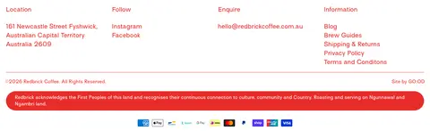
Multi-column footer
Organize location, social, enquiry, and information links into compact columns, then close with fine red rules and a rounded red acknowledgement band.
Imagery · Use real coffee, packaging, café, and product photography rather than illustration-led compositions. The hero pairs a large serif message with a rounded, saturated product scene; later split features alternate lifestyle imagery and copy. Product rails show isolated items on soft pale backgrounds. Keep photographs crisp and naturally varied; vivid red or package colours belong to image content, not additional UI tokens.
Use #e82c2a for interface text, links, headings, and rules.
Keep the main surface white and reserve #f2f2f2 for subtle neutral contrast.
Set campaign headlines in a light, high-contrast editorial serif.
Use the sans-serif for navigation, descriptions, product names, and utility links.
Separate storefront sections with fine red rules and generous whitespace.
Show products in repeatable image-led horizontal rails.
Round photographic media while keeping surrounding UI largely flat.
✕ 不该做
Do not introduce extra interface accent colours from product packaging.
Do not add drop shadows, gradients, or raised card stacks.
Do not use heavy bold display typography in place of the light serif.
Do not pack the page into a dense dashboard or rigid boxed grid.
Do not turn every link into a filled button.
Do not mistake photographic red backgrounds for a new page-wide section colour.
给 AI 的提示词
想快速出一个同风格的新页面,把这段话连同 DESIGN.md 一起发给 AI。
Build a new Redbrick Coffee page as a spacious, image-led storefront. Use Brick Signal (#e82c2a) for navigation, headings, links, announcement details, and fine section rules; keep Roaster White (#ffffff) as the principal surface and use Pale Ash (#f2f2f2) only for quiet neutral contrast. Set oversized editorial headlines in a light high-contrast serif similar to Editorial Old, with a clean, generously tracked sans-serif like Surt for navigation, body copy, labels, and product names. Organize content as open horizontal sections: label-and-link rails, repeated product rows, and alternating two-column photo-and-copy features. Use rounded image frames, real coffee photography, and ample whitespace. Keep the interface flat, avoid shadows and gradients, and do not promote incidental package colours into UI accents.