North star · Let vivid, authentic home imagery lead, using IKEA yellow and simple editorial modules to guide attention without clutter.
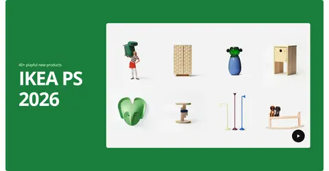
The page uses a warm near-white canvas (#fffefb) as a quiet frame for a long, image-led editorial feed. IKEA yellow (#ffdb00) is the most conspicuous brand accent: it powers the shopping panel and several story bands, while green (#1a7e3b) anchors the new-products showcase. Dark text (#111111) and black (#000000) keep headlines and video controls legible; blue (#0159a3) is present in the measured palette but is not a defining visible surface in the supplied screenshots. Typography is a clean sans serif, with large, tightly tracked bold headlines and smaller supporting labels. Wide media tiles, split panels, paired cards, and occasional full-bleed stories create a steady but varied rhythm. Photography of lived-in rooms and products carries the storytelling; bright color blocks and rounded media corners provide clear focal points without relying on shadows.
Site-wide sans-serif for navigation, headlines, body copy, labels, and controls.
角色
示例
字号
字重
行高
字距
特大标题
Oversized campaign headlines on prominent feature panels.
IKEA
82.5px
700
1.1
-0.043em
一级标题
Primary story or feature title within a large content block.
IKEA
45.5px
700
1.1
-0.035em
二级标题
Section titles such as editorial collection headings.
IKEA
36.5px
700
1.15
-0.03em
三级标题
Supporting story titles and secondary feature copy.
The quick brown fox 敏捷的狐狸
20px
400
1.62
0
正文
Explanatory descriptions and editorial supporting text.
The quick brown fox 敏捷的狐狸
16px
400
1.5
0
辅助文字
Small image labels, collection names, and metadata.
The quick brown fox 敏捷的狐狸
13.5px
400
normal
0
按钮
Shopping prompts, carousel controls, and video actions.
The quick brown fox 敏捷的狐狸
16px
400
normal
0
导航
Header navigation and prominent store-selection links.
The quick brown fox 敏捷的狐狸
20px
400
1.62
0
间距与布局
基准单位 8px · 密度:适中
60px版块间距
20px元素间距
16px卡片内边距
1392px内容最大宽度
1px
6px
7px
8px
10px
14px
16px
20px
24px
50px
60px
120px
A centered desktop composition uses a measured maximum content width of 1392px, with comfortable spacing and a recurring two-column or paired-card grid. The opening hero places large video media beside a yellow shopping panel. Below, the page alternates paired story tiles, split feature sections, and wide image bands. A 60px section rhythm and 20px element gap support separation without making the feed feel sparse; content stays aligned to a consistent outer edge. Headings and text generally align to the left.
圆角与层次
按钮 · 50%
输入框 · 8px
卡片 · 8px
图片 · 8px
没有测到阴影:页面是扁平的,层次靠底色和描边区分。
The page is mostly flat, with color fields and media edges defining sections rather than shadows. Cards generally sit directly on the canvas; media and cards use softly rounded corners, while the measured input also has a rounded edge. Dark overlays add caption contrast on imagery. Avoid ornamental borders and layered floating-card effects.
组件
下面的预览按实测的按钮、输入框、徽标、卡片样式重建(字体用替代字体)。
Header navigation
Compact IKEA logo and a horizontal set of restrained text links on the warm-white canvas.
Hero and shopping panel
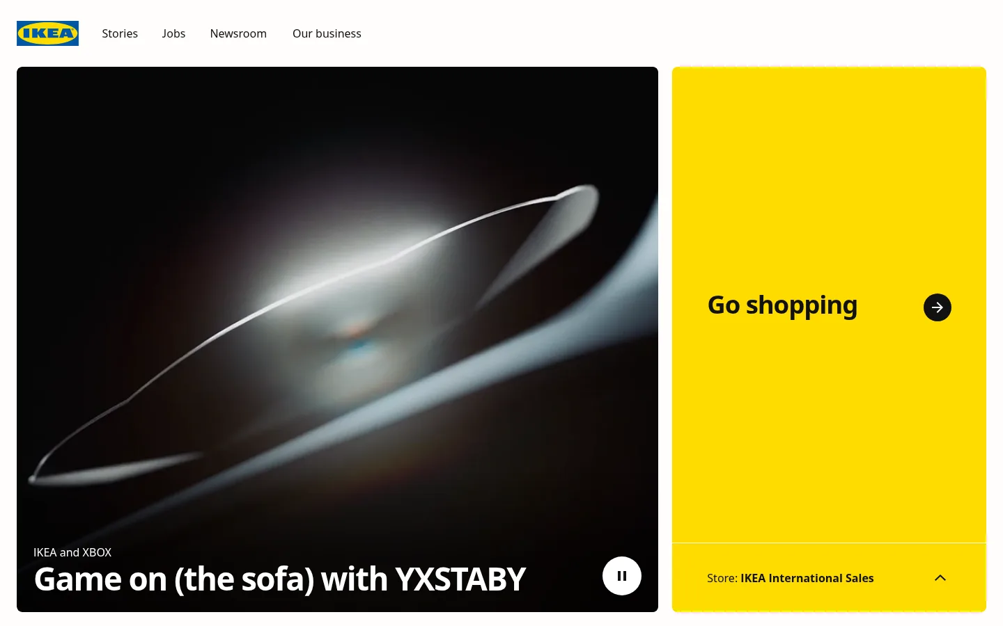
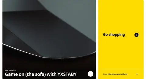
Large rounded video tile sits beside a bright yellow shopping panel with a dark circular arrow and a separate store-selector strip.
Editorial story tile
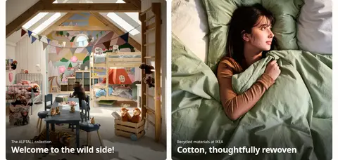
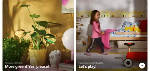
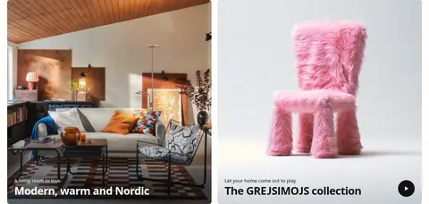
Room or product image with a dark lower gradient, small category label, and bold white title.
Feature split
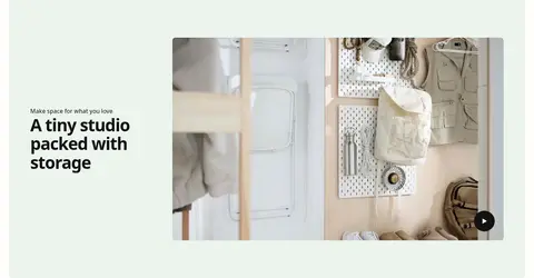
Pair a tinted text panel with a large media image; use left-aligned headline copy and a video or play control where relevant.
Inspiration carousel
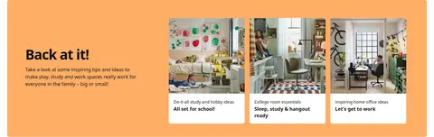
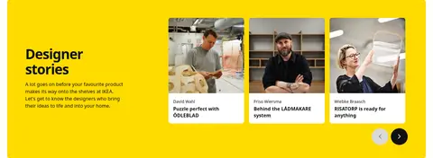
A vivid section band introduces a short editorial heading, description, and a row of compact linked image cards.
Video control
Small circular play or pause control sits over media, contrasting black-on-light or white-on-dark.
Footer
A dark full-width closing area uses a large brand graphic and small, quiet utility links.
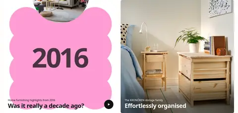
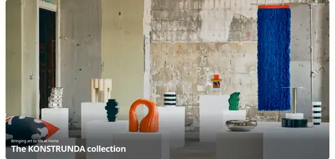
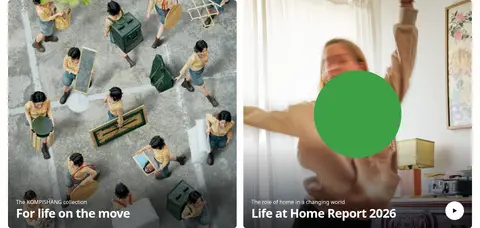
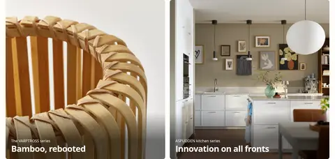
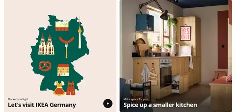
Imagery · Photography and video show furnished rooms, product details, people at home, and everyday activities. Media is framed as wide rounded tiles or paired cards, often with a dark lower gradient supporting white captions. Some editorial stories use bright graphic panels or illustrative artwork; these colors belong to individual stories, not the core palette. Product imagery remains integrated into the lifestyle context.
Use Gallery White as the breathing space around stories.
Reserve IKEA Yellow for high-priority shopping and editorial moments.
Let authentic rooms and products dominate each media tile.
Keep headings bold, left-aligned, and concise.
Alternate paired cards with wide or split feature sections.
Add dark caption gradients when text overlays imagery.
✕ 不该做
Do not make every section a yellow or green block.
Do not add drop shadows to otherwise flat cards.
Do not crowd tiles with long paragraphs or dense controls.
Do not use decorative gradients as the main page background.
Do not treat colors inside campaign artwork as core brand colors.
Do not use thin, highly tracked display typography.
给 AI 的提示词
想快速出一个同风格的新页面,把这段话连同 DESIGN.md 一起发给 AI。
Build a new editorial ecommerce page in IKEA’s visual style. Use Gallery White (#fffefb) as the main canvas, with Soft Ink (#111111) for clear, bold text. Use IKEA Yellow (#ffdb00) selectively for the primary shopping prompt or a featured story band; Forest Green (#1a7e3b), Pale Sage (#ebf4ed), and Apricot Glow (#ffae66) can distinguish individual feature sections. Create a centered, comfortable-width modular feed that alternates paired image cards, split text-and-media blocks, and occasional wide stories. Prioritize authentic home and product photography, with short caption overlays and subtle dark gradients when needed. Keep the sans-serif type hierarchy direct and left-aligned, round media corners, avoid shadows, and provide simple circular video controls. Do not make the result look like a generic storefront catalog.