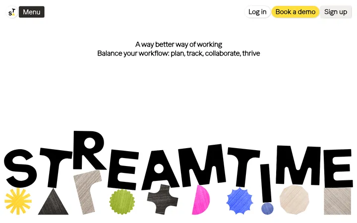
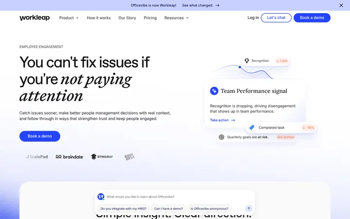
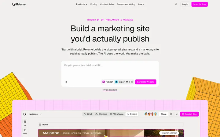
North star · Let whitespace and oversized, confident typography carry the page; keep controls quiet and imagery tactile.
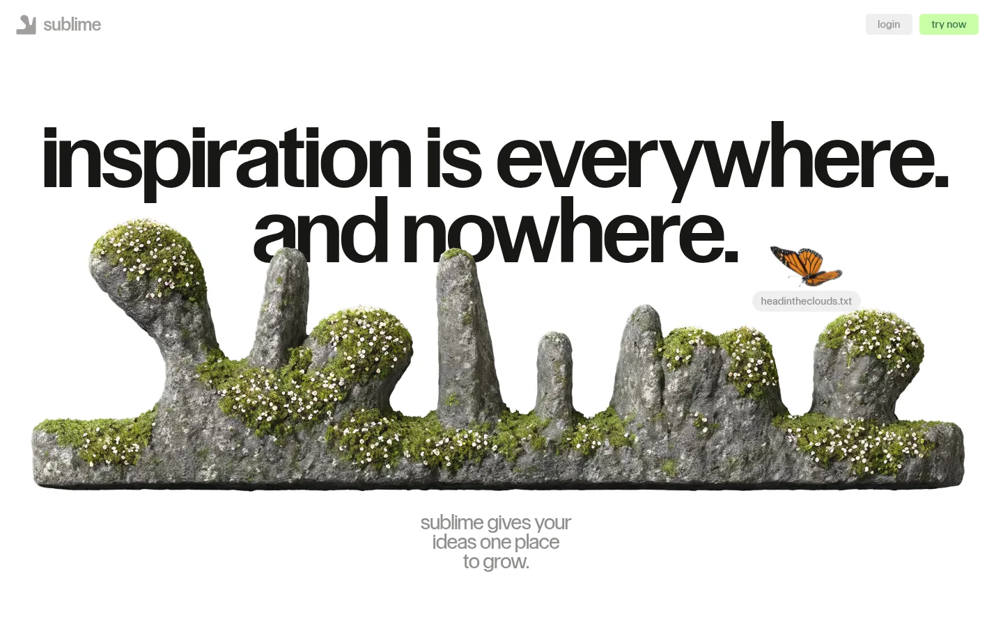
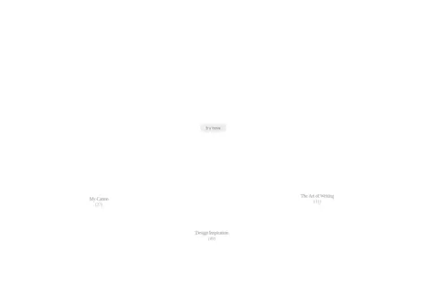
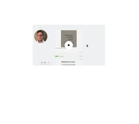
The visual system is built around a pure white canvas and generous uninterrupted space. Strong, oversized black headlines create the primary contrast, while warm gray navigation, captions, and supporting copy stay quiet. A compact pale-gray login button and light-green “try now” CTA provide the clearest interface accents; blue appears as a small related-content badge rather than a dominant brand field. Control Upright handles display, navigation, and controls in a clean, even-weight voice, contrasted by Times New Roman body copy. The hero pairs its monumental headline with a tactile, moss-covered rock formation and a small butterfly, bringing organic color and texture without changing the page’s restrained palette. Product examples and video previews sit within the long feature sequence, surrounded by expansive gaps. The overall effect is editorial and contemplative: interface elements remain simple, while scale, imagery, and whitespace create the drama.
Display headings, navigation, labels, buttons, and links.
Aa 设计
Times New Roman
系统字体 · 字重 400 · 占比 28%
免费替代:Libre Baskerville
Body copy and explanatory text.
角色
示例
字号
字重
行高
字距
特大标题
Oversized hero display headline.
Sublime
120px
400
0.9
0
一级标题
Major feature and section headlines.
Sublime
64px
400
0.9
0
二级标题
Secondary feature titles.
Sublime
28px
400
1
0
三级标题
Subheads and supporting feature labels.
The quick brown fox 敏捷的狐狸
24px
400
1
-0.014em
正文
Editorial-style explanatory paragraphs.
The quick brown fox 敏捷的狐狸
16px
400
1.2
0
辅助文字
Small media captions and metadata.
The quick brown fox 敏捷的狐狸
14px
400
1
0
按钮
Compact CTA and login button labels.
The quick brown fox 敏捷的狐狸
14px
400
1
0
导航
Header navigation and footer navigation.
The quick brown fox 敏捷的狐狸
16px
400
1.13
0
链接
Inline and standalone text links.
The quick brown fox 敏捷的狐狸
16px
400
1.13
0
间距与布局
基准单位 1px · 密度:宽松
160px版块间距
15px元素间距
—卡片内边距
—内容最大宽度
3px
8px
10px
13px
15px
18px
20px
25px
30px
35px
60px
70px
90px
100px
160px
The page is a vertically sequenced, mostly single-column story with a centered hero and long gaps between feature chapters. Feature areas alternate between centered content, multi-column capture examples, and two-column product explanations. Keep the content visually narrow relative to the viewport, but allow the hero artwork to stretch wide. Sections use generous separation rather than colored bands; headings commonly center, while the footer shifts to aligned columns. The measured data provides no fixed maximum width.
圆角与层次
按钮 · 5px
图片 · 5px
徽标 · 9999px
导航 · 5px
链接 · 20px
没有测到阴影:页面是扁平的,层次靠底色和描边区分。
The page reads as largely flat: measured shadows are absent and section backgrounds remain white. Use fine pale-gray boundaries or fills only for quiet controls, badges, and product-preview surfaces. Layer imagery and product examples through composition and whitespace rather than elevated cards; reserve rounded treatments for small controls, pills, and selected links.
组件
下面的预览按实测的按钮、输入框、徽标、卡片样式重建(字体用替代字体)。
Header
Small wordmark at left; restrained navigation at right with a pale-gray login control and pale-green primary CTA.
Primary CTA
“try now” label in Control Upright, regular weight, Forest Ink text on Young Leaf fill, with a subtle measured corner radius.
Login control
Compact Soft Pumice button with Quiet Stone label and restrained rounded corners.
Related badge
Small pill-shaped blue label for related items, using Clear Sky text on a pale-blue surface.
Feature chapter
Centered headline and concise supporting copy, followed by product imagery or capture examples with spacious separation.
Product preview
Screenshot, media, or saved-content sample placed directly in the white narrative flow; avoid heavy card framing.
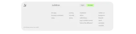
Footer
Pale-gray rounded panel with wordmark, login and CTA controls, and several compact link columns.
Imagery · Lead with the distinctive, photoreal nature image: a low, wide mossy rock formation with tiny flowers, paired with a small butterfly. Use product screenshots, saved-content fragments, and embedded video previews as supporting evidence in later feature sections. Keep imagery cleanly framed against white or pale-gray surfaces, without decorative illustration systems or heavy overlays; natural texture should contrast with the sparse interface.
Set major headlines large, black, and visually dominant.
Preserve generous blank space between story chapters.
Use Young Leaf for the primary CTA and Forest Ink for its label.
Keep navigation and secondary copy warm and low contrast.
Use natural, tactile imagery as a deliberate contrast to the clean interface.
✕ 不该做
Do not introduce colored section bands without evidence.
Do not turn every feature into a bordered card.
Do not make blue a dominant page color.
Do not crowd the hero artwork or its headline.
Do not add heavy shadows or glossy effects.
Do not replace the quiet product story with dense feature lists.
给 AI 的提示词
想快速出一个同风格的新页面,把这段话连同 DESIGN.md 一起发给 AI。
Build a new Sublime-style productivity page as a spacious editorial narrative on Gallery White (#ffffff). Use Control Upright or a close sans-serif for navigation, controls, and large regular-weight headlines; use a restrained serif for body copy. Make black (#000000) headline typography the main contrast, with Warm Ash (#a29e9c) or Quiet Stone (#908f8e) for low-emphasis interface text. Keep the header compact and place a Young Leaf (#cbffa6) CTA with Forest Ink (#38744d) lettering beside a Soft Pumice (#efefef) login control. Favor centered chapter headings, wide tactile nature imagery, and clean product previews separated by substantial whitespace. Use Clear Sky (#00aaff) only for small badges. Avoid heavy cards, colored bands, shadows, and dense layouts; let scale, natural texture, and empty space establish the identity.