North star · Keep the page bright and spacious, using dark precise typography and warm yellow only to guide attention toward actions and product moments.
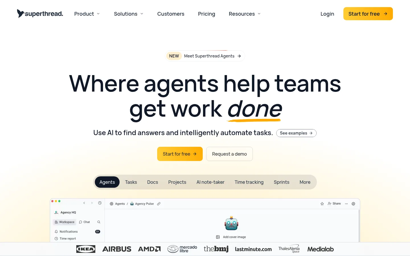
The page is built on a predominantly white canvas, with pale warm sections and fine gray outlines giving long stretches of content gentle separation. Dark navy-charcoal typography anchors the layout; large centered headlines establish hierarchy, while smaller body copy stays readable and restrained. Warm yellow is reserved for high-intent actions, small emphasis marks, and subtle gradients rather than broad blocks of saturated color. The first screen leads with centered messaging and a prominent workspace preview, followed by logos, use-case cards, testimonials, pricing, integrations, FAQ, and a compact footer. Product screenshots and interface illustrations do most of the visual storytelling, with a single dark side-quest panel providing contrast. Repeated rounded cards and pill-like controls soften the otherwise precise grid. Generous whitespace creates a calm, comfortable rhythm, while thin borders and low-key shadows keep interface elements distinct without making the page feel heavy.
Main body copy, descriptive text, and inline links.
Aa 设计
Vela Sans SemiBold
网络字体 · 字重 400 / 600 / 500 · 占比 23%
免费替代:Inter
Display headlines and prominent section headings.
Aa 设计
Vela Sans
网络字体 · 字重 400 / 500 / 600 / 700 · 占比 17%
免费替代:Inter
Navigation, controls, buttons, labels, and general UI text.
Aa 设计
Fragment Mono
网络字体 · 字重 400 / 700 · 占比 3%
免费替代:IBM Plex Mono
Small uppercase technical badges, especially in the dark side-quest feature.
角色
示例
字号
字重
行高
字距
特大标题
Large centered hero headline; emphasize a key word with a yellow underline.
Superthread
80px
600
1.1
-0.01em
一级标题
Primary section headings and key headline-level messages.
Superthread
32px
400
1.2
0
二级标题
Supporting section headings and prominent feature titles.
The quick brown fox 敏捷的狐狸
24px
400
1.5
0
三级标题
Card titles and smaller feature headings.
The quick brown fox 敏捷的狐狸
20px
500
1.4
0
正文
Explanatory paragraphs and supporting product copy.
The quick brown fox 敏捷的狐狸
16px
400
1.7
0.02em
辅助文字
Small supporting details, credits, and compact notes.
The quick brown fox 敏捷的狐狸
14px
400
1.71
0.02em
按钮
CTA labels and interface action controls.
The quick brown fox 敏捷的狐狸
16px
400
1.5
0
导航
Primary desktop navigation links.
The quick brown fox 敏捷的狐狸
20px
500
1.4
0
链接
Inline calls to action and supporting content links.
The quick brown fox 敏捷的狐狸
16px
400
1.7
0.02em
代码
Compact monospaced labels in the dark side-quest area.
const style = 1;
9px
400
1.5
0.08em
间距与布局
基准单位 4px · 密度:适中
48px版块间距
8px元素间距
16px卡片内边距
1088px内容最大宽度
4px
6px
8px
10px
12px
16px
20px
24px
28px
32px
Use a centered, responsive content frame with a measured maximum width of 1088px. The desktop hero is center-aligned, with a large headline, concise supporting line, paired actions, a pill-shaped feature selector, and a wide product preview. Below, alternate spacious full-width content bands with centered headings and contained grids. Cards and pricing panels use comfortable internal spacing; the overall rhythm is open rather than dense. Keep navigation horizontal on desktop and preserve clear separation between feature, social-proof, pricing, integrations, FAQ, and footer areas.
圆角与层次
按钮 · 10px
卡片 · 14px
图片 · 50%
徽标 · 9999px
导航 · 10px
链接 · 9999px
hairline · card
hairline · card
sm · button
md · other
Favor flat surfaces, thin gray outlines, and restrained shadows. Cards are distinguished mainly by rounded corners and a subtle border; product previews sit above the page on pale panels. Reserve stronger visual separation for the dark side-quest card, without adding heavy shadows across ordinary sections.
组件
下面的预览按实测的按钮、输入框、徽标、卡片样式重建(字体用替代字体)。
Primary CTA
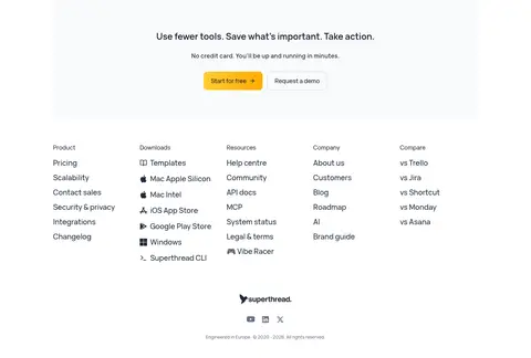
Warm yellow rounded button with dark label and a small arrow; used for Start for free in navigation, hero, and closing CTA.
Secondary CTA
Light or transparent button with a fine gray outline and dark text, used for Request a demo beside primary actions.
Feature selector
Horizontal pale pill containing compact product-area labels; the active Agents item is dark with white text.
Product preview
Wide workspace screenshot inside a subtly outlined rounded frame, often sitting over a soft warm background wash.
Use-case cards
Three-column cards with thin outlines, rounded corners, small uppercase context labels, prompt examples, and pale warm footer details.
Dark side-quest panel
Near-black rounded feature card with a mono badge, cyan detail, concise copy, yellow action button, and embedded game UI.
FAQ list
Stacked pale rows with short questions and small disclosure chevrons; restrained borders maintain a light touch.
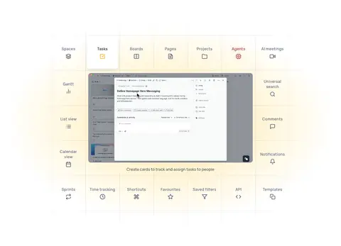
Imagery · Product UI screenshots and interface mockups are the primary imagery, shown in broad framed panels that let the workspace itself read clearly. Use the pale yellow wash behind hero media sparingly, and keep logo strips small and orderly. The dark side-quest module is a deliberate contrast, pairing a compact promotional message with a game-like interface preview. Avoid decorative photography that competes with the product.
Keep the main canvas white and the overall contrast crisp.
Use warm yellow for primary actions and selective emphasis.
Center the hero headline and give it generous breathing room.
Show product UI prominently in clean, rounded frames.
Separate content with subtle borders and pale surfaces.
Use dark panels sparingly for intentional contrast.
✕ 不该做
Do not use bright yellow as a full-page background.
Do not crowd the hero with dense copy or extra controls.
Do not replace product previews with generic lifestyle photography.
Do not add heavy shadows to ordinary cards.
Do not overuse cyan or orange outside small UI details.
Do not make the footer or FAQ visually compete with the hero.
给 AI 的提示词
想快速出一个同风格的新页面,把这段话连同 DESIGN.md 一起发给 AI。
Build a new Superthread-style productivity SaaS page with a white Gallery White (#ffffff) canvas, dark Midnight Ink (#101828) headlines, and Slate Ink (#1d2939) supporting text. Use Marigold (#facd4b) sparingly for primary actions and highlights; pale warm surfaces such as Vanilla Haze (#fff5d6) and Butter Glow (#ffe495) can softly frame product imagery. Set a centered, spacious layout with clear section rhythm, rounded cards, fine Soft Divider (#d0d5dd) outlines, and restrained shadows. Lead with a confident centered headline, concise copy, paired CTAs, and a convincing workspace preview. Use product UI rather than decorative photography. Add social proof, feature cards, and a dark side module only where useful. Keep controls simple, typography clean, and secondary copy subdued in Muted Slate (#667085).