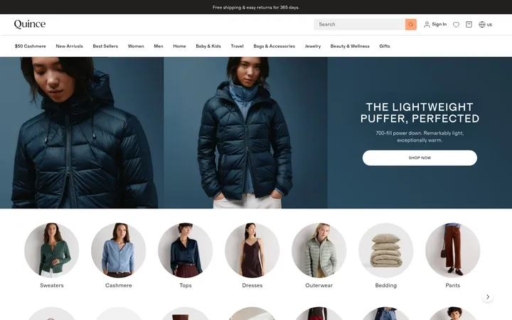
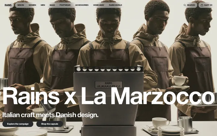
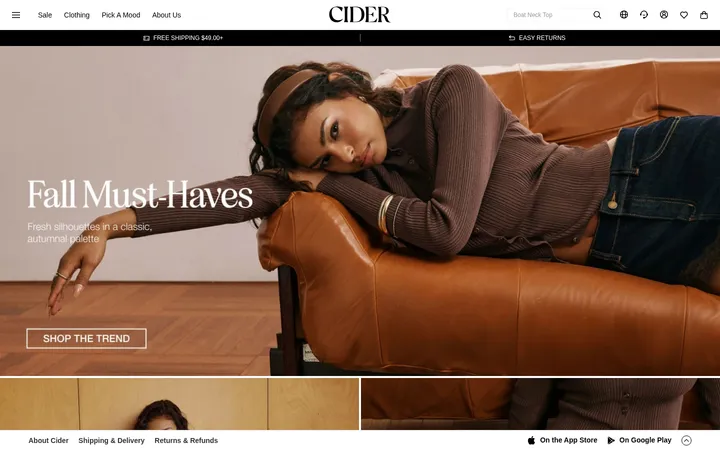
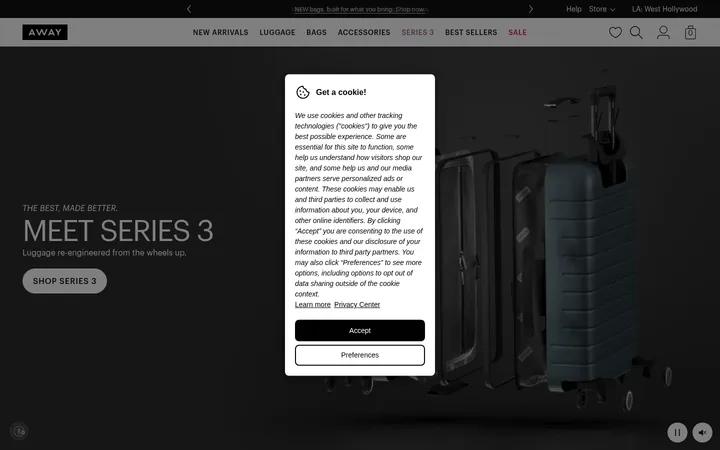
North star · Keep the evergreen canvas and white type dominant, using color and product imagery as deliberate, limited focal points.
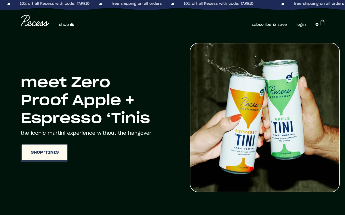
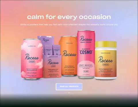
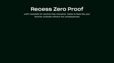
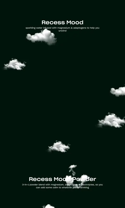
The page is anchored by a near-black evergreen canvas (#00140c), repeated across the hero and long product-category sections to make the site feel calm and continuous. White (#ffffff) carries the navigation, headings, supporting copy, and links, maintaining clear contrast without introducing extra interface colour. Lavender (#c2caff) appears as a small, high-visibility shop CTA accent; deep blue (#25385b) and navy (#1d2a58) are supporting accents, most notably in the announcement strip, button edging, and occasional graphic details. Sharp Grotesk Web supplies a clean, rounded sans-serif voice: a prominent hero headline contrasts with small, quiet descriptions and uppercase bold buttons. The opening hero is a two-part composition, with copy and CTA on the left and framed product photography on the right. Farther down, centered headings and generous dark intervals give product categories room to breathe. Pastel gradients, colorful cans, and cloud graphics belong to product imagery and illustrations, rather than replacing the dark brand canvas.
Site-wide typography for display headings, body copy, navigation, links, and buttons.
角色
示例
字号
字重
行高
字距
特大标题
Large, prominent campaign or hero headline.
Recess
60px
500
1.25
0
一级标题
Primary section heading and major category title.
The quick brown fox 敏捷的狐狸
24px
400
1.38
0
二级标题
Secondary heading or supporting section statement.
The quick brown fox 敏捷的狐狸
20px
400
1.63
0
正文
Compact product and explanatory copy.
The quick brown fox 敏捷的狐狸
14px
500
normal
0
按钮
Bold uppercase shopping CTA label.
The quick brown fox 敏捷的狐狸
16px
700
1.13
0
导航
Header navigation and announcement links.
The quick brown fox 敏捷的狐狸
16px
400
1
0
链接
Product, sampler, and promotional text links.
The quick brown fox 敏捷的狐狸
14px
500
normal
0
间距与布局
基准单位 8px · 密度:宽松
64px版块间距
32px元素间距
—卡片内边距
1024px内容最大宽度
4px
8px
12px
16px
24px
32px
36px
40px
48px
64px
84px
107px
144px
The measured content max width is 1024px, set within a much wider dark canvas. The opening hero uses a left text-and-button column beside a large framed product image; later sections shift to centered headings and product-category layouts. Spacious density is reinforced by a 64px section gap and 32px element gap, with generous empty stretches between category moments. Maintain a clear, deliberate reading order and avoid filling every dark interval with interface elements.
圆角与层次
没有测到阴影:页面是扁平的,层次靠底色和描边区分。
The interface is mostly flat: no measured shadows, and section backgrounds remain continuous. The hero image gains definition from a fine light outline and rounded corners. Buttons use square corners, with a visible border; use spacing and contrast rather than card shadows to establish hierarchy.
组件
下面的预览按实测的按钮、输入框、徽标、卡片样式重建(字体用替代字体)。
Announcement strip
A narrow repeating top band uses blue-toned contrast, small white promotional links, and shipping messages above the main navigation.
Header navigation
White script-style Recess logo sits at left with shop navigation; subscription, login, and cart links align to the right.
Hero feature
Left-aligned campaign heading, short supporting sentence, and uppercase shop button sit beside a large, bordered product photograph.
Shop CTA
Bold 16px uppercase Sharp Grotesk Web label; measured button padding is 24px 36px, with square corners and a visible 2px border.
Product category intro
Centered white heading and concise description introduce product families against the uninterrupted green canvas.
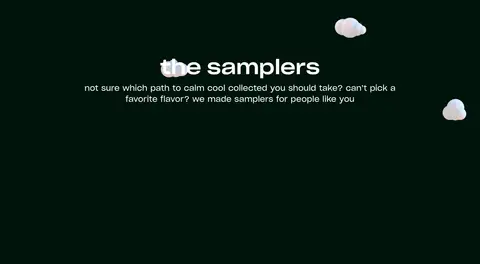
Sampler and product links
Product imagery and compact white links provide routes into the samplers, zero-proof drinks, and Recess ranges.
Imagery · Lead with tactile product photography: cans held in hands, cropped into a large rounded rectangular frame beside the hero copy. Product collections use colorful package images against a soft pastel gradient, visibly distinct from the evergreen site canvas. Small cloud illustrations float through later dark sections as decorative atmosphere; treat these as illustration assets, not as a new brand color system.
Reserve #c2caff for a small, prominent shopping action.
Give the hero product photo a clear frame beside the copy.
Center later category headings and keep their descriptions concise.
Preserve spacious gaps between sections and product moments.
✕ 不该做
Do not replace the dark evergreen canvas with a light page background.
Do not spread accent blue across large interface areas.
Do not use shadows to create card-heavy elevation.
Do not crowd the long category sections with extra UI.
Do not treat colorful product packaging or cloud art as the site palette.
Do not use rounded pill buttons; measured CTA corners are square.
给 AI 的提示词
想快速出一个同风格的新页面,把这段话连同 DESIGN.md 一起发给 AI。
Build a new Recess-style storefront page with a continuous #00140c Evergreen Night canvas and crisp #ffffff Cloud White typography. Use Sharp Grotesk Web, or Outfit when unavailable; keep headings clean and confident, supporting copy compact, and shopping buttons bold and uppercase. Structure the first view as a spacious split hero with copy and CTA beside a framed product photograph. Follow it with centered category introductions and generous dark intervals. Use #c2caff Lavender Signal sparingly for a CTA, and keep #25385b Midnight Slate and #1d2a58 Indigo Shade as minor accents. Let bright packaging, pastel product backdrops, and cloud illustrations remain inside their imagery. Prefer flat surfaces, square button corners, and fine borders over shadows or decorative card stacks.