North star · Let enormous black typography and the quiet grey canvas carry the page, using saturated color only for property-coded imagery and graphic accents.
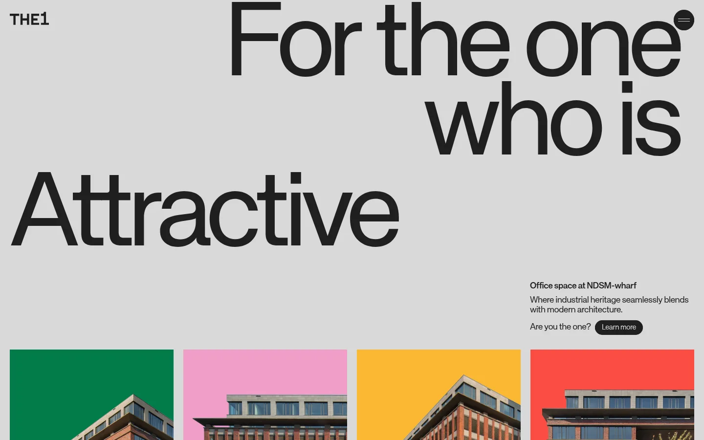
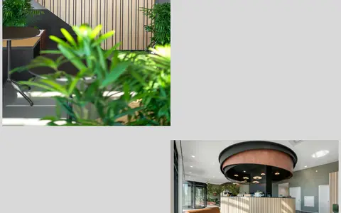
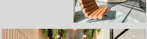
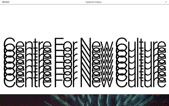
A nearly continuous light-grey canvas gives this real-estate page an unusually restrained base, while near-black typography supplies its strongest contrast. The opening is led by huge, tightly tracked sans-serif display text, with the brand mark and menu kept small and unobtrusive. Four vivid green, pink, yellow and red bands identify property imagery; treat these as deliberate category colors, not as a general-purpose interface palette. The same colors return in oversized, cropped numerals, creating a graphic interlude between the introductory property presentation and later content. Architectural photographs are shown plainly and at generous scale, then give way to offset workplace-interior images. Layouts alternate between broad single-column moments and multi-column image arrangements, with asymmetric alignment and substantial open canvas. The page feels flat and direct: use clean edges, minimal borders and no decorative shadow treatment.
配色
点色块复制色值。用途说明来自对页面的实测位置(背景、文字、描边、按钮)与截图判读。
品牌色
强调色
中性色
页面底色 · Concrete Mist表层 · Studio Pink主文字 · Foundry Ink次要文字 · Concrete Mist强调 · Wharf Green强调 2 · Studio Pink强调 3 · Signal Yellow
文字
背景
对比度
WCAG
#1f1f1f Foundry Ink
#d9d9d9 Concrete Mist
11.68:1
AAA
#1f1f1f Foundry Ink
#f19ec8 Studio Pink
8.21:1
AAA
#d9d9d9 Concrete Mist
#f19ec8 Studio Pink
1.42:1
不达标
#027b49 Wharf Green
#d9d9d9 Concrete Mist
3.78:1
AA-large
#027b49 Wharf Green
#f19ec8 Studio Pink
2.66:1
不达标
字体
字号阶梯:Custom(比例约 2.286,正文 18px)。示例用免费替代字体渲染,数值为实测。
Aa 设计
KH Teka Regular
网络字体 · 字重 400 · 占比 90%
免费替代:Inter
Primary display, headings, body copy, captions and links.
Aa 设计
KH Teka Medium
网络字体 · 字重 400 · 占比 10%
免费替代:Inter
Sparingly used medium-weight emphasis within the otherwise regular-weight typography system.
角色
示例
字号
字重
行高
字距
特大标题
Oversized hero statement and large graphic-led display moments.
The1
215px
400
0.8
-0.06em
一级标题
Primary page and major section headlines.
The1
60px
400
1
-0.06em
二级标题
Secondary section headings and supporting property statements.
The quick brown fox 敏捷的狐狸
26px
400
1.1
-0.03em
正文
Property details, explanatory copy and contact information.
The quick brown fox 敏捷的狐狸
18px
400
1.1
-0.03em
辅助文字
Small availability labels and compact supporting details.
The quick brown fox 敏捷的狐狸
15px
400
1.2
-0.03em
链接
Inline navigation, address and contact links.
The quick brown fox 敏捷的狐狸
18px
400
1.1
-0.03em
间距与布局
基准单位 2px · 密度:紧凑
40px版块间距
10px元素间距
—卡片内边距
1400px内容最大宽度
5px
6px
8px
10px
14px
15px
20px
30px
40px
170px
The measured page max width is 1400px, with a compact density and a measured section gap of 40px. The opening uses a broad canvas, a small brand mark and menu, huge staggered headline lines, and supporting copy aligned near the lower right. Property cards form a four-column row; later content alternates between expansive single-column passages and image-led multi-column compositions. Headings may align left or right, while large graphic panels interrupt the scroll. Keep edges crisp and let open grey space separate content rather than adding ornamental dividers.
圆角与层次
没有测到阴影:页面是扁平的,层次靠底色和描边区分。
The interface is predominantly flat: color bands and images sit directly in the page composition without card shadows. The measured radius scale is limited to circular and pill-shaped forms, used sparingly for controls such as the menu and CTA. Avoid adding borders, elevation or layered panels not evident in the design.
组件
下面的预览按实测的按钮、输入框、徽标、卡片样式重建(字体用替代字体)。
Brand and menu
Small THE1 wordmark at the top edge paired with a compact dark circular menu control.
Display hero
Oversized, regular-weight black KH Teka statement broken into staggered, tightly tracked lines over the grey canvas.
Intro and CTA
Small office-space introduction and supporting sentence positioned to the right, followed by a pill-shaped dark Learn more link.
Property color cards
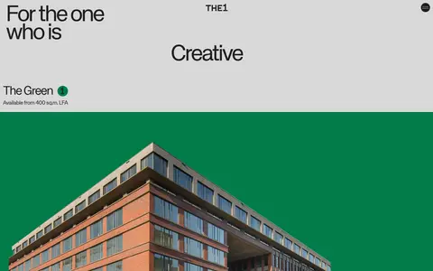
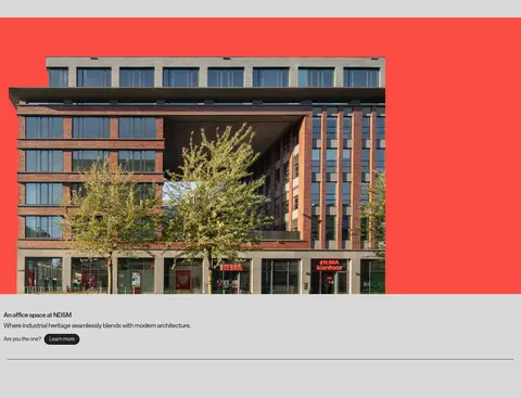
Four-column property presentation using green, pink, yellow and red solid bands behind building photography, with availability details.
Oversized numeral panels
Bright color blocks paired with enormous cropped black numerals as a graphic transition between page chapters.
Interior image sequence
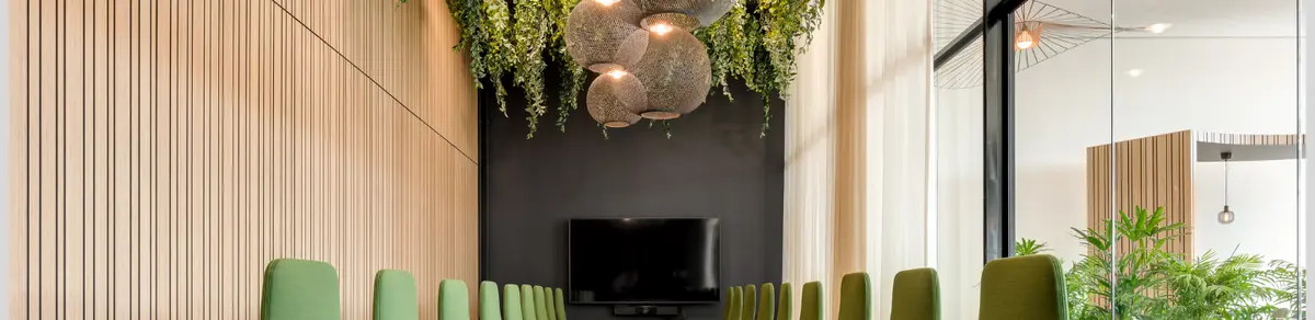
Rectangular workplace photographs arranged asymmetrically across the grey canvas, alternating sides and image proportions.
Imagery · Use clear architectural photography of the building and bright, natural workplace interiors. Property images sit against solid saturated color fields—green, pink, yellow and red—while later interior photographs appear in a staggered, offset sequence on grey. Keep images rectangular and largely untreated; preserve the photographic detail and contrast rather than applying filters, gradients or illustrative overlays.
Use the measured grey as the dominant page canvas.
Set display text in regular-weight, tightly tracked sans serif.
Let the opening headline occupy most of the visual attention.
Use the four saturated colors as distinct property identifiers.
Keep building and interior photography rectangular and unfiltered.
Create rhythm with asymmetry, open space and scale changes.
✕ 不该做
Do not introduce gradients or shadows.
Do not turn the page into a conventional boxed-card grid.
Do not use saturated colors as large, unrelated interface accents.
Do not center every headline or image sequence.
Do not add decorative borders or unmeasured spacing values.
Do not make the typography heavy or overly ornate.
给 AI 的提示词
想快速出一个同风格的新页面,把这段话连同 DESIGN.md 一起发给 AI。
Build a new page in The1’s editorial real-estate style. Use Concrete Mist (#d9d9d9) as the dominant canvas and Foundry Ink (#1f1f1f) for typography. Set oversized, regular sans-serif headlines with tight tracking, leaving supporting copy small and understated. Introduce property imagery with distinct Wharf Green (#027b49), Studio Pink (#f19ec8), Signal Yellow (#fbb833) and Brick Signal (#fa4d43) color fields; keep those hues tied to property graphics rather than scattering them across controls. Use crisp rectangular architecture and workplace photos, asymmetric image placement, broad open spaces and occasional large cropped numerals. Keep surfaces flat, avoid shadows and ornamental borders, and use pill or circular shapes only for compact controls. Follow measured page width and spacing values; do not invent dimensions.