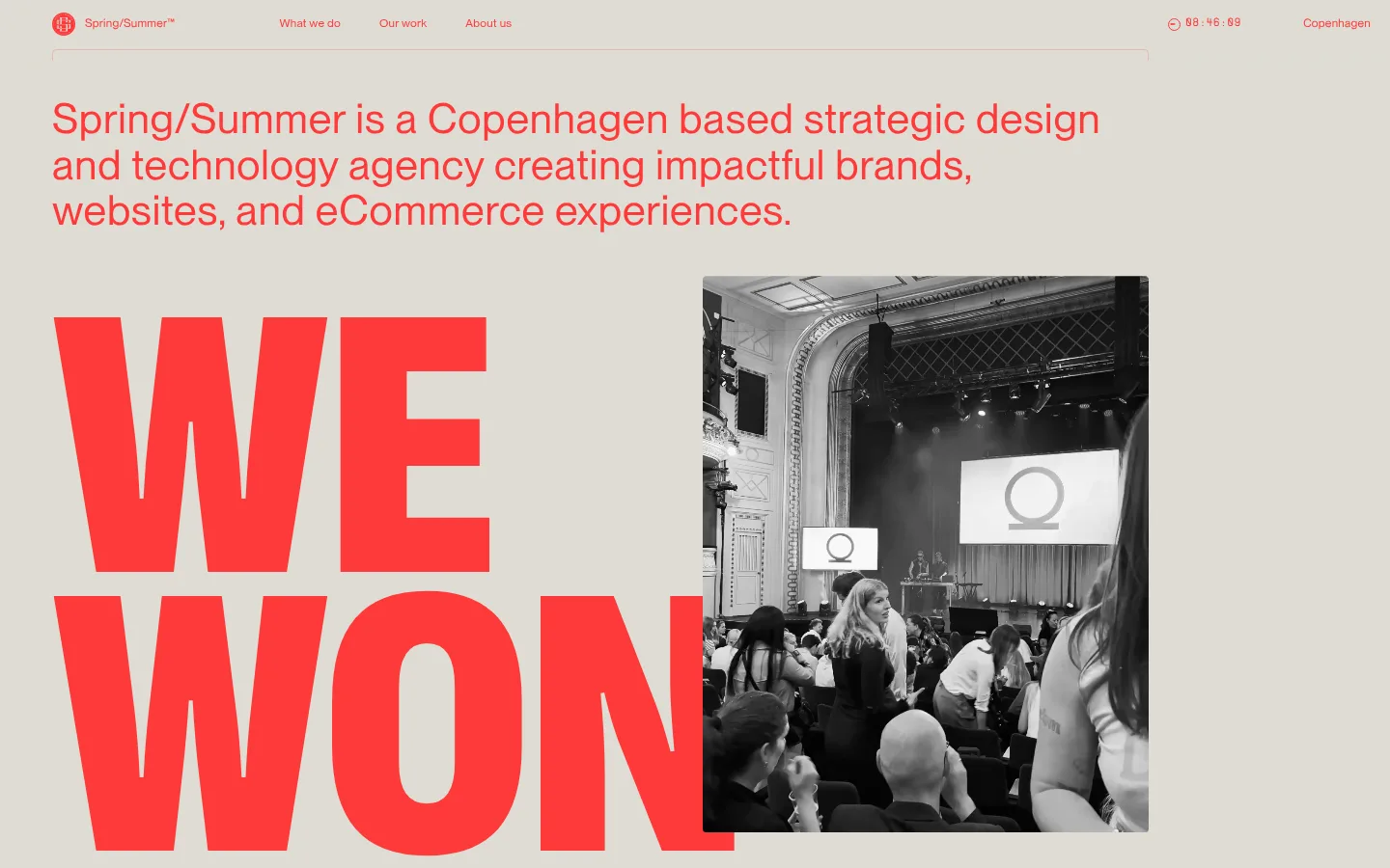
North star · Keep the warm canvas quiet and let oversized, precise red typography organize the page around real work.
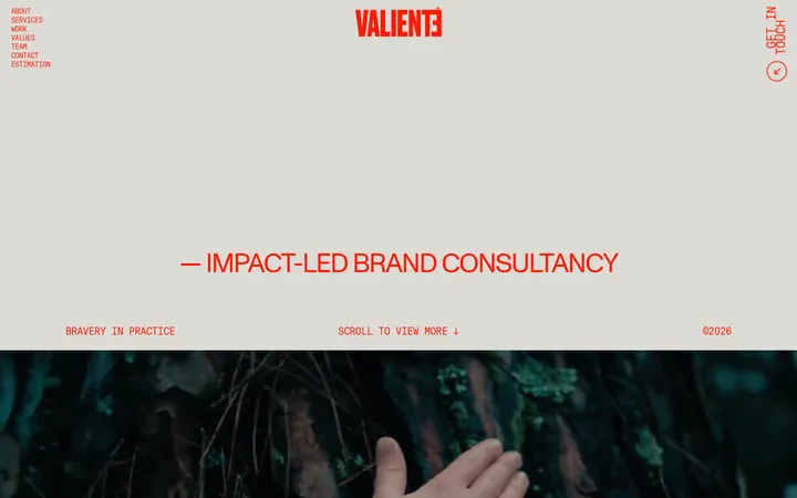
The page is built on a single warm beige canvas (#dedcd3), keeping the long scroll visually continuous rather than dividing it into contrasting bands. Signal-red (#fe3939) carries the identity: navigation, introductory copy, links, and oversized uppercase display headlines all use it. Grotesk display lettering is deliberately huge and tightly stacked, while Montreal handles readable prose and compact interface labels; Supply adds a monospaced, technical note to small captions and project tags. The layout alternates dramatic typography with restrained project grids, client marks, and offset text-and-image compositions. Project photography is shown as editorial evidence, often in large rectangular frames, and may bring its own unrelated colors. Hairline link borders use a soft beige-gray (#e5e3dc); pale blush tones are minor details, not alternate section backgrounds. Generous open canvas around content lets the red typography lead without decorative shadows or heavy card chrome.
配色
点色块复制色值。用途说明来自对页面的实测位置(背景、文字、描边、按钮)与截图判读。
品牌色
强调色
表层色
中性色
功能色
页面底色 · Copenhagen Sand主文字 · Signal Vermilion次要文字 · Paper White描边 · Soft Chalk强调 · Signal Vermilion
文字
背景
对比度
WCAG
#fe3939 Signal Vermilion
#dedcd3 Copenhagen Sand
2.61:1
不达标
#ffffff Paper White
#dedcd3 Copenhagen Sand
1.37:1
不达标
#fe3939 Signal Vermilion
#dedcd3 Copenhagen Sand
2.61:1
不达标
字体
字号阶梯:Custom(比例约 2.778,正文 18px)。示例用免费替代字体渲染,数值为实测。
Aa 设计
Supply
网络字体 · 字重 400 · 占比 61%
免费替代:Space Mono
Monospaced project tags and compact captions.
Aa 设计
Montreal
网络字体 · 字重 400 · 占比 39%
免费替代:DM Sans
Navigation, body copy, links, and secondary headings.
Aa 设计
Grotesk
网络字体 · 字重 400 · 占比 1%
免费替代:Archivo
Oversized uppercase display headlines and award statements.
角色
示例
字号
字重
行高
字距
特大标题
Huge uppercase campaign-style statements, including the award headline.
Spring/Summer
386px
400
0.75
0
一级标题
Primary oversized uppercase page or section headline.
Spring/Summer
170.5px
400
0.76
0
二级标题
Section titles and prominent secondary editorial headings.
Spring/Summer
43px
400
1.1
0.02em
正文
Introductory and supporting agency copy.
The quick brown fox 敏捷的狐狸
18px
400
1.4
0.02em
辅助文字
Small monospaced project labels and metadata.
The quick brown fox 敏捷的狐狸
10px
400
1.26
0.01em
按钮
Compact text-only calls to action.
The quick brown fox 敏捷的狐狸
12px
400
1.3
0.023em
导航
Small navigation links across the top bar.
The quick brown fox 敏捷的狐狸
12px
400
1.3
0.023em
链接
Inline project names and supporting text links.
The quick brown fox 敏捷的狐狸
18px
400
1.4
0.02em
间距与布局
基准单位 2px · 密度:适中
54px版块间距
10px元素间距
—卡片内边距
—内容最大宽度
2px
3px
8px
10px
12px
13px
14px
20px
54px
A broad, single-page composition uses the full viewport canvas, with content aligned to a consistent outer margin rather than a boxed card system. The work area moves into a twelve-column arrangement of project imagery; the client mark section uses a six-column rhythm. Other sections return to single-column editorial layouts, offsetting text and images or placing large type beside photography. Keep substantial breathing room between content groups; the measured section rhythm is 54 units, with a 10-unit element gap. Avoid inventing a fixed max width.
圆角与层次
导航 · 4px
链接 · 3px
没有测到阴影:页面是扁平的,层次靠底色和描边区分。
The interface is predominantly flat: no measured shadows and no heavy card surfaces. Separate content through whitespace, alignment, and image edges. Fine outlines around small project links use #e5e3dc and a subtle 3px radius; navigation and the larger page structure remain unboxed. Layering comes from overlapping or offset image-and-type compositions, not simulated depth.
组件
下面的预览按实测的按钮、输入框、徽标、卡片样式重建(字体用替代字体)。
Top navigation
Compact Montreal navigation in #fe3939 on the canvas, with brand at left and work/about links; keep treatment text-led and unobtrusive.
Oversized statement
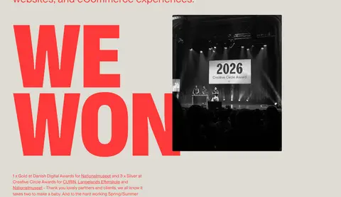
Grotesk uppercase display text in #fe3939, with very tight line stacking and image overlap or adjacency.
Project gallery
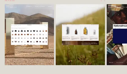
Twelve-column work presentation with linked project imagery, compact Supply labels, and subtle #e5e3dc link borders.
Client mark grid
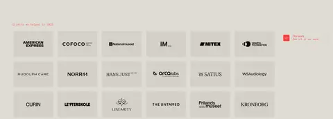
Six-column arrangement of client identities with ample space and restrained tonal treatment against the canvas.
Text-only CTA
Small Montreal link or button text in #fe3939 without a filled button background or shadow.
Contact block
Short project invitation, contact details, and a large uppercase red question headline, all on the continuous canvas.
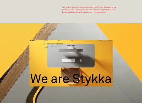
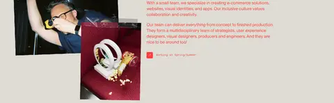
Imagery · Use real client and agency photography, website captures, and brand work rather than decorative illustration. Project imagery appears in rectangular frames and as broad showcase moments; compositions may be offset against large red headlines or arranged in a horizontal portfolio grid. Preserve each project's own colors and imagery as contained content, not as a change to the site's brand palette. The photographed award moment is monochrome, while other case-study imagery remains vivid.
Reserve #fe3939 for identity text, links, navigation, and key headlines.
Make display statements oversized, uppercase, and tightly stacked.
Pair real project imagery with editorial, text-led layouts.
Use Supply for small monospaced labels and metadata.
Separate sections with open space rather than filled bands.
✕ 不该做
Do not introduce unmeasured brand colors or section backgrounds.
Do not turn every project into a shadowed card.
Do not use pill-shaped controls or heavy button fills.
Do not apply display typography to long body paragraphs.
Do not mistake colors inside client imagery for site-wide brand colors.
Do not force all content into centered, identical modules.
给 AI 的提示词
想快速出一个同风格的新页面,把这段话连同 DESIGN.md 一起发给 AI。
Build a new agency page in Spring/Summer’s editorial Copenhagen style. Use Copenhagen Sand (#dedcd3) as the continuous canvas and Signal Vermilion (#fe3939) for navigation, links, intro copy, and commanding display headlines. Set display statements in a heavy-looking but regular-weight condensed grotesk substitute, uppercase and tightly stacked; keep body copy in a clear modern sans and tiny metadata monospaced. Arrange real project imagery in spacious, asymmetric editorial compositions, with a multi-column work gallery and a restrained client-mark grid. Use Soft Chalk (#e5e3dc) only for delicate outlines, and keep Dusty Blush (#e5bbb4) and Rose Haze (#e8aaa4) incidental. Maintain open space between sections, minimal chrome, no shadows, and text-led CTAs. Treat colors within client work as image content, not new site colors.