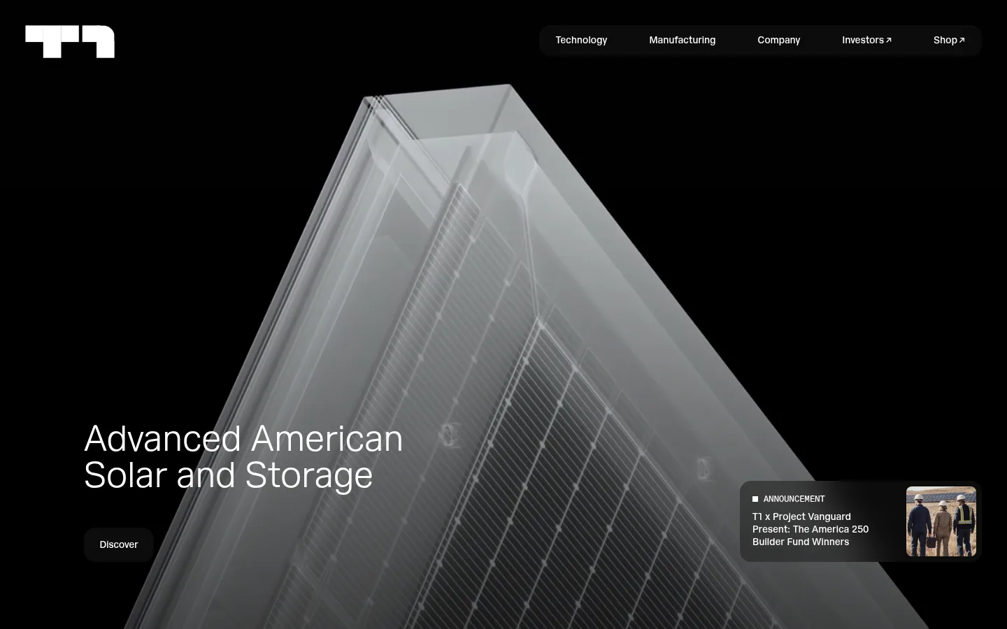
North star · Let industrial imagery and generous white space carry the story, using typography and contrast to keep every section precise and readable.
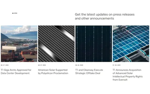
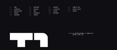
The visual strategy is built around a white canvas, with deep near-black media and footer areas providing strong contrast rather than a busy brand palette. Warm charcoal text keeps long-form mission and company copy softer than pure black; a pale warm-gray band distinguishes the technology showcase. Hairlines define outlined actions, while muted gray appears in compact filled controls. T1 Sans carries the page in light, generously scaled headings and restrained body copy; T1 Sans Mono adds a technical, uppercase label language for section markers and captions. The layout alternates spacious single-column statements with two-column image-and-copy compositions, rounded facility imagery, and a four-column news strip. Large media frames give manufacturing photography room to lead, while product imagery and performance figures remain clean and isolated. Whitespace, rather than shadows or decorative effects, creates hierarchy; the black footer closes the page with a compact, numbered link directory.
Technical section labels, captions, and compact coded-style metadata.
Aa 设计
T1 Sans
网络字体 · 字重 300 / 400 · 占比 49%
免费替代:Inter
Light display and headings, body copy, and navigation.
角色
示例
字号
字重
行高
字距
特大标题
Oversized light display statements where prominent headline scale is needed.
T1 Energy
96px
300
1
0
一级标题
Primary hero headline and major page-level statements.
T1 Energy
52px
300
1
0
二级标题
Section-level headings and prominent content titles.
T1 Energy
32px
300
1.2
0
三级标题
News titles and secondary feature headings.
The quick brown fox 敏捷的狐狸
24px
300
1.3
0
四级标题
Compact supporting headings in feature and company blocks.
The quick brown fox 敏捷的狐狸
20px
300
1.3
0
正文
Mission, manufacturing, supply-chain, and company descriptions.
The quick brown fox 敏捷的狐狸
14px
400
1
0.01em
辅助文字
Uppercase technical labels, metric descriptors, and section metadata.
The quick brown fox 敏捷的狐狸
12px
400
1.3
0.01em
导航
Header navigation and standard interface links.
The quick brown fox 敏捷的狐狸
14px
400
1.3
0.01em
代码
Numbered footer navigation and compact technical identifiers.
const style = 1;
12px
400
1.3
0.01em
间距与布局
基准单位 8px · 密度:宽松
120px版块间距
8px元素间距
—卡片内边距
1200px内容最大宽度
3px
4px
5px
8px
12px
16px
18px
22px
24px
36px
48px
60px
96px
120px
The page uses a spacious, predominantly white canvas and a measured maximum content width of 1200px. Content shifts between left-aligned single-column statements and two-column feature compositions; facility cards and product media provide larger visual anchors. The section rhythm is generous, with a measured 120px section gap and 8px element gap guiding a roomy rather than dense feel. News uses a four-column strip, and the footer organizes numbered links into four columns. Keep text edges deliberate and allow broad blank areas around key imagery and metrics.
圆角与层次
按钮 · 50%
图片 · 80px
导航 · 16px
链接 · 16px
没有测到阴影:页面是扁平的,层次靠底色和描边区分。
The interface reads as flat: measured shadows are absent, and hierarchy comes from canvas changes, media scale, and spacing. Light buttons use thin gray borders; dark cards and the footer sit directly on their surfaces. Rounded media corners soften large image blocks, while small controls remain visually restrained.
组件
下面的预览按实测的按钮、输入框、徽标、卡片样式重建(字体用替代字体)。
Header navigation
A compact horizontal menu over the hero, using white 14px T1 Sans links against the dark media; navigation labels are concise.
Outlined action
Light-background actions use Warm Ink text, a Soft Pewter border, and rounded corners; keep the styling quiet and avoid shadows.
Hero announcement
A dark, compact overlay combines a small uppercase announcement label, short copy, and a thumbnail over hero media.
Facility cards
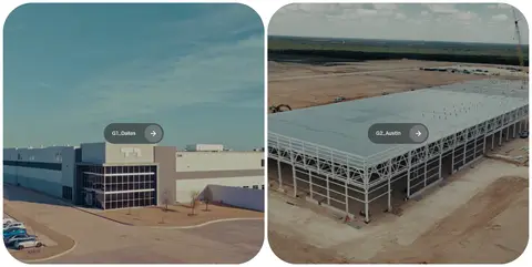
Two adjacent site images carry short location labels and arrow affordances, with strongly rounded media corners.
Technology showcase
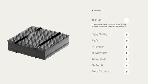
A pale warm-gray band pairs a product image with a technical layer list and compact expand controls.
Performance metrics
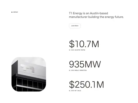
Large financial and production figures sit on white with small uppercase monospace descriptors beneath each value.
News strip
Four image-led article links present a thumbnail, compact date, and restrained headline in a clean grid.
Footer directory
A Night Charcoal panel groups numbered uppercase links into four columns, with white branding and compact legal details below.
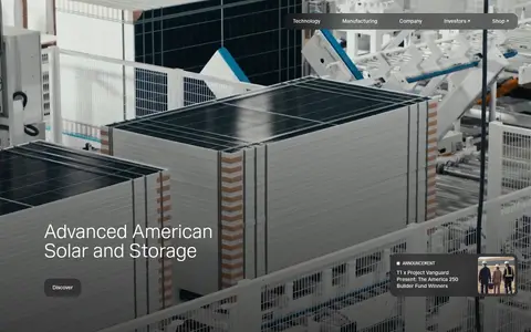
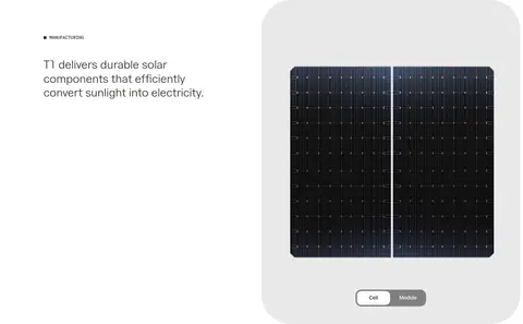
Imagery · Industrial photography and video are the main visual material: the hero is full-bleed, with solar manufacturing imagery under white text, while facility and news images show real sites, panels, and production. Product imagery is isolated against a pale neutral field. Media is presented cleanly, often in strongly rounded frames; the imagery itself supplies most color, so avoid adding decorative illustration or competing graphic effects.
Use monospace uppercase for technical labels and metadata.
Separate major stories with generous whitespace.
Use rounded corners primarily on media and compact controls.
✕ 不该做
Do not add unmeasured colors to the interface palette.
Do not crowd the page with dense card grids.
Do not add gradients or decorative shadows.
Do not use heavy heading weights or all-caps display copy.
Do not place utility gray across large content surfaces.
Do not let interface decoration compete with manufacturing imagery.
给 AI 的提示词
想快速出一个同风格的新页面,把这段话连同 DESIGN.md 一起发给 AI。
Build a new T1 Energy page with a restrained industrial-editorial feel. Use Gallery White (#ffffff) as the main canvas, Warm Ink (#322d2a) for readable text, and Night Charcoal (#0f0e12) only for inverse media cards or strong closing areas. Use Linen Mist (#f0efe9) sparingly for a distinct product or technology band; keep Soft Pewter (#bfb8b5) borders fine and Industrial Gray (#8b8b8b) limited to utility controls. Set display and heading copy in a light T1 Sans-like sans serif, with T1 Sans Mono-style uppercase labels. Favor spacious left-aligned sections, selective two-column layouts, image-led storytelling, and rounded photography. Keep buttons understated, avoid shadows and gradients, and make hierarchy come from scale, contrast, and whitespace.