North star · Let immersive campus media command the canvas, while sparse, high-contrast typography and framing provide orientation.
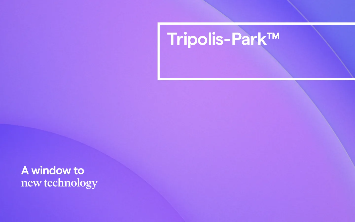
The page is built around immersive full-bleed video rather than a conventional collection of boxed sections. Its measured interface palette is deliberately spare: white is the canvas and high-contrast overlay color, black anchors text in lighter content areas, and gray appears on media cards. The vivid violet seen in the opening screenshot comes from the hero imagery, not the measured interface palette, so treat it as media content rather than a reusable UI token. Matter Regular carries navigation, body copy, links, and controls; Matter Medium supports secondary headings, while Ivar Headline Medium gives the main statement an editorial serif contrast. The opening viewport uses generous open space, a thin white outlined brand frame near the top, and a compact headline low on the left. Keep type confident but uncluttered, with large expanses of video and little visible interface chrome. Use spacing to preserve a comfortable, composed rhythm.
配色
点色块复制色值。用途说明来自对页面的实测位置(背景、文字、描边、按钮)与截图判读。
表层色
中性色
功能色
页面底色 · Gallery White表层 · Media Gray主文字 · Ink Black次要文字 · Gallery White描边 · Gallery White
Body copy, navigation, links, buttons, and captions.
Aa 设计
Matter-Medium
网络字体 · 字重 400 · 占比 11%
免费替代:Inter
Secondary headings.
Aa 设计
IvarHeadline-Medium
网络字体 · 字重 400 · 占比 4%
免费替代:DM Serif Display
Main editorial headline.
Aa 设计
Matter-SemiBold
网络字体 · 字重 400 · 占比 1%
免费替代:Inter
Sparse semibold emphasis where present.
角色
示例
字号
字重
行高
字距
一级标题
Editorial hero headline over full-bleed video.
Tripolis-Park™
47px
400
1.08
-0.015em
二级标题
Secondary section headings in content areas.
The quick brown fox 敏捷的狐狸
27px
400
1.25
0
正文
Supporting campus and project descriptions.
The quick brown fox 敏捷的狐狸
18px
400
1.25
0
辅助文字
Compact legal or media-related notes.
The quick brown fox 敏捷的狐狸
13.5px
400
1.2
0
按钮
Text-led calls to action and film controls.
The quick brown fox 敏捷的狐狸
18px
400
1.25
0
导航
Primary site navigation links.
The quick brown fox 敏捷的狐狸
18px
400
1.25
0
链接
Inline project, credit, and information links.
The quick brown fox 敏捷的狐狸
18px
400
1.25
0
间距与布局
基准单位 1px · 密度:适中
90px版块间距
—元素间距
70px卡片内边距
—内容最大宽度
3px
5px
11px
12px
13px
14px
16px
19px
23px
30px
36px
41px
44px
45px
53px
54px
Use full-bleed media as the primary section format, with content positioned directly over the visual rather than inside a dense card grid. The measured opening viewport is a single-column hero. Place the identity frame toward the upper area and align the headline low on the left, leaving broad uninterrupted image space between them. Keep content density comfortable and section transitions spacious. No reliable page maximum width or grid measurements are supplied, so preserve the open composition without inventing fixed dimensions.
圆角与层次
按钮 · 50%
没有测到阴影:页面是扁平的,层次靠底色和描边区分。
The visual language is predominantly flat: measured shadows are absent, and content is not organized through raised panels. Use thin white framing as a graphic overlay rather than a card border system. Any layering should come from the video itself and its overlaid identity or headline, preserving a clean, cinematic surface.
组件
下面的预览按实测的按钮、输入框、徽标、卡片样式重建(字体用替代字体)。
Outlined identity frame
A thin white rectangular outline encloses the Tripolis-Park™ wordmark near the top of the opening video.
Hero headline
A short white editorial statement sits low on the left over the full-bleed media.
Text-led CTA
Use simple Matter Regular link-style calls to action, including the measured arrow-led “Learn more” treatment.
Film control
A circular control may use a white outline and black icon or detail; keep it visually light.
Content card
Where cards appear, measured examples use white with black text or a gray media surface, without shadow or rounded corners.
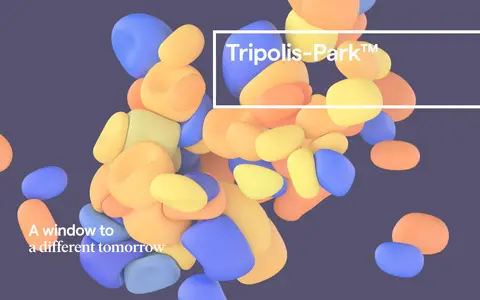
Imagery · The opening is a full-screen video with luminous, layered violet forms; the scaled full-page view shows a different scene of colorful, floating organic shapes against a dark background. Treat these colors and objects as video imagery, not brand palette tokens. Use bold, abstract or architectural motion imagery with a full-bleed crop, while keeping typography legible over its changing areas.
Use full-bleed media as the dominant visual field.
Keep the interface palette to the measured white, black, and gray.
Reserve violet and other vivid hues for the video itself.
Pair Matter sans-serif utility text with an editorial serif headline.
Use white framing and overlay text where the imagery allows.
Preserve generous negative space around headlines.
✕ 不该做
Do not promote screenshot violet tones into interface color tokens.
Do not add gradients to interface elements without evidence.
Do not introduce shadows or elevated card styling.
Do not crowd the hero with navigation or supporting copy.
Do not use rounded card corners; measured cards are square-edged.
Do not invent fixed page widths or spacing values.
给 AI 的提示词
想快速出一个同风格的新页面,把这段话连同 DESIGN.md 一起发给 AI。
Build a new Tripolis-Park-style page around immersive, full-bleed campus or architectural video. Keep interface colors faithful to the measured palette: Gallery White (#ffffff) for the canvas, outlined identity frame, and overlay text; Ink Black (#000000) for text and control details; Media Gray (#808080) only for subdued card surfaces. Do not treat the hero’s vivid violet as a UI token—it belongs to the video imagery. Use Matter-like sans-serif for navigation, body, links, and controls, with an editorial serif display face for the main statement. Compose the hero with a framed wordmark near the top, a concise headline low on the left, and ample open image space. Favor flat surfaces, square card edges, light borders, and comfortable section rhythm; avoid invented measurements, shadows, and decorative interface gradients.