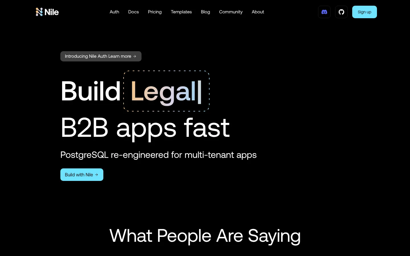
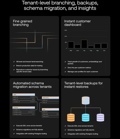
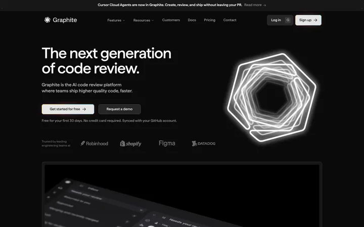
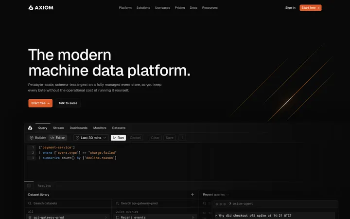
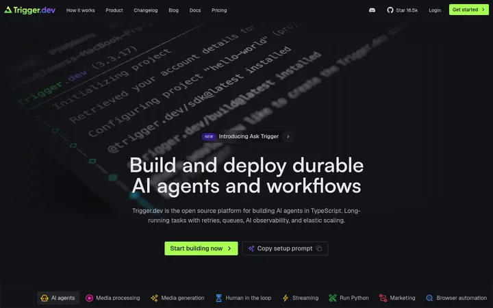
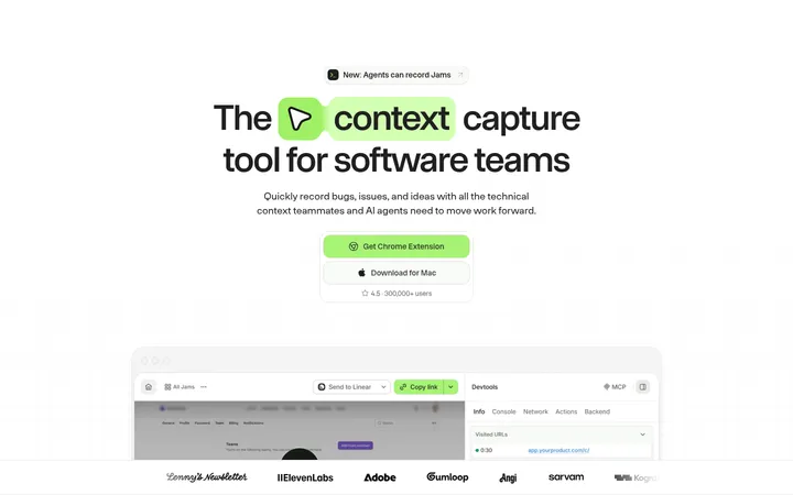
Nile 以近乎纯黑的画布搭配清晰字体、青色行动按钮和柔和的多色渐变。宽松醒目的首屏之后,依次展开技术示意图、彩色功能卡片与面向 B2B 应用开发者的产品说明。
North star · Let a black, spacious canvas carry clear product messaging, and reserve color for actions, technical highlights, and focused feature surfaces.
The page is anchored by a pure black canvas (#000000), which gives the white headline and restrained gray copy strong contrast without making the product feel visually busy. Aeonik supplies the clean, rounded sans-serif voice across oversized, light-weight headings and compact body text; monospace is reserved for code and technical captions. Cyan (#6fe2ff) marks the primary action, while warm peach, lilac, and pale blue form a recurring gradient used for highlighted text, callout bands, and feature-card surfaces. Content sits in a centered, spacious column, with generous separation between sections and centered headings for most feature explanations. Product diagrams, database illustrations, code panels, and testimonial cards carry the technical story; these are graphic-led rather than photographic. Dark charcoal cards and fine gray borders create quiet structure against the black field. Keep gradients and brighter card colors as deliberate accents, not competing page-wide backgrounds.
Display and headings, body copy, links, and most interface text
Aa 设计
aeonikMedium
网络字体 · 字重 500 · 占比 15%
免费替代:Inter
Emphasized links such as “Learn more”
Aa 设计
ui-monospace
系统字体 · 字重 400 · 占比 7%
免费替代:Roboto Mono
Code samples and compact technical captions
角色
示例
字号
字重
行高
字距
特大标题
Oversized hero-style display headings and key campaign statements.
Nile
64px
400
1
-0.01em
一级标题
Primary hero headline.
Nile
48px
400
1.08
0
二级标题
Major section headlines, usually centered.
Nile
42px
400
1
0
三级标题
Feature and product section subheadings.
Nile
40px
400
1.1
0
四级标题
Smaller card and nested content headings.
Nile
32px
400
1
0
正文
Explanatory feature copy and general page text.
The quick brown fox 敏捷的狐狸
15px
400
1.5
0
辅助文字
Compact technical labels and supporting captions.
The quick brown fox 敏捷的狐狸
14px
400
1.14
0
按钮
CTA and button labels.
The quick brown fox 敏捷的狐狸
14px
700
1.5
0
链接
Inline navigation and content links.
The quick brown fox 敏捷的狐狸
16px
400
1.5
0
代码
Code examples and database query panels.
const style = 1;
14px
400
1.14
0
间距与布局
基准单位 8px · 密度:宽松
96px版块间距
8px元素间距
16px卡片内边距
1208px内容最大宽度
8px
10px
12px
16px
20px
24px
32px
36px
40px
64px
96px
A centered content frame reaches a measured maximum width of 1208px, while the black canvas runs edge to edge. The hero aligns left and leaves substantial open space; most later feature headings are centered above diagrams, card grids, or paired showcases. The page uses a spacious section rhythm, with a measured 96px section gap and compact 8px element gap. Feature layouts vary between two- and three-column groupings, with technical visuals given room to breathe rather than compressed into dense dashboards.
圆角与层次
按钮 · 9999px
卡片 · 20px
没有测到阴影:页面是扁平的,层次靠底色和描边区分。
The interface favors flat surfaces over shadow. Cards use dark charcoal fills, with fine gray borders where measured; feature cards also use flat warm, lavender, or cyan fills. Rounded corners soften panels and pill-shaped secondary buttons, while diagrams and code panels gain definition from outlines, internal contrast, and careful layering rather than pronounced drop shadows.
组件
下面的预览按实测的按钮、输入框、徽标、卡片样式重建(字体用替代字体)。
Primary CTA
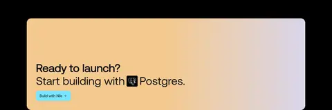
Cyan-filled “Build with Nile” and “Sign up” actions use dark text; the measured Build with Nile button has 10px radius and 8px 16px padding.
Social button
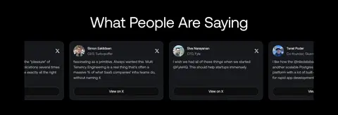
Compact dark “View on X” controls use a fine #3f3f46 outline, light label, and pill-shaped 9999px radius.
Testimonial card
Dark #16181c quote cards use white text and a #2f3336 border; the measured card radius is 16px.
Feature card
Feature explanations use charcoal or warm, lavender, and cyan surfaces, with concise copy and a “Learn more” link.
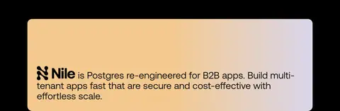
Gradient callout
A broad rounded band blends #f4c587, #d6d3e9, and #99d2ec behind dark introductory or closing copy.
Technical showcase
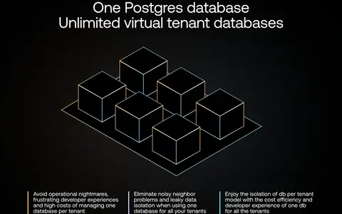
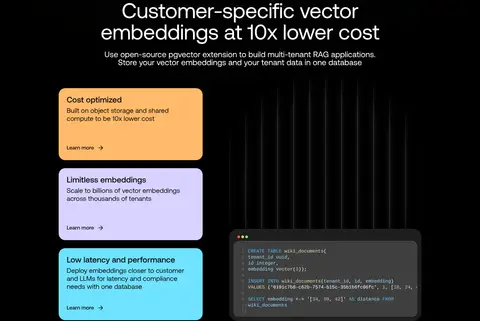
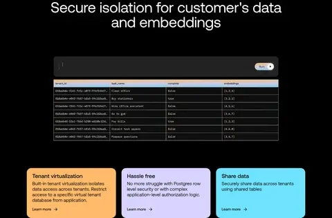
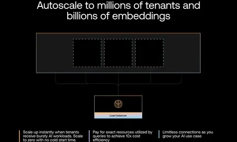
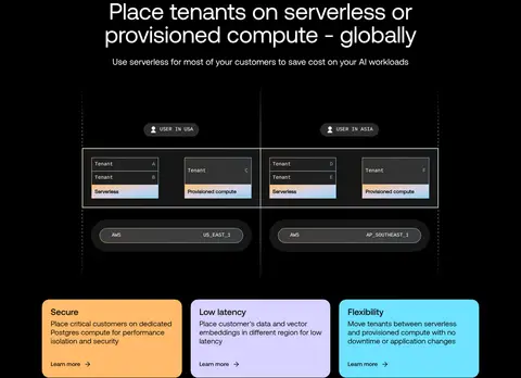
Database and tenant diagrams, code panels, and charts sit beneath centered feature headings on the black canvas.
Imagery · The page is illustration-led: database cubes, tenant diagrams, branching and schema visuals, charts, and code panels explain the product. No dominant lifestyle photography defines the identity. Technical graphics sit within the dark canvas or charcoal panels, often with thin outlines and small color accents. Gradient-backed callouts and softly colored feature cards provide the most vivid contrast; imagery remains contained and product-specific.
Set major headings in clean, regular-weight Aeonik-style sans.
Reserve #6fe2ff for prominent actions and selected highlights.
Use the apricot–lavender–blue gradient as a contained accent.
Pair technical diagrams with concise explanatory copy.
Separate sections generously and keep the content frame centered.
✕ 不该做
Do not turn the entire page into a gradient background.
Do not add large lifestyle photography as the primary visual language.
Do not replace the dark canvas with a succession of bright section bands.
Do not overuse accent colors in headings, buttons, and diagrams at once.
Do not add heavy shadows to cards or technical panels.
Do not make the spacious feature sections feel like a dense admin dashboard.
给 AI 的提示词
想快速出一个同风格的新页面,把这段话连同 DESIGN.md 一起发给 AI。
Build a new Nile-style developer SaaS page on a dominant #000000 canvas, with white #ffffff headings and restrained #c6c6c6 supporting copy. Use an Aeonik-like geometric sans for the main interface and reserve monospace for code or technical labels. Keep the content centered within the measured 1208px maximum width, with generous section breaks and mostly centered feature headings; allow the hero to align left. Make #6fe2ff the clearest action color with dark #0e0e0e text. Use #f4c587, #d6d3e9, and #99d2ec as a contained gradient or isolated feature-card fills, not as broad page backgrounds. Explain the product with database diagrams, code panels, and dark bordered cards. Favor flat surfaces, fine outlines, and clear hierarchy over shadows or decorative clutter.