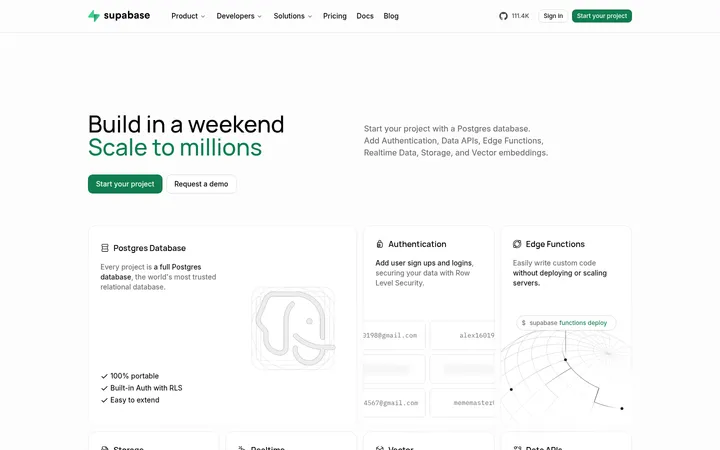
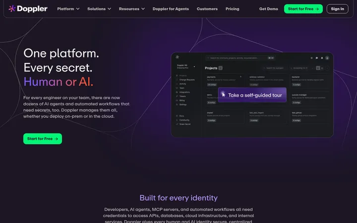
North star · Keep the page mostly white and quiet; use violet for the primary action and let real product screens carry the visual complexity.
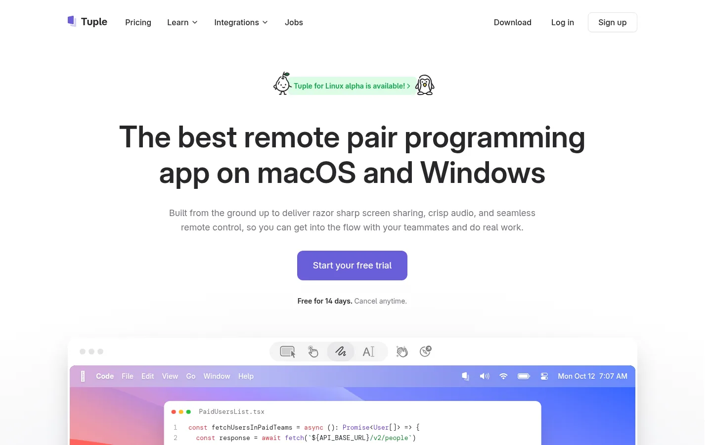
The visual strategy is built around a white, spacious canvas, with very dark charcoal reserved for a single workflow section that gives the long page a clear tonal shift. The violet primary CTA is the strongest recurring brand signal; green appears sparingly in announcement or feature-link details, while muted grays handle supporting copy. Inter Variable gives headings, navigation, and body copy a crisp, familiar software feel. DM Mono is used for uppercase section eyebrows and code-like labels, connecting the marketing layout to developer tools. The hero centers its message and CTA above a large, framed desktop product image. Below it, alternating white and soft-gray bands organize centered introductions, feature cards, a testimonial grid, and product demonstrations. Screenshots provide color and texture, but remain contained within rounded frames rather than taking over the page. Borders and subtle shadows define cards and navigation without making the interface feel heavy.
Headings, body copy, navigation, links, and buttons
Aa 设计
DM Mono
网络字体 · 字重 400 / 500 · 占比 26%
免费替代:Roboto Mono
Uppercase section eyebrows, captions, and code-like labels
角色
示例
字号
字重
行高
字距
特大标题
Large promotional display heading where the page needs a strong statement.
Tuple
60px
600
1.2
0
一级标题
Hero headline and primary page-level heading.
Tuple
48px
600
1
0
二级标题
Section titles and prominent feature headings.
The quick brown fox 敏捷的狐狸
20px
600
1.4
0
正文
Explanatory copy, testimonial text, and feature descriptions.
The quick brown fox 敏捷的狐狸
16px
400
1.63
0
辅助文字
Small supporting labels and compact metadata.
The quick brown fox 敏捷的狐狸
13px
400
1.63
0
按钮
Primary action text on free-trial buttons.
The quick brown fox 敏捷的狐狸
18px
500
1.56
0
导航
Top navigation links and footer navigation labels.
The quick brown fox 敏捷的狐狸
16px
500
1.5
0
链接
Compact inline links and contextual calls to action.
The quick brown fox 敏捷的狐狸
14px
600
1.43
0
眉题
Uppercase mono section labels above headings.
The quick brown fox 敏捷的狐狸
16px
500
1.5
0.1em
代码
Code samples and developer-oriented interface labels.
const style = 1;
13px
400
1.63
0
间距与布局
基准单位 8px · 密度:紧凑
32px版块间距
8px元素间距
32px卡片内边距
—内容最大宽度
4px
6px
8px
10px
12px
16px
24px
32px
48px
64px
128px
A centered, spacious marketing page with a compact top navigation and a narrow hero message above a wide product image. Content stays aligned to a consistent central column, while feature and testimonial areas use three-column arrangements and the dark workflow section expands to four columns. Full-width section bands alternate between white and very light gray, with one near-black band as a deliberate interruption. The measured density is compact within cards but generous between major sections; avoid inventing a fixed max-width where none was measured.
圆角与层次
按钮 · 12px
卡片 · 12px
徽标 · 9999px
导航 · 4px
链接 · 24px
sm · text, other
hairline · card, nav
xl · card
hairline · card
Most sections are flat, separated by background bands and whitespace. Cards use rounded corners and subtle hairline borders or very soft shadows; the navigation has a slightly stronger floating shadow. Product screenshots sit above the page through their own window framing and restrained shadow, while dark workflow cards rely on tonal contrast rather than heavy elevation.
组件
下面的预览按实测的按钮、输入框、徽标、卡片样式重建(字体用替代字体)。
Top navigation
Compact horizontal Tuple navigation on white, with text links, a bordered Sign up control, and a subtly elevated bar.
Announcement banner
Small centered green update link with playful character marks; visually secondary to the hero.
Hero CTA
Centered headline and muted supporting copy above a violet Start your free trial button; add concise trial reassurance below.
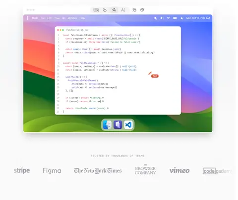
Product window
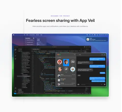
Large desktop screenshot in a rounded app-window frame, showing code or collaboration UI as concrete product proof.
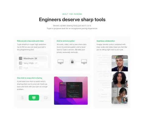
Feature cards
Light cards with concise headings, restrained gray copy, and small interface imagery or diagrams.
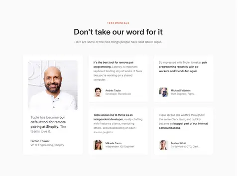
Testimonial cards
Soft-gray testimonial band with a centered introduction and a multi-column mix of portraits, quotes, and attribution.
Workflow panels
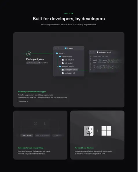
Dark-section cards use charcoal panels, pale text, developer-oriented diagrams, and small green highlights.
Trial CTA and footer
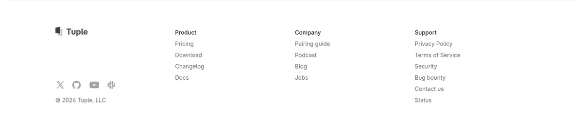
Centered closing trial prompt followed by a simple multi-column footer with understated links.
Imagery · Use authentic Tuple desktop-interface screenshots as the primary imagery, framed like app windows and shown large enough to read as product evidence. The hero screen is colorful, while later demos show code, calls, and workflow UI. Testimonial portraits are small supporting elements. Keep illustration-like characters limited to the announcement banner; avoid decorative stock photography or unrelated 3D artwork.
Keep the main canvas white and let content breathe.
Use Tuple Violet #6a5ed9 for the primary trial action.
Use Graphite Ink #27272a for primary text and headings.
Reserve Night Canvas #09090b for the workflow band.
Use DM Mono for uppercase eyebrows and code-adjacent labels.
Show real product UI inside clear, rounded screenshot frames.
✕ 不该做
Do not make every section dark or saturated.
Do not use green, coral, or blue as competing primary CTA colors.
Do not replace product screenshots with generic stock photography.
Do not add heavy gradients across the whole page.
Do not use thick borders or pronounced shadows on every card.
Do not crowd the centered hero with extra navigation or decorative copy.
给 AI 的提示词
想快速出一个同风格的新页面,把这段话连同 DESIGN.md 一起发给 AI。
Build a developer-focused SaaS page in Tuple's restrained visual style. Use Gallery White #ffffff as the dominant canvas, Graphite Ink #27272a for headings and navigation, and Quiet Slate #71717a for supporting copy. Make the primary CTA Tuple Violet #6a5ed9 with white text. Use a single Night Canvas #09090b section for workflow content, with Panel Charcoal #18181b cards and pale labels. Set interface text in Inter Variable and use DM Mono for uppercase eyebrows and code-like details. Center the hero, place a large real product screenshot beneath it, and organize lower content into alternating light bands, compact feature cards, and testimonials. Prefer subtle borders, rounded frames, and restrained shadows. Keep bright colors inside product imagery or small informational accents.