页面以深色、克制的界面承载完整的开发者产品故事,并用细分隔线梳理长篇内容。荧光绿按钮、代码细节和产品界面截图为整体注入鲜明但节制的活力。
North star · Keep the interface nearly monochrome and let functional content and a few vivid accents carry the hierarchy.
The page uses a near-black canvas throughout, with subtle charcoal surfaces and thin borders defining controls, cards, and section edges rather than large contrasting bands. Pale gray headlines sit against the dark background; muted gray copy keeps dense technical explanations readable without competing with the main message. Lime green is reserved for primary actions and small brand signals, while violet and green accents appear sparingly in badges, labels, and product visuals. Large Satoshi headings create a confident editorial hierarchy, paired with Geist for navigation, interface labels, and body copy; Geist Mono gives code samples their developer-tool character. The layout is a long, mostly single-canvas narrative, mixing centered hero content with left-aligned feature sections and occasional multi-column grids. Product screens, diagrams, and code snippets provide the visual substance instead of lifestyle photography. Compact spacing, generous section pauses, and restrained borders make the dense page feel structured rather than ornamental.
配色 点色块复制色值。用途说明来自对页面的实测位置(背景、文字、描边、按钮)与截图判读。
品牌色
Night Canvas
#121317
Dominant page canvas, hero background, and the continuous backdrop behind most sections.
强调色
Badge Violet Edge
#481abd
Thin border on the small violet NEW badge; a limited badge detail, not a page-wide brand color.
Badge Lilac
#bab2ff
Text inside the small NEW badge; primarily a badge-specific accent.
Badge Aubergine
#311678
Fill for the NEW badge, a small localized notification element.
Signal Lavender
#9c9af2
Sparse accent text and small product or feature labels.
Trigger Lime
#afec73
Bright primary CTA and brand signal, most visible in the header and hero.
Soft Citron
#d9f07c
Secondary lime accent in text and product details; use sparingly.
表层色
Divider Charcoal
#1c1e21
Hairline borders around cards, controls, footer areas, and subtle grid treatments.
Panel Charcoal
#15171a
Subtle filled surfaces for compact buttons, links, and interface elements.
中性色
Slate Copy
#878c99
Primary muted text for supporting copy, footer links, and secondary descriptions.
Soft Headline
#d7d9dd
Main headline, navigation, button, and foreground text against dark backgrounds.
Mist Gray
#b5b8c0
Secondary button text and softer supporting copy.
Steel Gray
#5f6570
Occasional subdued text and interface detail; also appears in consent-control styling.
文字 背景 对比度 WCAG #d7d9dd Soft Headline#121317 Night Canvas13.13:1 AAA #d7d9dd Soft Headline#15171a Panel Charcoal12.71:1 AAA #878c99 Slate Copy#121317 Night Canvas5.52:1 AA #878c99 Slate Copy#15171a Panel Charcoal5.34:1 AA #b5b8c0 Mist Gray#121317 Night Canvas9.35:1 AAA #b5b8c0 Mist Gray#15171a Panel Charcoal9.05:1 AAA
字体 字号阶梯:Perfect Fourth(比例约 1.351,正文 18px)。示例用免费替代字体渲染,数值为实测。
Aa 设计
Geist 网络字体 · 字重 400 / 500 / 600 · 占比 45%
免费替代:Inter
Navigation, body labels, buttons, captions, and interface copy.
Aa 设计
Satoshi-Variable 网络字体 · 字重 500 / 600 · 占比 44%
免费替代:Plus Jakarta Sans
Display and page-section headings.
Aa 设计
Geist Mono 网络字体 · 字重 400 · 占比 11%
免费替代:IBM Plex Mono
Code samples and technical snippets.
角色 示例 字号 字重 行高 字距 特大标题 Oversized, centered hero headline.
Trigger.dev
60px 600 1 0 一级标题 Primary page or major feature heading.
Trigger.dev
36px 600 1.11 0 二级标题 Section headings such as How it works and feature groups.
Trigger.dev
30px 600 1.2 0 三级标题 Feature-card and secondary section headings.
The quick brown fox 敏捷的狐狸
24px 600 1.33 0 正文 Supporting product explanations and hero description.
The quick brown fox 敏捷的狐狸
18px 500 1.56 0 辅助文字 Compact labels and supporting interface text.
The quick brown fox 敏捷的狐狸
16px 400 1.5 0 按钮 CTA and action labels.
The quick brown fox 敏捷的狐狸
16px 400 1.5 0 导航 Header navigation and footer navigation.
The quick brown fox 敏捷的狐狸
14px 400 1.43 0 链接 Inline actions and feature links.
The quick brown fox 敏捷的狐狸
14px 400 1.43 0 代码 Code examples and technical snippets.
const style = 1;
14px 400 1.43 0
间距与布局 基准单位 4px · 密度:紧凑
32px 版块间距
12px 元素间距
— 卡片内边距
1222px 内容最大宽度
2px
4px
6px
8px
12px
16px
24px
28px
32px
40px
48px
The measured content max width is 1222px, with a compact 4px-based spacing system and a 32px section gap. The page is a long, mostly continuous dark canvas rather than a sequence of color-blocked bands. The centered hero gives way to left-aligned product sections, alternating feature splits and multi-column grids. Use a clear content rail and preserve generous pauses between major stories, while keeping cards, table-like lists, and interface labels compact. Media can extend broadly within its section; text stays organized into readable columns.
圆角与层次 hairline · button
hairline · other
The interface is predominantly flat: rely on the dark canvas and fine charcoal borders for separation instead of raised cards or heavy shadows. Product previews can sit within outlined frames, with limited background overlays for legibility. Buttons have restrained depth, and the NEW badge uses a filled pill treatment. Avoid pronounced drop shadows.
组件 下面的预览按实测的按钮、输入框、徽标、卡片样式重建(字体用替代字体)。
Primary CTA Compact lime-filled action with dark text, a small corner radius, and a right-facing arrow; prominent in the header and hero.
Header navigation A single dark horizontal bar with compact Geist links, a lime wordmark, community and GitHub affordances, and a bright Get started action.
Announcement badge A pill-shaped dark violet NEW badge with lilac text and a fine violet border, paired with the Ask Trigger announcement.
Feature panel Flat content areas use charcoal hairlines and restrained framing; technical explanations sit beside code, diagrams, or product media.
Feature navigation strip A compact row of bordered capability links with small colored icons and concise labels, placed immediately after the hero.
Code sample Dark, unraised code or terminal display with Geist Mono text, syntax color, and generous visual breathing room around the sample.
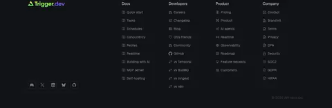
Footer link columns Multiple compact navigation columns on the dark canvas, introduced by the wordmark and grouped by product, developer, and company topics.
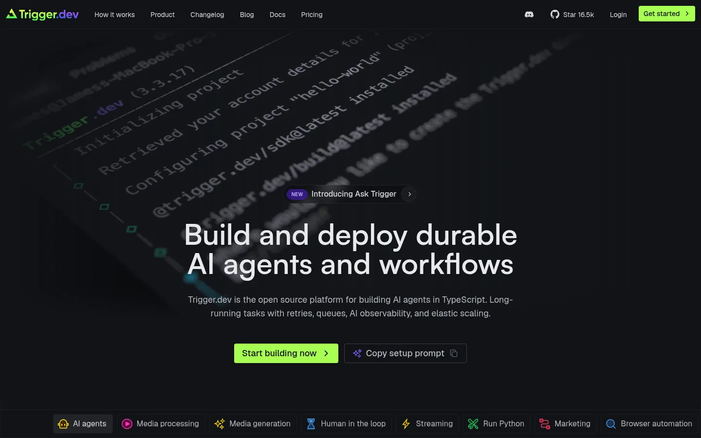
Imagery · There is no lifestyle photography in the first viewport. Use product videos, dashboard mockups, terminal/code panels, workflow diagrams, and small technology logos as the core imagery. Frame media in dark containers with restrained borders and keep contrast controlled so code and interface details feel embedded in the page. The hero uses blurred, angled code imagery behind centered copy; vivid greens, blues, and violets belong mostly to illustrative product content.
页面版块 共 22 个版块,按页面从上到下排列,每个都标了类型、布局和交互套路。
该做与不该做 ✓ 该做 Use #121317 as the dominant page canvas. Reserve #afec73 for primary actions and a few brand signals. Use Satoshi for headings and Geist for interface copy. Separate content with #1c1e21 hairlines rather than heavy shadows. Use code, diagrams, and product screens as the main visual material. Keep supporting copy muted and technical details compact. ✕ 不该做 Do not introduce bright section backgrounds or broad gradients. Do not use lime as a large text or surface color. Do not add lifestyle photography as the main product imagery. Do not make every section a rounded, elevated card. Do not use heavy shadows or thick decorative borders. Do not crowd the hero with navigation-like secondary content. 给 AI 的提示词 想快速出一个同风格的新页面,把这段话连同 DESIGN.md 一起发给 AI。
复制 Build a new developer-focused SaaS page using Trigger.dev’s dark, restrained visual language. Set #121317 as the continuous canvas, use #d7d9dd for primary text, #878c99 for supporting copy, and #1c1e21 for fine dividers. Treat #afec73 as a scarce, high-visibility action accent; keep #9c9af2 and #d9f07c to small labels or technical details. Use Satoshi or a close substitute such as Plus Jakarta Sans for confident semibold headings, Geist or Inter for UI and body text, and Geist Mono for code. Structure content on a centered max-width rail, mixing aligned feature splits, compact grids, code examples, diagrams, and product previews. Keep surfaces flat and shadows minimal. Make the page feel detailed and technical without sacrificing clear section rhythm.
DESIGN.md Tailwind v4 CSS 变量 Design Tokens
---
title: "Trigger.dev design system"
variant: extended
source: https://trigger.dev/
captured_at: 2026-10-12
theme: dark
industry: devtools
generator: Design DNA (https://four.wiralomi.com/style/trigger-dev)
ai_generated: true
ai_label: "本文件由 AI 辅助生成:数值取自公开网页的实测样式,命名、用途说明与建议为模型解读。商标归原所有者。 / AI-assisted content"
---
# Trigger.dev · Design System
> A dark, code-first canvas with vivid signals
**Theme:** dark · **Industry:** devtools · **Source:** https://trigger.dev/ · **Captured:** 2026-10-12 (1440×900 desktop)
_AI-assisted content: values are measured from the public page at capture time; names, roles and guidance are model-written interpretations. Trademarks belong to their owners._
A dark, editorial-style developer homepage uses restrained surfaces and hairline dividers to organize a long product story. Bright lime CTAs, compact code details, and dashboard imagery bring selective energy to an otherwise near-black interface.
## North star
Keep the interface nearly monochrome and let functional content and a few vivid accents carry the hierarchy.
## Overview
The page uses a near-black canvas throughout, with subtle charcoal surfaces and thin borders defining controls, cards, and section edges rather than large contrasting bands. Pale gray headlines sit against the dark background; muted gray copy keeps dense technical explanations readable without competing with the main message. Lime green is reserved for primary actions and small brand signals, while violet and green accents appear sparingly in badges, labels, and product visuals. Large Satoshi headings create a confident editorial hierarchy, paired with Geist for navigation, interface labels, and body copy; Geist Mono gives code samples their developer-tool character. The layout is a long, mostly single-canvas narrative, mixing centered hero content with left-aligned feature sections and occasional multi-column grids. Product screens, diagrams, and code snippets provide the visual substance instead of lifestyle photography. Compact spacing, generous section pauses, and restrained borders make the dense page feel structured rather than ornamental.
## Colors
| Name | Hex | Token | Group | Role |
|---|---|---|---|---|
| Night Canvas | ` | `--color-night-canvas` | brand | Dominant page canvas, hero background, and the continuous backdrop behind most sections. |
| Slate Copy | ` | `--color-slate-copy` | neutral | Primary muted text for supporting copy, footer links, and secondary descriptions. |
| Divider Charcoal | ` | `--color-divider-charcoal` | surface | Hairline borders around cards, controls, footer areas, and subtle grid treatments. |
| Badge Violet Edge | ` | `--color-badge-violet-edge` | accent | Thin border on the small violet NEW badge; a limited badge detail, not a page-wide brand color. |
| Panel Charcoal | ` | `--color-panel-charcoal` | surface | Subtle filled surfaces for compact buttons, links, and interface elements. |
| Soft Headline | ` | `--color-soft-headline` | neutral | Main headline, navigation, button, and foreground text against dark backgrounds. |
| Mist Gray | ` | `--color-mist-gray` | neutral | Secondary button text and softer supporting copy. |
| Badge Lilac | ` | `--color-badge-lilac` | accent | Text inside the small NEW badge; primarily a badge-specific accent. |
| Badge Aubergine | ` | `--color-badge-aubergine` | accent | Fill for the NEW badge, a small localized notification element. |
| Steel Gray | ` | `--color-steel-gray` | neutral | Occasional subdued text and interface detail; also appears in consent-control styling. |
| Signal Lavender | ` | `--color-signal-lavender` | accent | Sparse accent text and small product or feature labels. |
| Trigger Lime | ` | `--color-trigger-lime` | accent | Bright primary CTA and brand signal, most visible in the header and hero. |
| Soft Citron | ` | `--color-soft-citron` | accent | Secondary lime accent in text and product details; use sparingly. |
### Semantic aliases
`--color-canvas` → ` (Night Canvas) · `--color-surface` → ` (Panel Charcoal) · `--color-text` → ` (Soft Headline) · `--color-text-muted` → ` (Slate Copy) · `--color-text-subtle` → ` (Mist Gray) · `--color-border` → ` (Divider Charcoal) · `--color-accent` → ` (Signal Lavender) · `--color-accent-2` → ` (Trigger Lime) · `--color-accent-3` → ` (Soft Citron)
### Contrast (WCAG 2.x)
| Text | Background | Ratio | Level |
|---|---|---|---|
| ` | ` | 13.13:1 | AAA |
| ` | ` | 12.71:1 | AAA |
| ` | ` | 5.52:1 | AA |
| ` | ` | 5.34:1 | AA |
| ` | ` | 9.35:1 | AAA |
| ` | ` | 9.05:1 | AAA |
| ` | ` | 7.35:1 | AAA |
| ` | ` | 7.11:1 | AAA |
### Gradients
- `linear-gradient(90deg, rgb(28, 30, 33) 1px, rgba(0, 0, 0, 0) 1px)`
- `linear-gradient(90deg, rgba(18, 19, 23, 0), rgb(18, 19, 23) 25%, rgb(18, 19, 23) 75%, rgba(18, 19, 23, 0)), image-set(url("https://trigger.dev/patterns/crosses-64x64.png") 1dppx, url("https://trigger.dev/patterns/crosses`
- `linear-gradient(oklab(0 0 0 / 0) 0%, oklab(0.187446 0.000649907 -0.00823779 / 0.8) 50%, rgb(18, 19, 23) 100%)`
- `linear-gradient(to top, rgb(18, 19, 23) 0%, oklab(0.187446 0.000649907 -0.00823779 / 0.75) 50%, oklab(0 0 0 / 0) 100%)`
## Typography
| Family | Token | Source | Weights | Role | Free substitute |
|---|---|---|---|---|---|
| Geist | `--font-geist` | webfont | 400, 500, 600 | Navigation, body labels, buttons, captions, and interface copy. | Inter |
| Satoshi-Variable | `--font-body` | webfont | 500, 600 | Display and page-section headings. | Plus Jakarta Sans |
| Geist Mono | `--font-mono` | webfont | 400 | Code samples and technical snippets. | IBM Plex Mono |
- **Geist:** Mostly regular weight; compact UI text stays in sentence case, with uppercase reserved for tiny badges.
- **Satoshi-Variable:** Semibold headings; large display text is tight and confident, without added tracking.
- **Geist Mono:** Regular monospace with readable code-like line structure; avoid decorative tracking.
### Type scale — Perfect Fourth (ratio ≈ 1.351, base 18px)
| Role | Size | Weight | Line height | Letter spacing | Case | Family | Used for |
|---|---|---|---|---|---|---|---|
| display | 60px | 600 | 1 | 0 | — | Satoshi-Variable | Oversized, centered hero headline. |
| h1 | 36px | 600 | 1.11 | 0 | — | Satoshi-Variable | Primary page or major feature heading. |
| h2 | 30px | 600 | 1.2 | 0 | — | Satoshi-Variable | Section headings such as How it works and feature groups. |
| h3 | 24px | 600 | 1.33 | 0 | — | Satoshi-Variable | Feature-card and secondary section headings. |
| body | 18px | 500 | 1.56 | 0 | — | Satoshi-Variable | Supporting product explanations and hero description. |
| caption | 16px | 400 | 1.5 | 0 | — | Geist | Compact labels and supporting interface text. |
| button | 16px | 400 | 1.5 | 0 | — | Geist | CTA and action labels. |
| nav | 14px | 400 | 1.43 | 0 | — | Geist | Header navigation and footer navigation. |
| link | 14px | 400 | 1.43 | 0 | — | Geist | Inline actions and feature links. |
| code | 14px | 400 | 1.43 | 0 | — | Geist Mono | Code examples and technical snippets. |
## Spacing & layout
- Base unit **4px**, density **compact**.
- Scale (most used values): 2, 4, 6, 8, 12, 16, 24, 28, 32, 40, 48 px.
- Section rhythm 32px · element gap 12px · card padding — · max content width 1222px.
The measured content max width is 1222px, with a compact 4px-based spacing system and a 32px section gap. The page is a long, mostly continuous dark canvas rather than a sequence of color-blocked bands. The centered hero gives way to left-aligned product sections, alternating feature splits and multi-column grids. Use a clear content rail and preserve generous pauses between major stories, while keeping cards, table-like lists, and interface labels compact. Media can extend broadly within its section; text stays organized into readable columns.
## Shape & elevation
- Radius: button `4px` · media `50%` · badge `9999px` · nav `4px` · link `4px` · xs `4px` · sm `6px` · pill `9999px`
- Shadow `hairline` (button): `rgba(0, 0, 0, 0) 0px 0px 0px 0px, rgba(0, 0, 0, 0) 0px 0px 0px 0px, rgba(0, 0, 0, 0) 0px 0px 0px 0px, rgba(0, 0, 0, 0) 0px 0px 0px 0px, rgba(0, 0, 0, 0.05) 0px 1px 2px 0px`
- Shadow `hairline-2` (other): `rgba(0, 0, 0, 0) 0px 0px 0px 0px, rgba(0, 0, 0, 0) 0px 0px 0px 0px, rgba(0, 0, 0, 0) 0px 0px 0px 0px, oklab(0.917562 -0.136625 0.151101 / 0.3) 0px 0px 0px 3px, rgba(0, 0, 0, 0) 0px 0px 0px 0px`
- Motion: standard transition `0.3s cubic-bezier(0.4, 0, 0.2, 1)` on interactive elements.
The interface is predominantly flat: rely on the dark canvas and fine charcoal borders for separation instead of raised cards or heavy shadows. Product previews can sit within outlined frames, with limited background overlays for legibility. Buttons have restrained depth, and the NEW badge uses a filled pill treatment. Avoid pronounced drop shadows.
## Imagery
There is no lifestyle photography in the first viewport. Use product videos, dashboard mockups, terminal/code panels, workflow diagrams, and small technology logos as the core imagery. Frame media in dark containers with restrained borders and keep contrast controlled so code and interface details feel embedded in the page. The hero uses blurred, angled code imagery behind centered copy; vivid greens, blues, and violets belong mostly to illustrative product content.
## Components
### Primary CTA
Compact lime-filled action with dark text, a small corner radius, and a right-facing arrow; prominent in the header and hero.
### Header navigation
A single dark horizontal bar with compact Geist links, a lime wordmark, community and GitHub affordances, and a bright Get started action.
### Announcement badge
A pill-shaped dark violet NEW badge with lilac text and a fine violet border, paired with the Ask Trigger announcement.
### Feature panel
Flat content areas use charcoal hairlines and restrained framing; technical explanations sit beside code, diagrams, or product media.
### Feature navigation strip
A compact row of bordered capability links with small colored icons and concise labels, placed immediately after the hero.
### Code sample
Dark, unraised code or terminal display with Geist Mono text, syntax color, and generous visual breathing room around the sample.
### Footer link columns
Multiple compact navigation columns on the dark canvas, introduced by the wordmark and grouped by product, developer, and company topics.
### Measured component styles
- **Primary button** (“Write tasks in regular code”): background ## Do
- Use ## Don't
- Do not introduce bright section backgrounds or broad gradients.
- Do not use lime as a large text or surface color.
- Do not add lifestyle photography as the main product imagery.
- Do not make every section a rounded, elevated card.
- Do not use heavy shadows or thick decorative borders.
- Do not crowd the hero with navigation-like secondary content.
## Agent prompt
Build a new developer-focused SaaS page using Trigger.dev’s dark, restrained visual language. Set ## Page sections (top to bottom)
| # | Type | Layout | UX patterns | UI patterns |
|---|---|---|---|---|
| 1 | hero | Centered headline and description over full-bleed code video, with two actions. | Announcement link, Primary and secondary CTA | Dark code backdrop, Lime CTA, Centered heading |
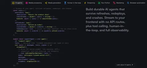
| 2 | category-nav | Compact horizontal strip of capability links followed by a split code-and-copy feature. | Jump among capabilities, Explore feature | Icon links, Code preview, Hairline separators |
| 3 | how-it-works | Left-aligned section title above a wide video or process area. | Play, Replay, Fullscreen | Video controls, Minimal heading |
| 4 | video | Wide single-column video panel with a short label. | Watch product demo | Code video, Small caption |
| 5 | feature-split | Section heading and explanatory copy on a single content rail. | Learn about AI agents | Text-led feature, Inline link |
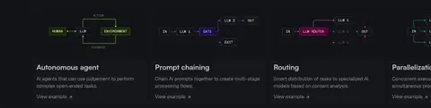
| 6 | feature-grid | Six visual feature cards in a multi-column grid. | View example | Workflow diagrams, Compact cards |
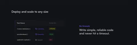
| 7 | feature-split | Large section title followed by alternating product preview and text rows. | Scan operational benefits | Queue preview, Short feature copy |
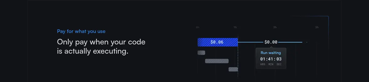
| 8 | feature-split | Text and billing visual arranged as a feature row. | Understand pricing model | Cost graphic, Muted label |
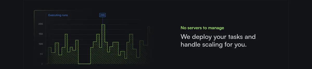
| 9 | feature-split | Infrastructure graphic paired with a short text block. | Review scaling benefit | Chart illustration, Feature copy |
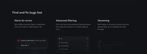
| 10 | feature-grid | Two-column section with several feature descriptions and small interface previews. | Review alerts, Filter runs | Alert preview, Filter UI, Versioning panel |
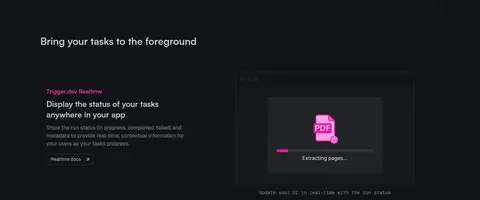
| 11 | product-showcase | Text and product mockup arranged in a wide split, followed by another example. | Explore realtime status | App mockup, Status display |
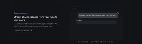
| 12 | feature-split | Feature copy and streaming illustration in a single content section. | Explore streaming API | Stream preview, Inline action |
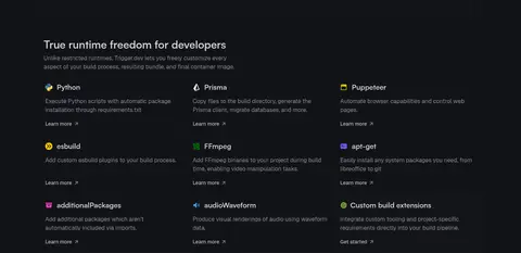
| 13 | feature-grid | Introductory heading followed by a three-column integration and runtime grid. | Learn more | Icon labels, Compact feature items |
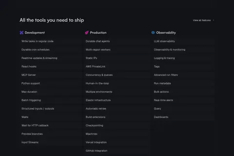
| 14 | comparison | Long feature matrix grouped into Development, Production, and Observability columns. | View all features, Compare capabilities | Column headings, Dense link list |
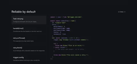
| 15 | feature-split | Two-column section with selectable retry topics beside a code sample. | Select retry behavior, Open docs | Selected list item, Code block |
| 16 | integrations | Short heading aligned with a horizontal row of technology logos. | Scan supported stack | Logo strip, Minimal framing |
| 17 | feature-split | Centered statement with small supporting logos or graphic details. | Reinforce open-source trust | Centered text, Simple illustration |
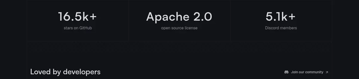
| 18 | stats | Three horizontally aligned metrics followed by a community section heading. | Review community proof | Large figures, Small labels |
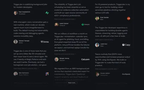
| 19 | testimonials | Several narrow testimonial columns with attribution and small profile images. | Read testimonials, Join community | Quote columns, Avatar and attribution |
| 20 | content-feed | Four-column content preview with a section heading and view-all link. | Browse updates, View all | Article cards, Compact metadata |
| 21 | cta | Three-column closing pitch with actions on the left and benefits alongside. | Get started for free, Copy setup prompt | Lime CTA, Benefit columns |
| 22 | footer | Wordmark and social icons beside several compact link columns. | Navigate documentation, Visit social channels | Grouped footer links, Brand mark, Social icons |
## Source CSS custom properties (selected)
```css
--cc-modal-border-radius: .375rem;
--cc-btn-border-radius: .375rem;
--cc-modal-transition-duration: .25s;
--cc-link-color: