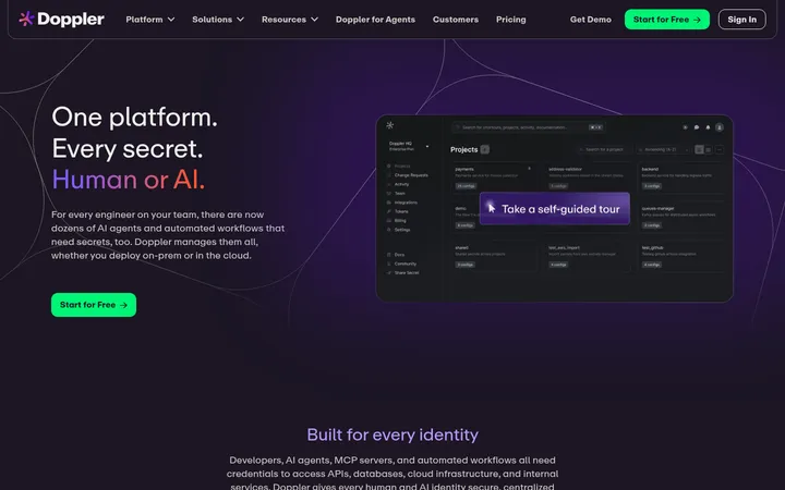
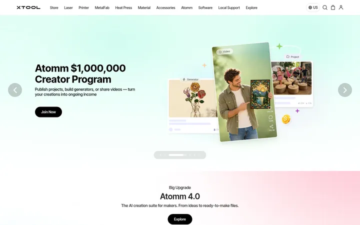
North star · Keep the interface nearly black and typographically direct, letting vivid 3D product imagery and a single orange CTA provide the emphasis.
The page is built on a near-black canvas, with black hero and media areas giving the product renders room to stand out. Dark charcoal section and card surfaces, fine gray borders, and muted gray copy provide hierarchy without breaking the restrained palette; the vivid orange is reserved for signup actions and small product accents. White headings use a bold system sans, with large centered hero typography giving way to smaller, left-aligned feature and creator content. The opening 3D mark is the visual anchor, followed by a video/demo area and a tightly arranged feature-card grid. The later creator block uses a split layout, while beta signup and FAQ content return to simple, focused modules. Comfortable section spacing contrasts with dense card content. Keep the interface flat and precise: use hairline borders and rounded containers rather than dramatic shadows, and let embedded product imagery carry the color and detail.
Headings, navigation, body copy, buttons, and links throughout the page.
角色
示例
字号
字重
行高
字距
特大标题
Oversized opening hero statement.
ThreeTools
68px
700
1
-0.015em
一级标题
Primary page headline and large section heading.
ThreeTools
48px
700
1
0
二级标题
Major section headings, including feature and creator areas.
ThreeTools
46px
700
1
-0.011em
三级标题
Feature card titles and supporting section headings.
The quick brown fox 敏捷的狐狸
24px
700
1.25
0
四级标题
Small module headings and subheads.
The quick brown fox 敏捷的狐狸
22px
700
1.25
0
正文
Explanatory copy and feature descriptions.
The quick brown fox 敏捷的狐狸
16px
700
1.25
-0.016em
辅助文字
Small supporting notes and metadata.
The quick brown fox 敏捷的狐狸
14px
700
1.25
0
按钮
Compact CTA and control labels.
The quick brown fox 敏捷的狐狸
12px
700
1
-0.008em
导航
Brand name and navigation labels.
The quick brown fox 敏捷的狐狸
16px
700
1.25
-0.011em
链接
Small attribution and inline links.
The quick brown fox 敏捷的狐狸
10px
700
1.25
0
间距与布局
基准单位 4px · 密度:适中
70px版块间距
20px元素间距
—卡片内边距
820px内容最大宽度
1px
5px
6px
8px
10px
12px
16px
20px
22px
24px
25px
32px
40px
44px
48px
60px
A centered, single-column landing flow opens with a compact navigation bar and spacious hero, then moves through a product video and testimonial snippets into a feature-card grid. The measured page max width is 820px; the feature cards use two columns, while the creator section becomes a two-column split. Center the hero headline and signup, then use left alignment for content-heavy blocks. Sections have generous separation, with denser content contained inside cards and FAQ rows.
圆角与层次
按钮 · 15px
输入框 · 22px
卡片 · 20px
导航 · 9999px
没有测到阴影:页面是扁平的,层次靠底色和描边区分。
The visual system is mostly flat, with no measured shadow system. Use dark surface changes to separate sections and cards, plus fine charcoal borders for definition. Rounded card and control edges soften the otherwise restrained, high-contrast layout; avoid adding floating layers or strong drop shadows.
组件
下面的预览按实测的按钮、输入框、徽标、卡片样式重建(字体用替代字体)。
Hero signup
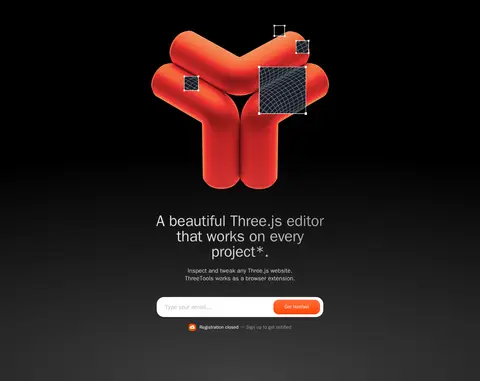
Centered headline and supporting copy above a white email field; pair the form with an orange Get Notified action.
Access pill
Compact pale pill navigation action with dark text and a small orange icon.
Product demo
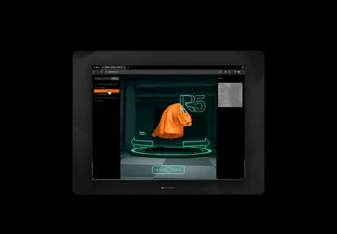
Large embedded video or product screen centered in a black section, with interface imagery kept prominent.
Feature cards
Two-column dark cards with a fine #343434 outline, rounded corners, short copy, and product UI imagery.
Creator split
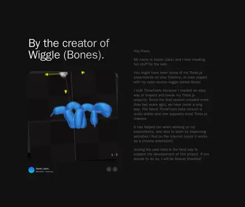
Charcoal section with product carousel imagery on one side and creator biography on the other.
FAQ rows
Stacked dark rounded question rows with subdued text and circular expand controls.
Beta CTA
Signup module combining concise feature copy, an email input, and the orange notification button.
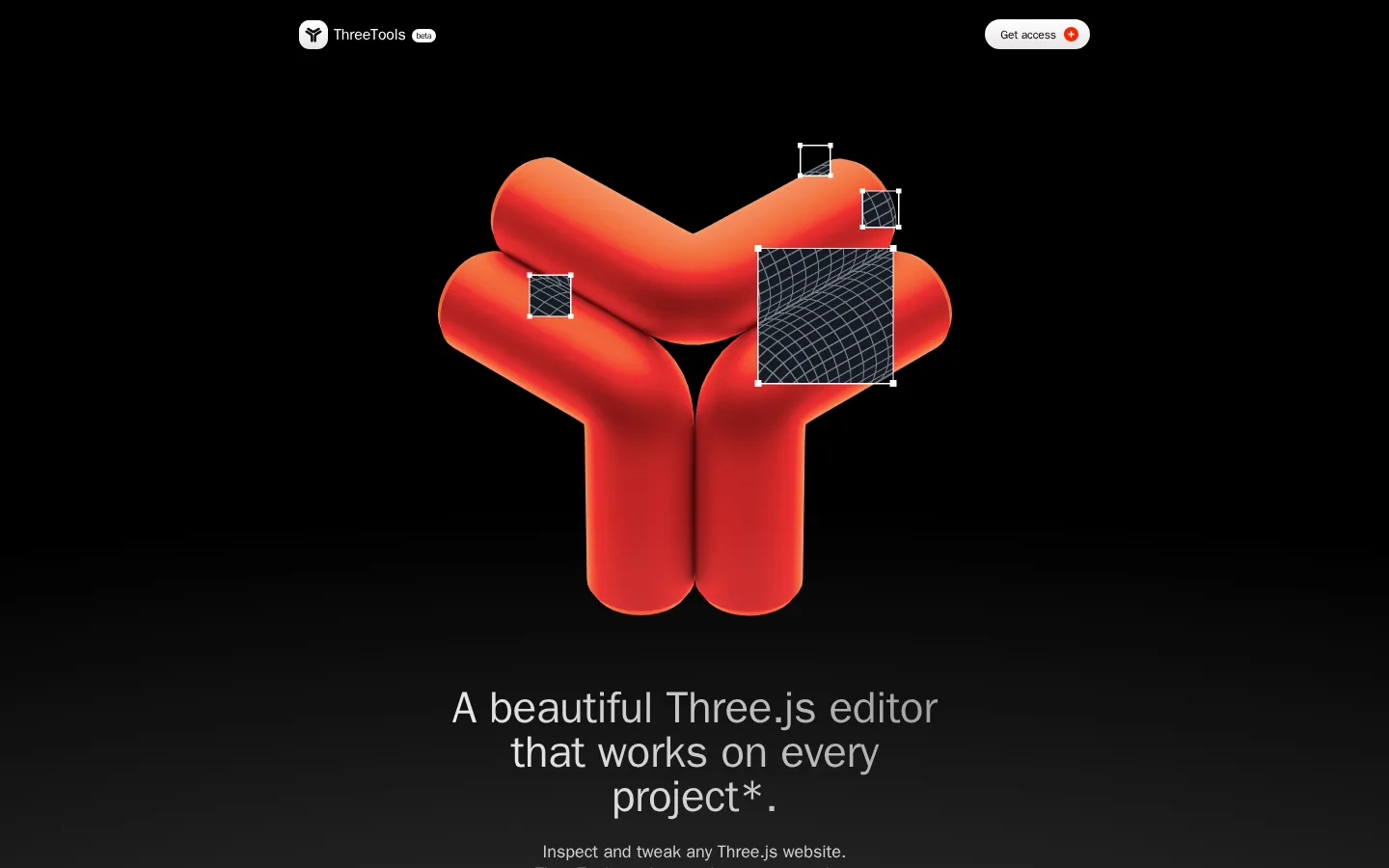
Imagery · Lead with a large glossy red-orange ThreeTools mark shown with editor selection overlays, then use screen recordings and browser-interface images to demonstrate the extension. Product cards contain dark UI screenshots with orange selections and occasional vivid 3D assets. Treat these colors as embedded product imagery, not as a broader page palette; keep framing crisp and surrounding UI dark.
Reserve #ff4300 for primary signup actions and small highlights.
Use charcoal surfaces and fine borders to define cards.
Give hero product imagery ample dark negative space.
Keep hero messaging centered and content sections plainly aligned.
Use compact, bold system-sans typography.
✕ 不该做
Do not add a broad multicolor interface palette.
Do not use bright accent colors for ordinary copy.
Do not add heavy shadows or glossy UI layers.
Do not make every section a bordered card.
Do not let product screenshots dictate the page-wide palette.
Do not replace the dark canvas with large light panels.
给 AI 的提示词
想快速出一个同风格的新页面,把这段话连同 DESIGN.md 一起发给 AI。
Build a developer-tool landing page in the ThreeTools visual style. Use Deep Canvas (#000000) as the dominant background, Signal White (#ffffff) for primary headings, and restrained gray copy including Quiet Gray (#666666) and Soft Silver (#cacaca). Reserve Tool Orange (#ff4300) for the main signup action and small UI highlights. Set bold system-sans typography with a large centered hero, concise supporting copy, and a compact email form. Feature the product through vivid 3D imagery and dark browser-interface demos, keeping their colors contained within the media. Arrange feature content in rounded charcoal cards with fine Border Graphite (#343434) outlines, then use a split creator section and a simple stacked FAQ. Maintain generous section breaks, clear alignment, and flat surfaces without prominent shadows.