North star · Let monochrome line art and product evidence provide character, while a near-black canvas and crisp white type keep every action legible.
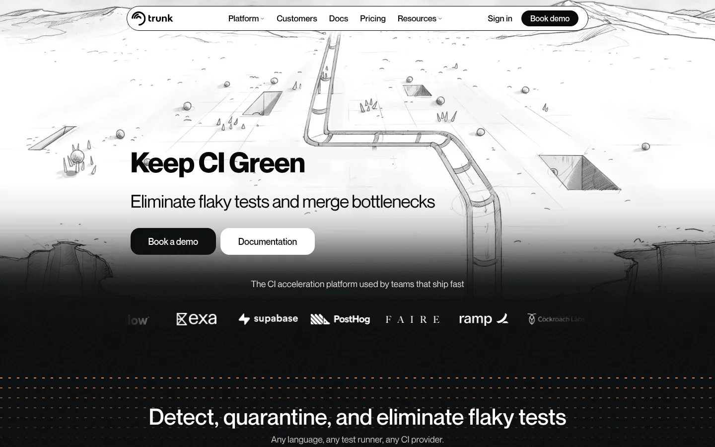
The page builds its identity from a near-black canvas, white type, and muted gray supporting text; color is deliberately held back so the product story and monochrome artwork carry attention. The opening hero reverses that darkness with a bright, hand-drawn landscape, then fades into the dark page beneath it. A Neue sans-serif face gives the headline strong presence without decorative styling, while smaller text stays compact and readable. The centered navigation and hero sit above a narrow, controlled content column, with broad vertical gaps separating product sections. Product screenshots, customer logos, and testimonial cards provide evidence of the software in use; they sit against dark surfaces rather than competing with the page. Thin charcoal borders define cards and interfaces where needed, while white pill-like buttons create the clearest interaction cue. Across the long page, recurring line-art dividers and restrained contrast make the layout feel continuous rather than fragmented.
配色
点色块复制色值。用途说明来自对页面的实测位置(背景、文字、描边、按钮)与截图判读。
品牌色
表层色
中性色
页面底色 · Night Canvas表层 · Pure Black表层 2 · Paper White主文字 · Paper White次要文字 · Soft Ash弱文字 · Cloud Gray描边 · Border Charcoal
All page typography, including display headings, navigation, body copy, links, and buttons.
角色
示例
字号
字重
行高
字距
特大标题
Large hero or section display headline.
Trunk
60px
500
1
-0.026em
一级标题
Primary page headline, including the hero title.
Trunk
45px
500
1
0
二级标题
Major product-section headings.
Trunk
36px
400
0.94
-0.028em
三级标题
Feature titles and emphasized card headings.
The quick brown fox 敏捷的狐狸
24px
700
1.5
0
四级标题
Smaller supporting headings within product content.
The quick brown fox 敏捷的狐狸
18px
400
1.3
0
正文
Default descriptive copy and supporting paragraphs.
The quick brown fox 敏捷的狐狸
14px
400
1.4
0
辅助文字
Compact notes, labels, and low-emphasis supporting text.
The quick brown fox 敏捷的狐狸
13.5px
400
1
-0.013em
按钮
CTA labels such as Book demo and Documentation.
The quick brown fox 敏捷的狐狸
17px
500
1.18
-0.009em
导航
Top navigation labels and menu items.
The quick brown fox 敏捷的狐狸
17px
500
1.18
0
链接
Inline secondary links within feature descriptions.
The quick brown fox 敏捷的狐狸
14px
400
1.5
0
间距与布局
基准单位 1px · 密度:宽松
263px版块间距
12px元素间距
27px卡片内边距
938px内容最大宽度
3px
4px
5px
6px
8px
9px
12px
13px
14px
15px
18px
24px
36px
45px
A centered, spacious composition uses a measured content maximum of 938px for much of the page, with wider visual bands and artwork extending beyond it. The navigation is a compact horizontal capsule, followed by a centered hero and logo row. Product sections repeat a clear heading, supporting line, large screenshot or feature cards, then smaller details. Generous section gaps separate these groups; card content is denser but remains aligned and orderly. The overall density is spacious, with consistent centered alignment.
圆角与层次
按钮 · 18px
卡片 · 24px
图片 · 50%
导航 · 12px
没有测到阴影:页面是扁平的,层次靠底色和描边区分。
The interface is predominantly flat, with no measured shadows. Thin #232323 borders outline dark cards and separate some feature panels. Contrast, background transitions, and layered artwork create depth: the bright hero fades down into the near-black page, while screenshots sit visually above the surrounding canvas without heavy framing.
组件
下面的预览按实测的按钮、输入框、徽标、卡片样式重建(字体用替代字体)。
Capsule navigation
A centered, light navigation capsule holds the Trunk mark, menu links, sign-in, and a dark Book demo action.
Hero CTA pair
A dark Book a demo button sits beside a white Documentation button; both use concise labels and rounded pill-like forms.
Product showcase
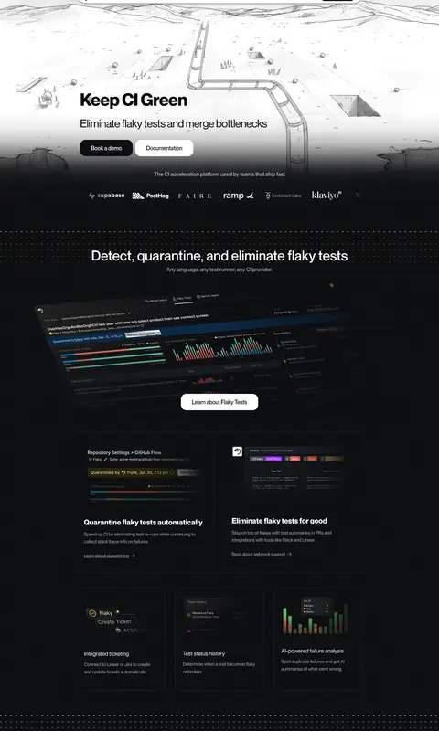
Large dark product screenshots anchor feature sections, with a centered white learn-more action nearby.
Feature cards
Dark cards use thin #232323 outlines and rounded corners, grouping short feature descriptions and inline links.
Customer proof
Customer logos and testimonial cards appear in horizontal bands against the dark page, adding social proof between product sections.
Newsletter form
The footer includes a compact email field and Subscribe action alongside grouped resource and company links.
Imagery · The hero uses monochrome, hand-drawn landscape line art with a winding path as a broad atmospheric backdrop. Product UI screenshots appear as dark, slightly angled showcase images, while customer marks and testimonial cards add proof. Illustrations and product imagery are treated as narrative or evidence rather than decorative color accents; subtle fades help imagery blend into the dark canvas.
Reserve bright white for key headings and primary contrast.
Use muted gray for supporting copy and secondary links.
Keep product screenshots and customer proof inside a spacious vertical rhythm.
Use thin charcoal borders rather than heavy card shadows.
Let monochrome line art bridge the hero and dark page.
✕ 不该做
Do not introduce a bright accent palette into the interface.
Do not crowd the centered hero with extra content.
Do not use heavy shadows to lift cards.
Do not make every text element pure white.
Do not let screenshots overwhelm the page hierarchy.
Do not replace the hand-drawn monochrome mood with glossy stock imagery.
给 AI 的提示词
想快速出一个同风格的新页面,把这段话连同 DESIGN.md 一起发给 AI。
Build a new Trunk-style devtools page with a near-black #08090b canvas and a restrained monochrome palette. Use Paper White (#ffffff) for primary headings and high-contrast actions, Soft Ash (#b3b3b5) for secondary copy, and Border Charcoal (#232323) for subtle card outlines. Set all type in a clean Neue-like sans-serif such as Inter; keep headlines confident, supporting copy compact, and labels natural-case. Center the navigation and main content within a controlled column, then use broad section gaps to separate product stories. Pair large dark UI screenshots with concise feature cards and clear learn-more actions. Use hand-drawn monochrome line art as atmospheric narrative imagery, fading it into the dark canvas. Keep surfaces flat, avoid unnecessary color and shadows, and maintain a clear CTA hierarchy.