North star · Keep the deep plum canvas calm and spacious, then use violet for atmosphere and electric green only where action matters.
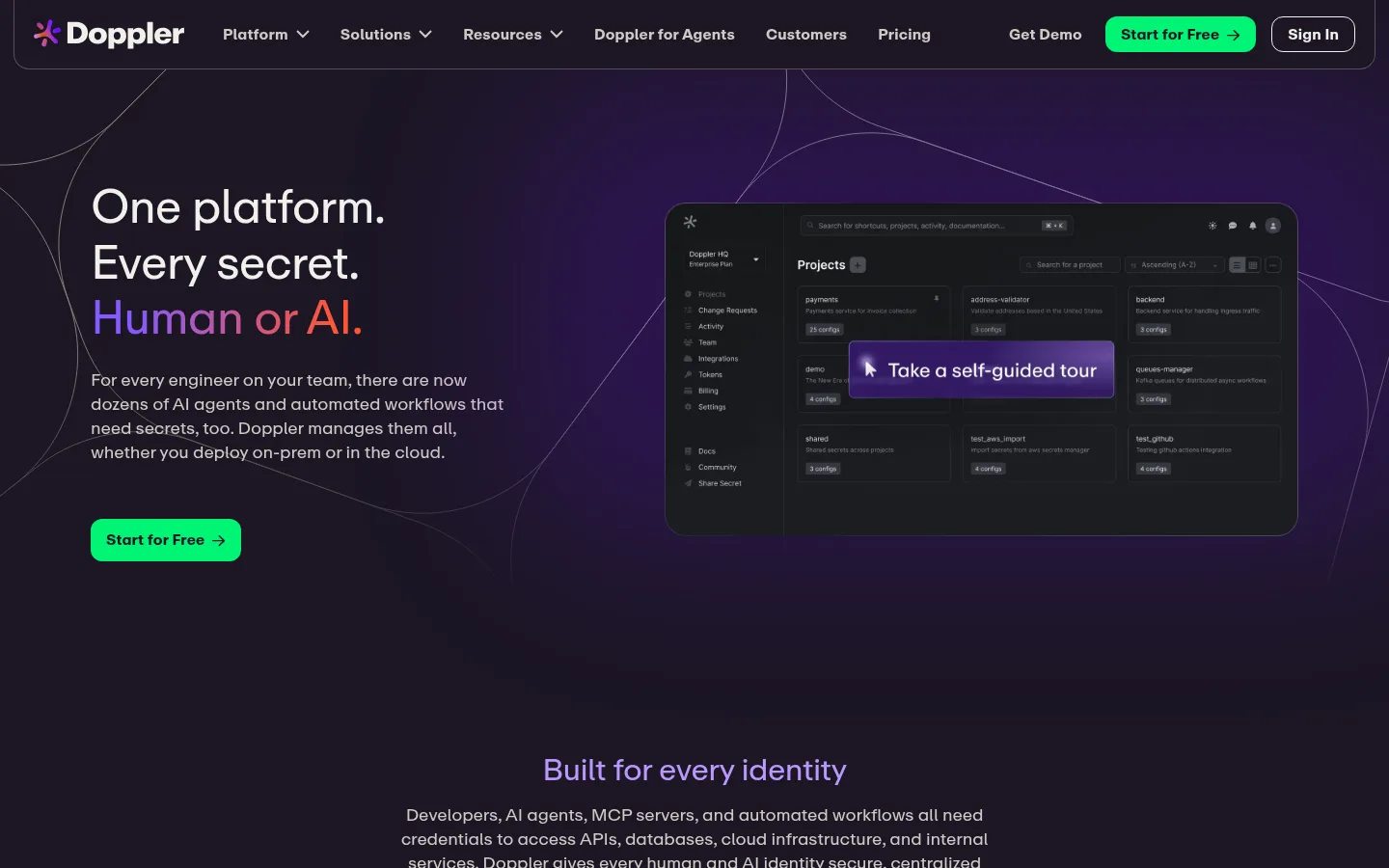
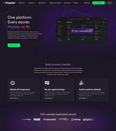
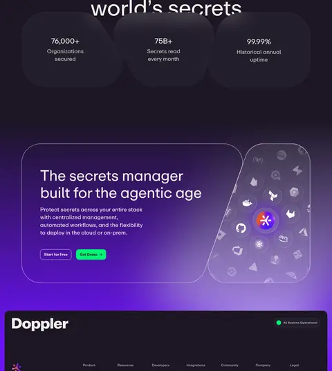
The page is grounded in a near-black plum canvas (#1c1624), with pale warm text and muted gray-lilac copy providing legible contrast. Violet (#6b13f5) and lavender (#b997ff) energize hero treatments, section transitions, and selected headings; electric green (#00f575) is reserved for high-priority actions. A subtle violet-to-pink gradient appears as decorative light, not as a reason to expand the core palette. One custom sans-serif family handles the full hierarchy: oversized, lightly weighted display headlines contrast with compact uppercase labels and bolder navigation. The opening section pairs left-aligned copy and CTA with a dark product-interface visual; later content alternates centered introductions, feature cards, logo proof, integrations, and customer stories. Repeated rounded cards, thin outlines, restrained borders, and large vertical gaps keep dense technical information orderly. Imagery is predominantly interface captures and branded technology illustrations rather than lifestyle photography.
配色
点色块复制色值。用途说明来自对页面的实测位置(背景、文字、描边、按钮)与截图判读。
品牌色
强调色
表层色
中性色
功能色
页面底色 · Deep Plum表层 · Raised Plum主文字 · Warm Chalk次要文字 · Soft Pebble弱文字 · Quiet Ash描边 · Slate Hairline强调 · Electric Violet强调 2 · Lavender Glow强调 3 · Signal Green
Site-wide display, headings, body copy, navigation, links, and controls
角色
示例
字号
字重
行高
字距
特大标题
Hero-scale headline treatment for prominent brand statements.
Doppler
96px
450
1.05
-0.02em
一级标题
Primary page and major section headlines.
Doppler
64px
450
1.15
-0.02em
二级标题
Section headings, often centered above content.
Doppler
48px
450
1.2
-0.02em
三级标题
Feature and customer-story card titles.
Doppler
32px
450
1.2
-0.02em
四级标题
Smaller supporting headings within feature content.
The quick brown fox 敏捷的狐狸
24px
400
1.4
-0.01em
正文
Paragraphs explaining product value and technical capabilities.
The quick brown fox 敏捷的狐狸
14px
400
1.5
0.03em
辅助文字
Compact uppercase category labels and metadata.
The quick brown fox 敏捷的狐狸
10px
700
1
0.1em
导航
Primary navigation labels and top-level site links.
The quick brown fox 敏捷的狐狸
15px
700
1
0.01em
链接
Bold secondary actions such as Learn More.
The quick brown fox 敏捷的狐狸
15px
700
1
0.01em
眉题
Small uppercase labels introducing content categories.
The quick brown fox 敏捷的狐狸
10px
700
1
0.1em
间距与布局
基准单位 8px · 密度:宽松
140px版块间距
8px元素间距
—卡片内边距
1252px内容最大宽度
2px
4px
8px
10px
14px
16px
20px
28px
32px
56px
A spacious, centered page uses a measured 1252px maximum content width and a 12-column-like rhythm, with hero copy and product visual arranged side by side. Subsequent sections combine centered headings, three-column card rows, a split integration feature, and broad story cards. The measured section rhythm is generous, with large vertical separation and compact gaps within related elements. Cards sit in tidy grids, while the footer expands into multiple link columns. Alignment alternates between centered introductions and left-aligned content.
圆角与层次
按钮 · 12px
没有测到阴影:页面是扁平的,层次靠底色和描边区分。
The page favors restrained layering over heavy shadows: product screenshots and cards sit slightly above the plum canvas through subtle tonal differences. Fine outlines define navigation and card edges, while rounded corners soften interface panels and CTAs. Violet glow and gradients provide depth in selected hero and CTA areas; most content remains visually flat and clean.
组件
下面的预览按实测的按钮、输入框、徽标、卡片样式重建(字体用替代字体)。
Primary CTA
Electric-green Start for Free button with dark text, a measured 12px radius, and compact internal padding; appears in navigation and hero.
Outline CTA
See Integrations uses warm chalk text and a 1px warm-chalk border, with the same 12px button radius.
Top navigation
Dark, outlined horizontal bar with the Doppler mark, bold compact links, a green CTA, and a secondary outlined sign-in action.
Feature cards
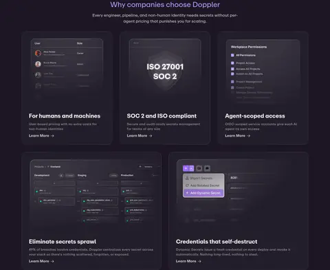
Dark raised panels in three-column rows, combining a small graphic or interface visual, a concise title, muted description, and Learn More link.
Integration split
Integration ecosystem artwork sits beside a left-aligned heading, technical copy, and an outlined See Integrations action.
Customer story cards
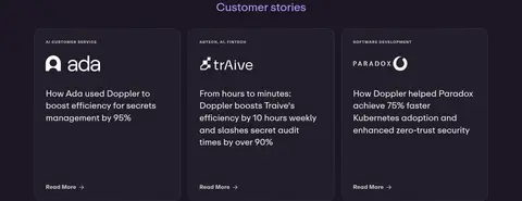
Three-column dark cards pair customer branding and category labels with outcome-focused summaries and understated reading links.
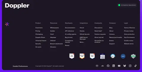
Footer
Dark, multi-column directory with a prominent Doppler wordmark, operational status, link groups, trust badges, preferences, and social icons.
Imagery · The hero pairs concise copy with a dark, cropped product-dashboard capture framed as a wide interface panel. Below, small integration marks, customer logos, security and permissions screens, and illustrated ecosystem graphics carry the technical story. Images remain embedded in the dark palette, often with violet light or soft glow; they are product proof and interface detail rather than decorative lifestyle photography. The closing CTA uses a prominent branded illustration.
Alternate centered section introductions with structured card grids.
✕ 不该做
Do not turn the page into a bright white SaaS template.
Do not use green as a large background field.
Do not apply Petal Light (#ff9efa) as a general UI color.
Do not crowd the page with tight section spacing.
Do not rely on heavy shadows to separate every card.
Do not replace product-interface imagery with lifestyle photography.
给 AI 的提示词
想快速出一个同风格的新页面,把这段话连同 DESIGN.md 一起发给 AI。
Build a new Doppler-style developer-tools page on Deep Plum (#1c1624), with Warm Chalk (#f1f0ec) for primary text and Soft Pebble (#d0c9c4) for supporting copy. Use Electric Violet (#6b13f5) and Lavender Glow (#b997ff) sparingly for atmospheric gradients and emphasized headings; reserve Signal Green (#00f575) for primary actions. Follow a spacious centered layout with a side-by-side hero, dark product-interface imagery, clear section introductions, and orderly rounded feature cards. Use a single clean sans-serif family, lightly weighted large headings, compact body copy, and bold navigation. Define panels with subtle tonal contrast and fine borders rather than strong shadows. Keep technical proof—screenshots, integration marks, customer logos—visually integrated with the dark canvas. Maintain generous section rhythm and focused CTAs.